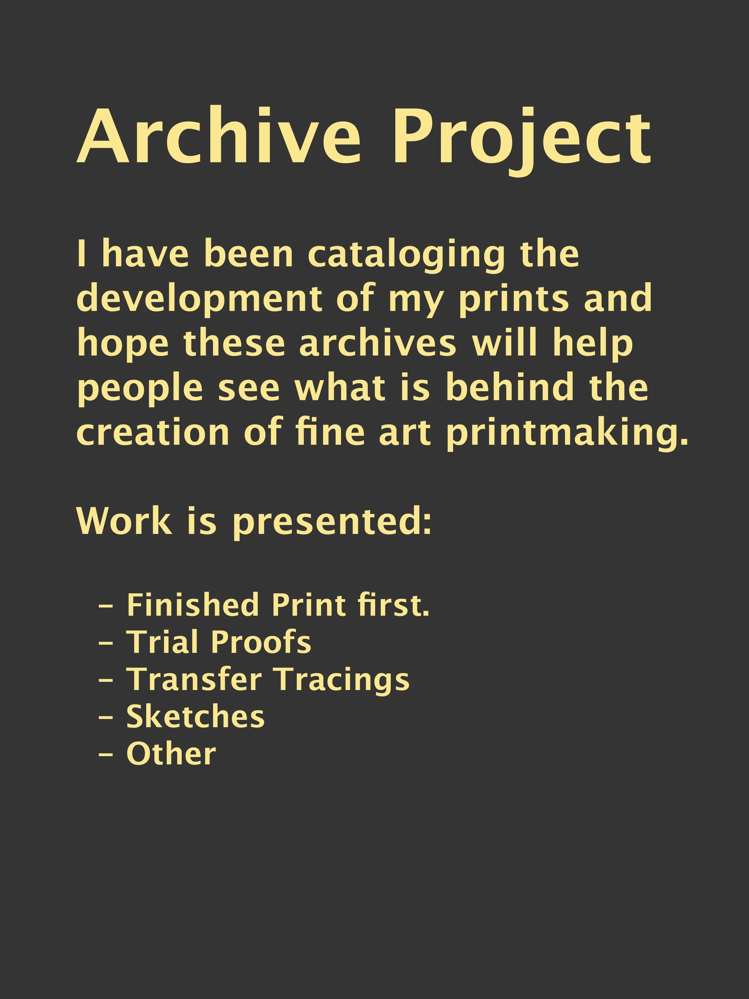
This page presents a selection from the archives of my intaglio career. During the pandemic, I went through my drawers and discovered all kinds of proofs, which I began photographing and organizing. I hope this page offers an educational look at how mezzotint and color prints are created. Ultimately, I hope to find a home for these archives in a public institution.
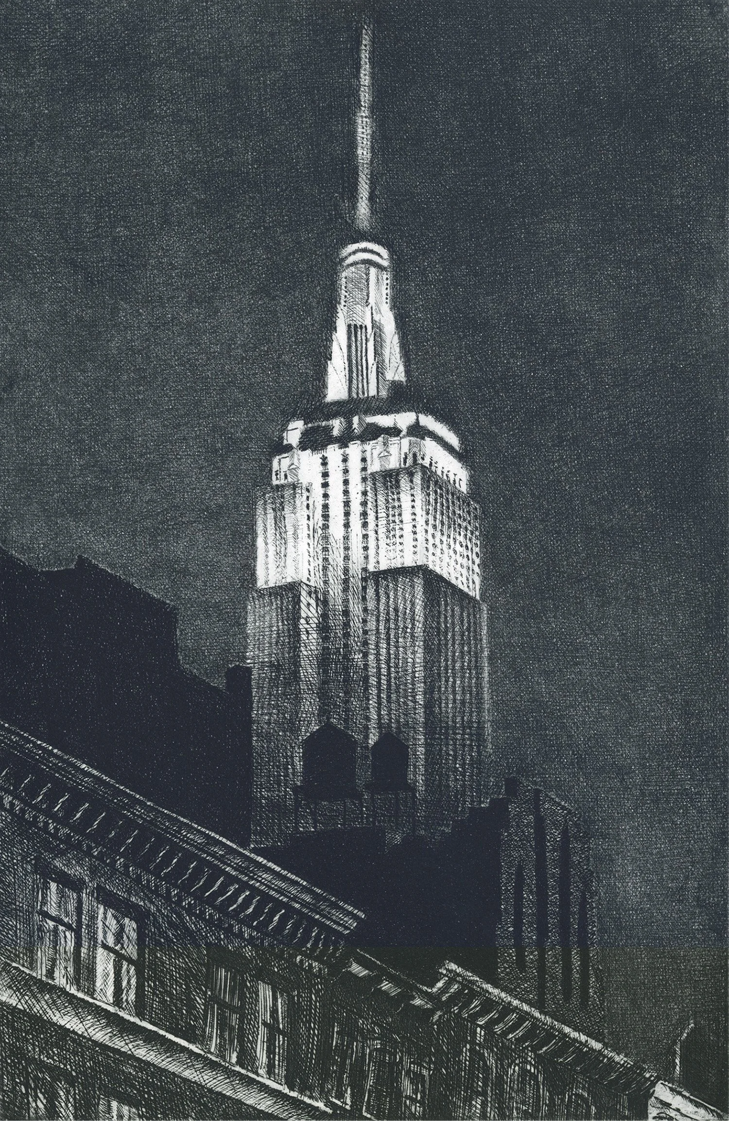
This line etching was the first intaglio print I ever created. It depicts the Empire State Building at night in the background, with small- and mid-level buildings in the foreground.
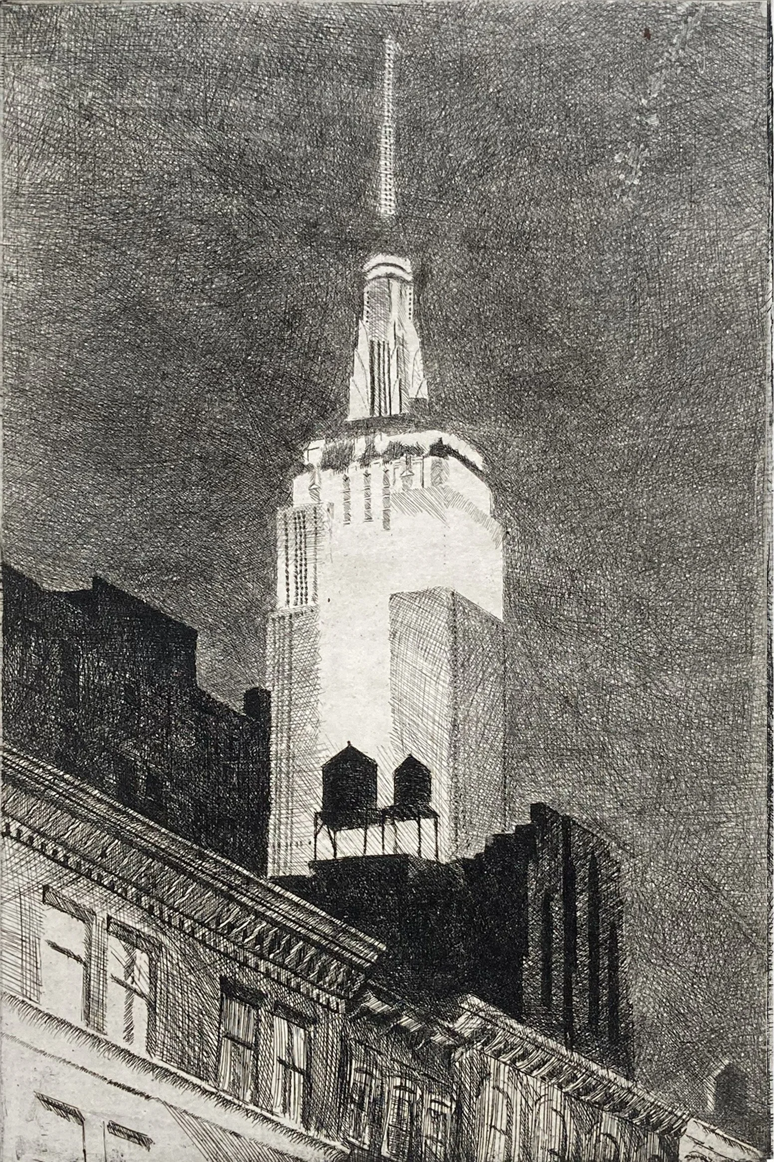
This is the first proof of my first etching. I didn’t have time to finish the drawing on the plate, so part of the Empire State Building was not fully rendered.
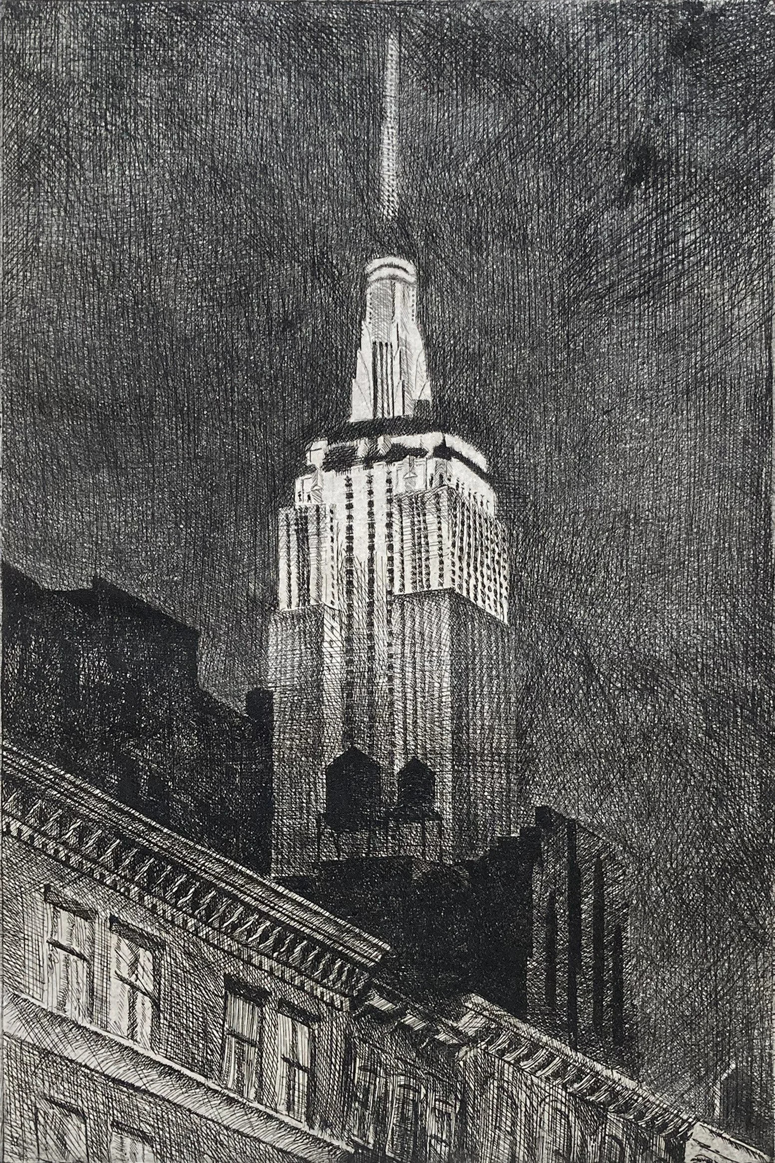
The second state has additional marks that are darker than those in the first state. The first state was etched in an older, weaker acid bath, while the second etching was done using a fresh, stronger acid bath. I learned a valuable lesson from this process: the condition of the acid is important for achieving consistent results.
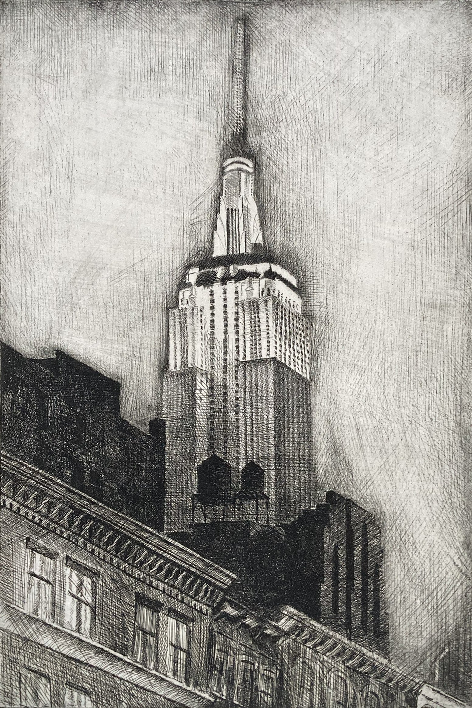
This image shows where I removed much of the background sky using my scraper and burnisher. Through this process, I learned a great deal about adding and removing marks in my first print.

This shows the next stage in the evolution of the print, where I added a new sky. I did this by re-grounding the plate, scratching through the waxy ground, and then re-etching the plate in the acid.
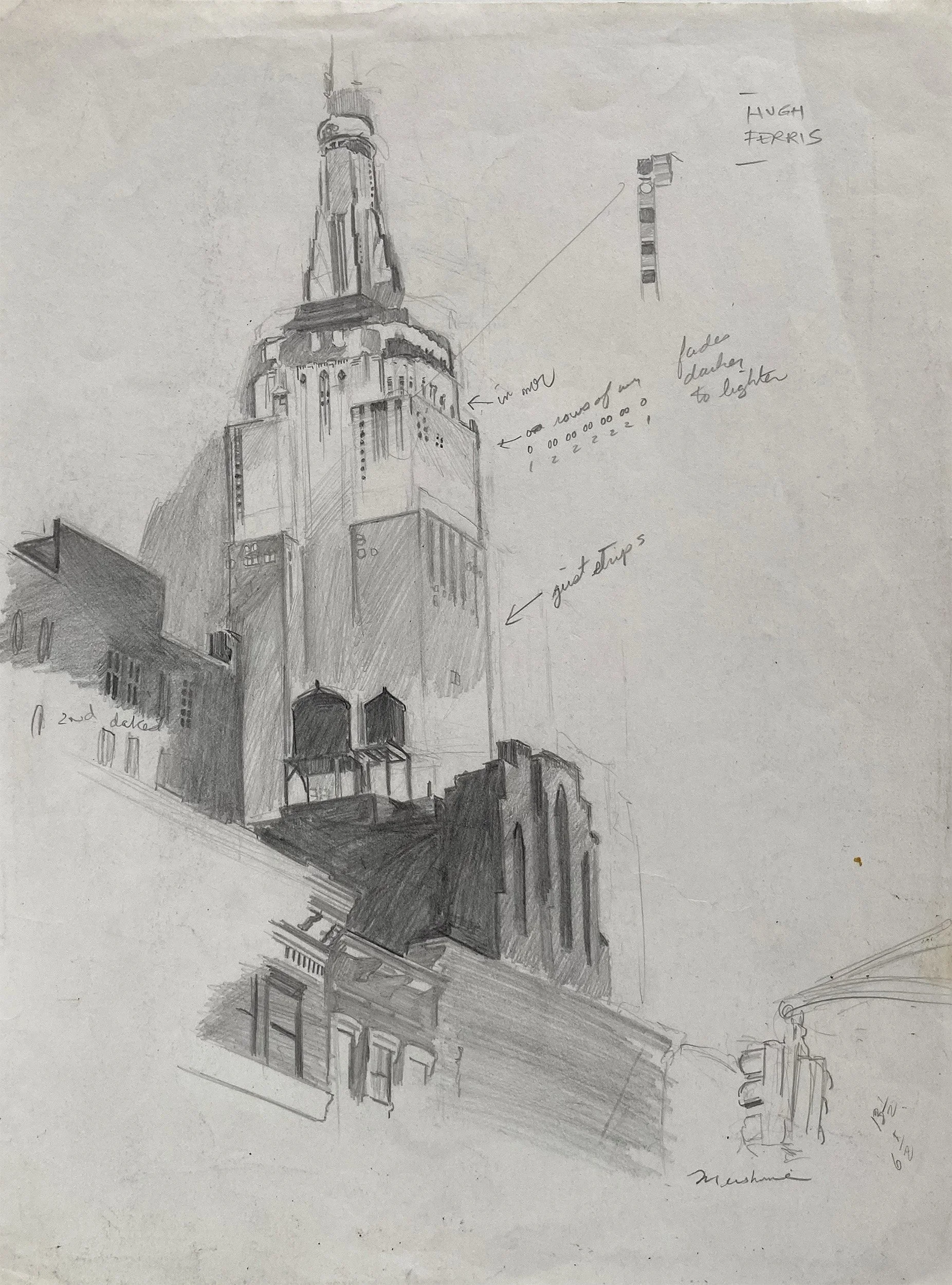
Pencil sketch with notes depicting the window details of the Empire State Building.
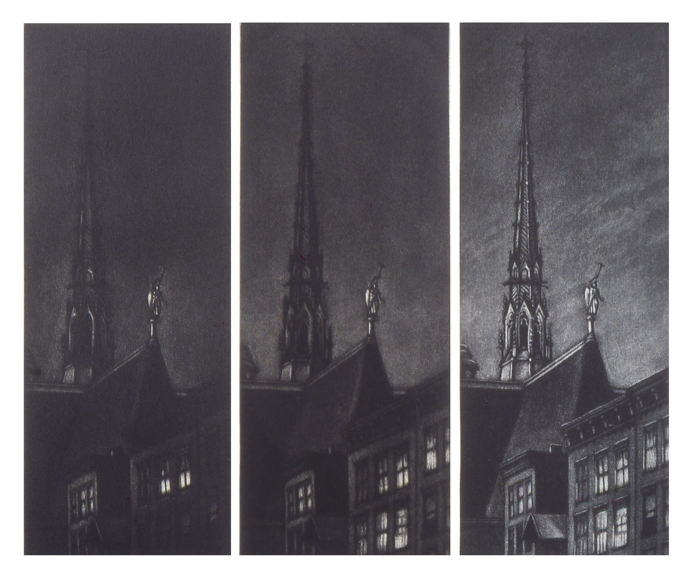
Mezzotint is a subtractive process in which the image is developed from dark to light. A dark ground is created by texturing a copper plate so that it will hold ink. The image is then created using a burnisher and scraper to reduce the texture, allowing the plate to hold less ink. The lightest tones are produced in areas where the copper has been completely smoothed. (See About Page for more information).
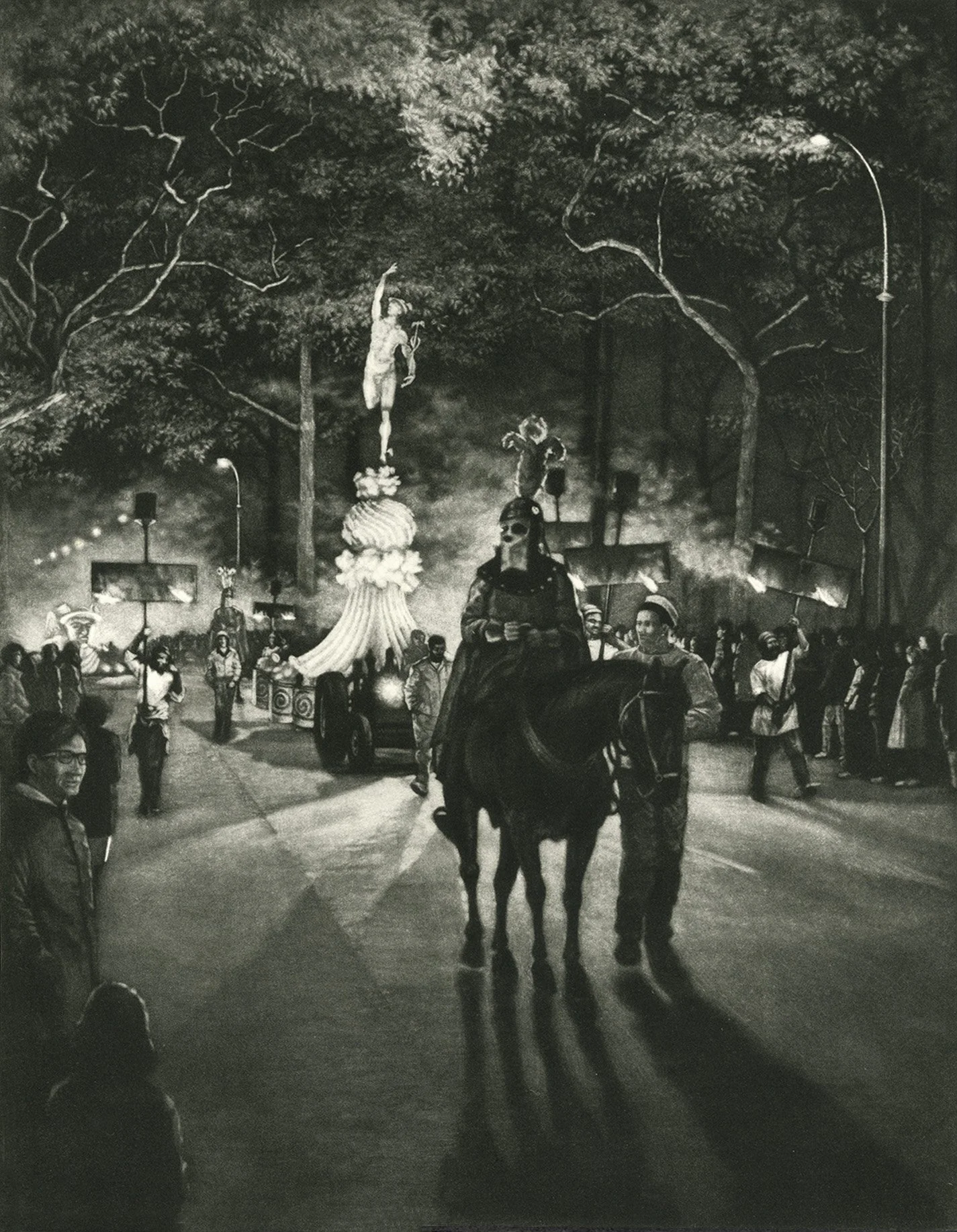
This scene depicts a nighttime Mardi Gras parade by the Krewe of Hermes. It was the first Mardi Gras parade I had ever seen, and I was captivated by its pageantry. The imagery for this print was drawn from five different photographs.
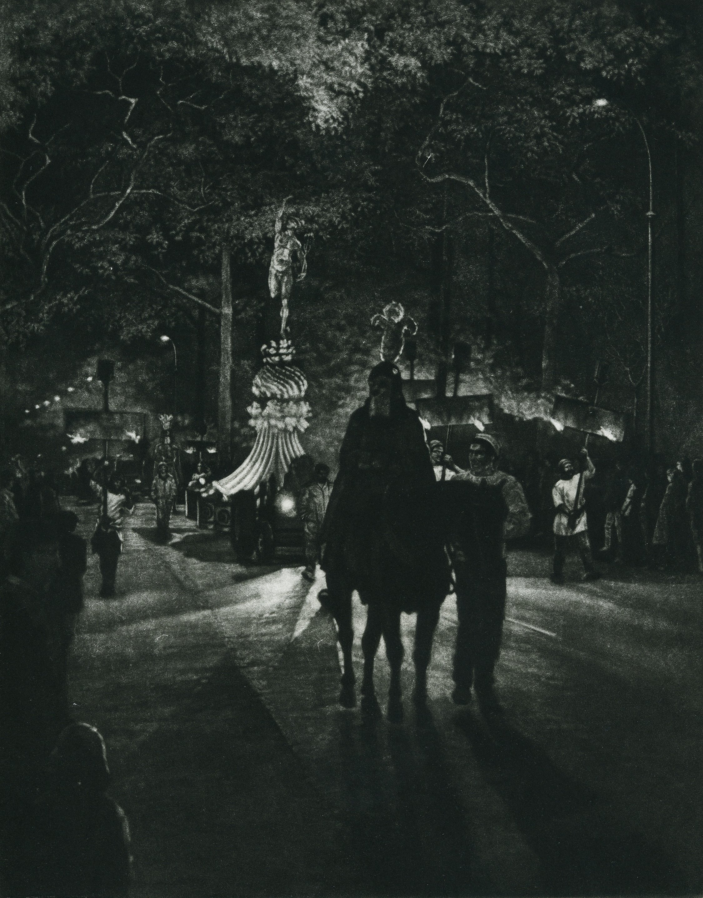
These next three proofs demonstrate the dark-to-light process of creating an image in mezzotint. The plate can look deceptively lighter than the resulting print, but when in doubt, it is best to err on the side of underworking the plate. You can always lighten the image.
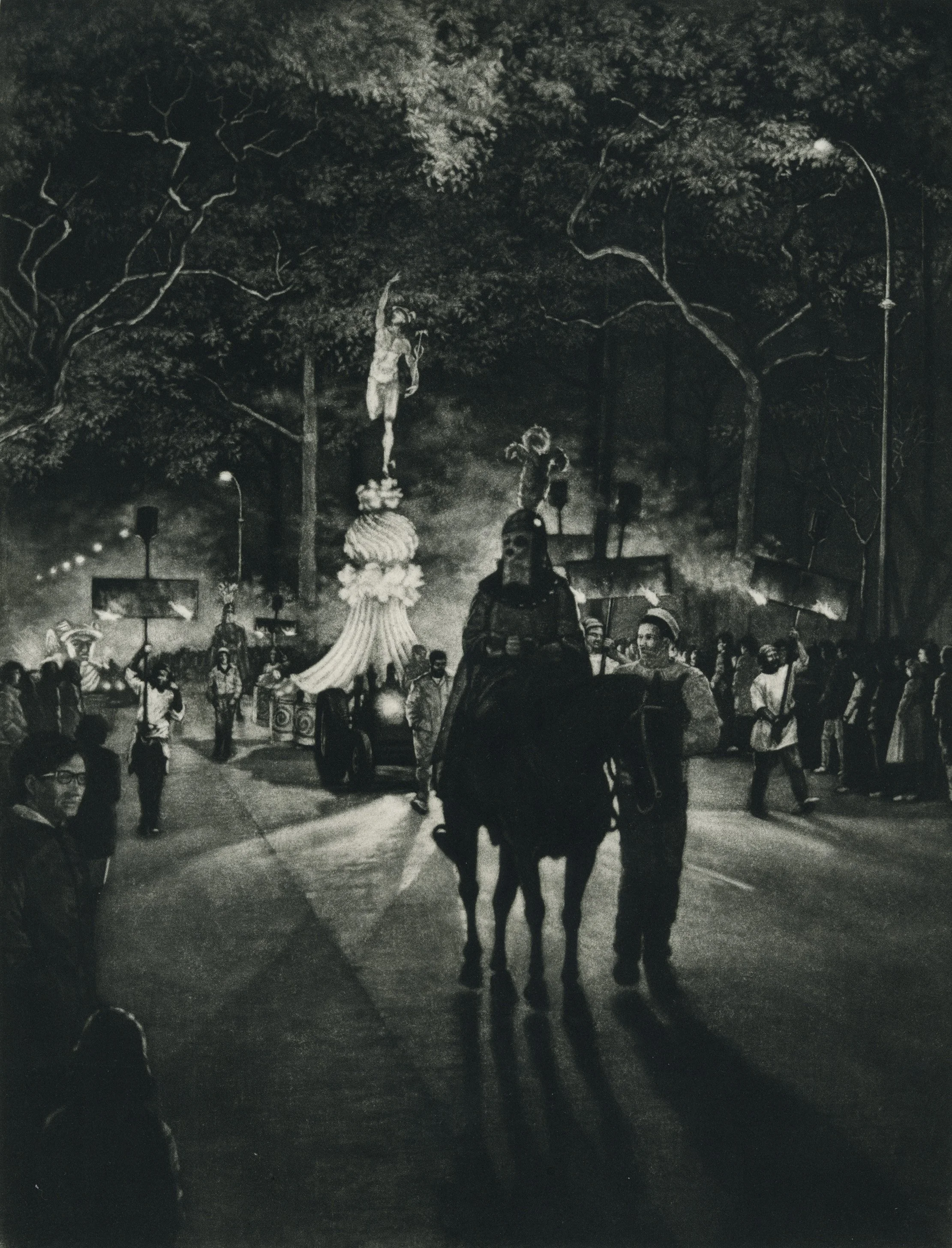
A mezzotint plate is sculptural, with a certain depth to its texture. When working, I error on preserving more of that texture then less, because it is always possible to take away, but much more difficult to add back and still maintain a seamless tone.
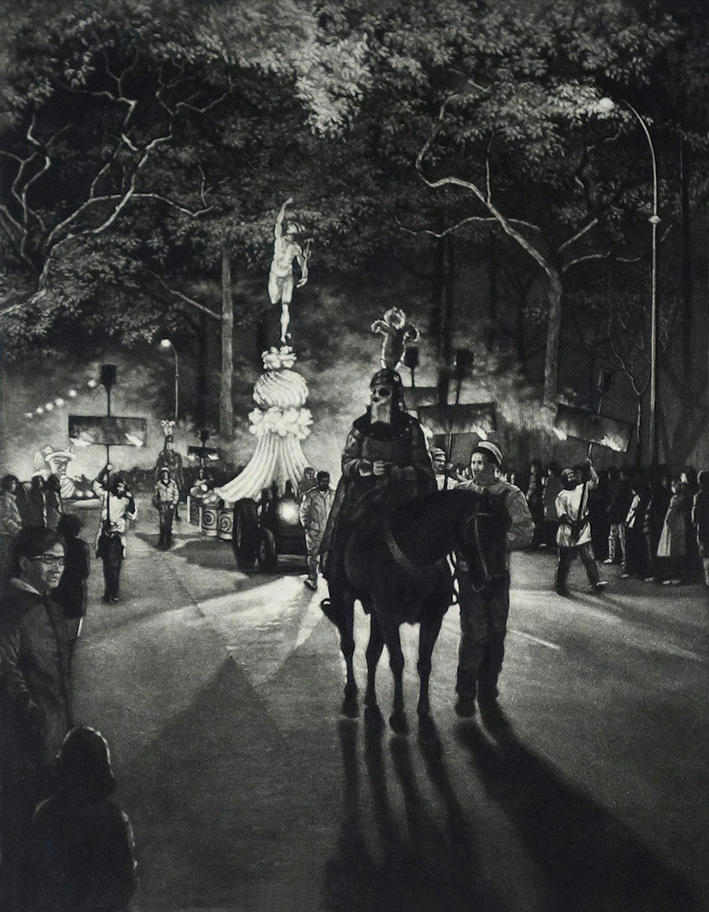
Each of the past three proofs has become progressively lighter, while the chiaroscuro quality of the knight leading the parade remains.
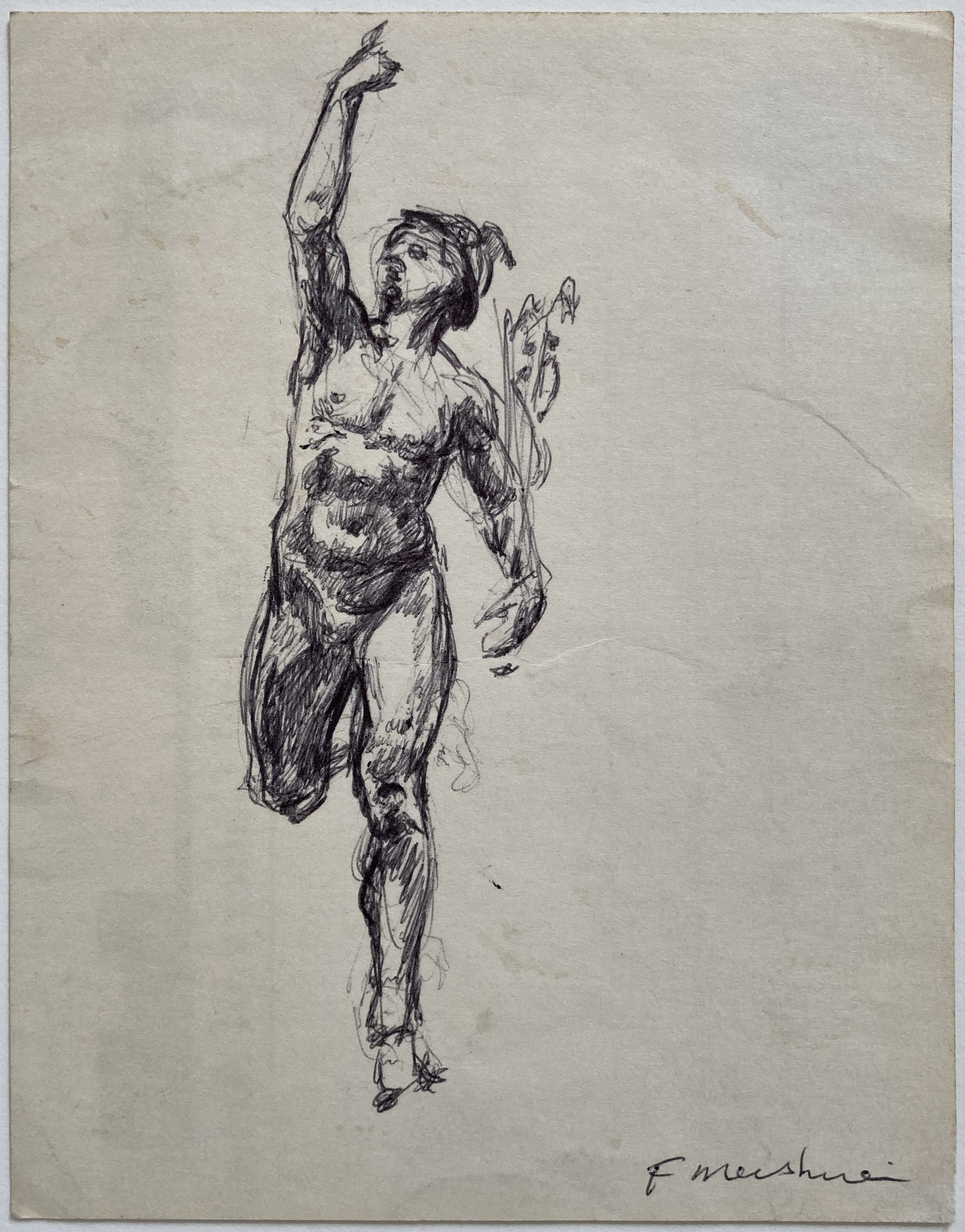
I was looking for reference material for the figure on the float. At the National Gallery of Art, I found a version of the sculpture displayed in the main entrance. I found a museum card nearby and used the back of it to make a quick sketch. This ballpoint sketch gave me the information I needed.
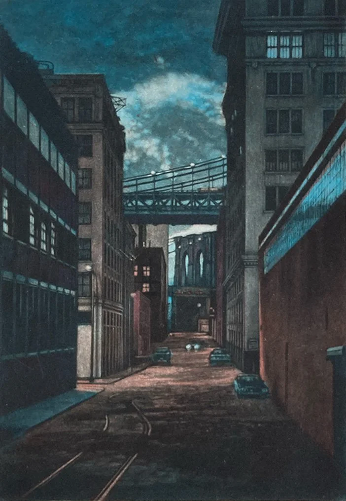
A twilight scene in DUMBO, looking down Plymouth Street toward the Brooklyn Bridge at the end of the street.
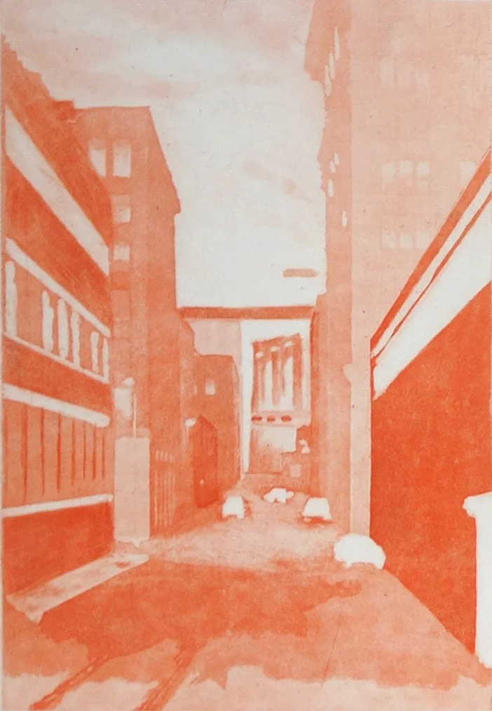
This is the orange plate for Plymouth Street, which is printed first. A separate plate is used for each color.
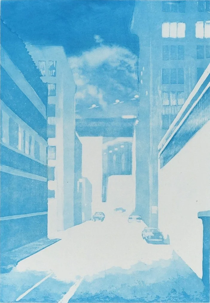
The sky on the blue plate is created by using a roulette-grounded mezzotint, while the street and side buildings are etched with aquatint.
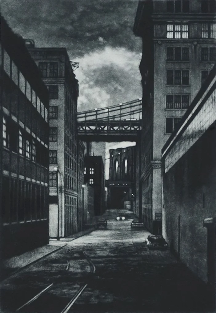
With color images, the color plates are relatively simple, while most of the detail comes from the key plate. The deep tones of this mezzotint plate set the mood for the entire image.
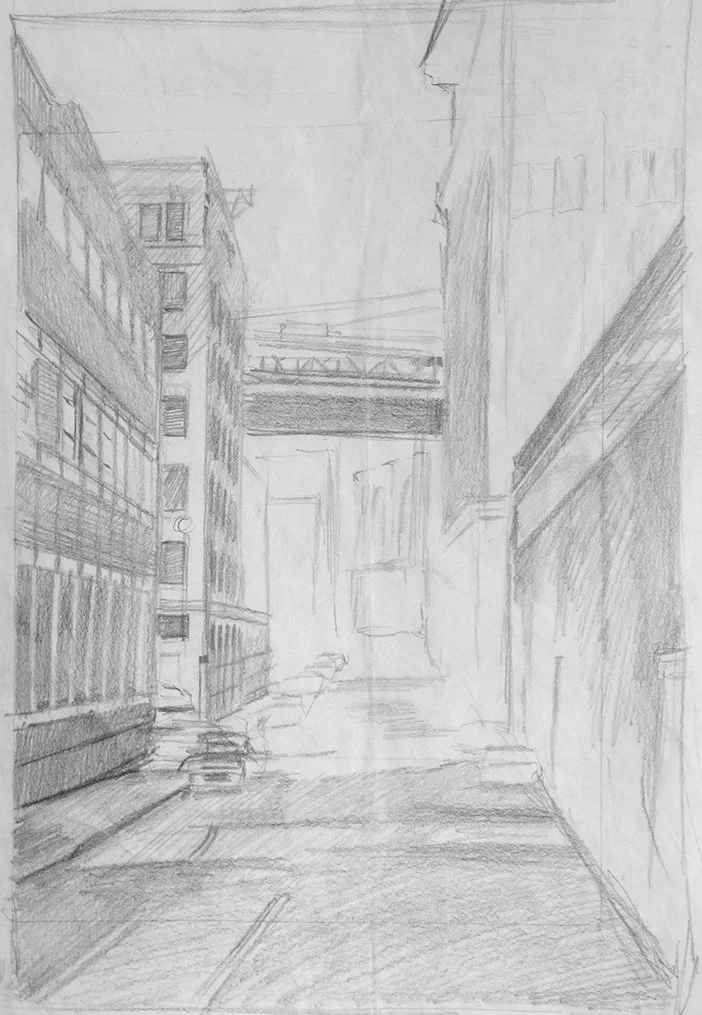
A sketch blocking out the composition for the Plymouth Street print.
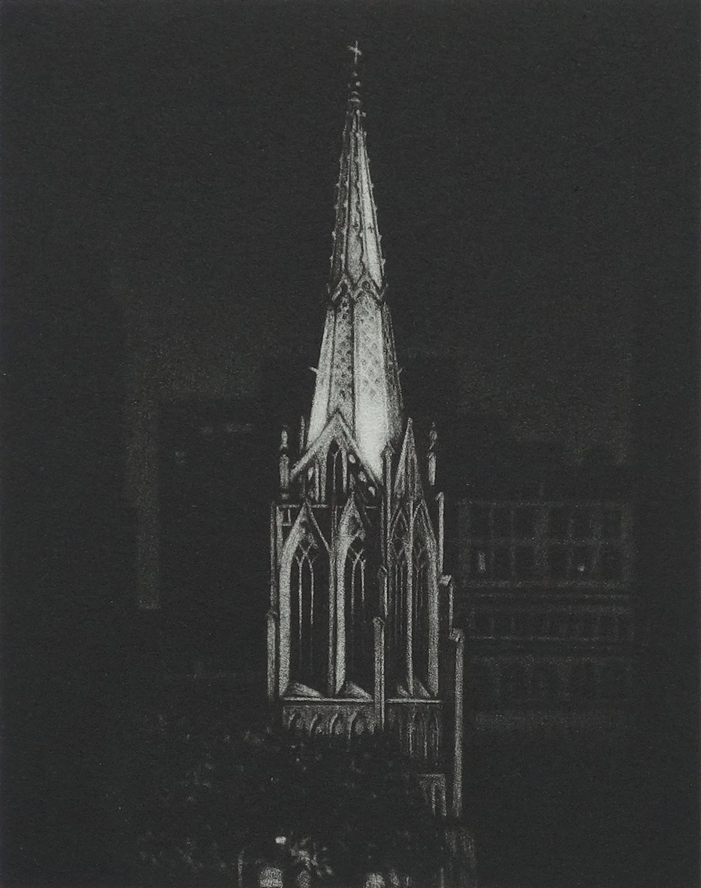
Grace Church was the first mezzotint I ever attempted. I was first introduced to mezzotint at my first job as a picture framer in New York City, and I was immediately drawn to the unique qualities of the medium.
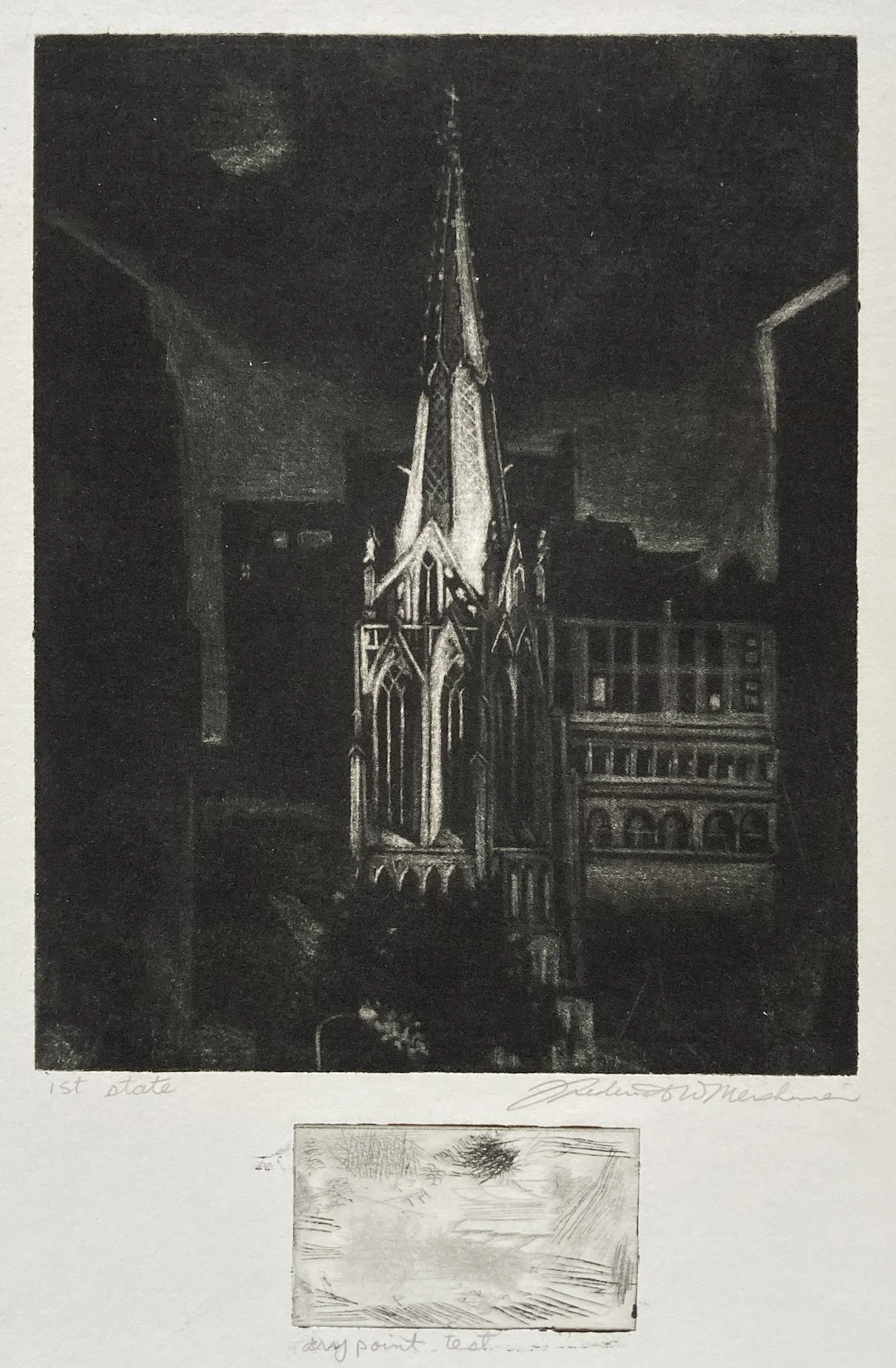
This was the first proof of my very first mezzotint, shown on top, while the small plate on the bottom was my first drypoint. I learned many lessons from mistakes I had made. After making this proof, I picked up my rocker—the tool used to re-texture the plate—and rocked over the plate in several directions before starting again.
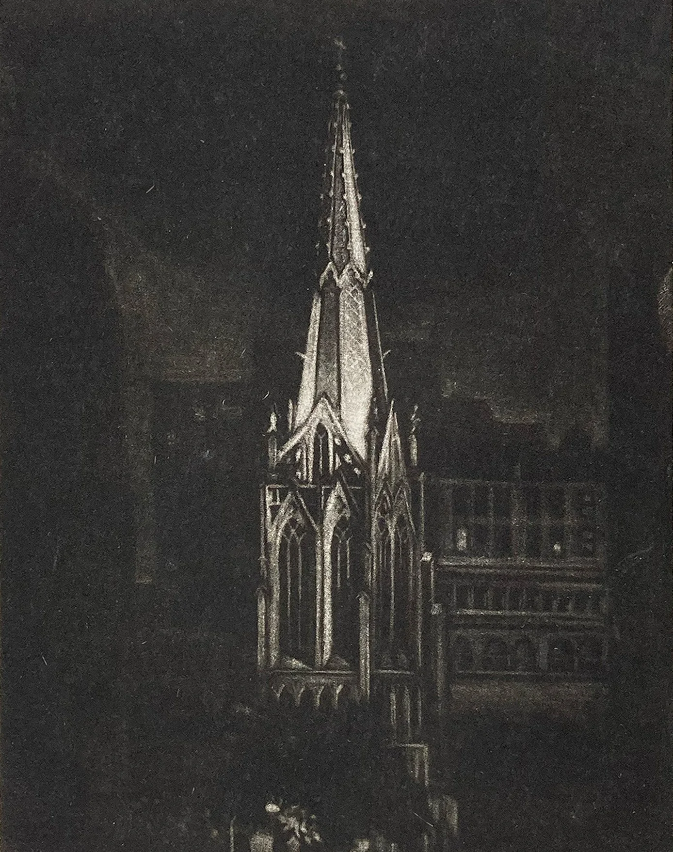
I was beginning to get a handle on this new medium and understand what was happening technically.
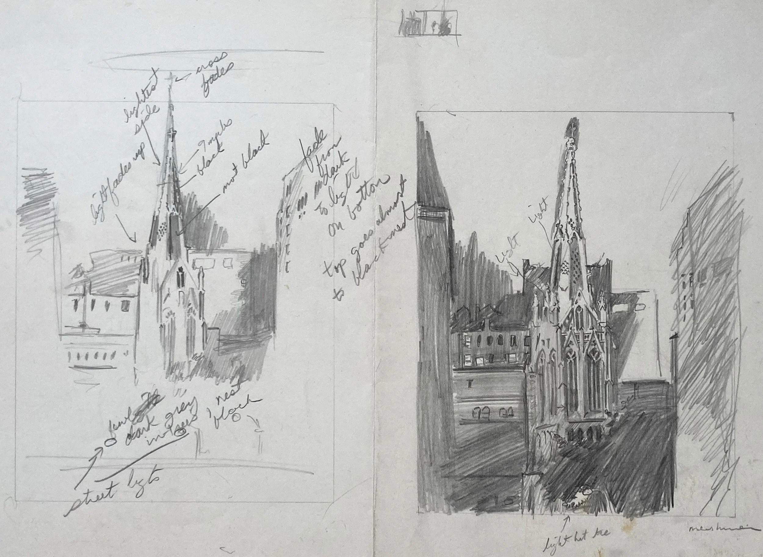
I drew this sketch on site, studying the church steeple and noting details and tonal shifts as I observed them.
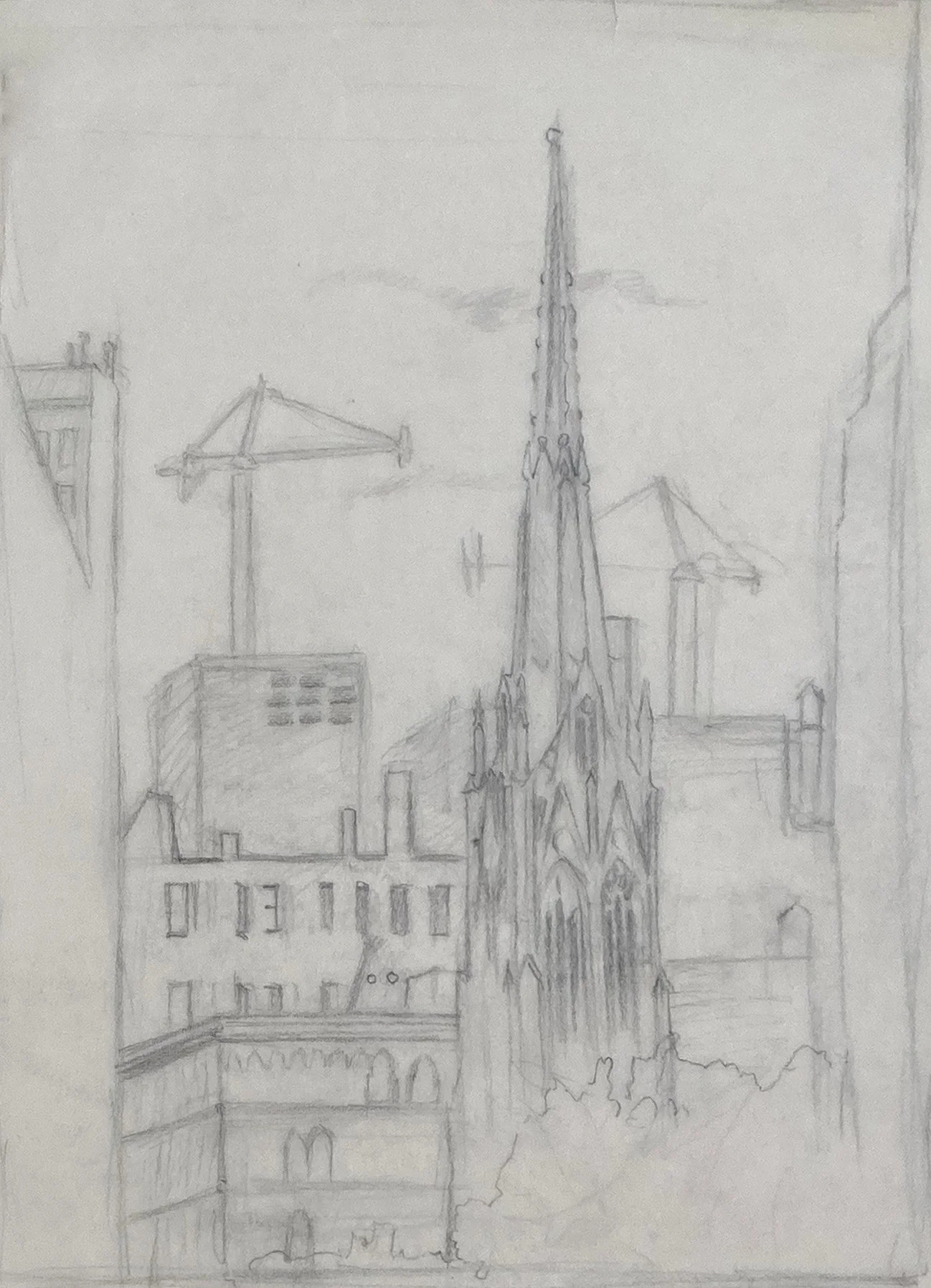
Sketch of Grace Church with cranes in background.
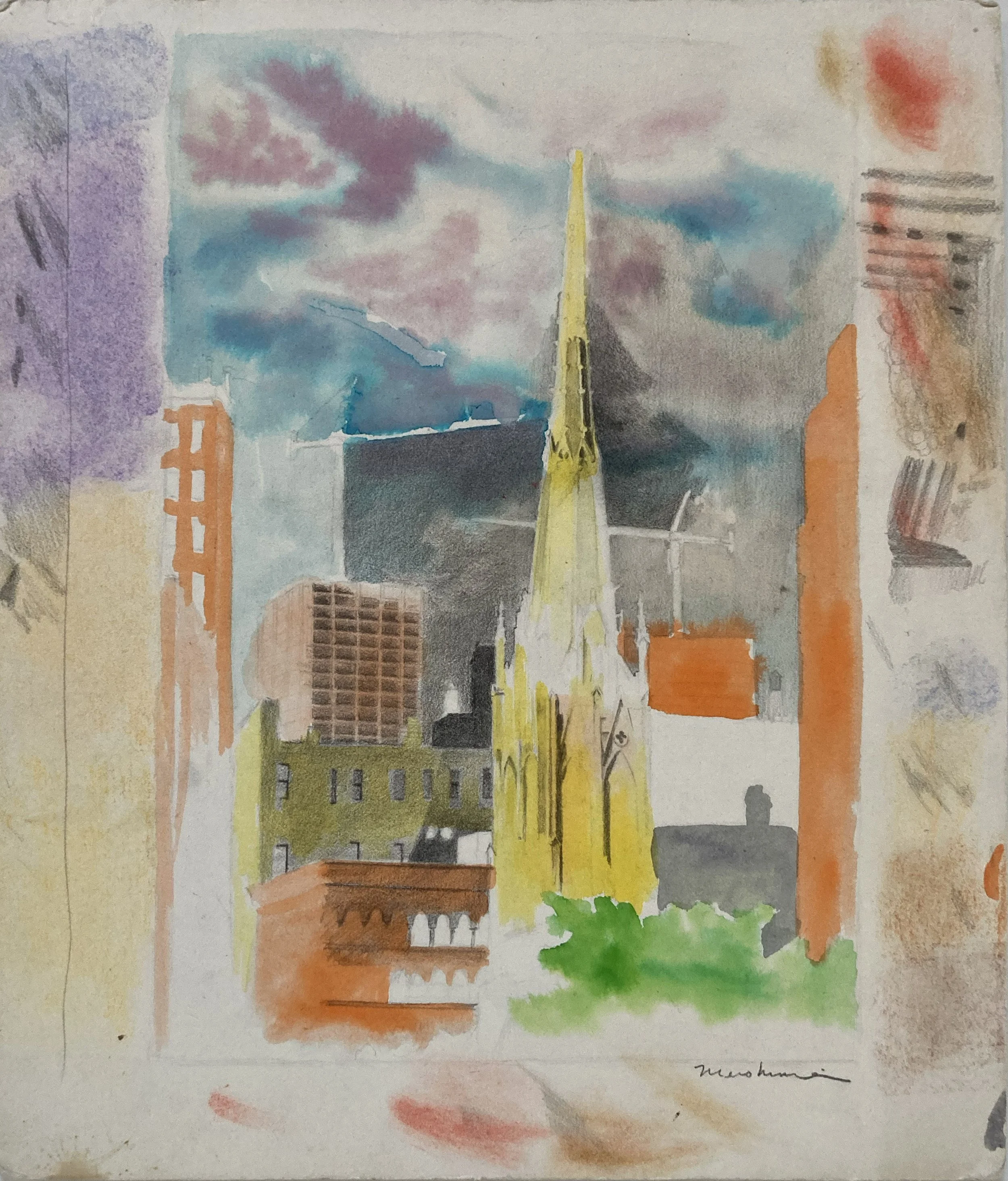
Watercolor and graphite on mat board depicting the Grace Church steeples centered in the foreground, with cranes constructing Zeckendorf Towers in the background.
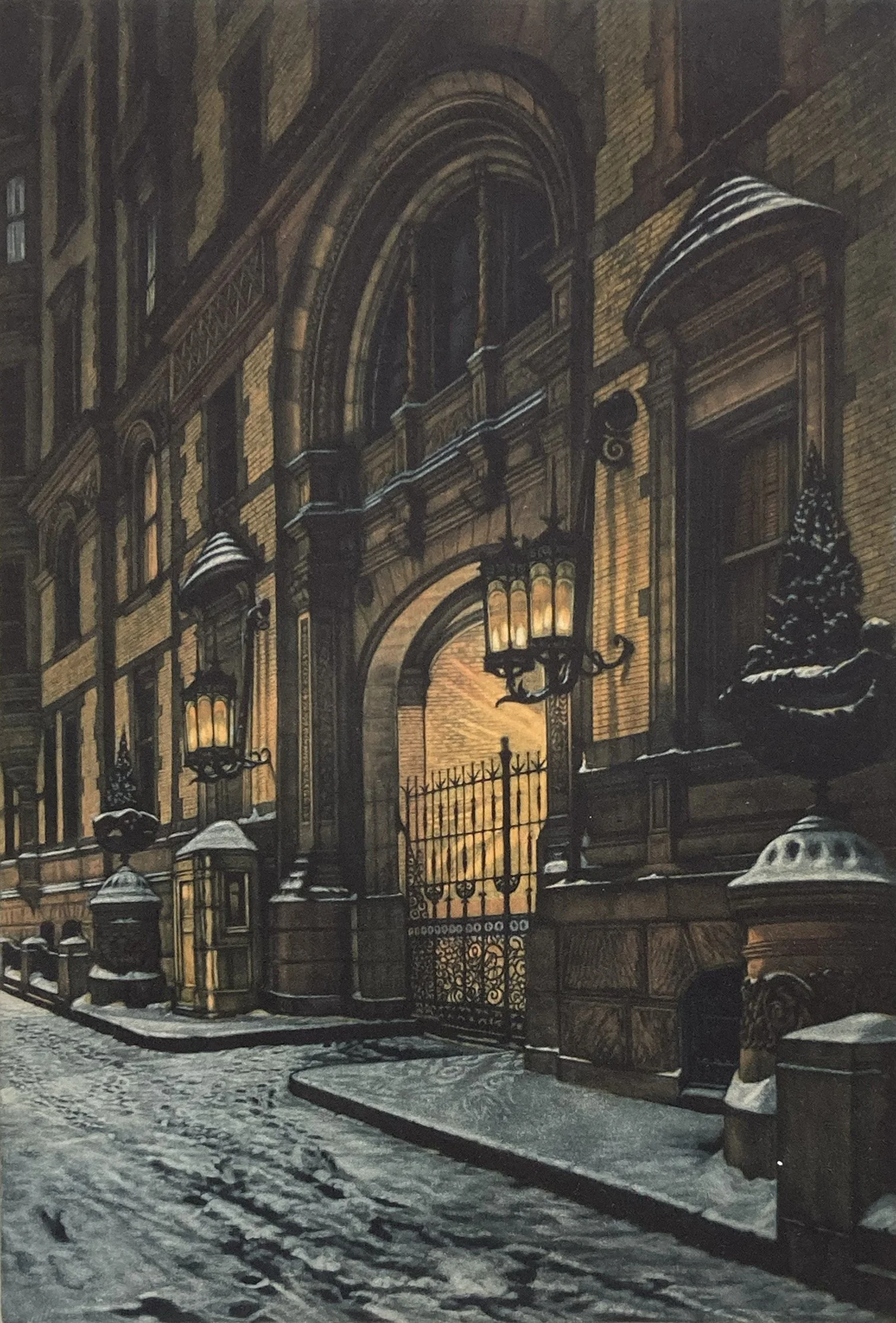
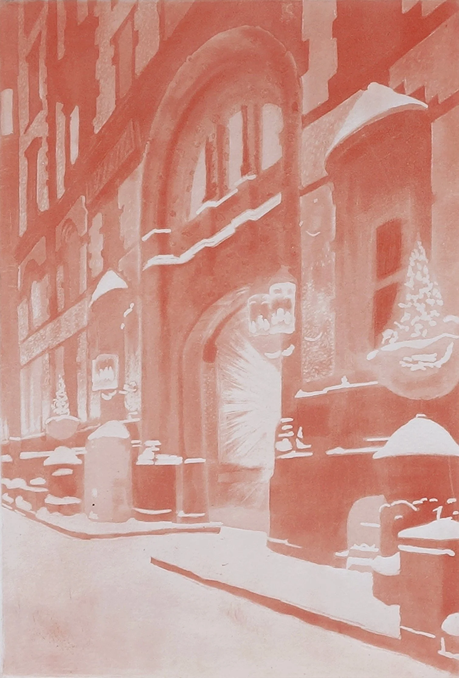
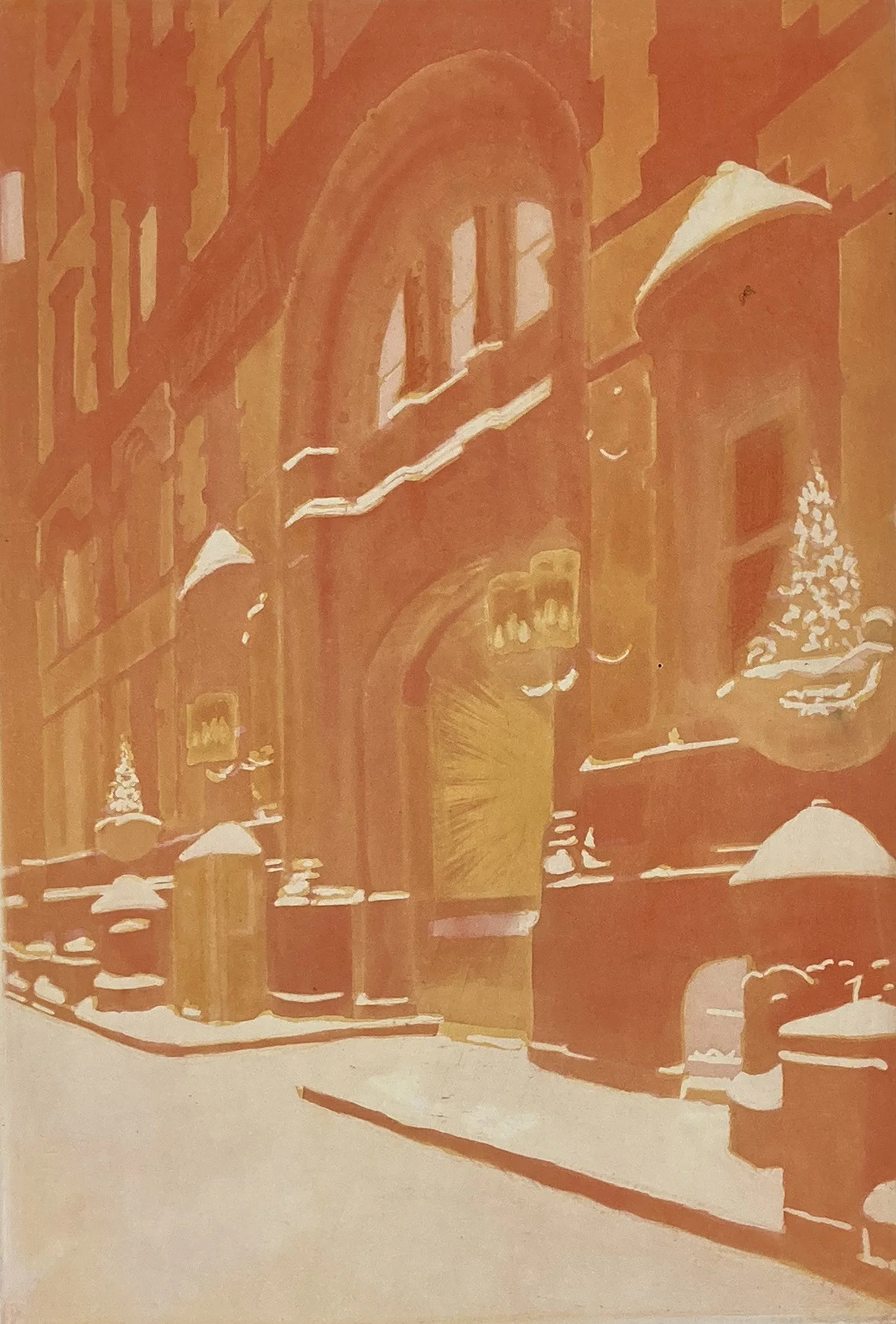
A winter nighttime scene depicting the front entrance of the Dakota apartment building.
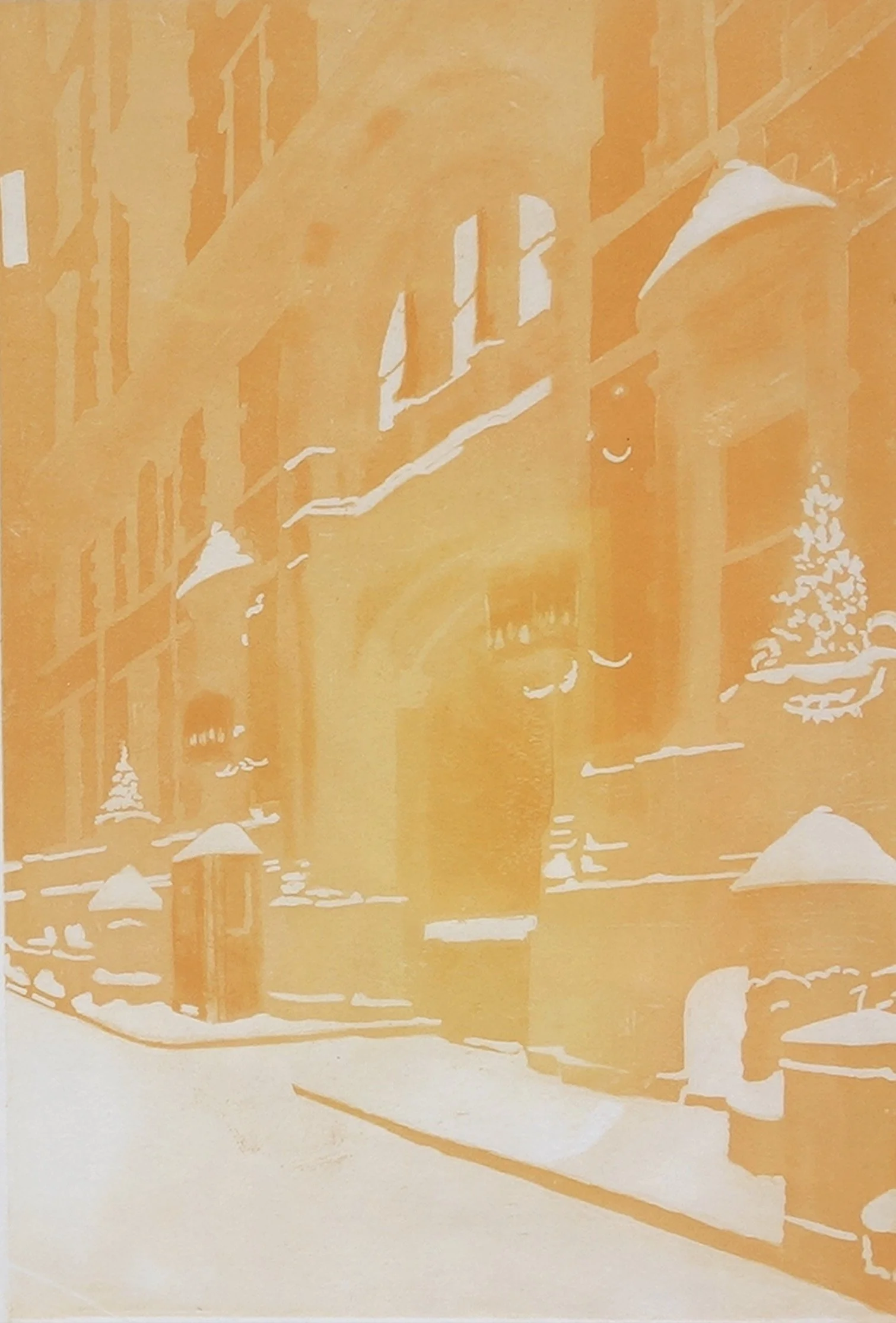
This aquatint plate is created by melting powdered rosin onto the copper plate as a resist and then applying ferric chloride. The acid etches around the particles of melted rosin, creating a textured surface that holds ink. The longer the acid etches the copper, the darker the area will print.
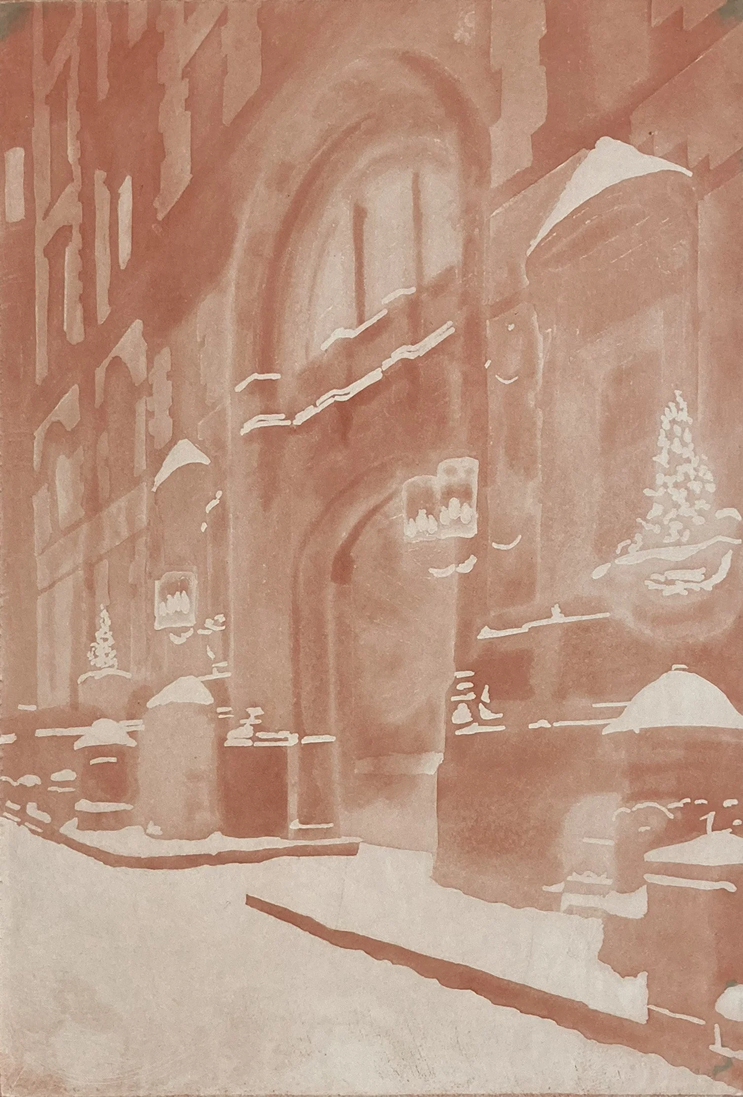
The first proof of the red plate was created using spit-bite aquatint. The term spit-bite aquatint refers to an etching technique. When ferric solution is applied to copper, it tends to bead up on the surface. Adding saliva to the acid breaks the surface tension, allowing the mixture to flow more smoothly and remain in place. The acid-and-saliva mixture is painted directly onto the plate, which has been coated with melted rosin.
By applying saliva to the plate first and then brushing acid into it, the two liquids gradually merge, creating delicate tonal variations and fluid, watercolor-like effects.
Proof of the first and second plates printed together. When printing multiple plates, the plates are printed from the lightest tones to the darkest.
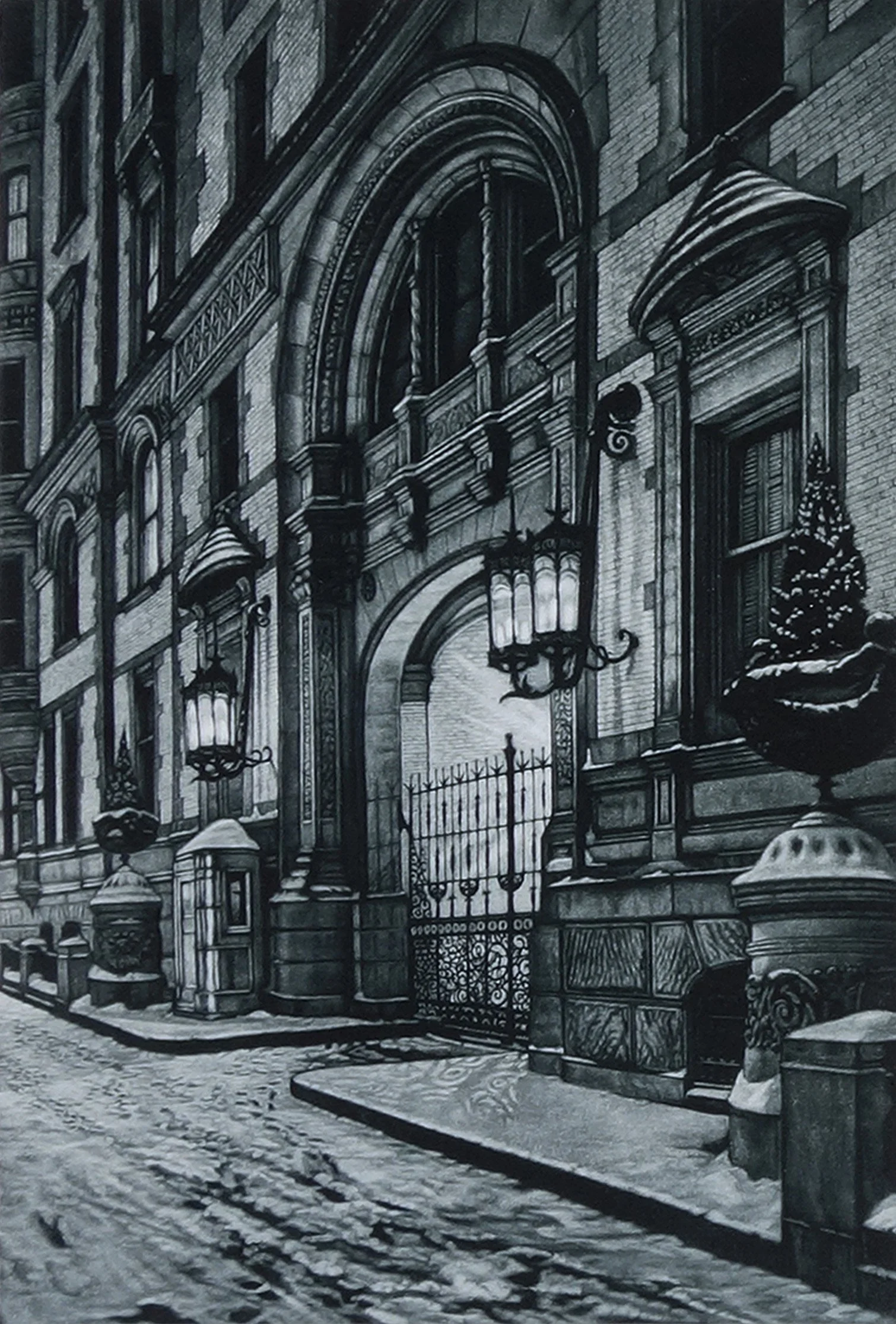
The key plate captures most of the details and subtle tonalities. It is printed last, allowing it to dominate the two color plates beneath it.
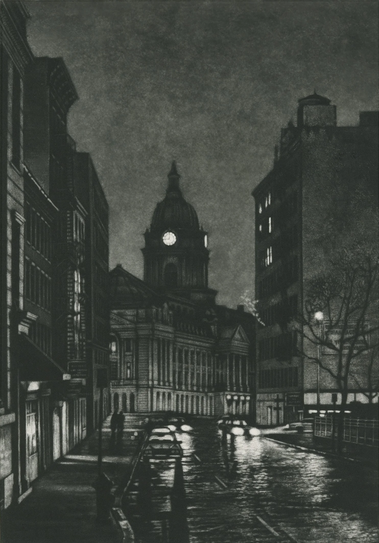
The Old Police Headquarters at night, with lights from the domed clock tower cutting through the darkness like a pair of eyes.
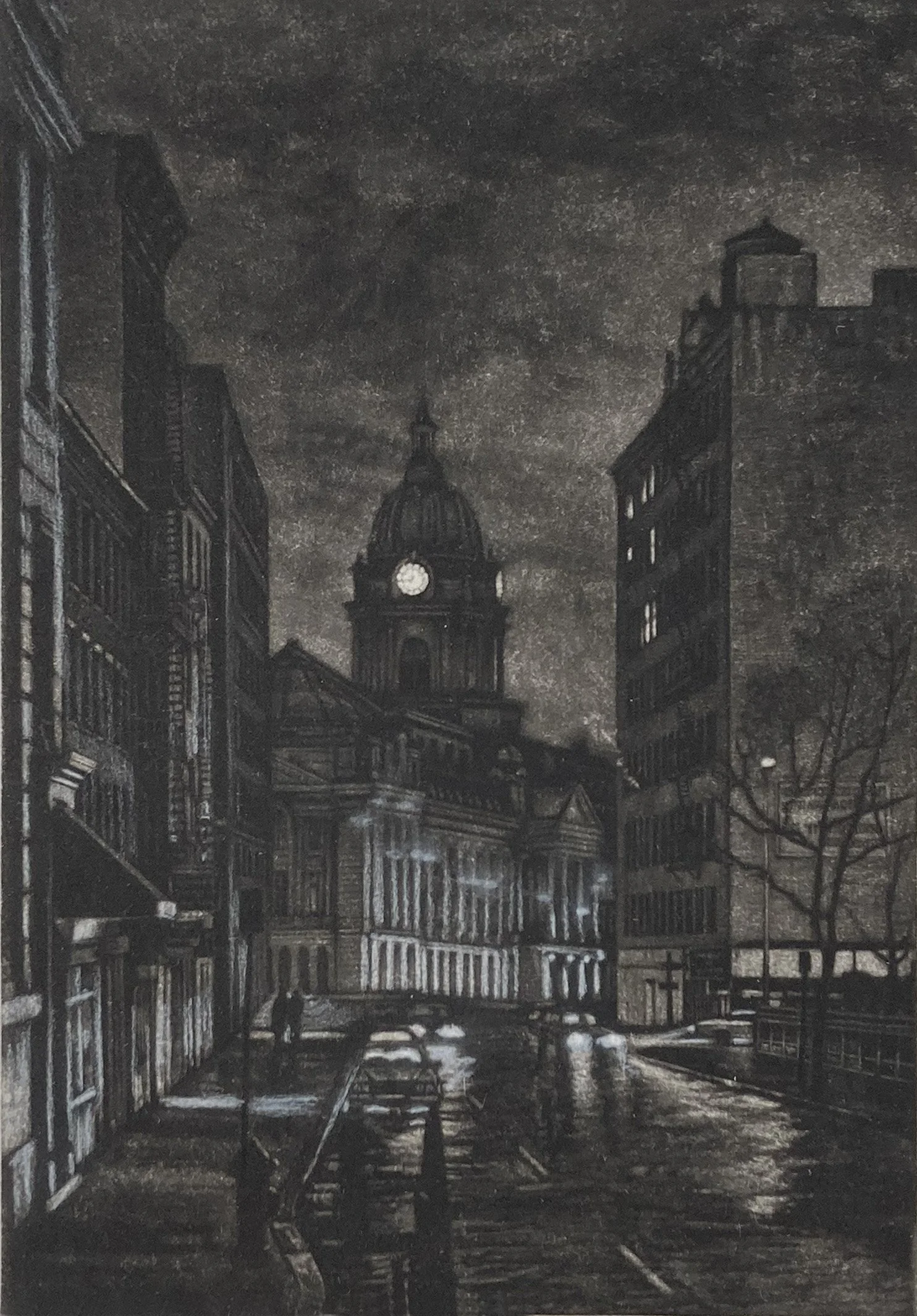
A proof of Cleveland Place, with white colored pencil used to visualize the highlights to be developed in the final print.
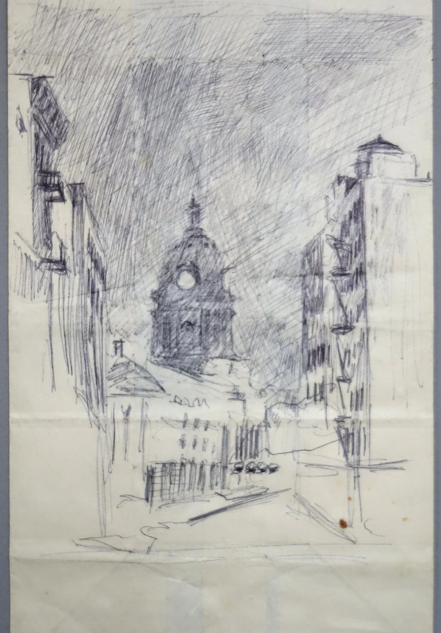
This ballpoint drawing of the Old Police Headquarters was made on a white paper bag. The night I came upon this scene, I wanted to capture it. I found a white paper bag near a local falafel shop and used it to make this quick sketch.
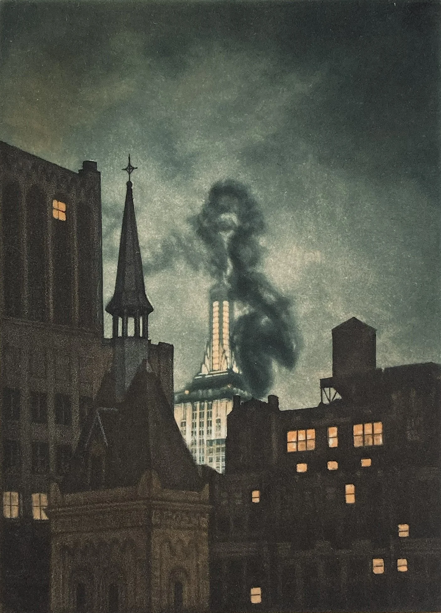
This view shows the Empire State Building lighting up the night sky in the background, while dark smoke rises in the foreground and swirls around the Empire’s spire.
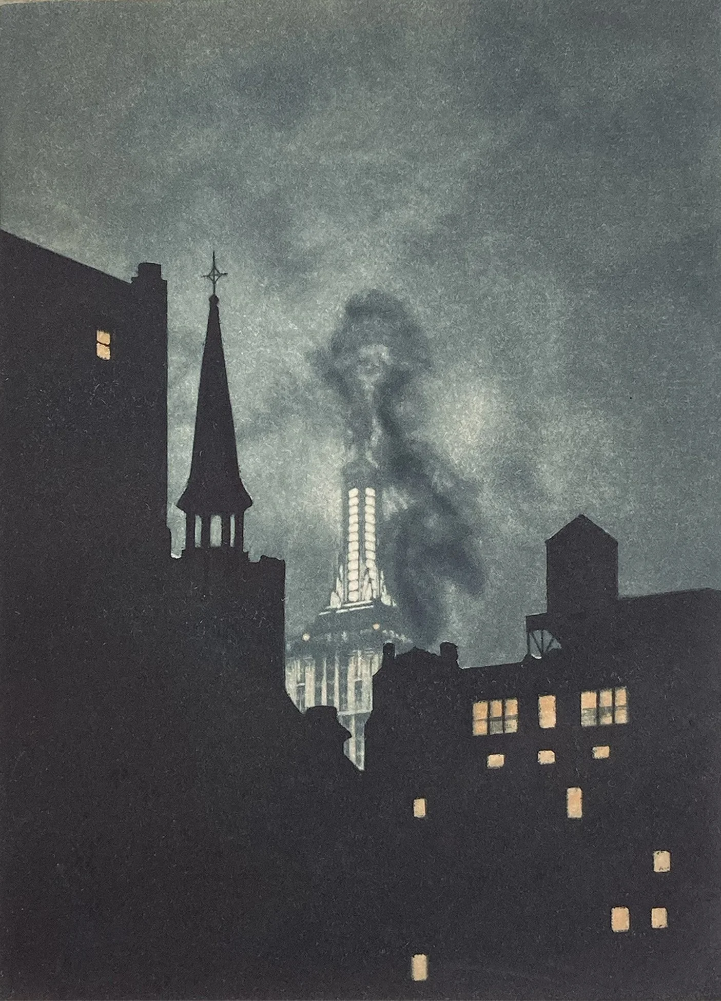
This print is unusual because the dark foreground plate is an aquatint that will be worked in a subtractive mezzotint manner. A burnisher and scraper will be used to reduce the etched texture created by the acid.
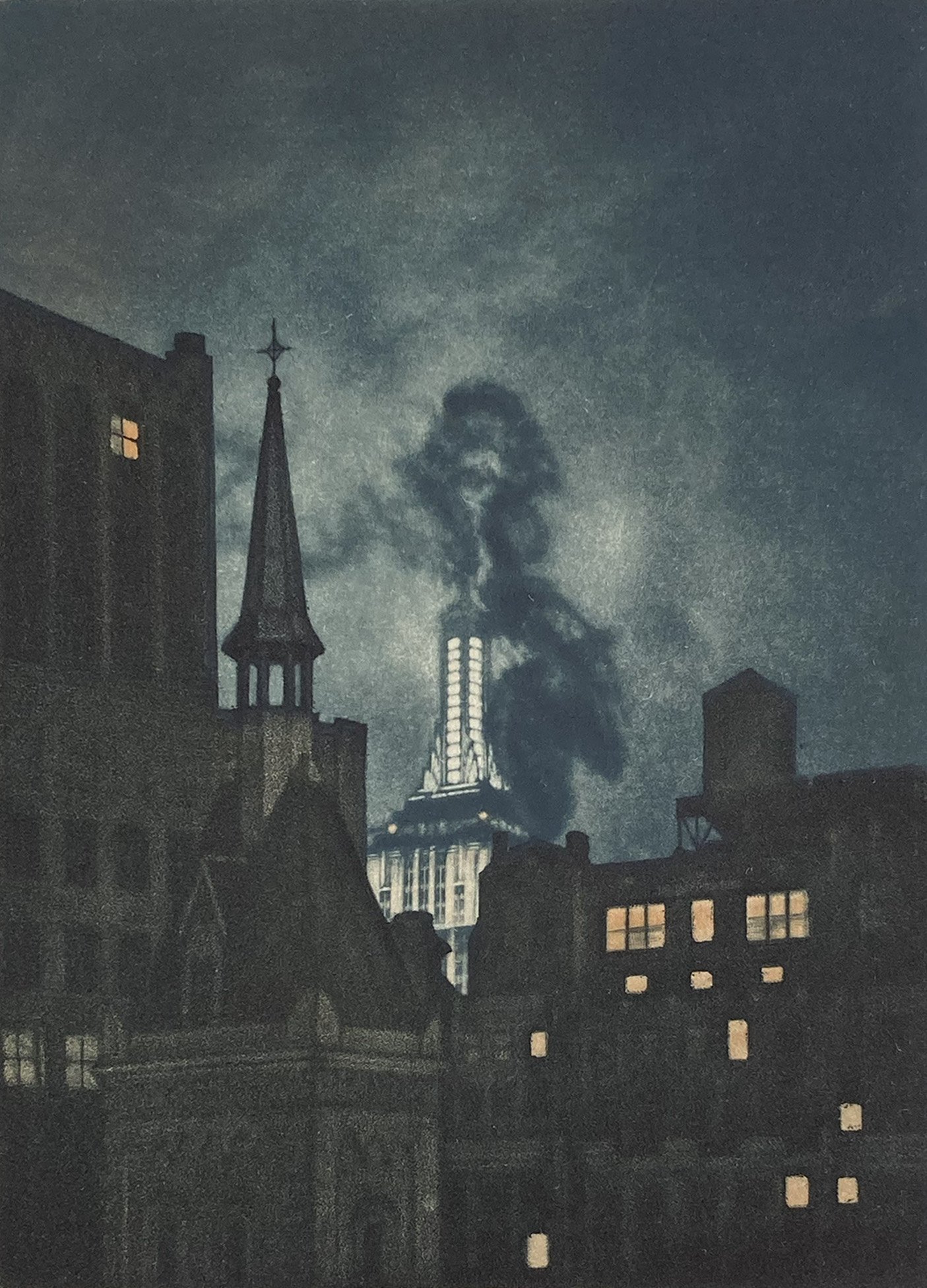
This is the second proof of Luminous, where I began carving out tones from the solid black aquatint ground. Aquatint grounds are much more difficult to burnish than mezzotint grounds.
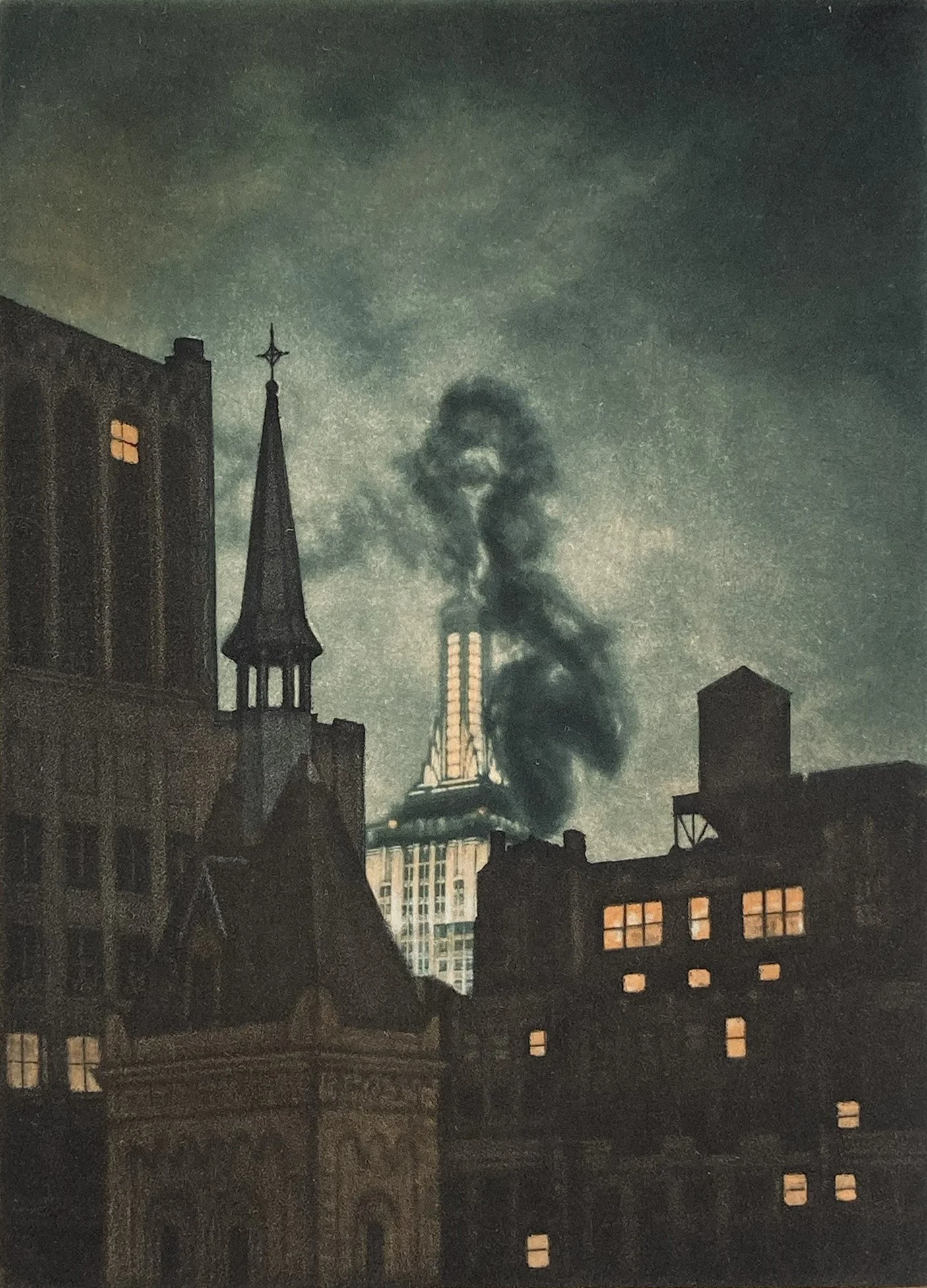
Further development of the aquatint portion of this print. Generally, burnishing an aquatint plate is not recommended, as it does not provide the same range or control as a rocked mezzotint plate.
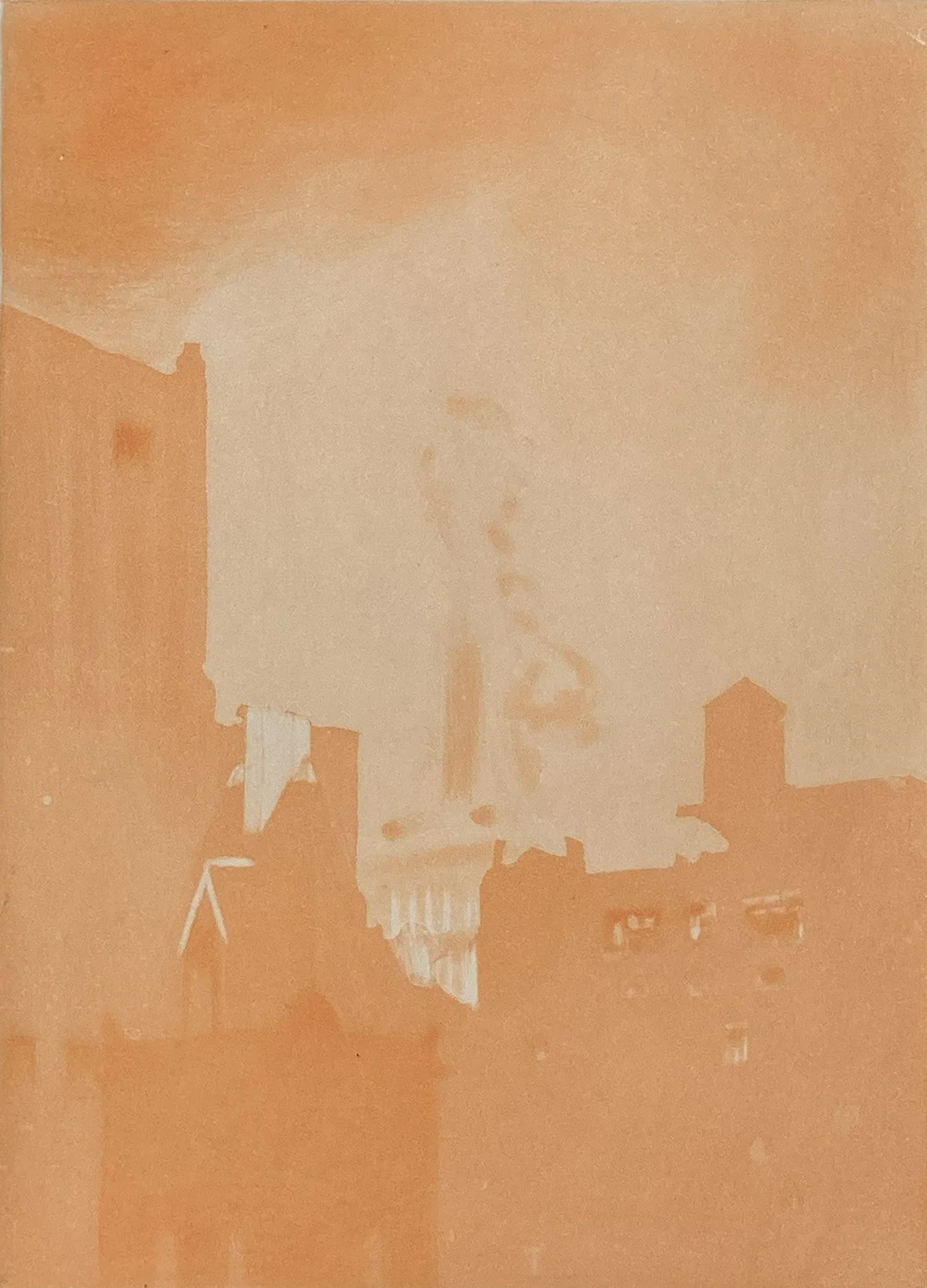
The orange plate is the first plate to be printed and is created using spit-bite aquatint.
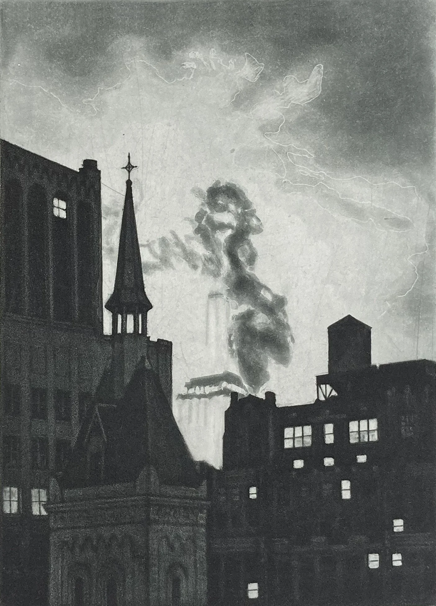
This print is unusual because the dark foreground plate is an aquatint worked in a subtractive manner. The sky and smoke were created using spit-bite aquatint, in which a mixture of saliva and acid is painted onto the plate to create watercolor-like effects.
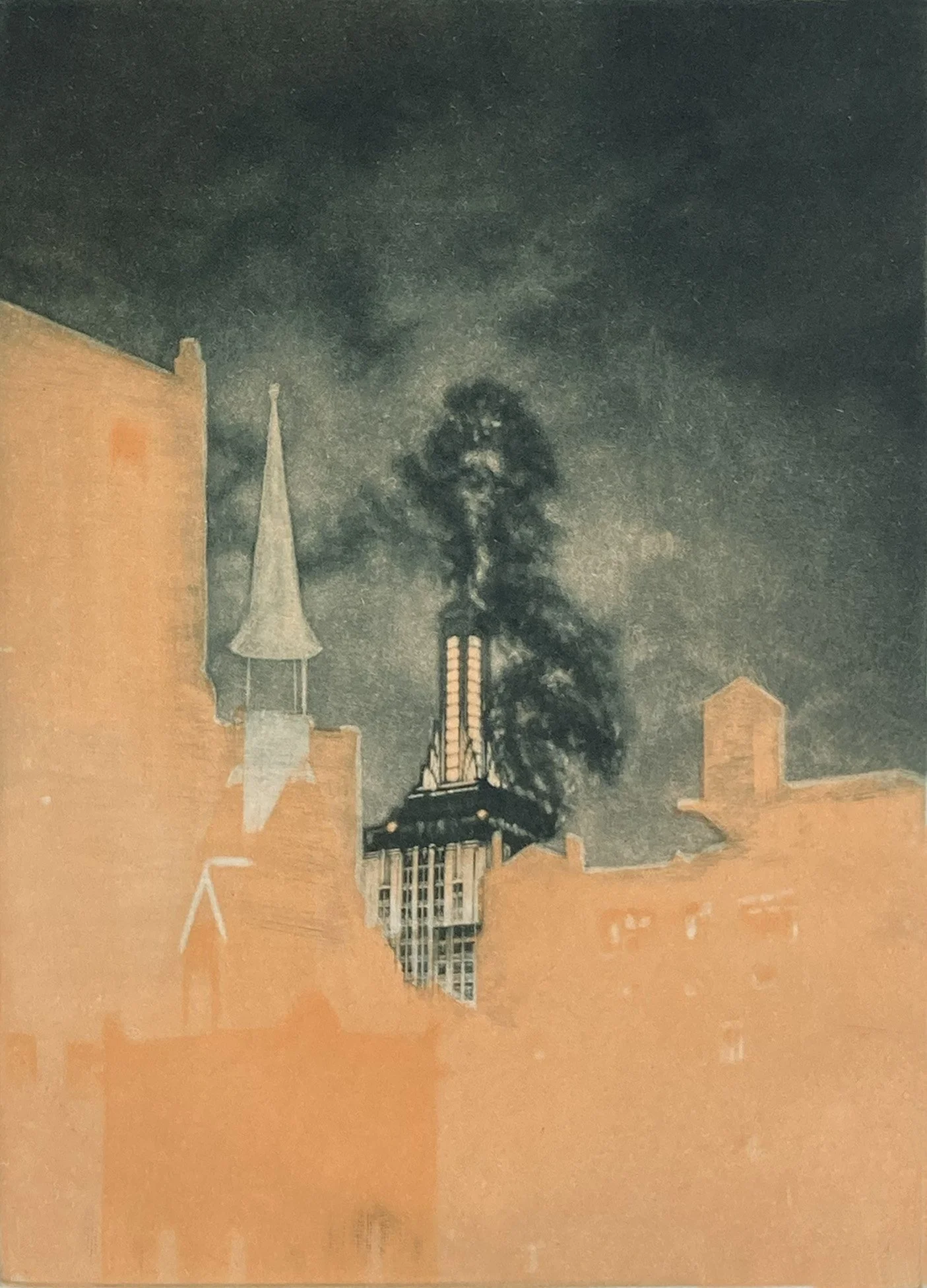
The Empire State Building and sky are created in mezzotint. The process begins by transferring the boundaries of the image, then masking the lower foreground area before rocking the upper portion of the plate. Shown here is the proof of the first and second plate.
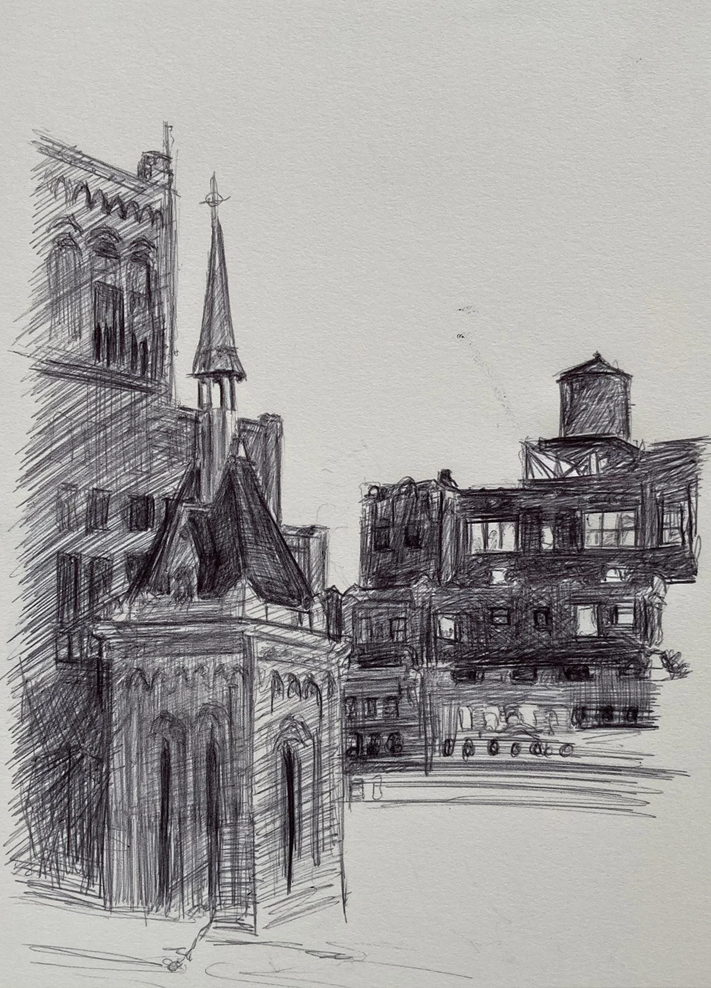
Sketch of the steeple of Gustavus Adolphus Lutheran Church, with the surrounding buildings in the foreground.
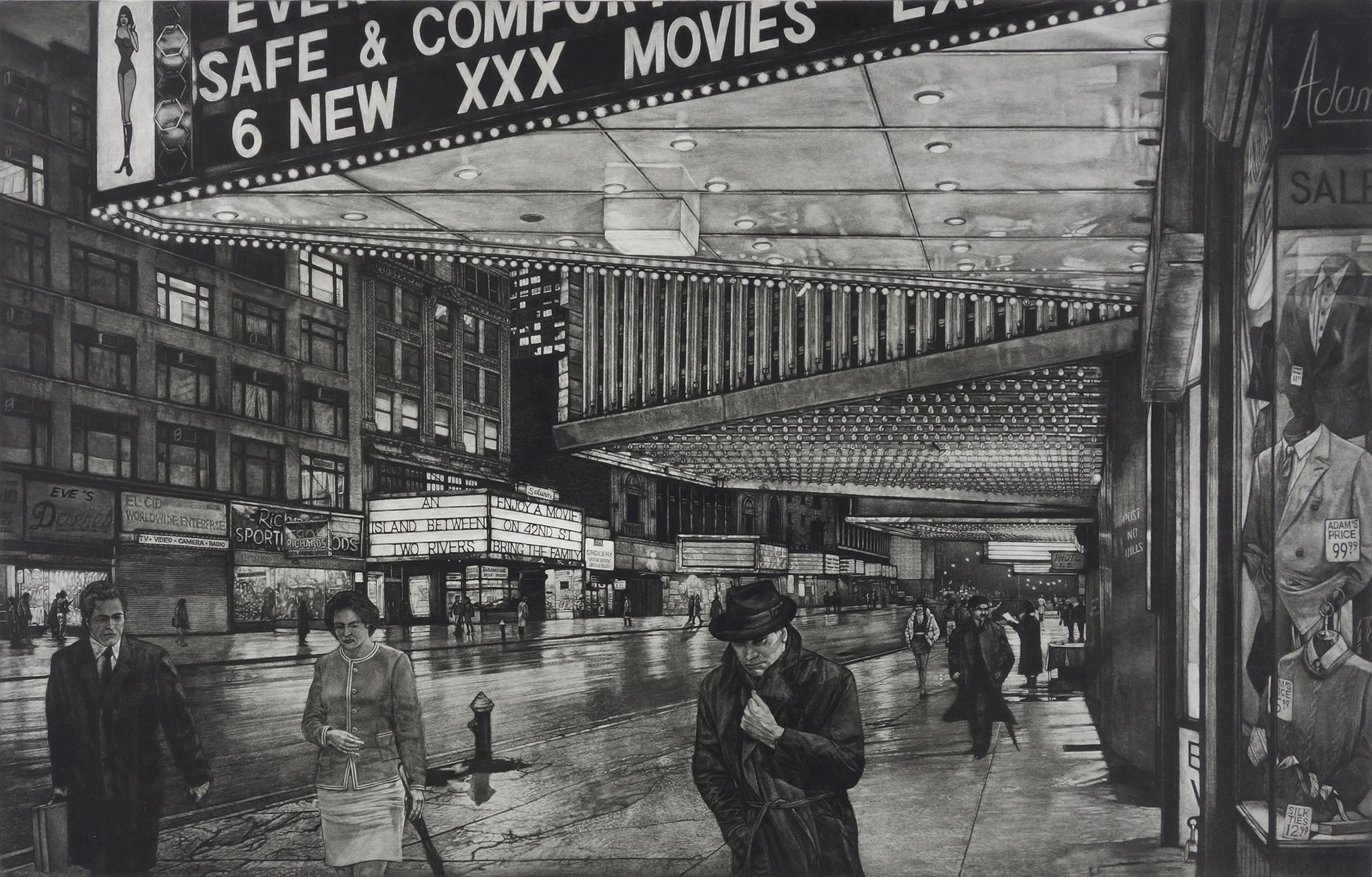
This is a unique piece depicting the theater district on 42nd Street. It was originally released as The Great Divide in 1994 and was later revised and released in 1997 under the title 42nd Street. The marquees are the focus of the piece, documenting the transformation of 42nd Street from the adult movie theaters of the 1970s back into the traditional theater district.
The foreground sign advertises a triple-X theater, contrasted with the theater across the street, whose sign reads, “Bring the Family.” The juxtaposition of these two signs captures the dramatic change in the character and identity of 42nd Street during this period.
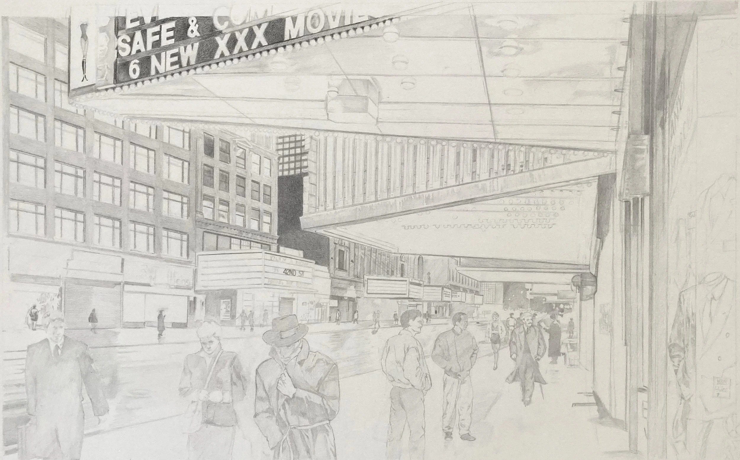
This drawing establishes a perspective that deliberately breaks the rules. The two marquees closest to the viewer are stretched up to reveal the light bulbs and their reflections. The adult theater would normally have extended beyond the edge of the page, but the go-go girl on the sign was crucial to the meaning and purpose of the print, so the composition was adjusted to keep her in view. Some times you have to draw something wrong to get the right mood.
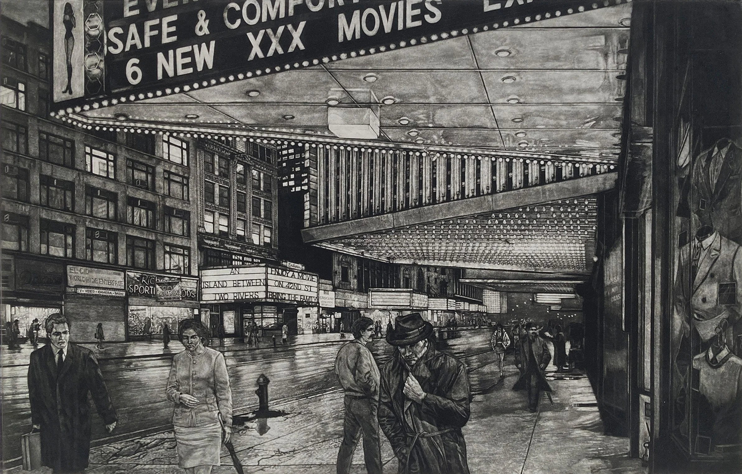
An early proof of 42nd Street that includes an additional figure not present in the final version. The men’s store on the right side of the composition is only partially developed, providing a glimpse into the process of the work as it evolved.
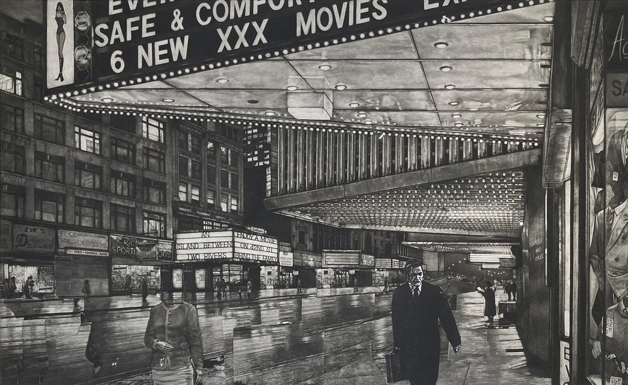
To visualize revisiting the plate, I made proofs and cut out sections of the street and sidewalk to cover the figures. I liked the background figure, but the foreground figures disrupted the spiral effect of the theater marquees.
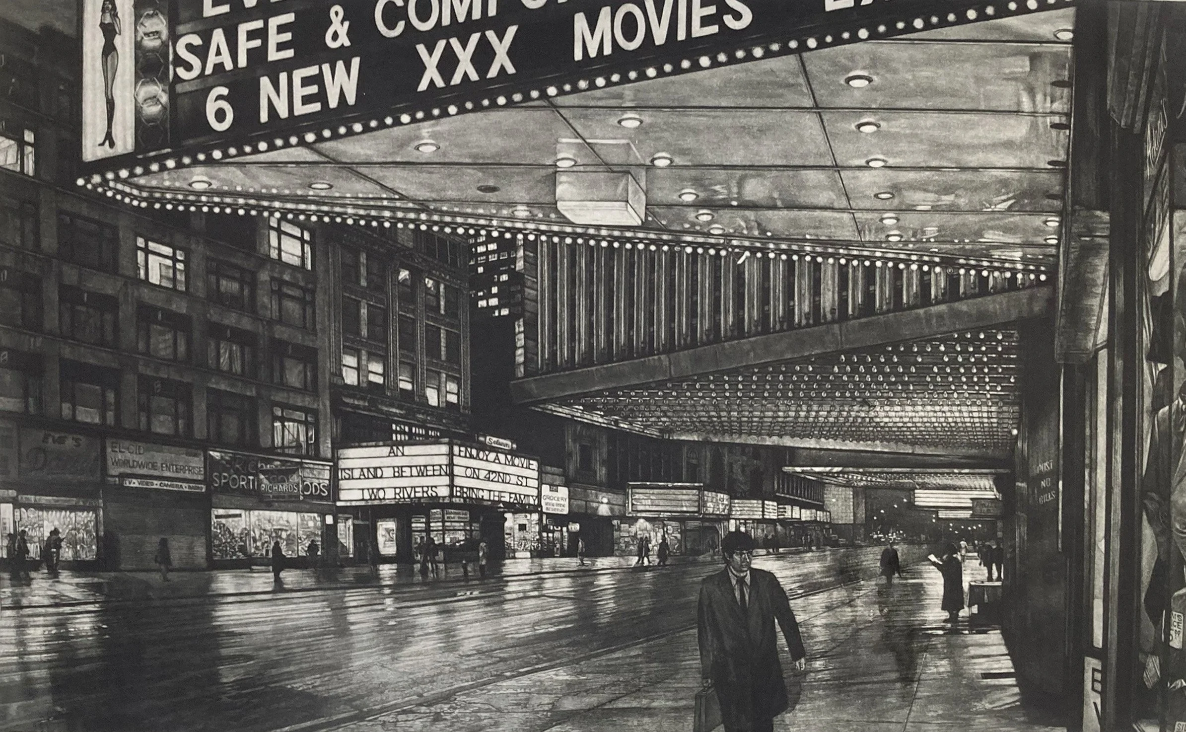
This proof was made after re-rocking the lower-left portion of the plate and burnishing the revised area. Some fragments of the previous version remain visible in the print. In the lower-left corner, a hand and briefcase, while near the center of the print are remnants of the former woman and man.
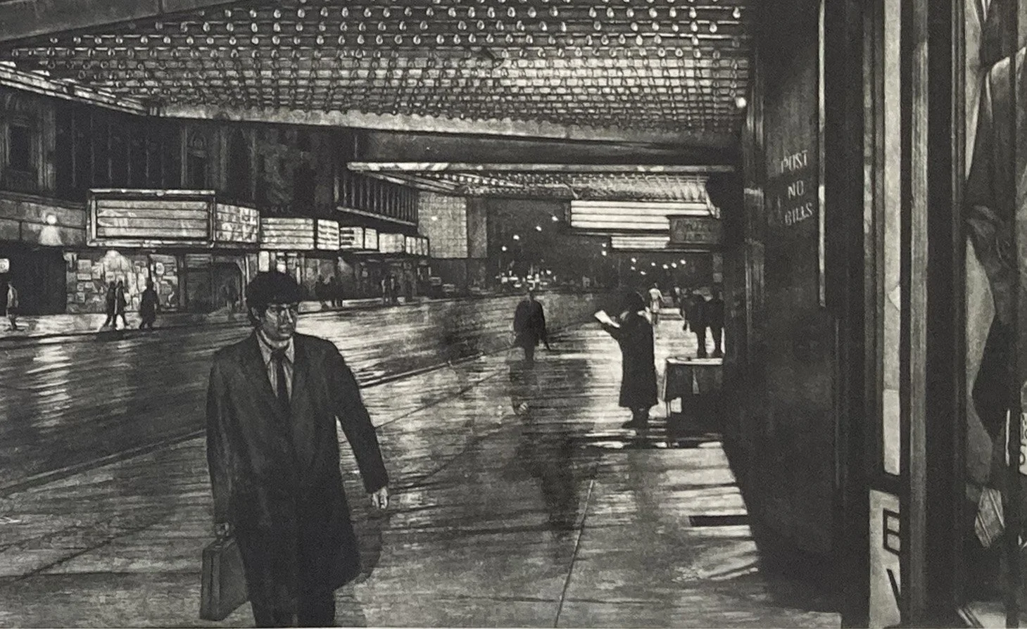
Detail of the first proof. On the right-hand side of the new central figure, the right side of the original figure remains visible. The woman and man from the earlier version can also be seen in the center of the print.
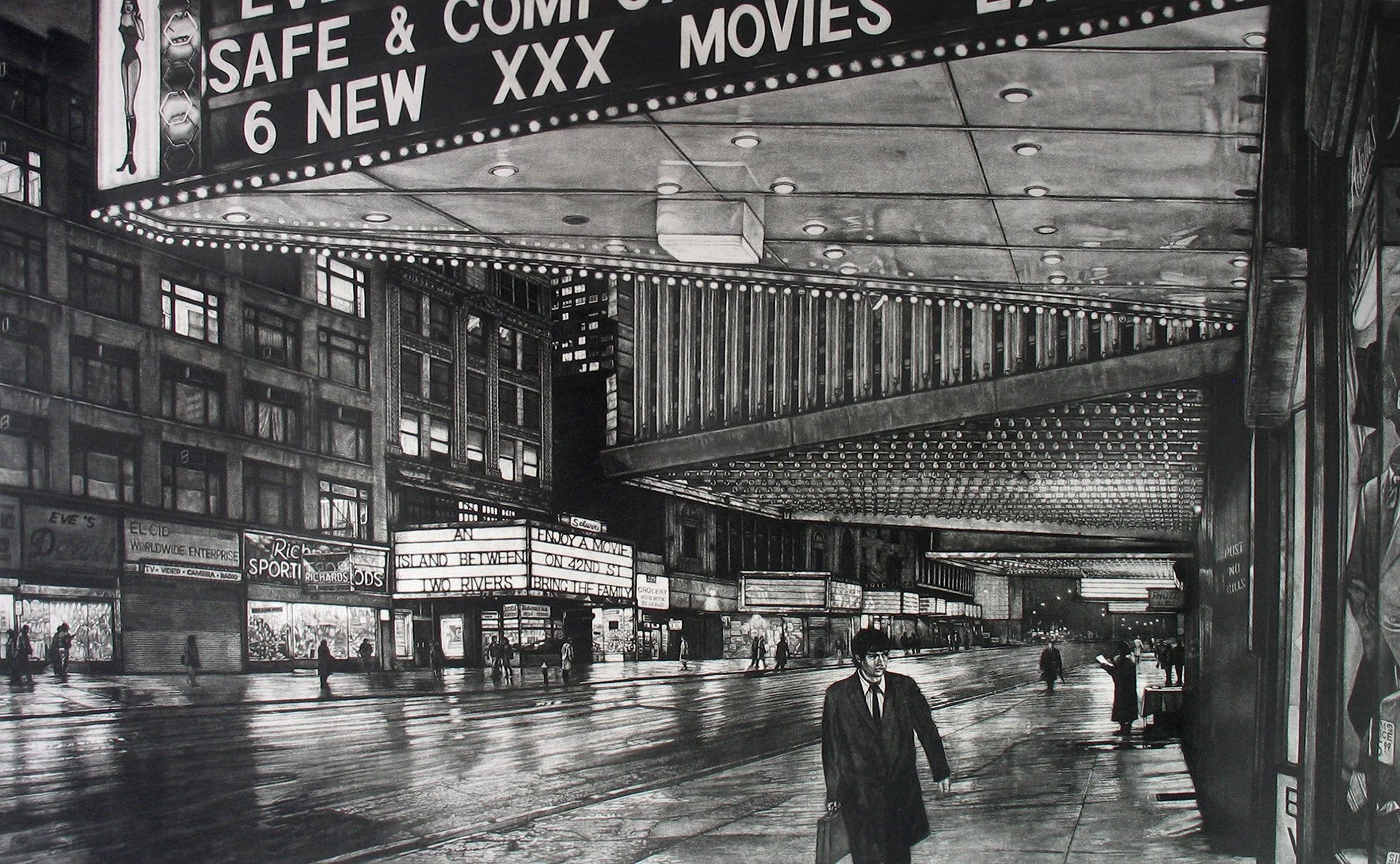
The finished revised 42nd Street print.
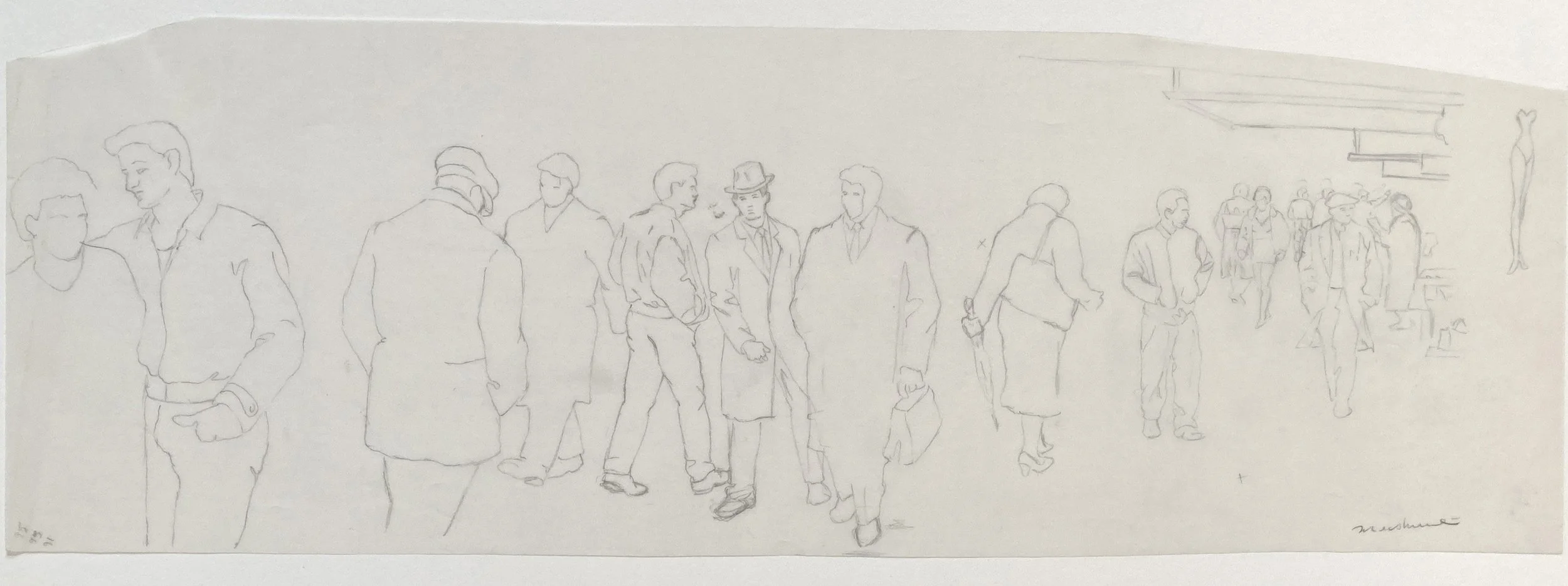
Study of figures for The Great Divide print. My initial concept was to depict the crowds of people moving through the theater district. As the work developed, however, I decided to reduce the number of figures.
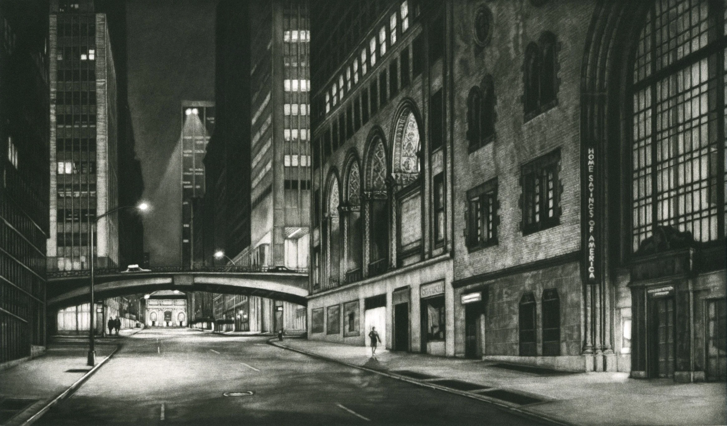
A view looking east down East 41st Street toward the Pershing Bridge, with the scene extending to the New York Public Library. This mezzotint was created as the inaugural print for the Print Club of New York.
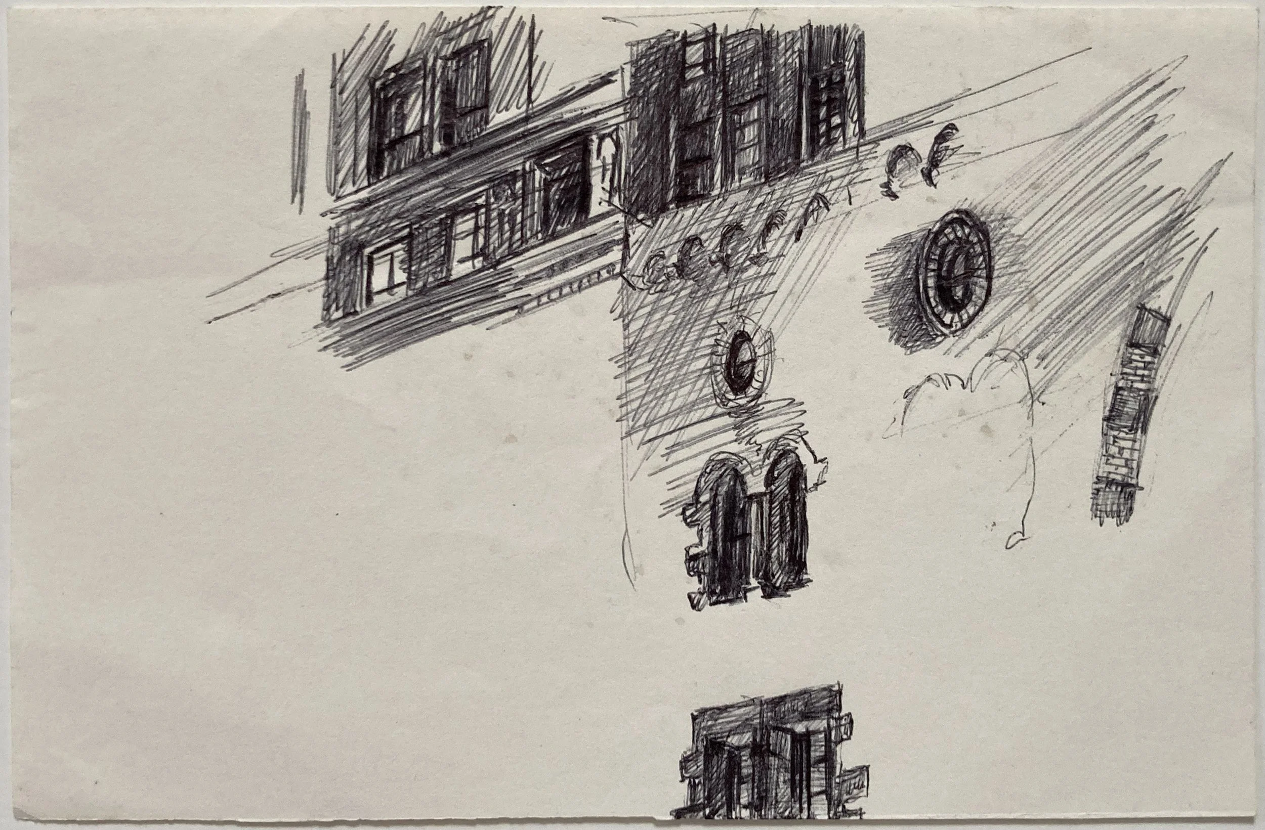
A ballpoint sketch exploring some of the window details of the building in the right-side foreground.
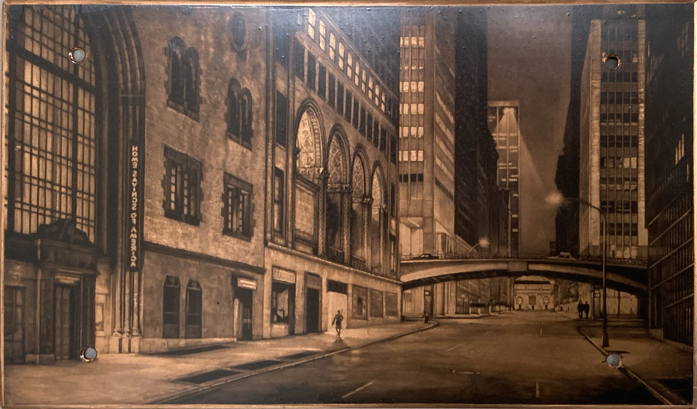
The copper mezzotint plate that is inked and coated with polyurethane. The plate has been canceled with four drill holes, which also serve as mounting points for display. Copper is the traditional matrix used for many intaglio prints, valued for its mailability.
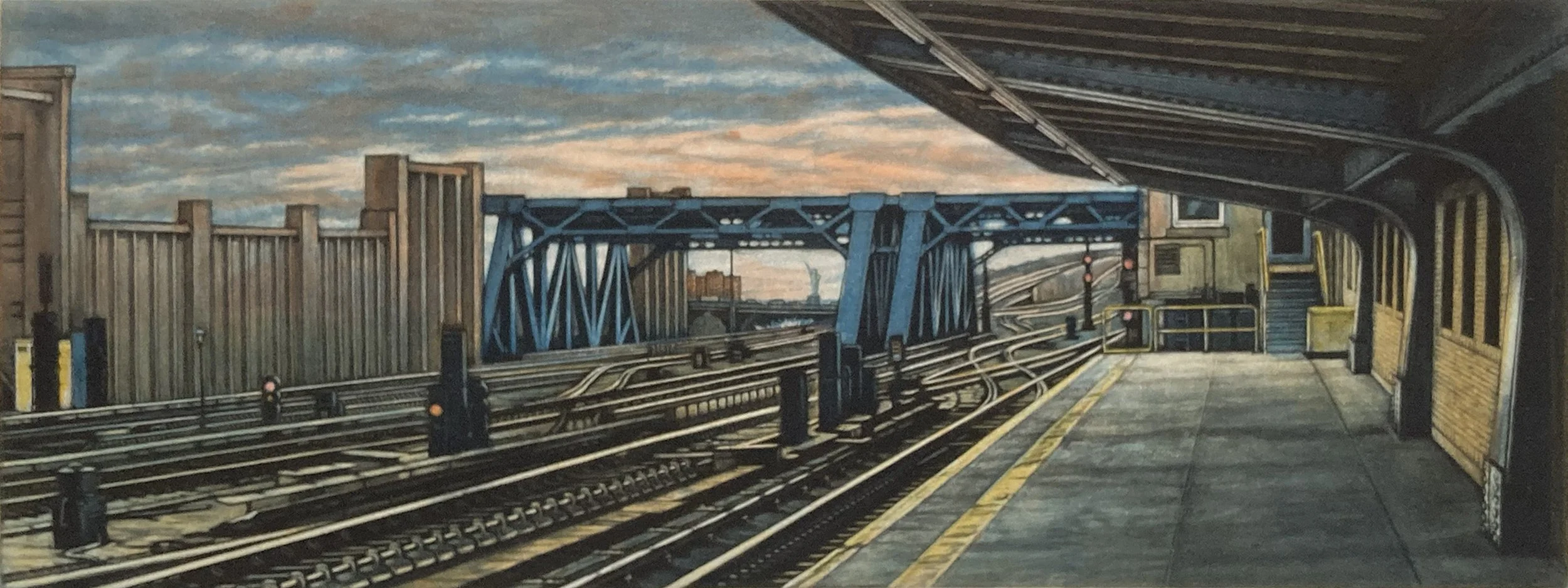
A three-plate print depicting the 4th Avenue subway platform and tracks, with a small Statue of Liberty visible in the distance. This final print is hand-colored with small touches of red and yellow watercolor in selected areas.
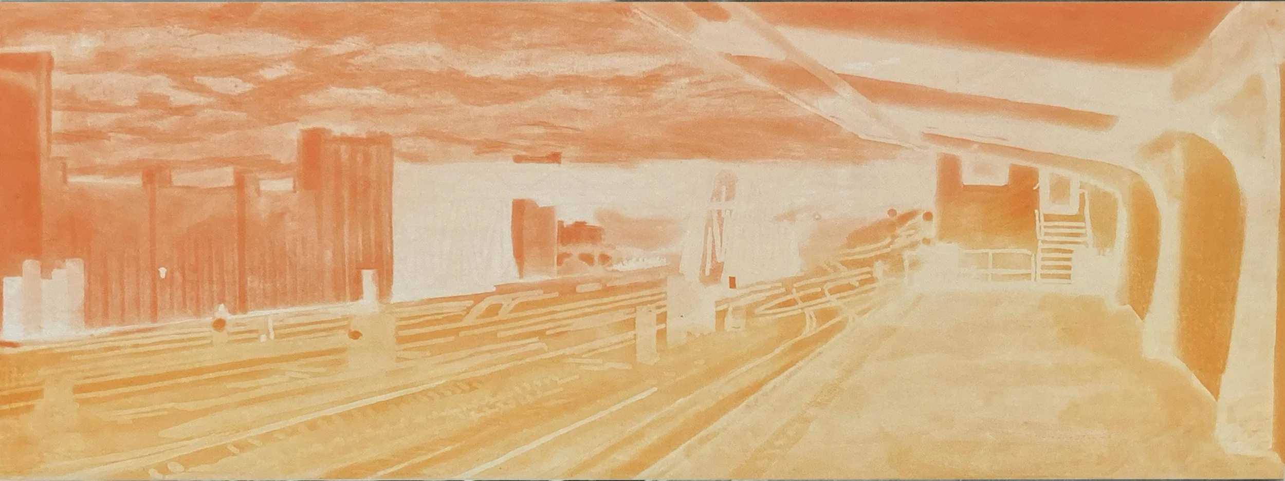
Color prints almost always require multiple plates, with a separate plate used for each color. In this case, I inked a single plate with both orange and apricot ink. This technique, in which multiple colors are applied directly to one plate is called à la poupée.
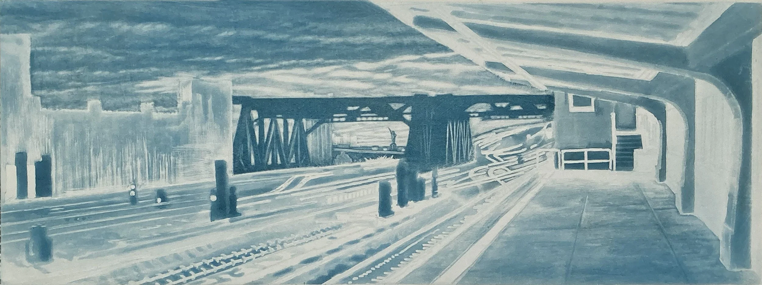
This plate combines two processes: spit-bite aquatint for the subway station and roulette-ground mezzotint for the sky and train trestle.
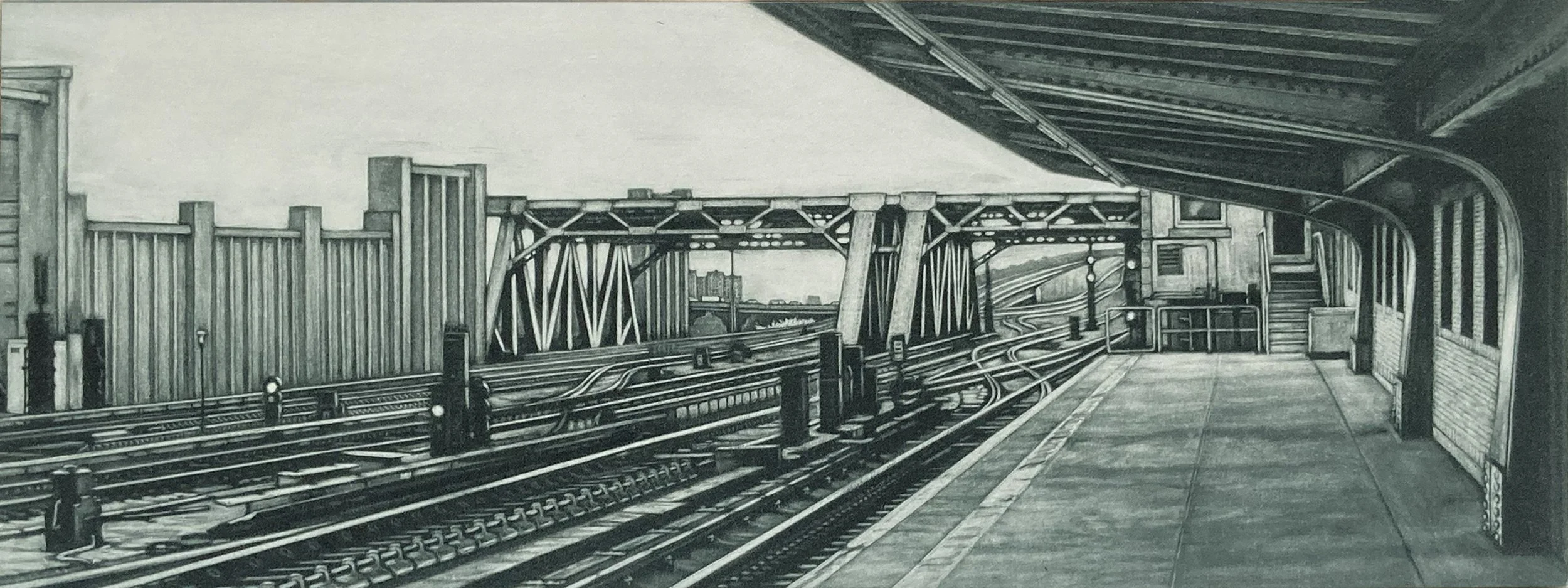
This is the third plate for the 4th Avenue print and is executed in mezzotint. The mezzotint plate is printed last and is referred to as the key plate, providing the darkest tones and defining details of the image.
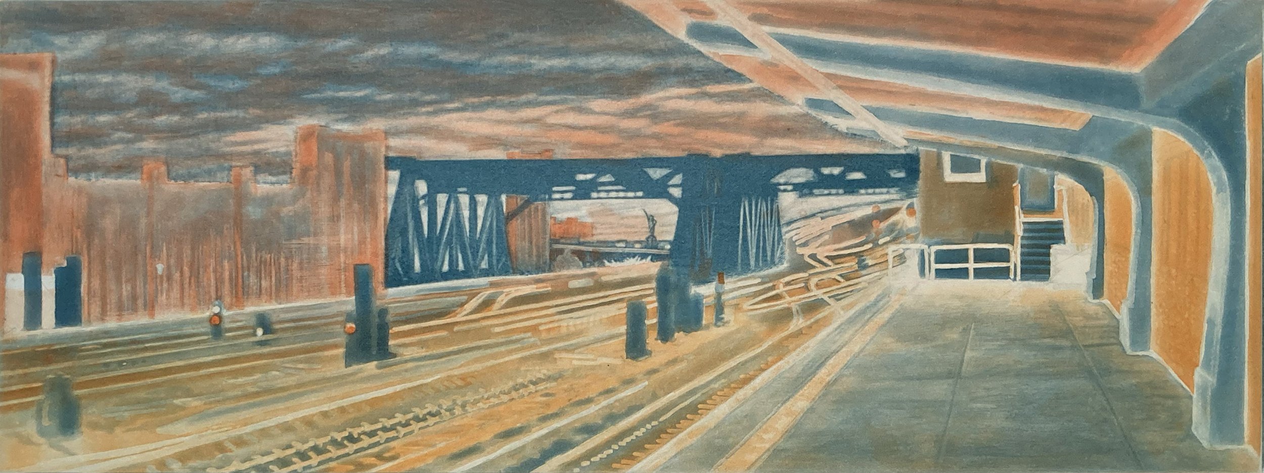
Proof of the first and second plates. I print the lightest, brightest colors first to keep them pure, since some ink will transfer from the paper back onto the next plate. This avoids having to clean the a plate after each printing.
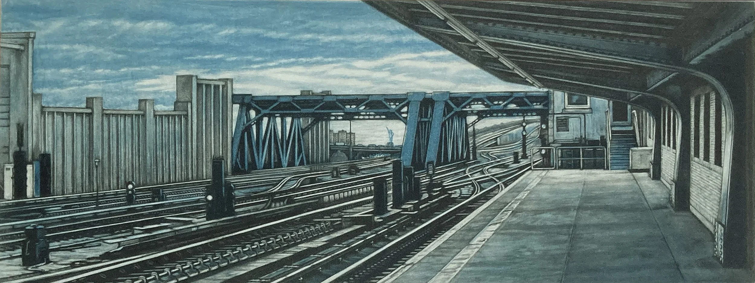
This is a proof of the second and third plates. In this image, the mezzotint portions of each plate combine to create the complete image.
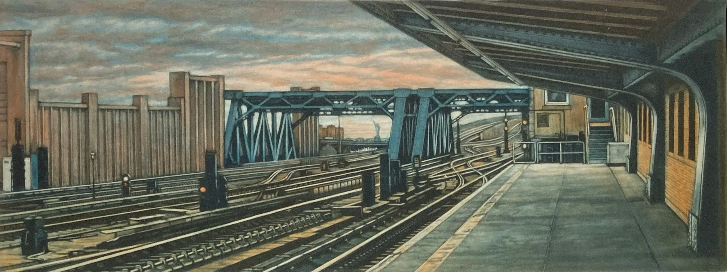
The final print is hand-colored with small touches of red and yellow watercolor in selected areas. These subtle additions of color give the image an extra visual punch. This proof shows the image before the hand coloring was applied.
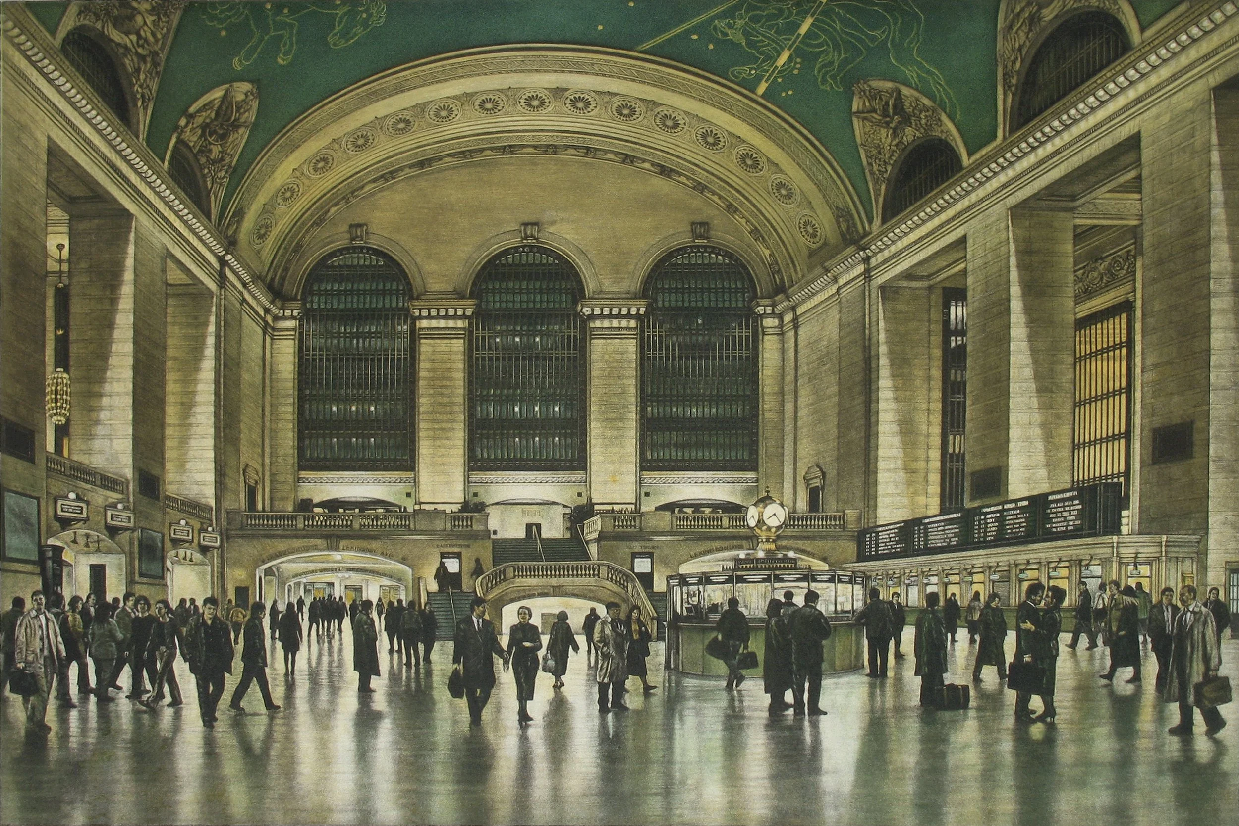
Mezzotint and aquatint print depicting the Main Concourse of Grand Central Terminal, with figures and their reflections visible in the polished floor. In this piece, the aquatint is crucial to the development of the image, establishing much of the architectural structure and tonal atmosphere.
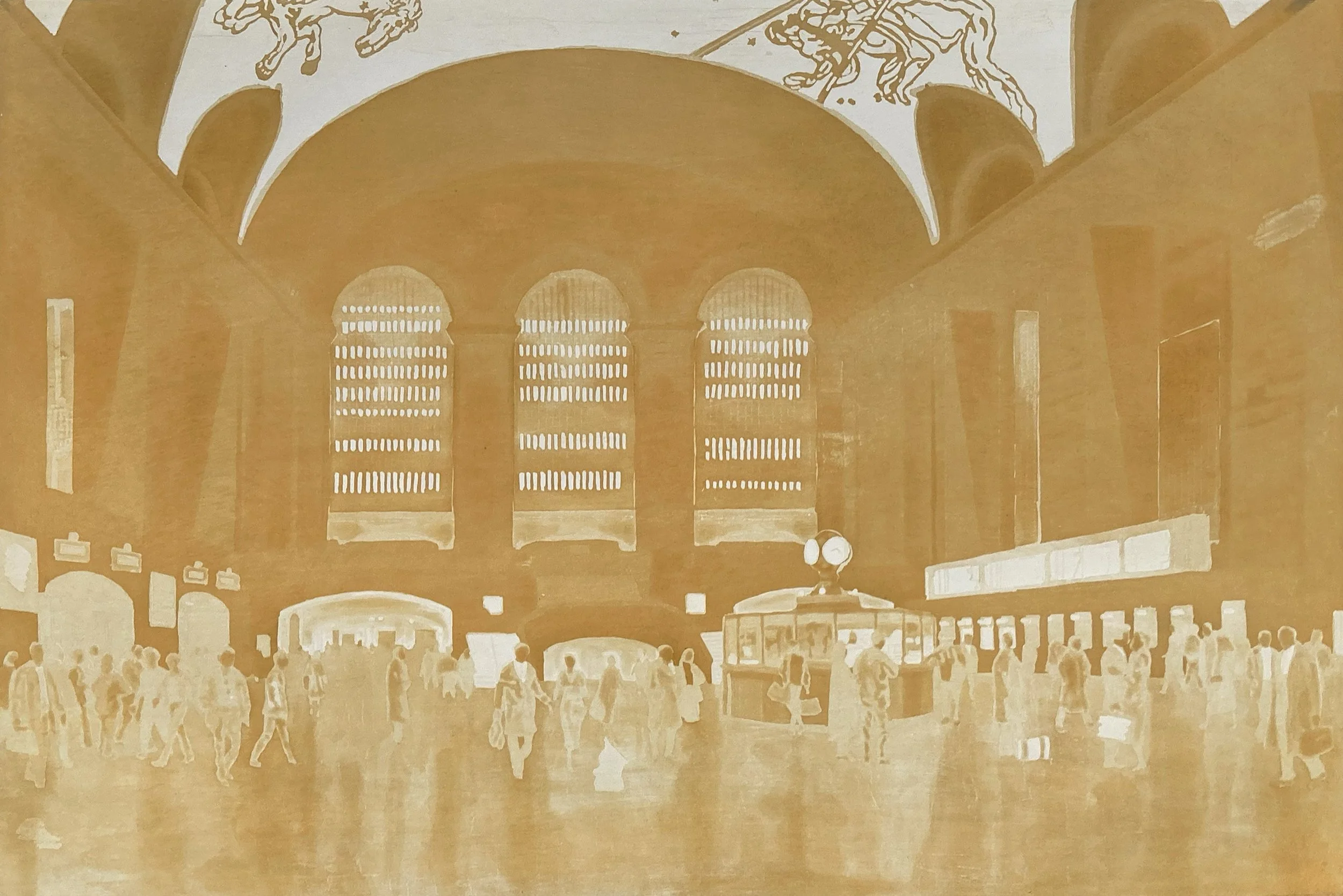
The first proof of the orange plate for the Across the Floor print. The plate was created using the spit-bite aquatint technique.
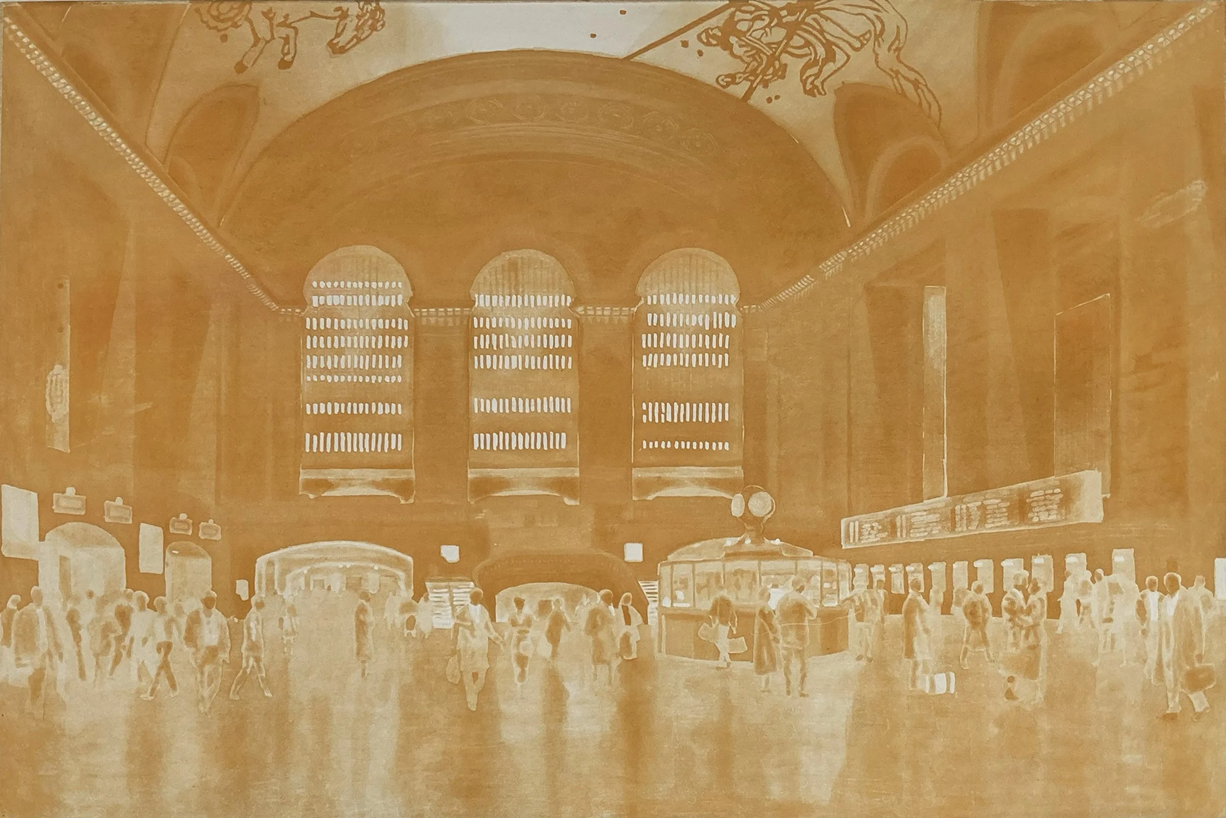
The second proof of the orange plate for the Across the Floor print. Additional etching was done on the ceiling, and lighter tones were burnished into the aquatint ground.
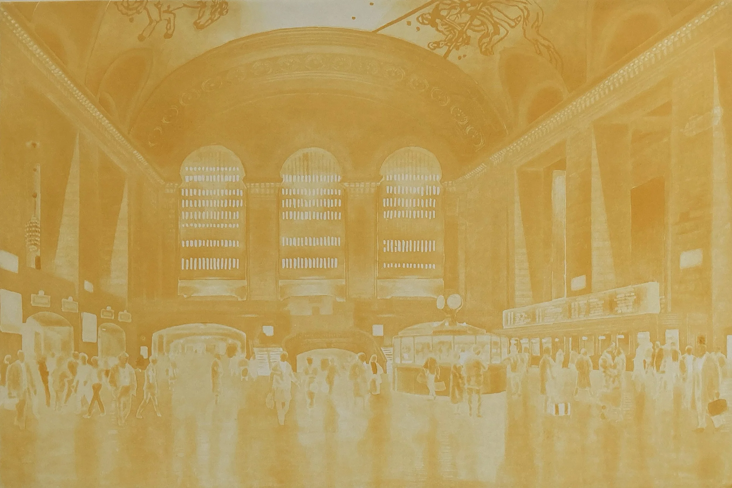
Final proof of the orange plate for the Across the Floor print. Additional etching was done on the ceiling, and I continued burnishing the aquatint ground to refine the lighter tones. The ink color was also adjusted to achieve the desired effect.
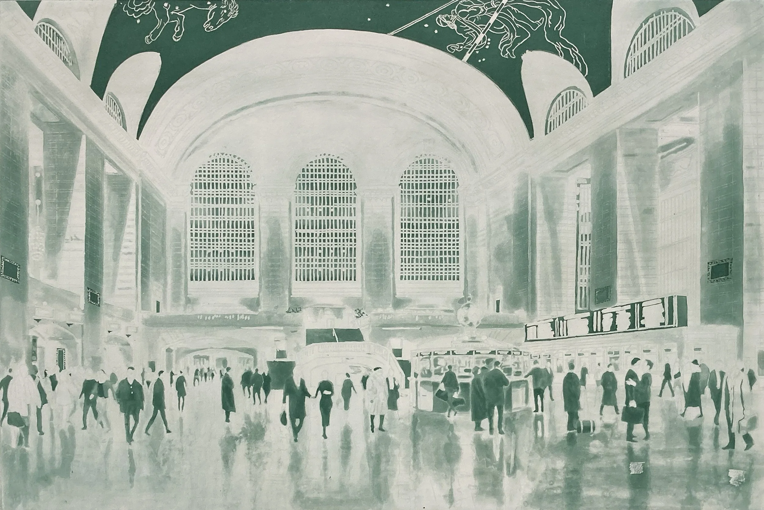
The first proof of the green plate for the Across the Floor print. The plate was created using the spit-bite aquatint technique.

The second proof of the green plate with additional tones added to the vaulted ceiling, walls, and floor.
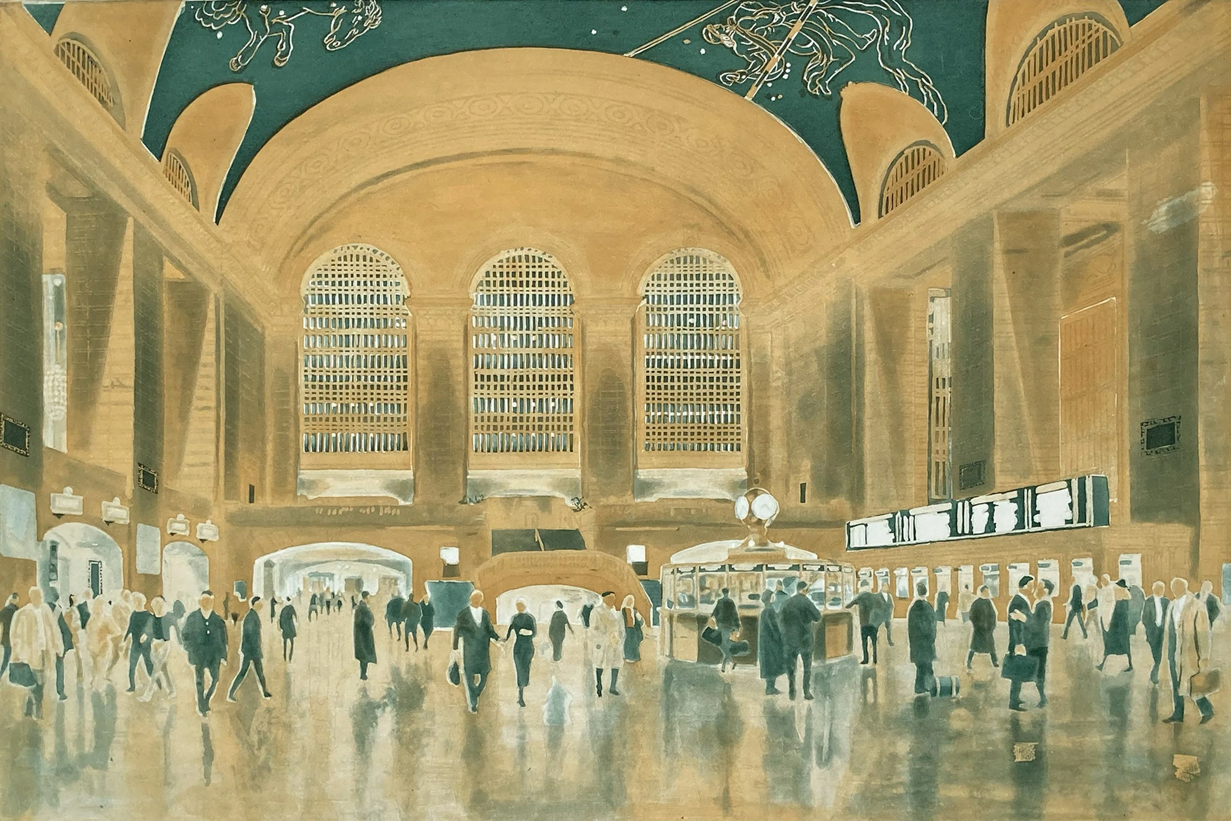
This is the first proof of the two color plates that sit beneath the mezzotint plate.
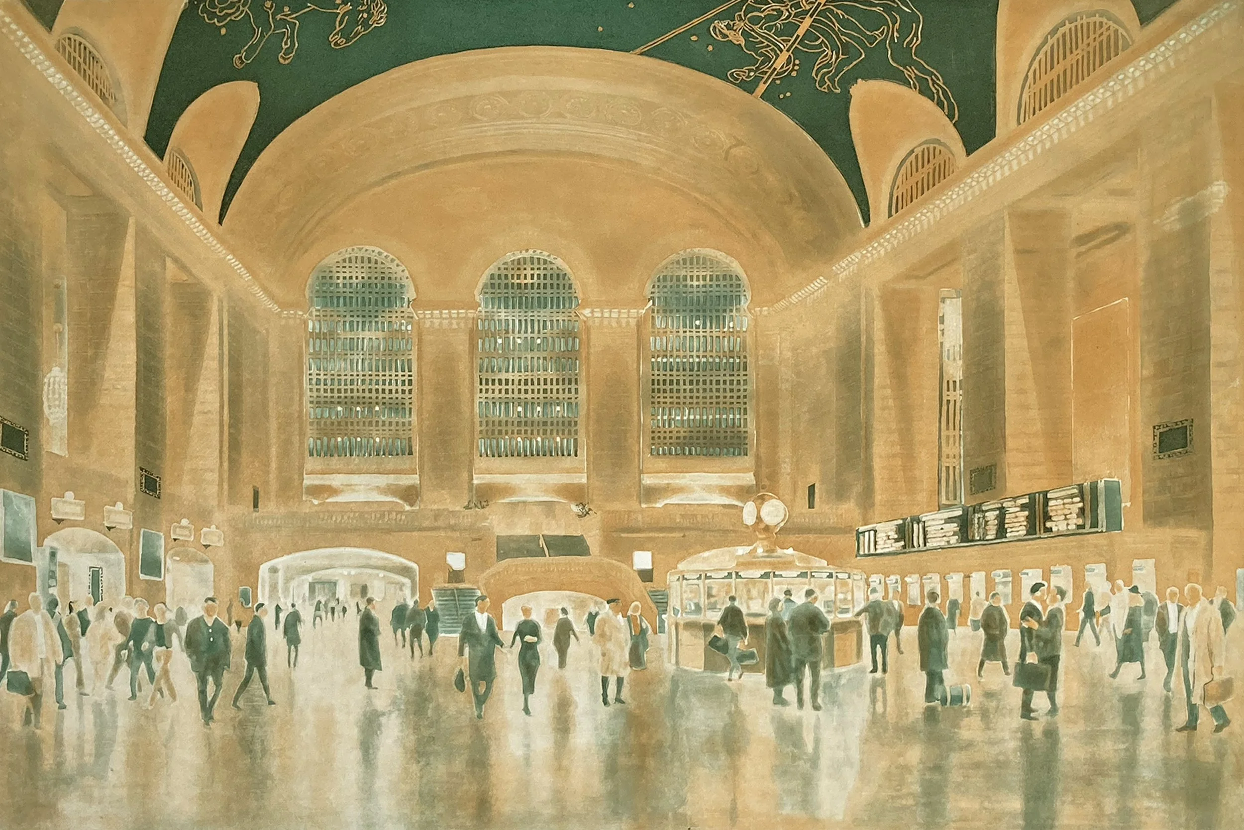
The second proof of the two color plates. Highlights in the terminal walls are created by burnishing down the aquatint ground.
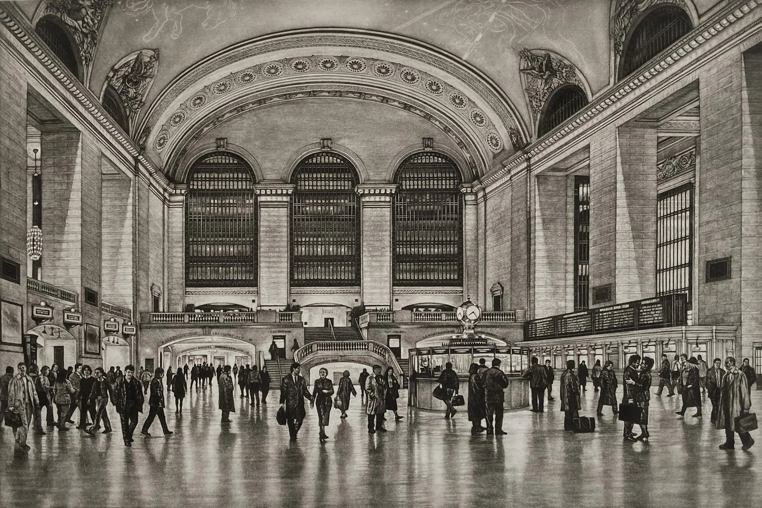
This is the key mezzotint plate, which is printed on top of the previous proof. The color plates defines the ceiling and the mezzotint dark tones set off the figures and architectural details.
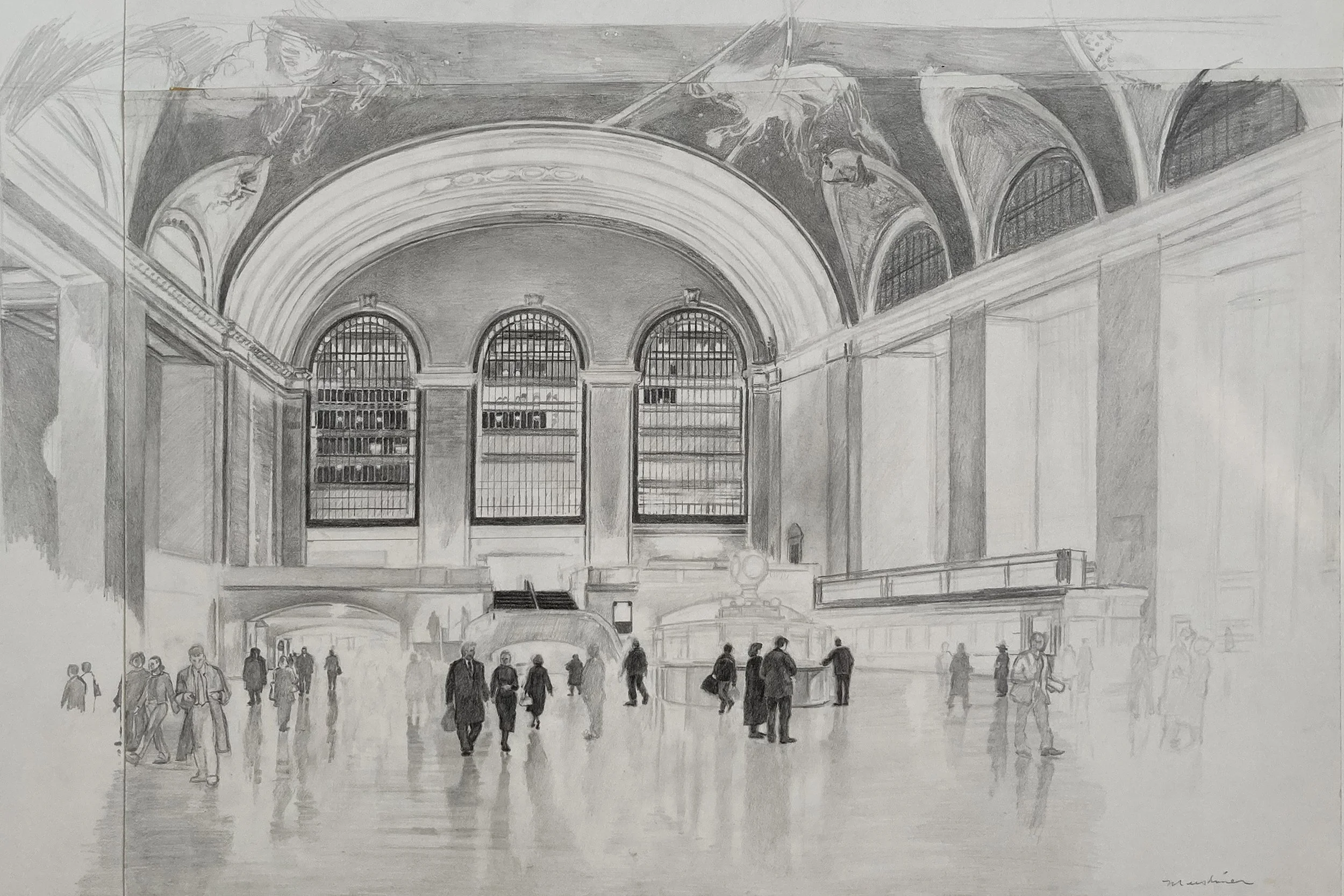
This is a sketch of the scene drawn on three pieces of paper. It is common for me to begin drawing and if I want to expand the composition, I simply add another piece of paper.
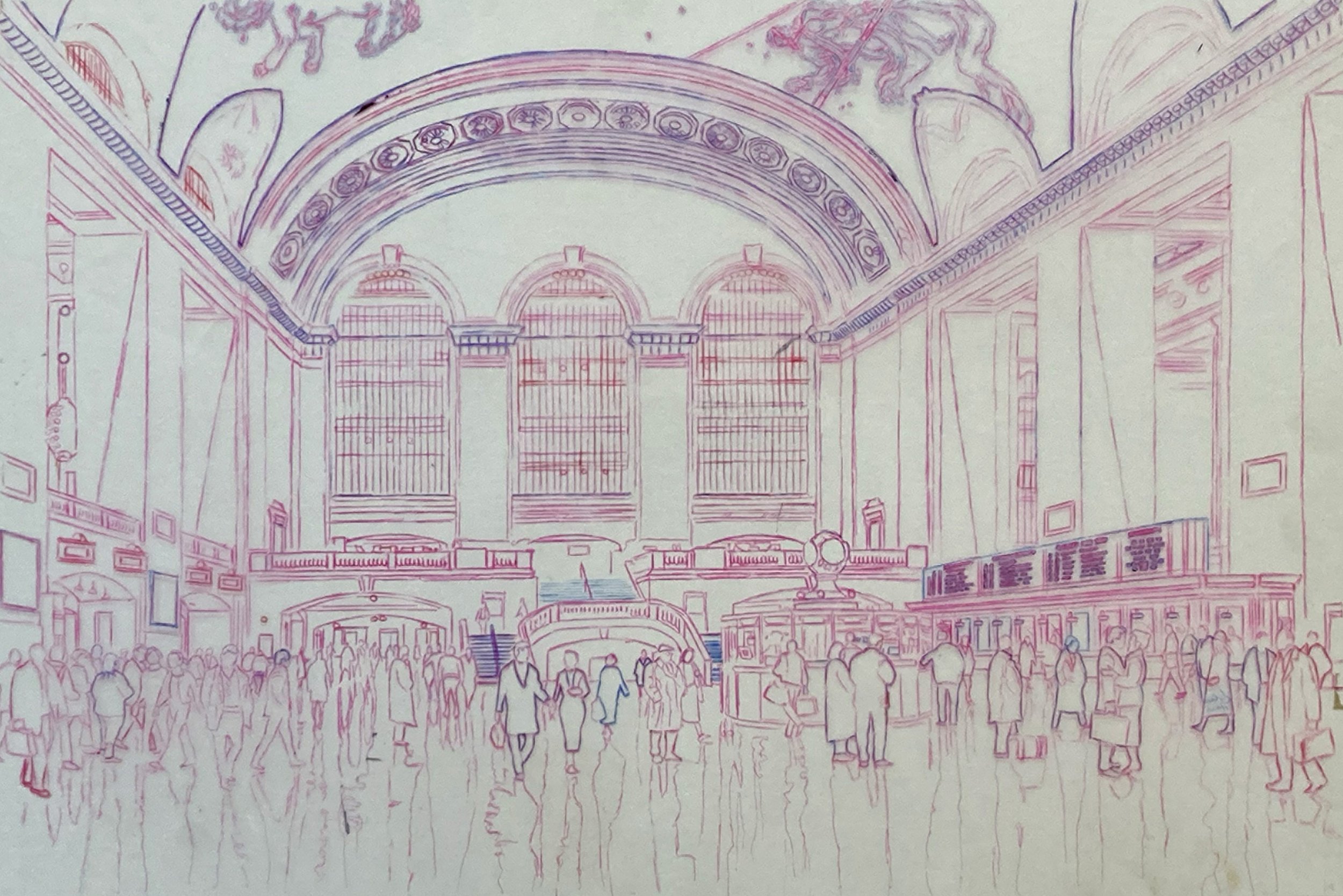
This Mylar is used to register the three plates. Multiple colored pens are used to ensure that that I don’t miss any details. The first tracing is done in pink, the second transfer in blue, and the final tracing in black.
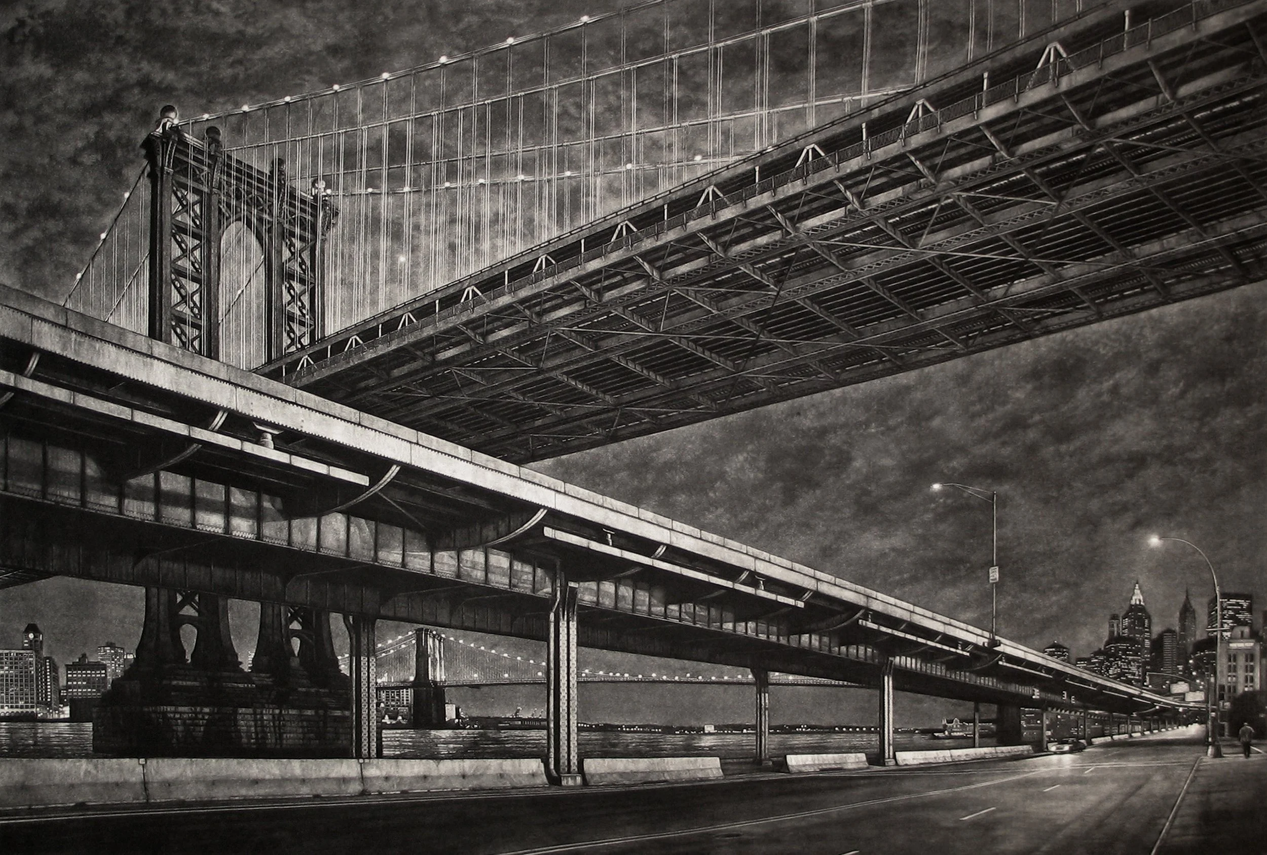
Mezzotint of the elevated FDR Drive, with the Manhattan Bridge receding behind it and the Brooklyn Bridge in the distance. Texturing the 24 × 36-inch plate with a rocker took about four months.
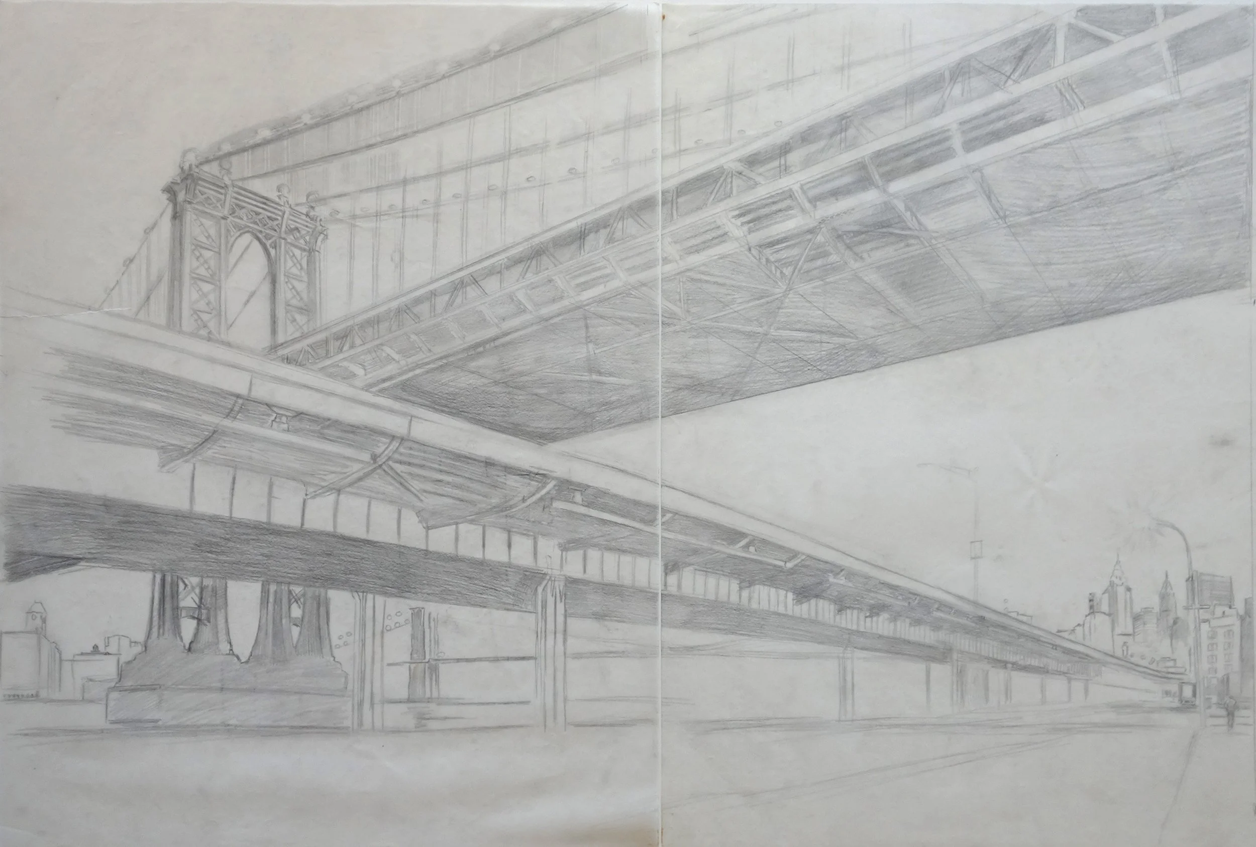
A drawing on two sheets of tracing paper used to work out the basic composition.
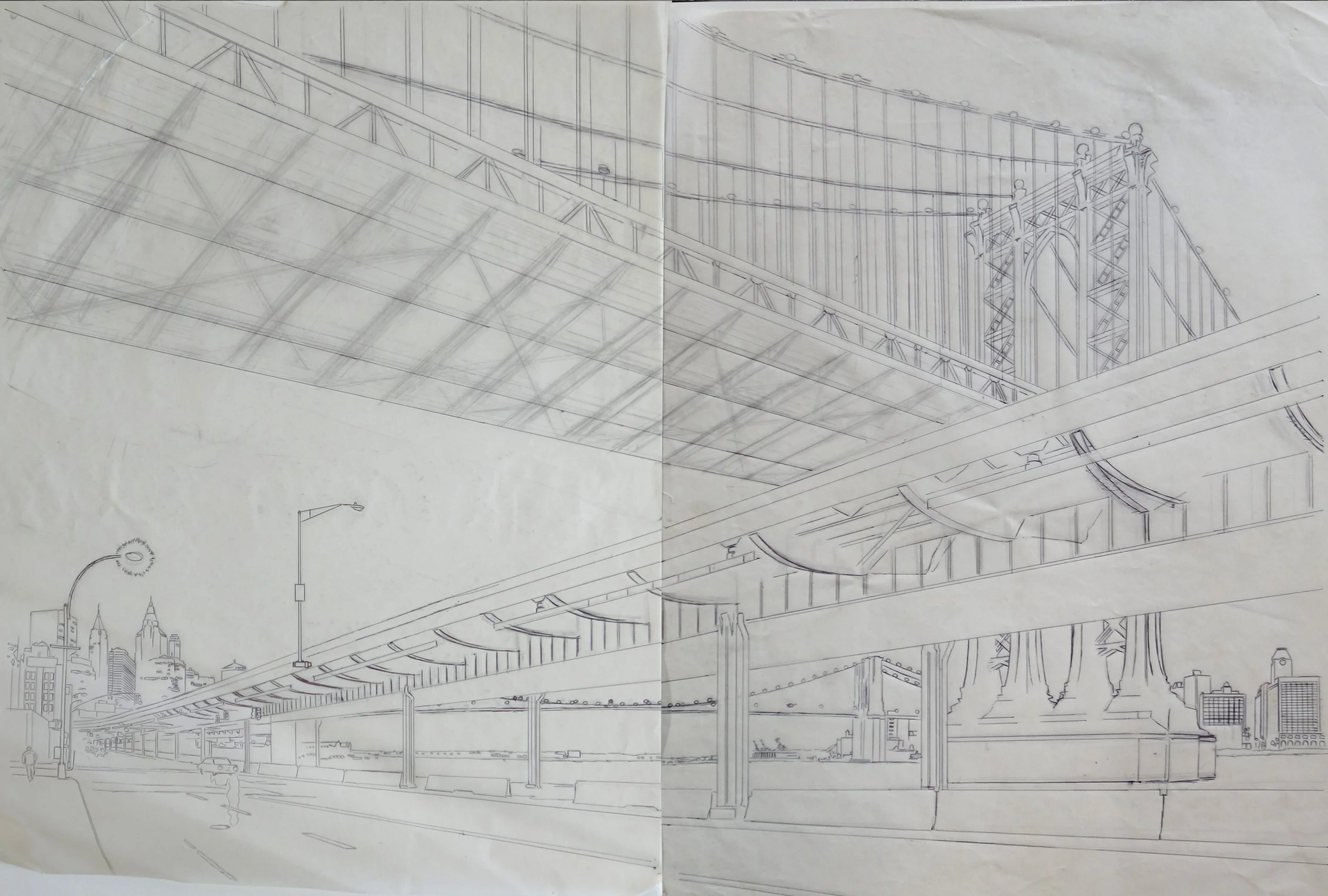
The final composition transferred to the mezzotint plate. The image is reversed because, when printed, it will be transferred onto the paper in the correct orientation.
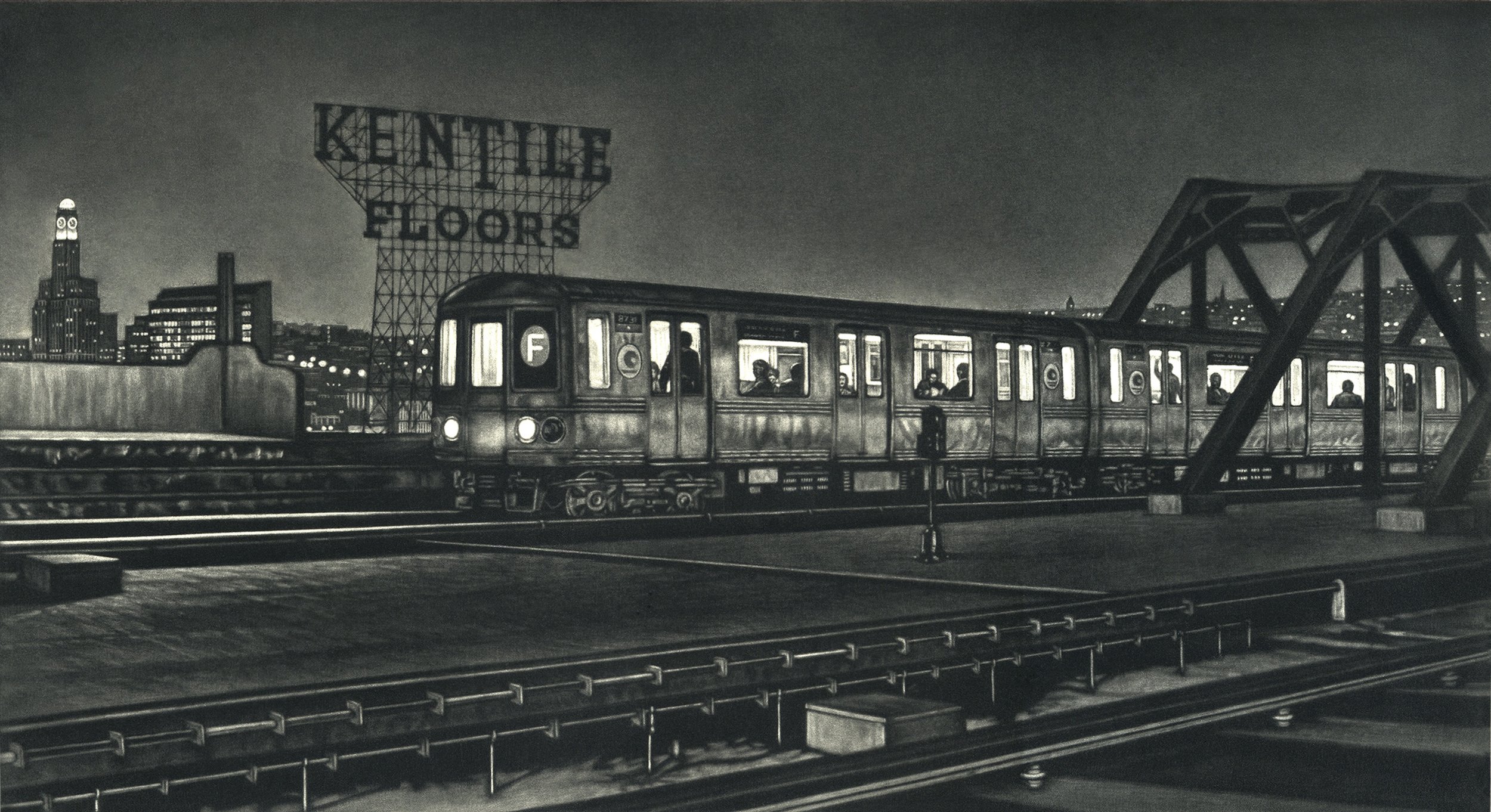
Mezzotint print depicting a Manhattan-bound F train entering Smith–9th Streets station, with the Williamsburg Savings Bank and the Kentile sign visible in the background.
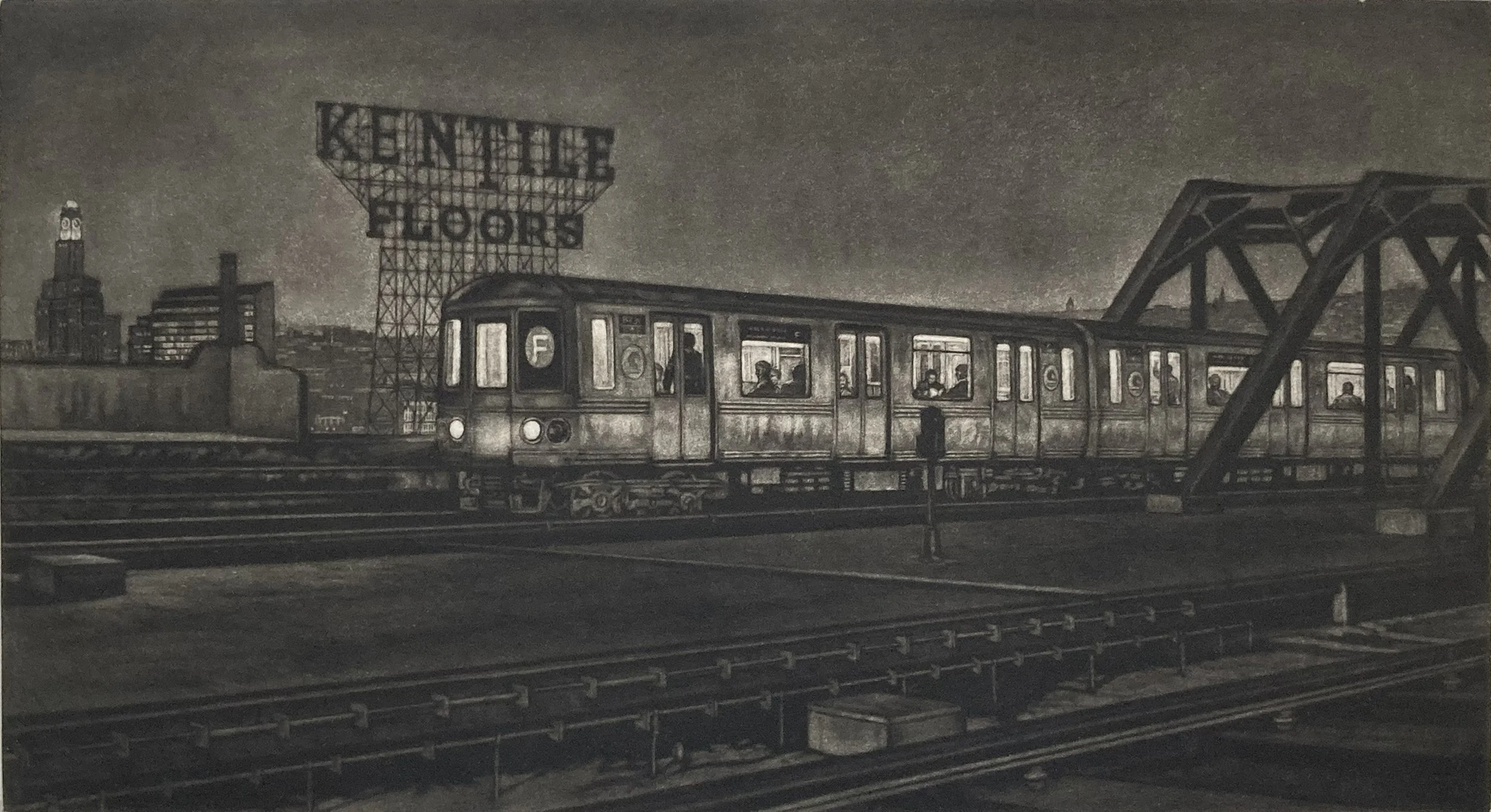
Working from dark to light, I always err on the side of making the plate too dark, since it is much easier to lighten it later. The first proof is somewhat murky, but it provides a useful starting point for developing the final tonal range.
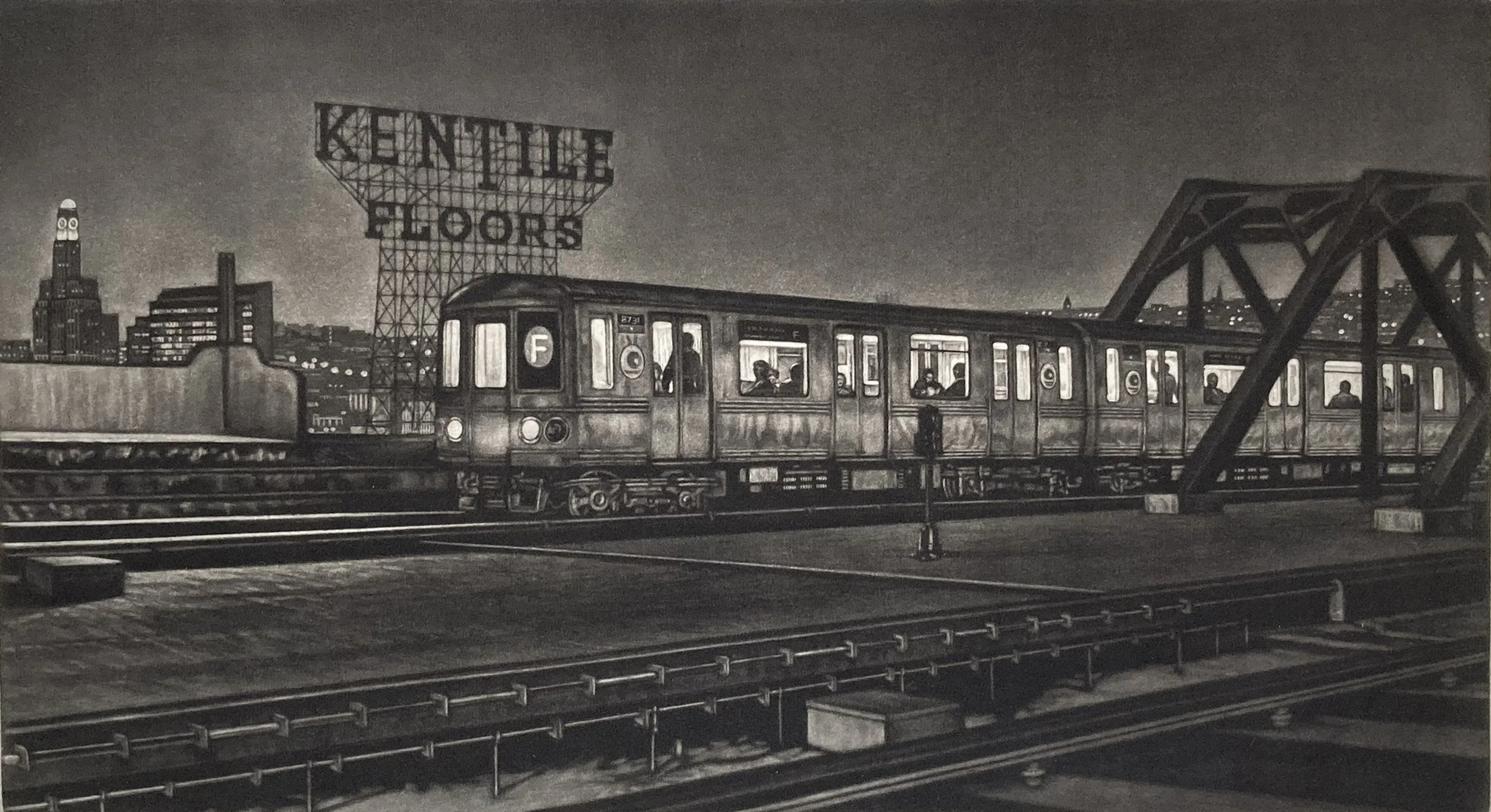
The third proof is brighter and getting closer to the tonal range and overall effect I wanted.
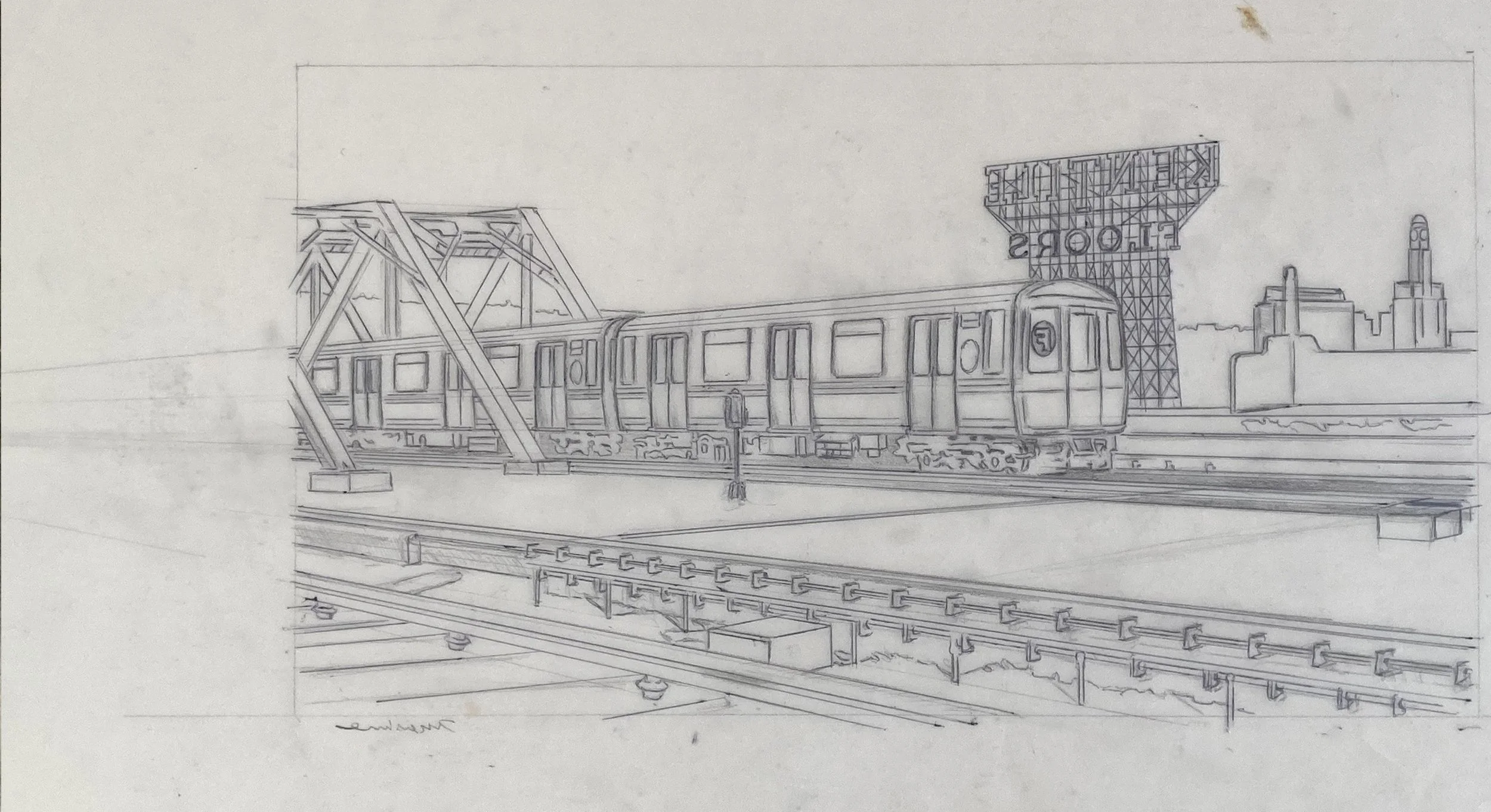
The tracing transferred to the copper plate. The drawing is reversed because, when the paper is lifted from the plate, the image is mirrored from what appears on the plate.
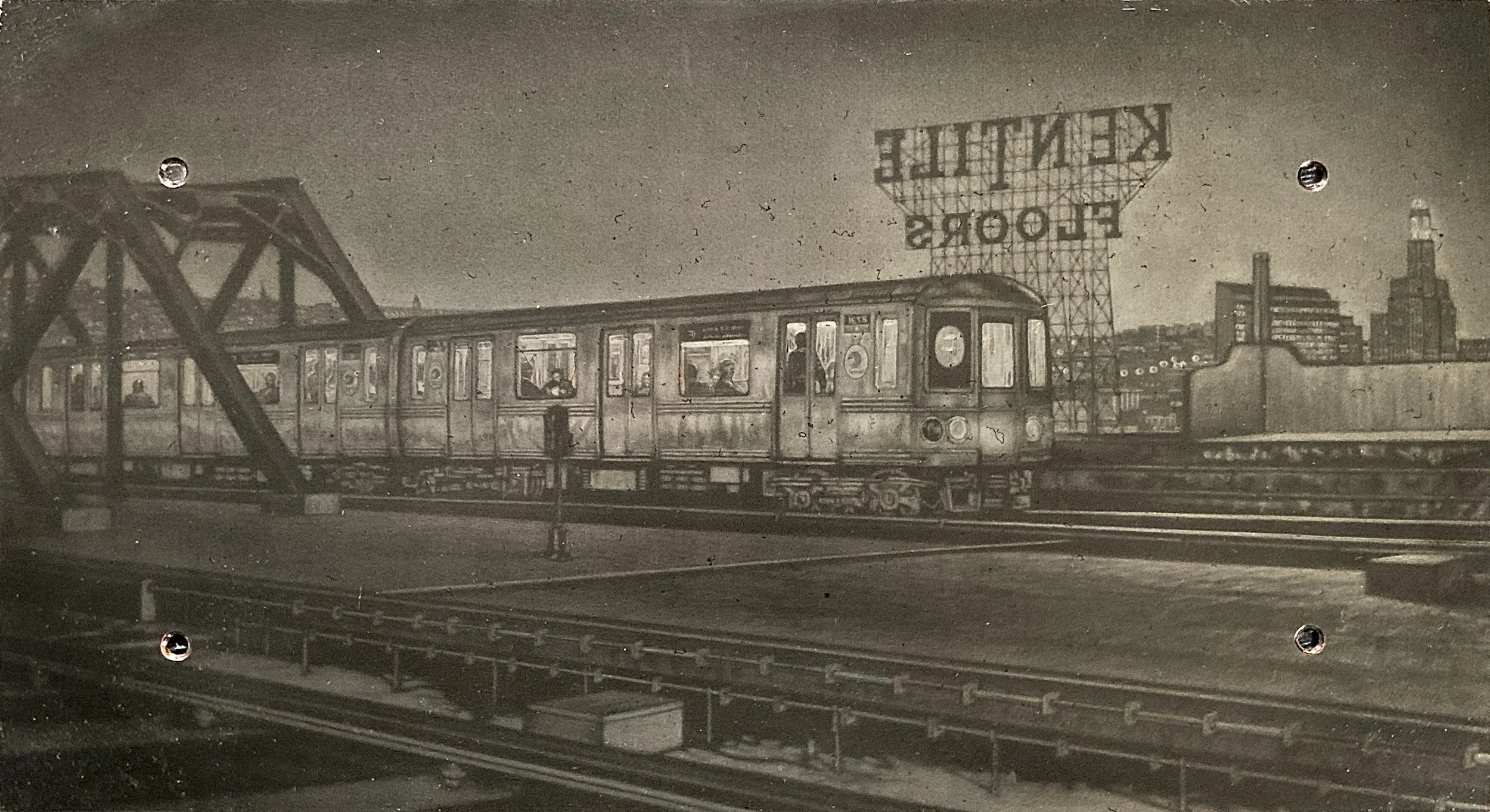
This is the steel-faced plate for the Manhattan-bound image. I originally started with a copper plate, but copper is a relatively soft metal and its texture can wear down during printing. To ensure consistent, deep tones throughout the edition, the copper plate was electroplated with a thin layer of iron, creating a more durable printing surface.
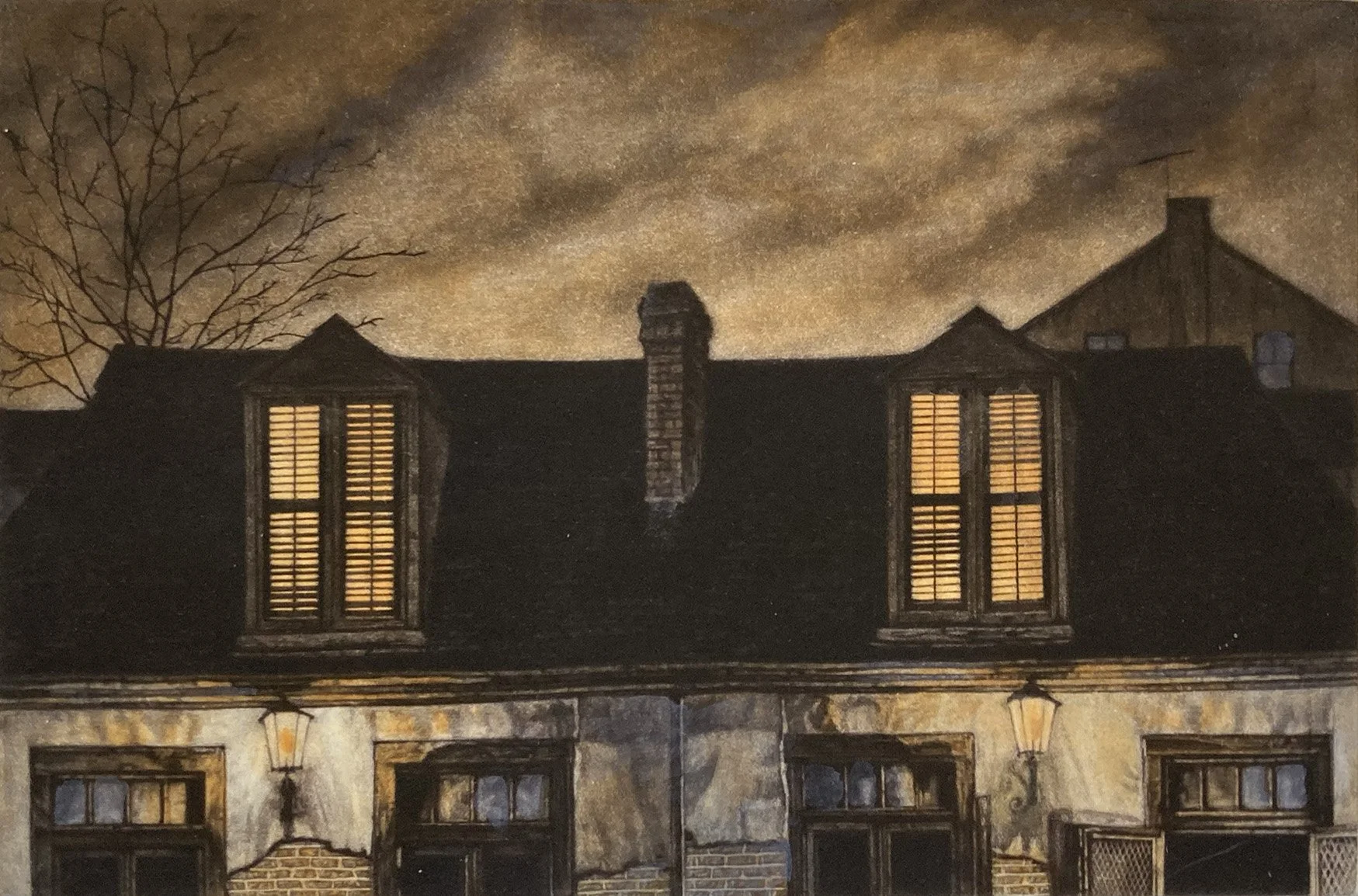
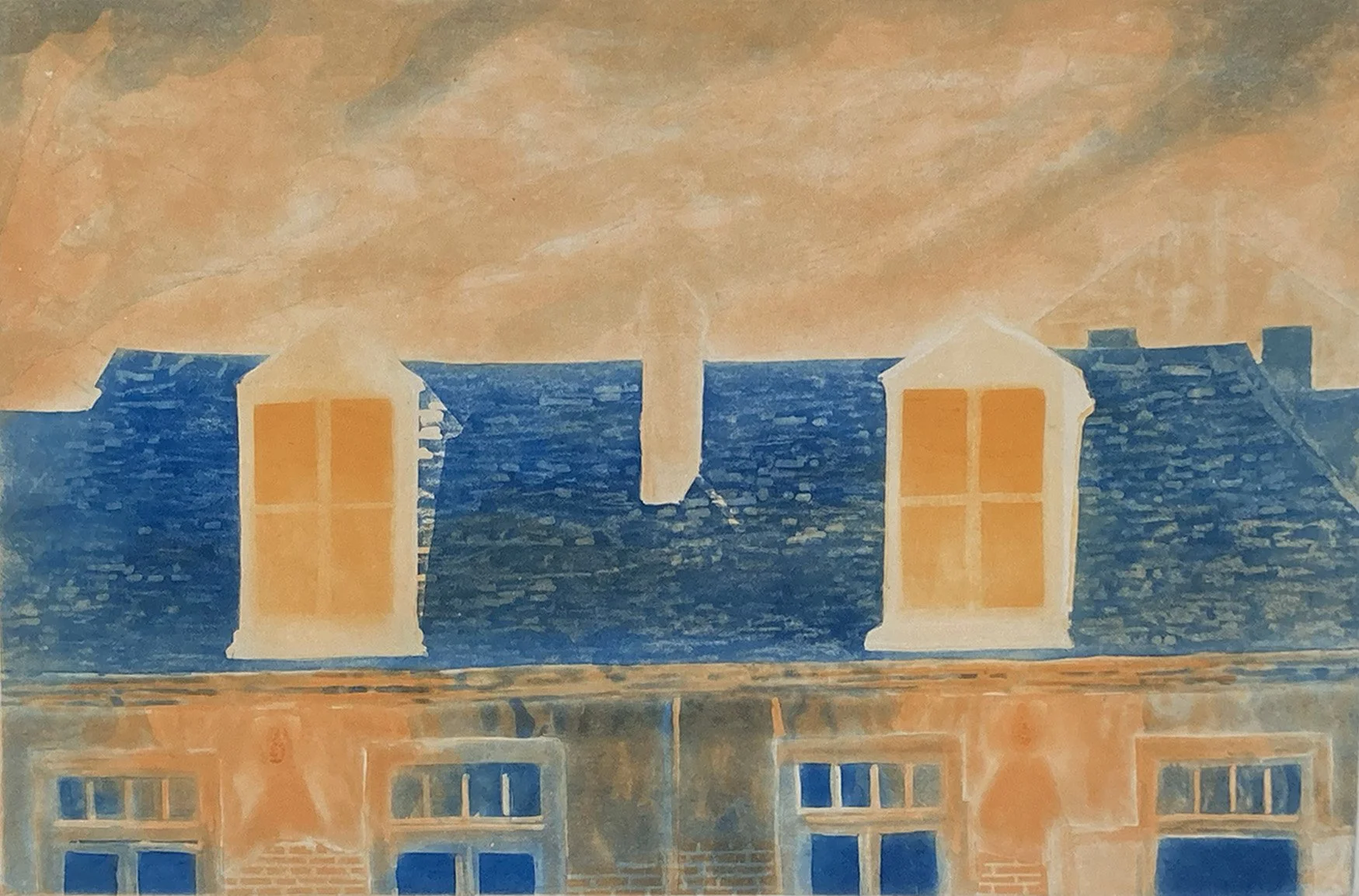
A nighttime scene of the shuttered upper windows of Lafitte’s Blacksmith Shop Bar. This is a three-plate color print.
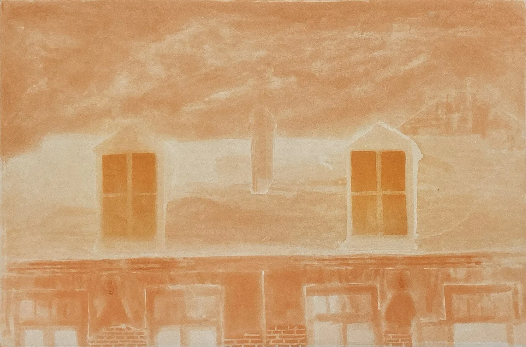
The orange proof for Lafitte’s features three distinct shades of orange. The building is rendered in cadmium orange, the upper windows in a yellow-orange, and the sky in an orange tone with a touch of brown added.
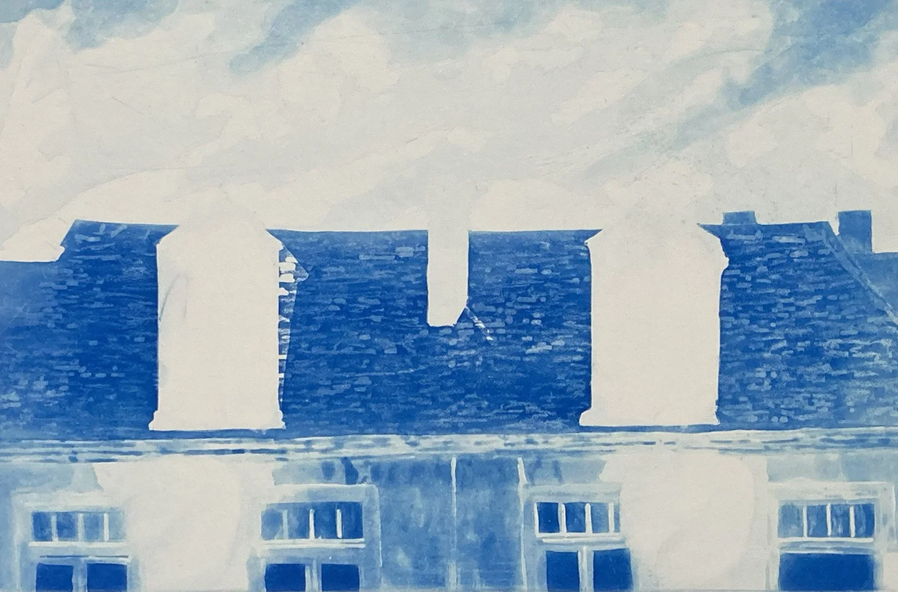
The blue plate proof for Lafitte’s demonstrates the watercolor-like qualities of spit-bite aquatint. The lightest tones are etched first, after which selected areas of the plate are stopped out to preserve those values. Acid is then brushed onto the exposed areas, gradually deepening the etching and producing darker tones.
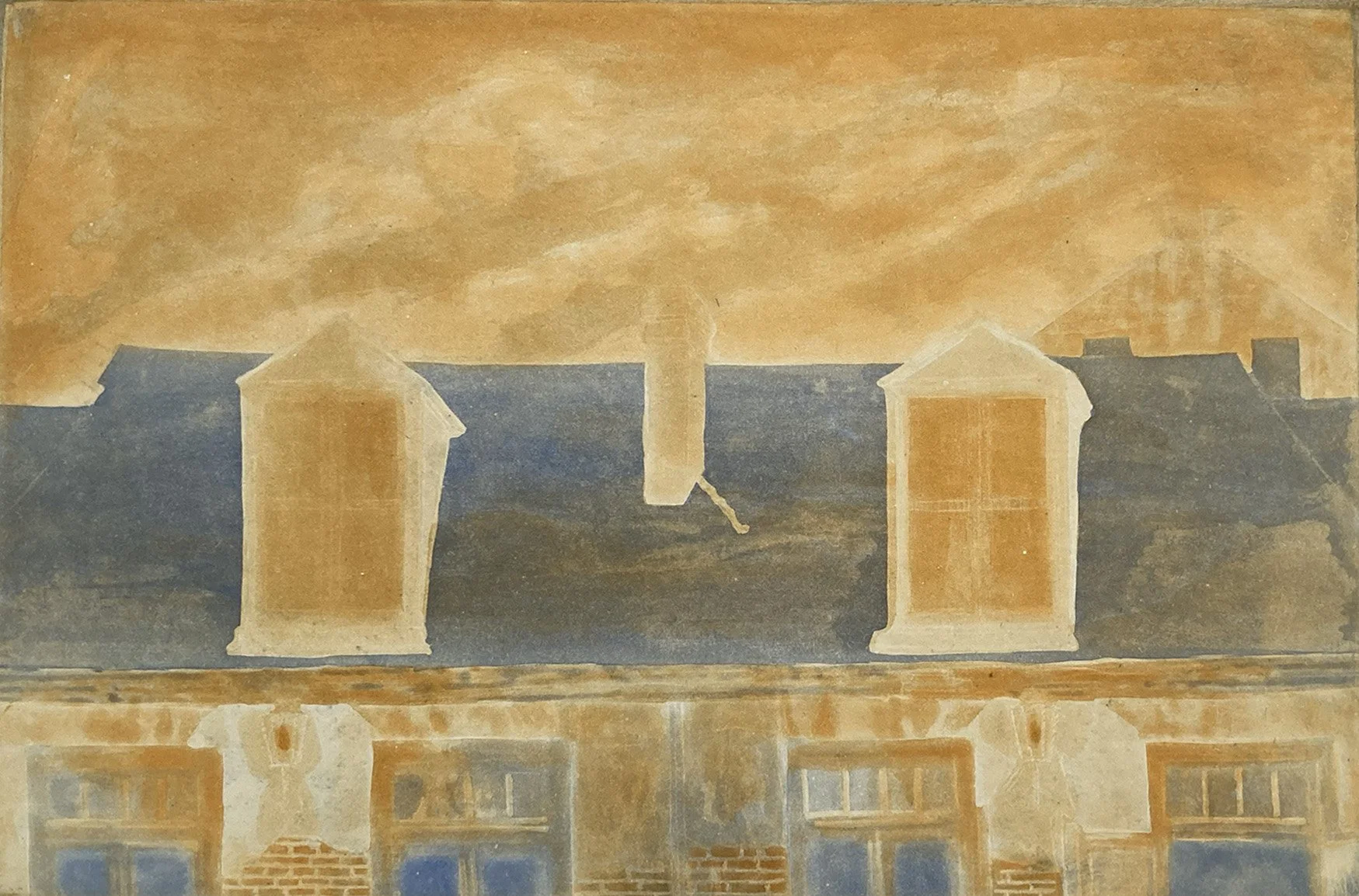
This is the first proof of the orange and blue plates, printed before the plates were steel-faced. Ink can oxidize on copper, causing the printed colors to appear duller than the ink itself. Once the plates are steel-faced, the colors will print with brighter, purer tones.
The orange and blue print much brighter in the second proof, after the plates were steel-faced. The steel facing allows the colors to retain their true color as well as keeping the plate from wearing out.
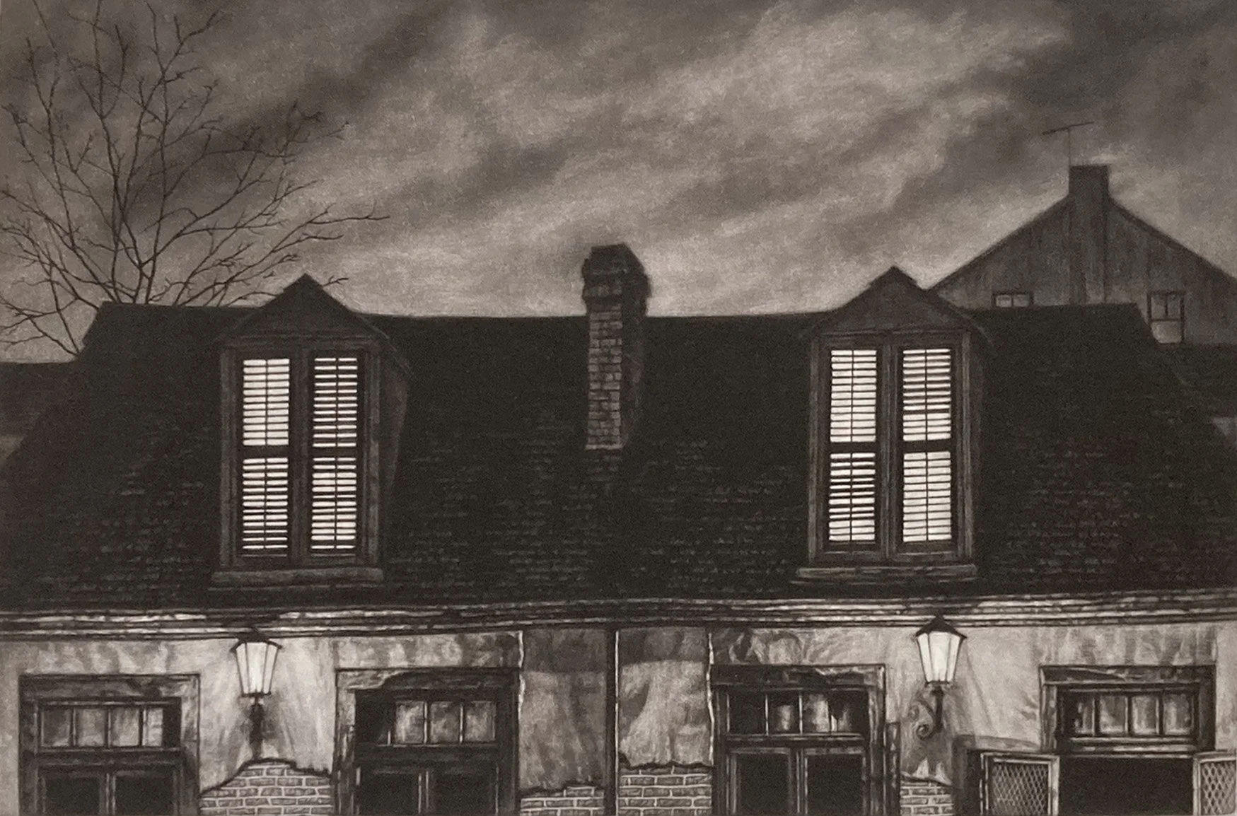
Lafitte’s mezzotint plate is printed on top of the two color plates to create the finished print. The deep, rich tones of the mezzotint create a mysterious, atmospheric quality that captures the character of New Orleans at night.
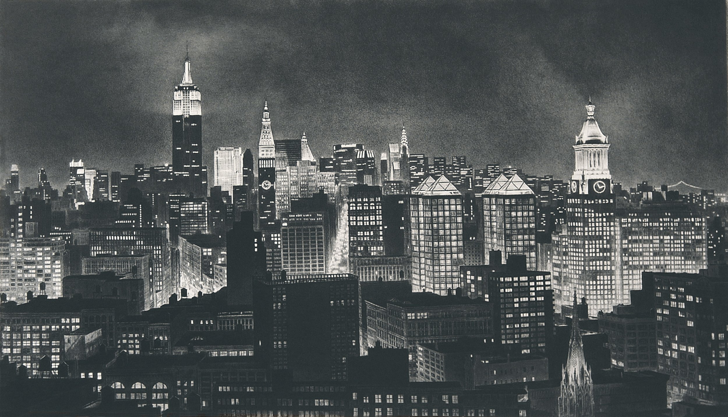
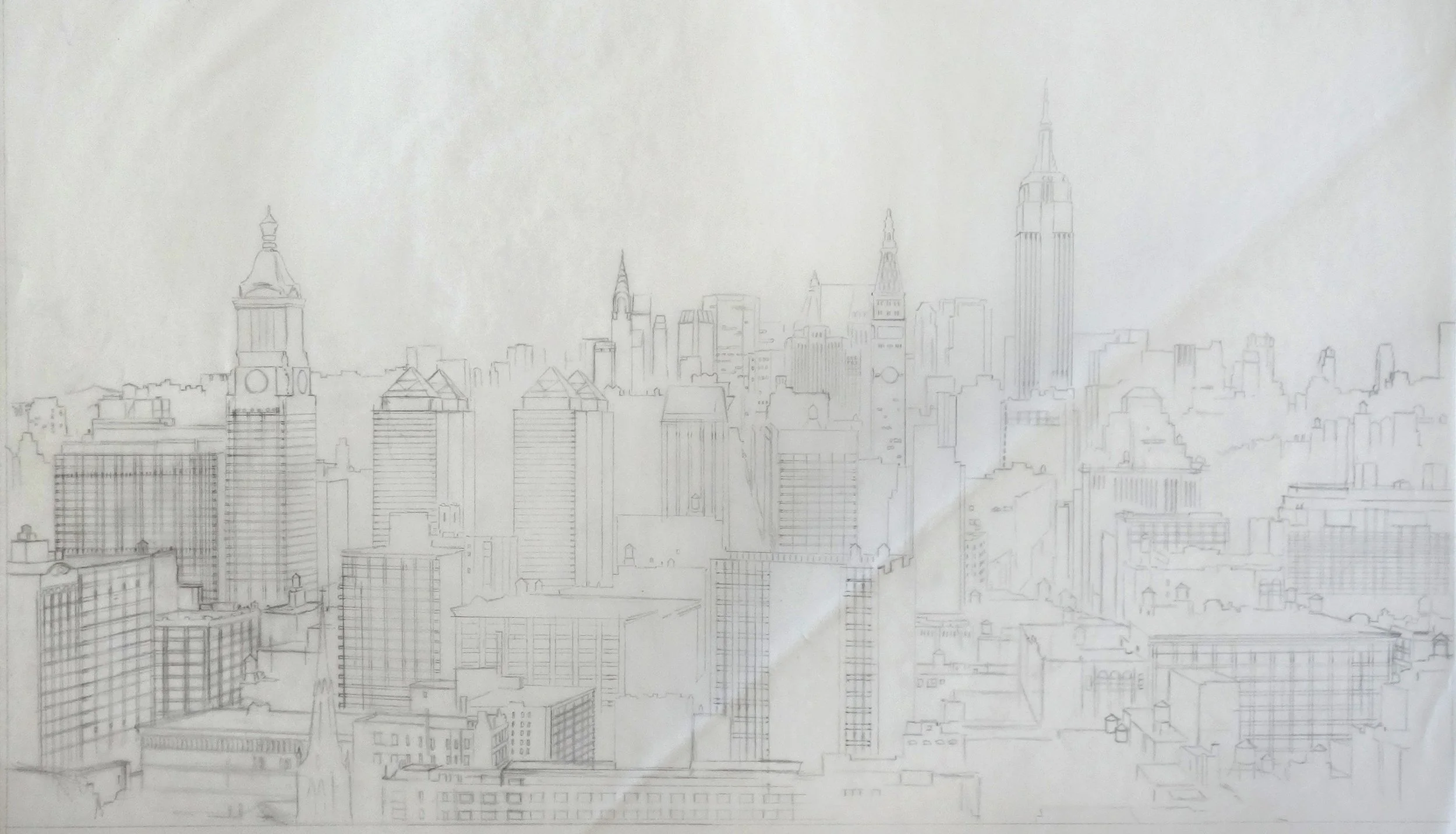
This iconic view of Midtown Manhattan’s skyscrapers was captured from the rooftop of an apartment building at 8th Street and Broadway.
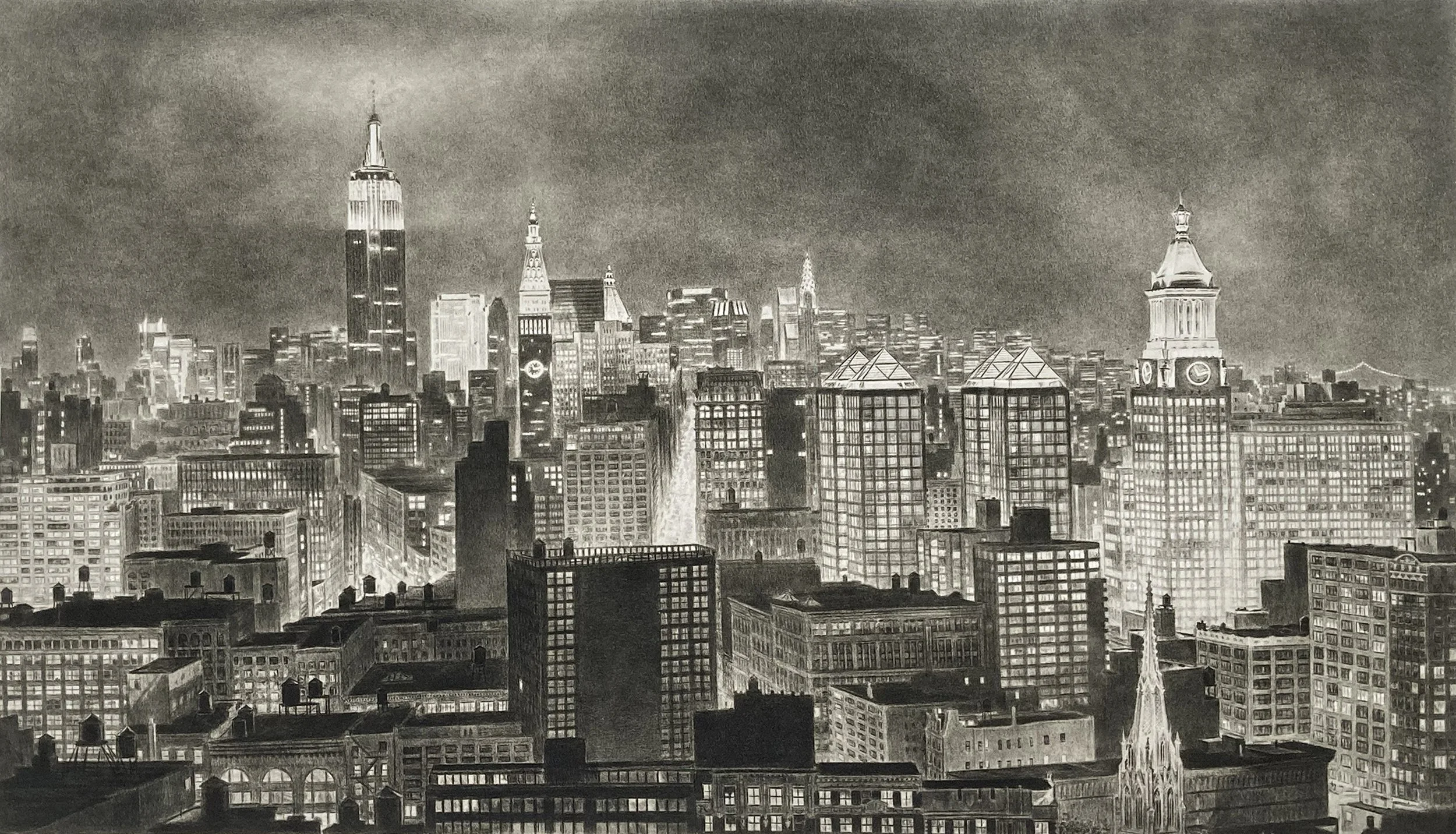
This is one of three direct gravures I made. The process is similar to photogravure, but instead of using a photographic positive, I created a drawing on a Mylar sheet instead. I wasn’t happy with the results of the process alone, so I ended up reworking the plate with aquatint and mezzotint.
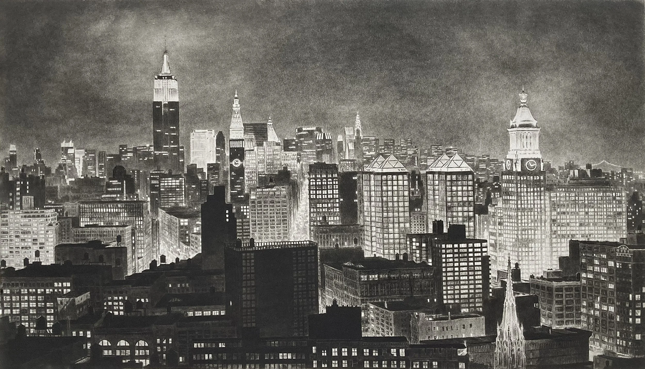
Aquatint has been added, deepening the tones and introducing richer blacks into the foreground buildings.
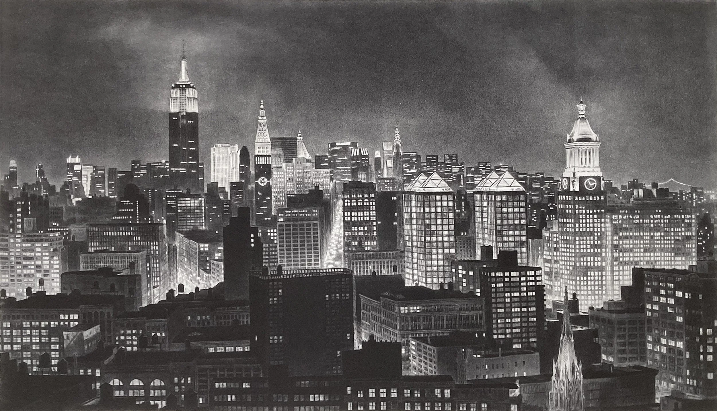
More aquatint has been added, along with mezzotint in select areas, such as the top of the Con Edison Building.
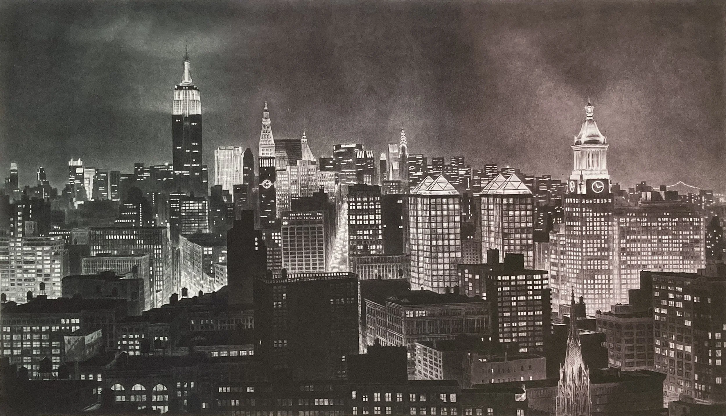
An efficient way to proof a plate is to try several different ink colors on the plate at once. You can use a single piece of paper and spend only a little extra time carefully inking the plate, rather than making two separate proofs.
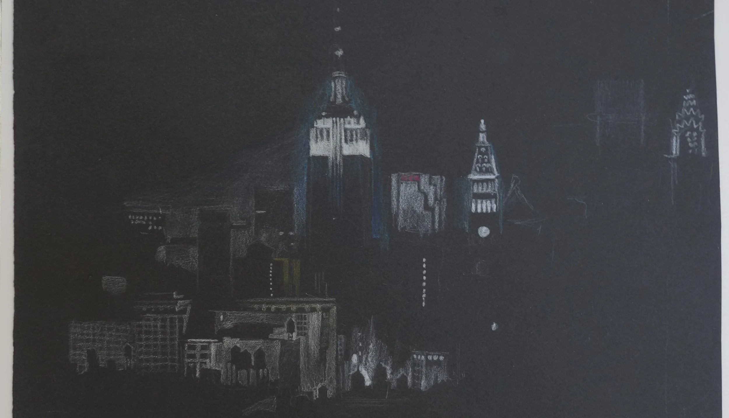
This is a drawing on black paper, using colored pencils to block in this nighttime scene.
A detailed drawing on tracing paper of the final composition for Penthouse. Copper is malleable, but it takes considerable work to alter a plate, so I like to fully develop the composition before staarting work on the copper plate.
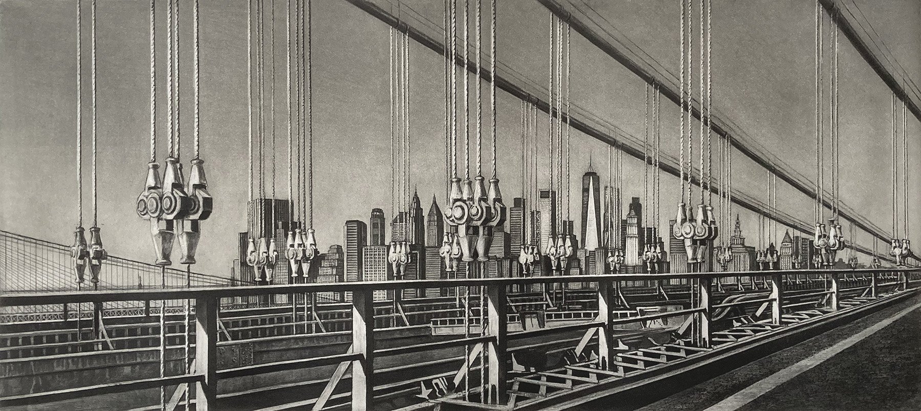
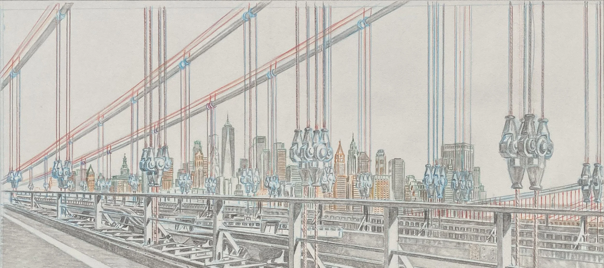
A scene depicting the cables and hardware of the Manhattan Bridge, with One World Trade Center and the Lower Manhattan skyline visible in the background. I used three processes to create this image: soft-ground etching, line etching, and aquatint.
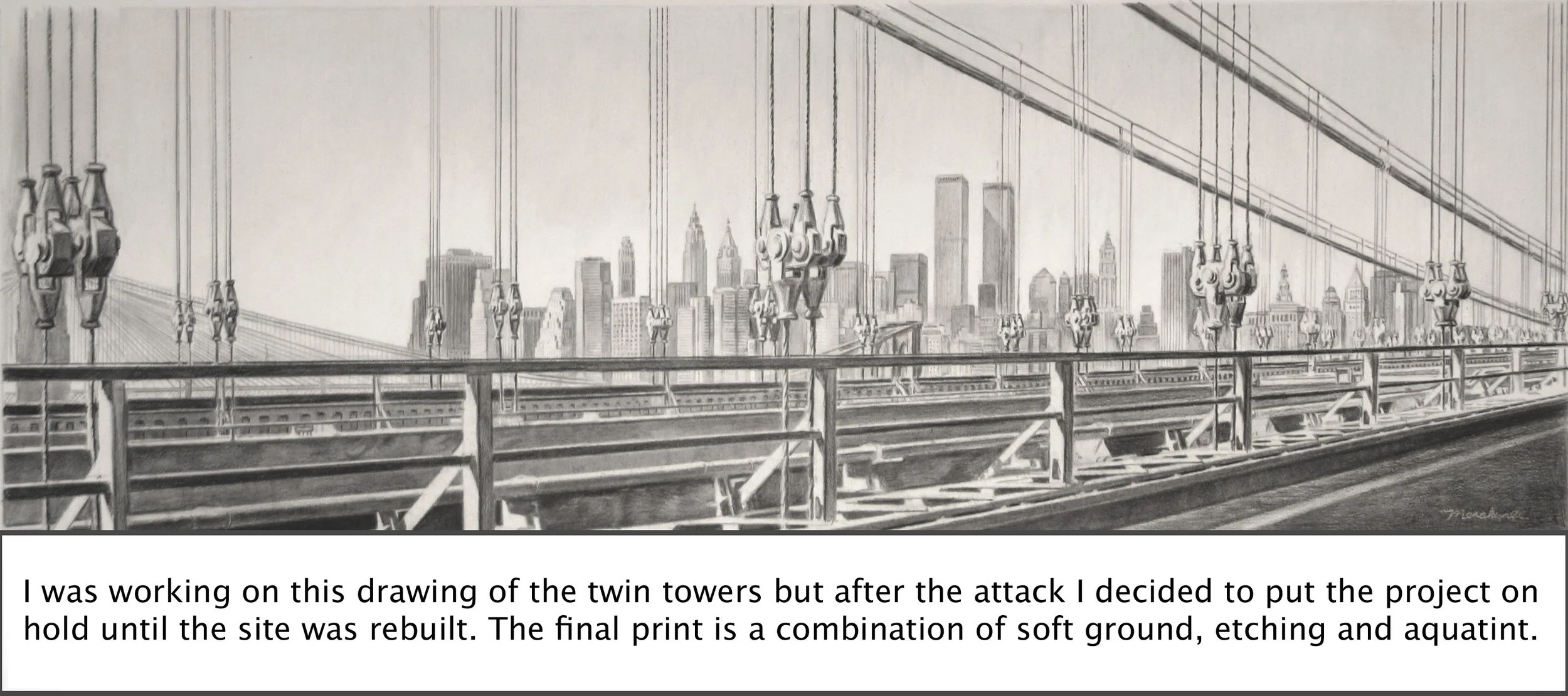
This was the original concept for the print, with the World Trade Center towers in the background contrasted against the Manhattan Bridge cables in the foreground.
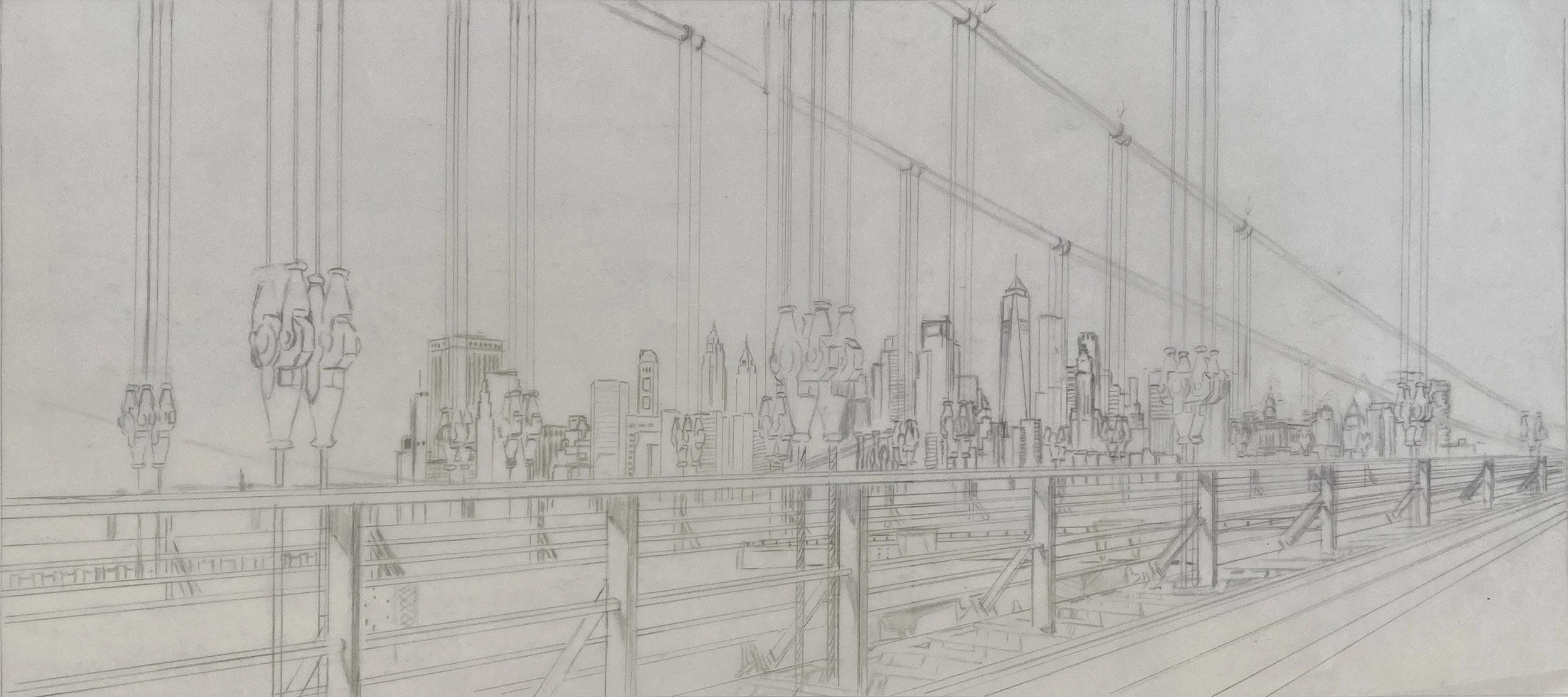
This drawing on tracing paper shows the new composition, with the cables of the Manhattan Bridge in the foreground and the new One World Trade Center tower rising above the Lower Manhattan skyline in the background.
The pencil marks were used to create the image through the soft-ground etching process. The copper plate beneath the drawing is coated with a waxy ground formulated to remain soft. As the pencil moves across the paper, the pressure pushes the paper into the ground, lifting some of the wax from the plate. These disturbed areas expose the copper to the acid, which etches the drawn lines into the plate.
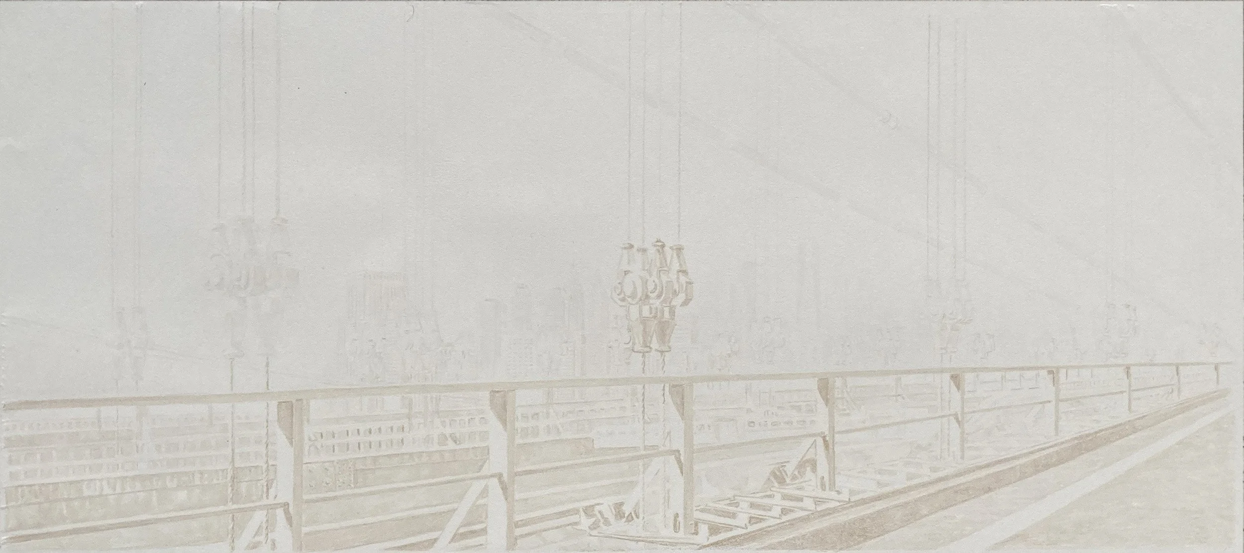
This is the reverse side of the paper I used for the soft ground, you can see where the brown, waxy soft ground is absorbed into the fibers. The transferred ground on the paper looks subtle, but the next image reveals how the drawing etched.
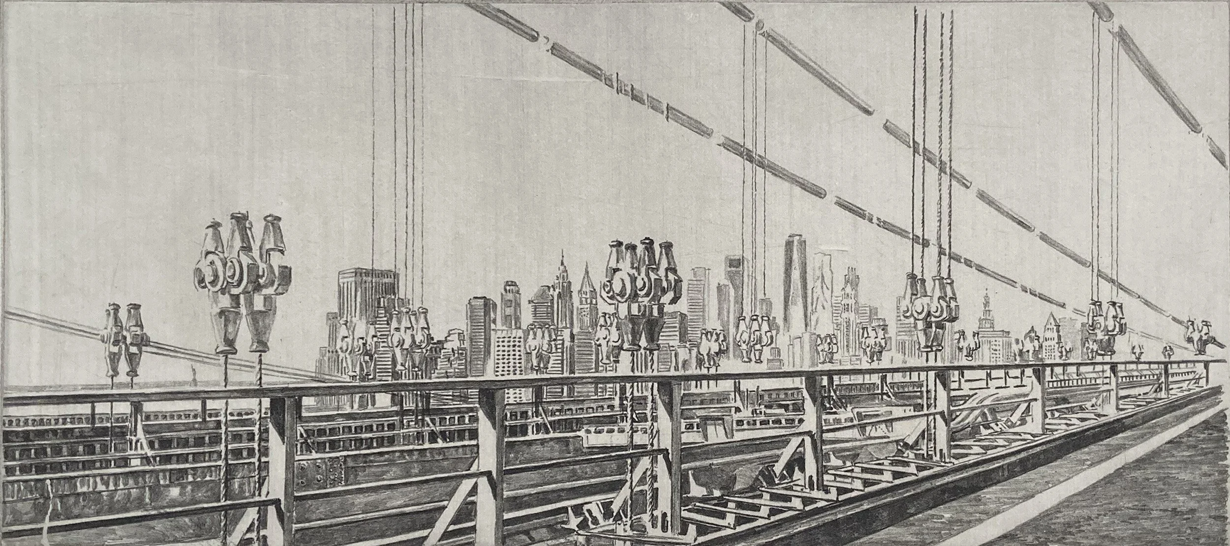
The pressure applied with the pencil, along with the length of time the plate is exposed to the acid, determines how dark the image will print. Soft ground allows the artist to create an intaglio print with the direct, expressive quality of a drawing.
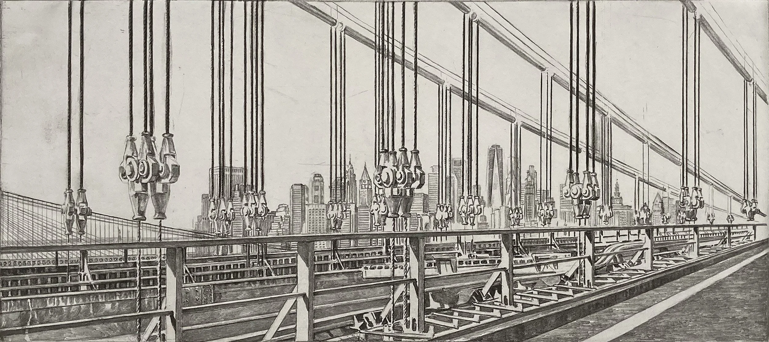
The cables were created with line etching and I felt they were too heavy and dark.
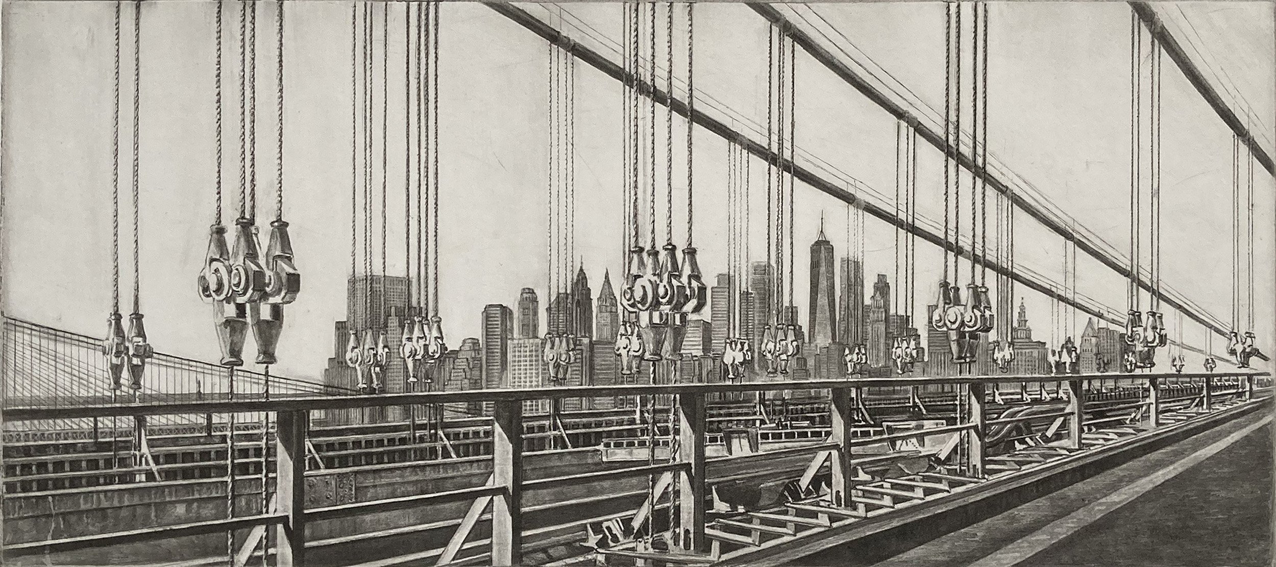
It took a lot of work to scrape down the dark cabled in the sky but I decided I wanted to put tone in the sky so I could capture light hitting the cable.
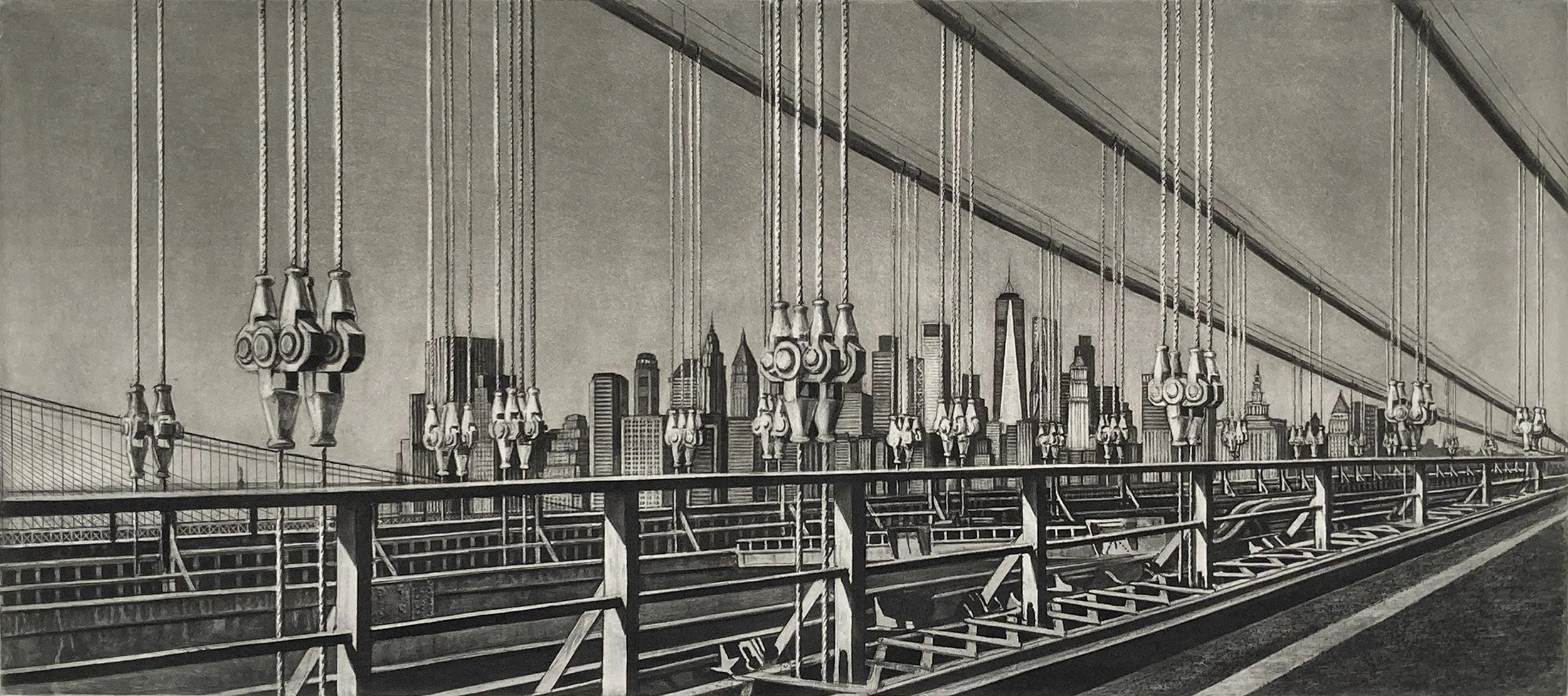
Aquatint was added to the sky to create the effect of sunlight falling across the cables.
In the original World Trade Center drawing, I was responding to the vertical boxes of the towers. In the new image, the composition draws attention to the triangular form of One World Trade Center and the triangular shapes found throughout the bridge structure.
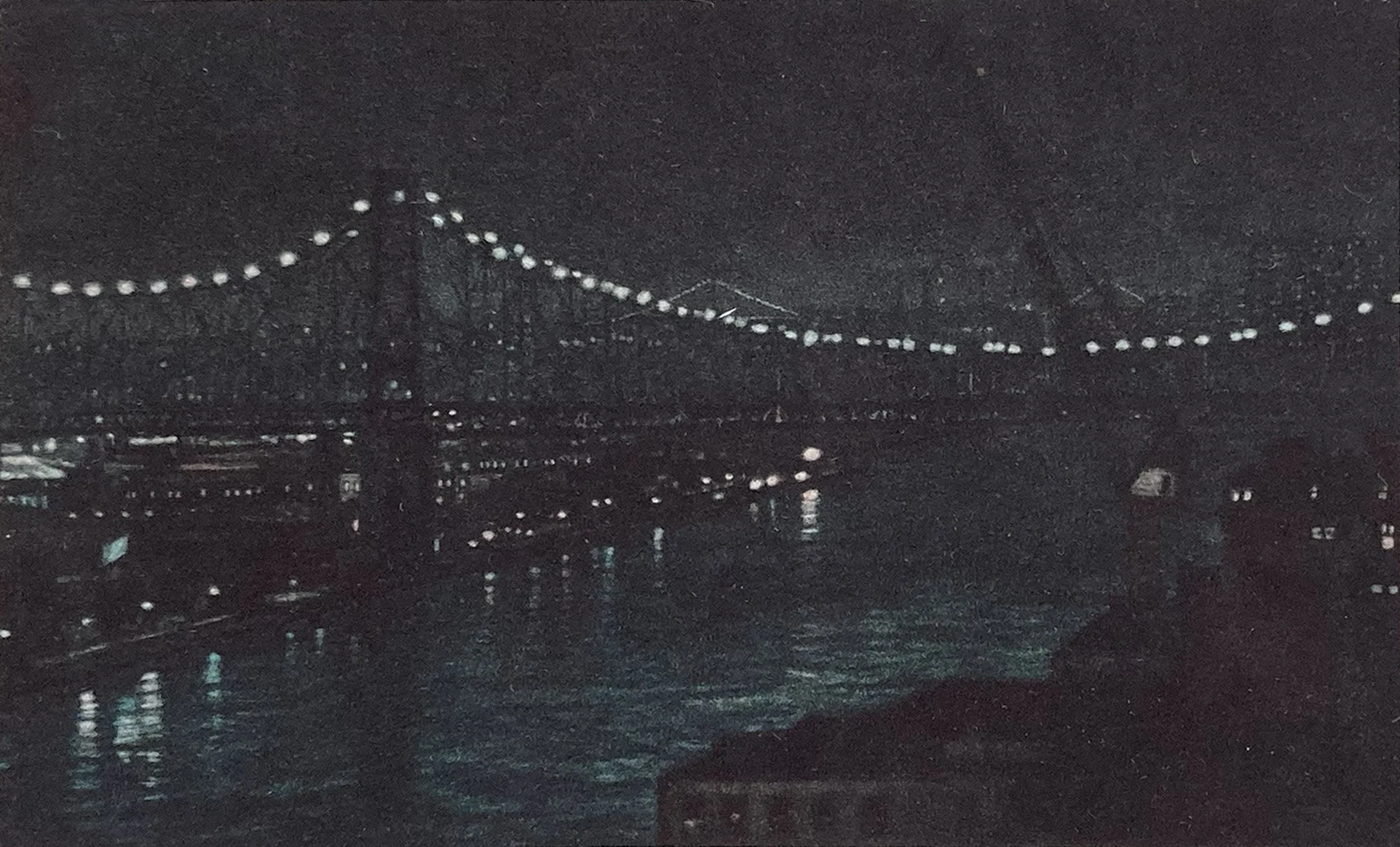
The print of the 59th Street Bridge at night is shown in the order in which it is developed, from dark to light. This is the first proof.
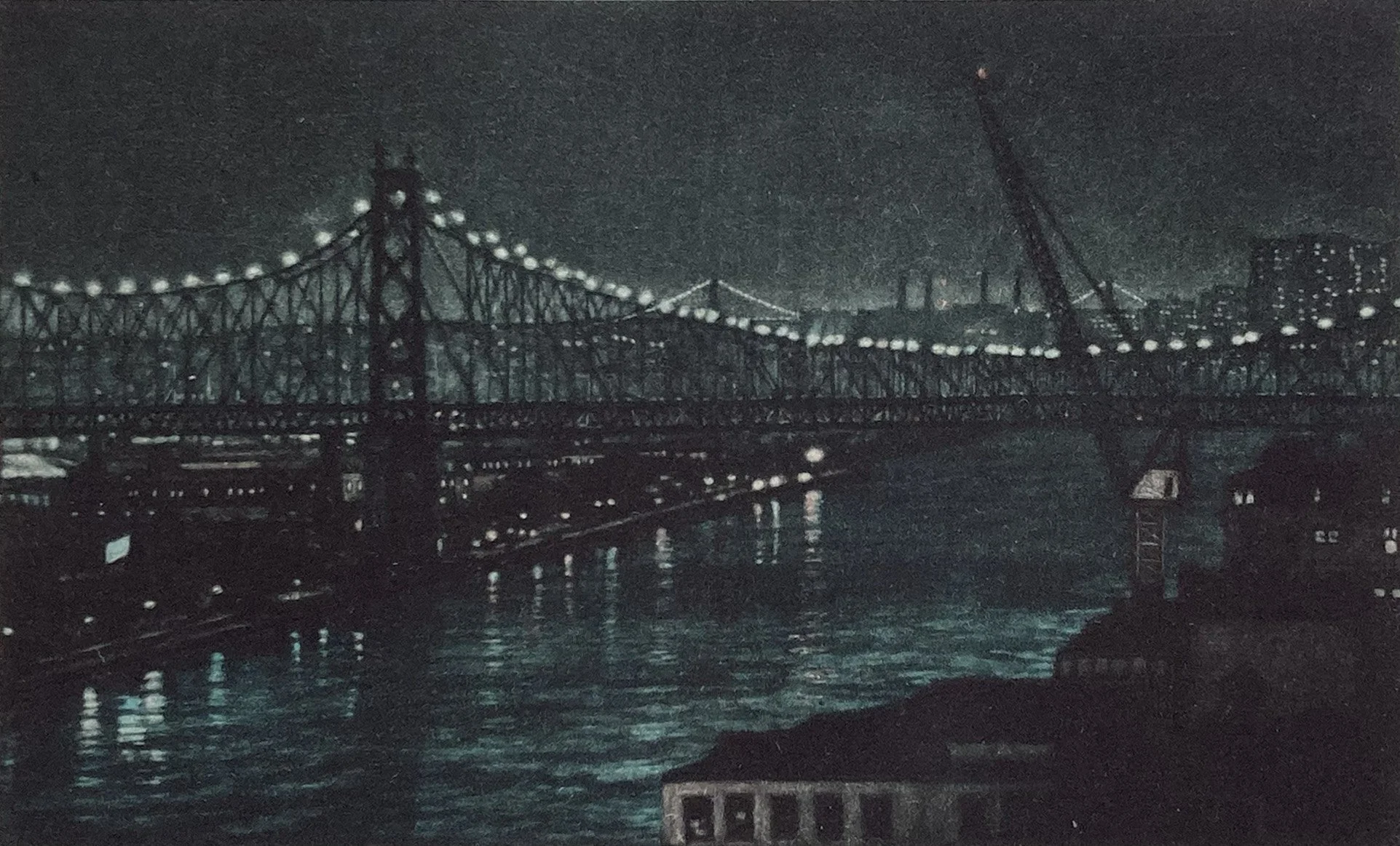
This is the second proof of the 59th Street Bridge at night .
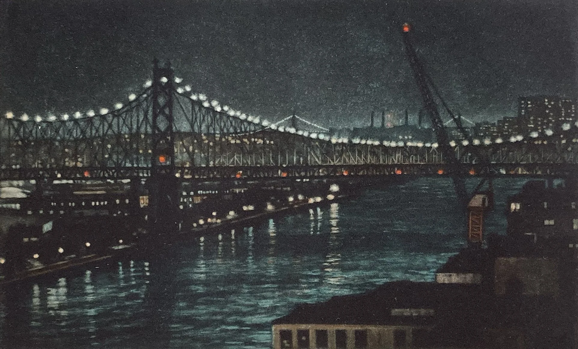
This is the final proof of the 59th Street Bridge at night.
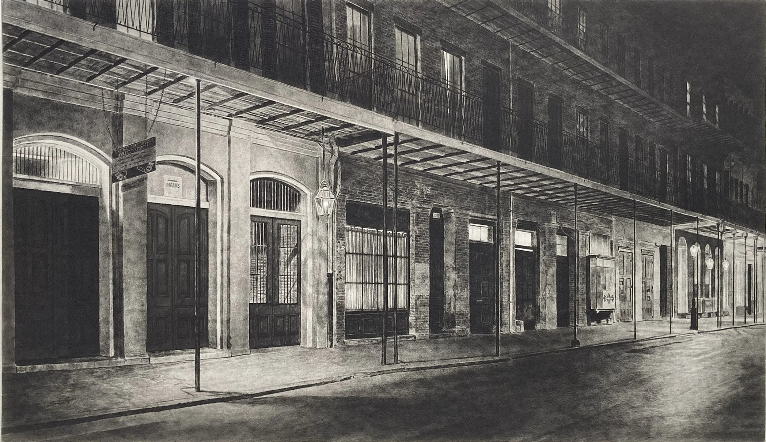
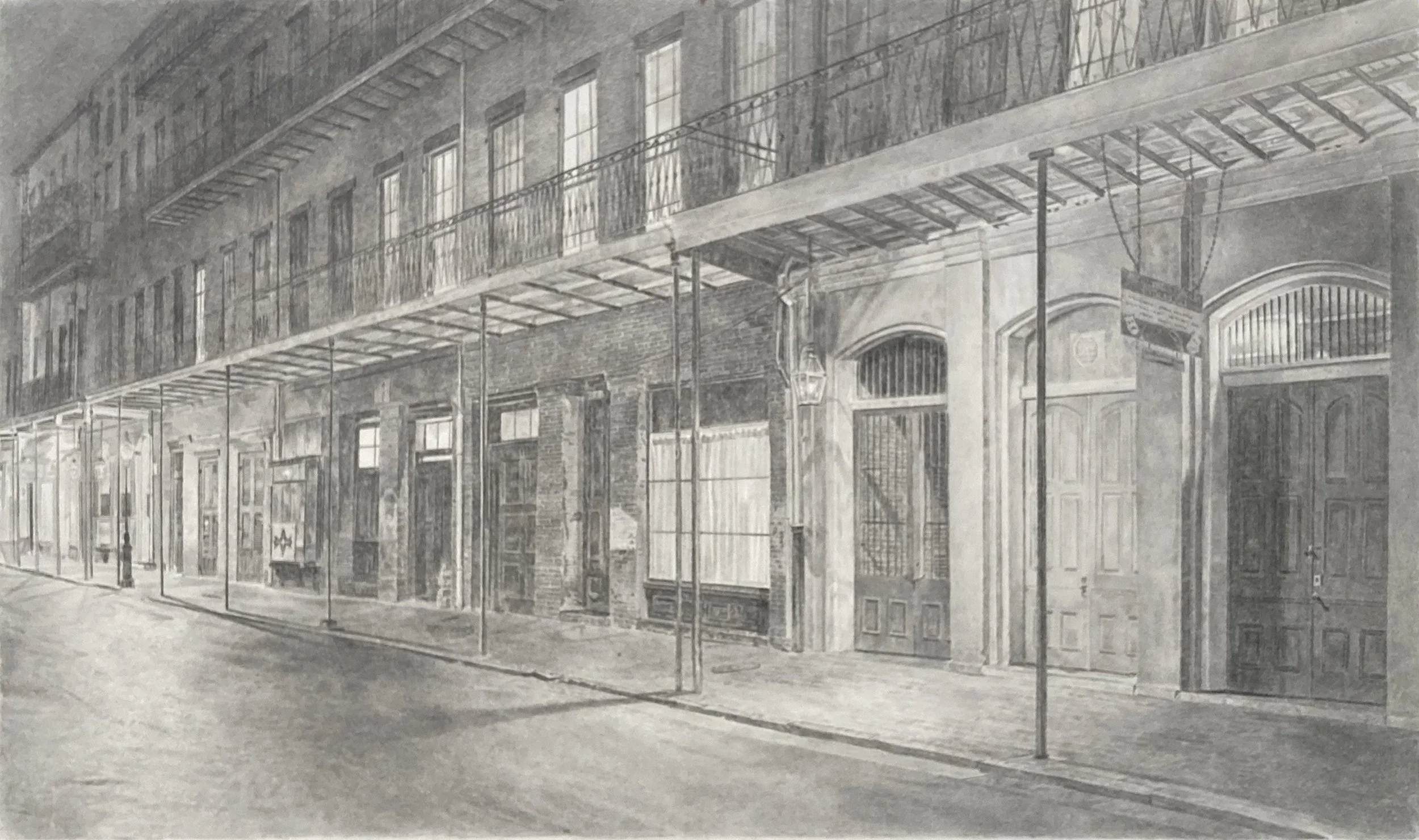
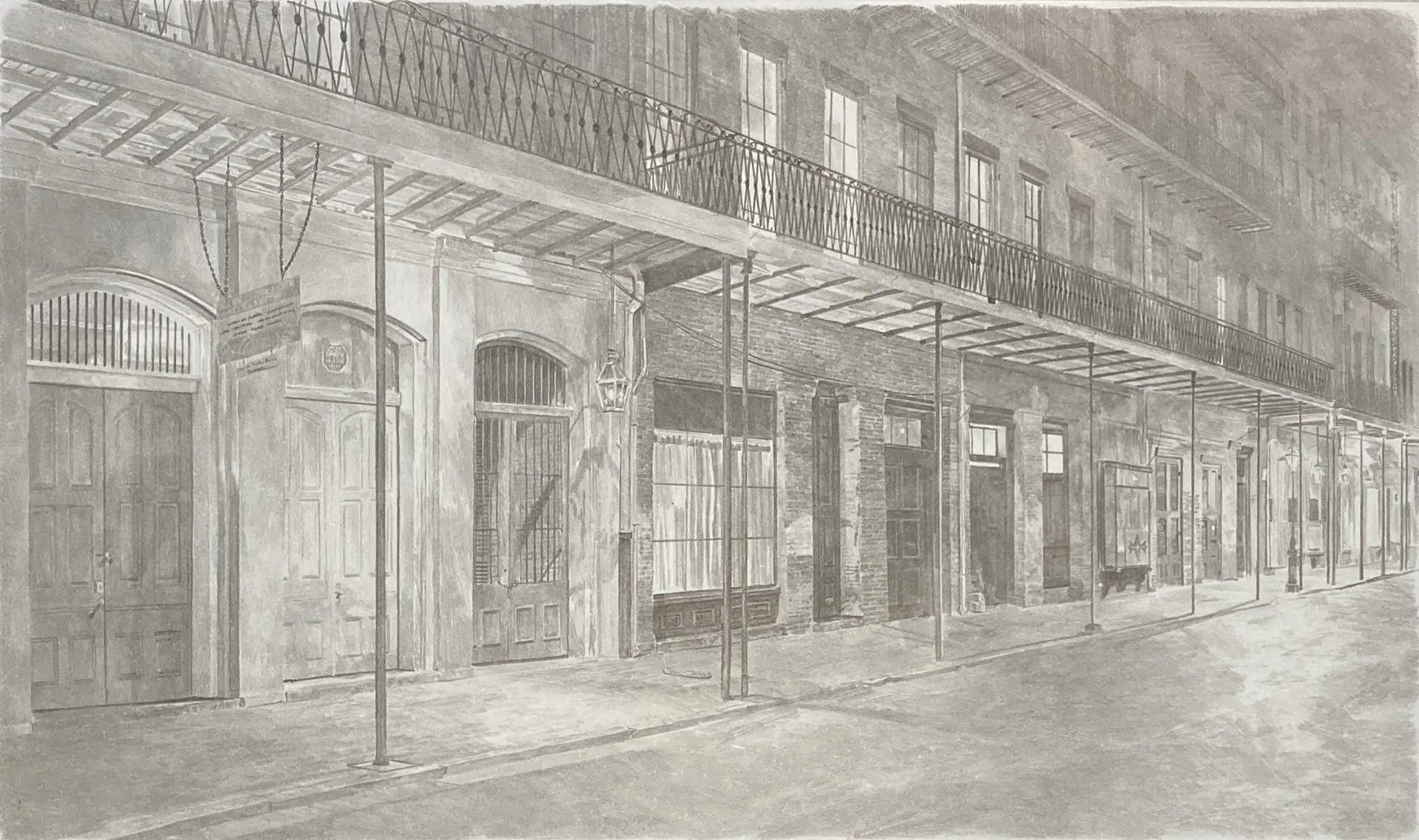
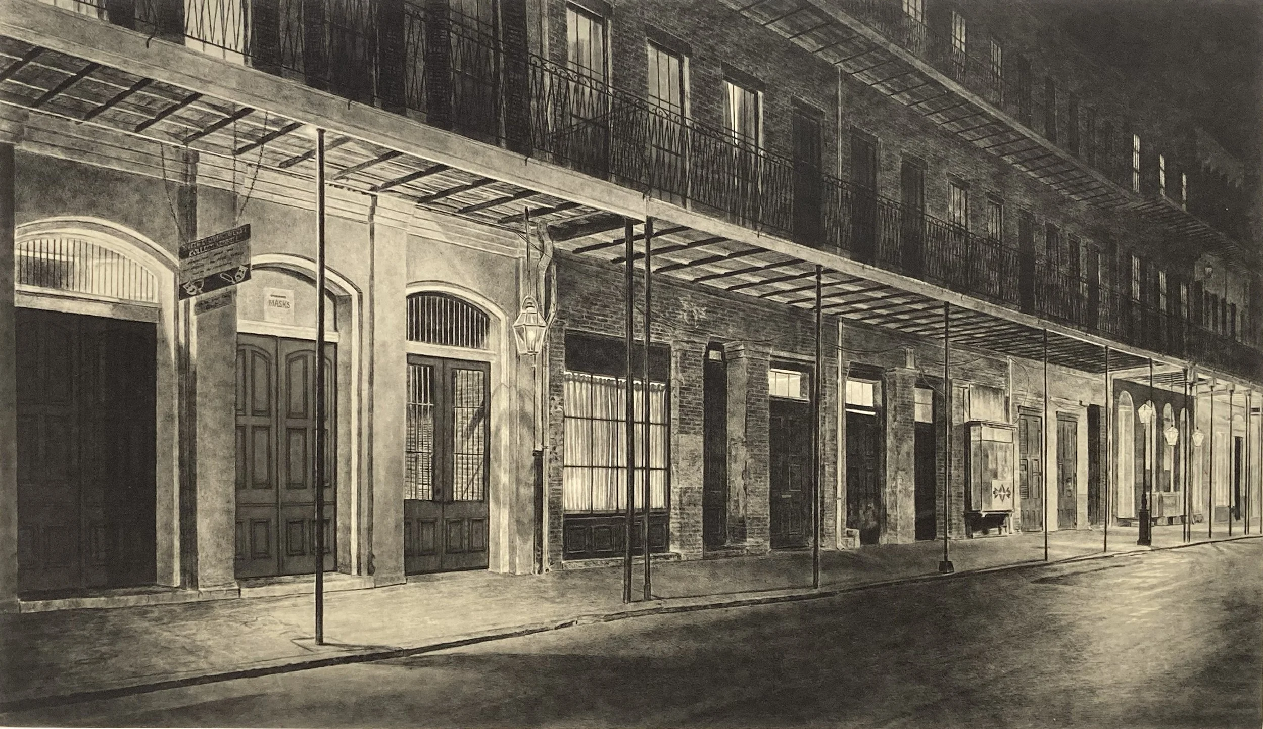
A mysterious New Orleans evening scene on the 800 block of Chartres Street. The street is empty, but lights glow behind the closed doors, suggesting activity just out of view. This is the second of three gravure editions I have made.
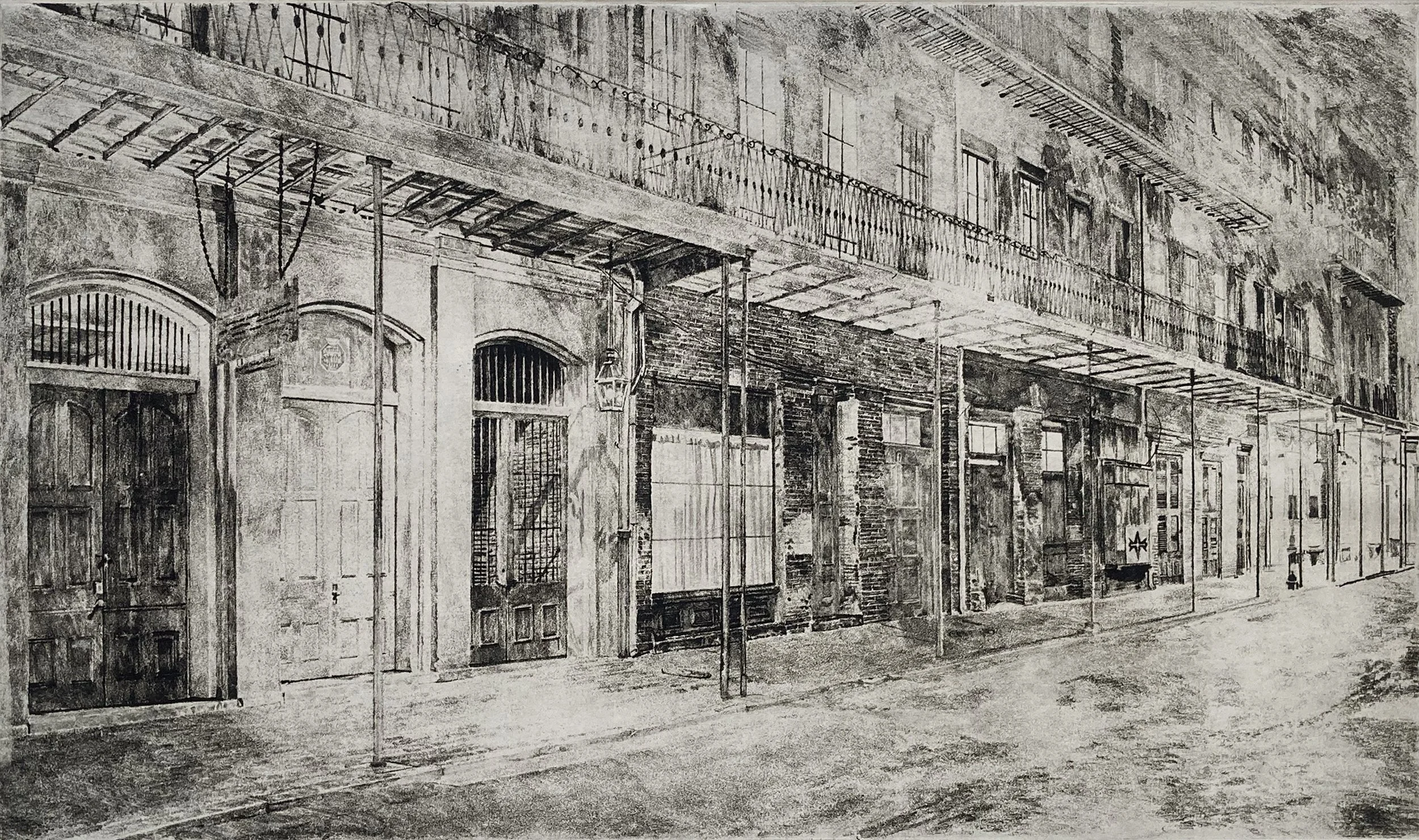
This print began as a soft-ground etching, but I was very disappointed with the result and decided to start the image over using the direct gravure. The next few images show soft-ground proofs.
The pencil marks were used to create the image through the soft-ground etching process. This is the same technique used in the making of the Cable print.
This is the same sheet of paper as the previous image. This side was against the soft ground, creating the image by absorbing the waxy ground. The previous side was created by the pencil.
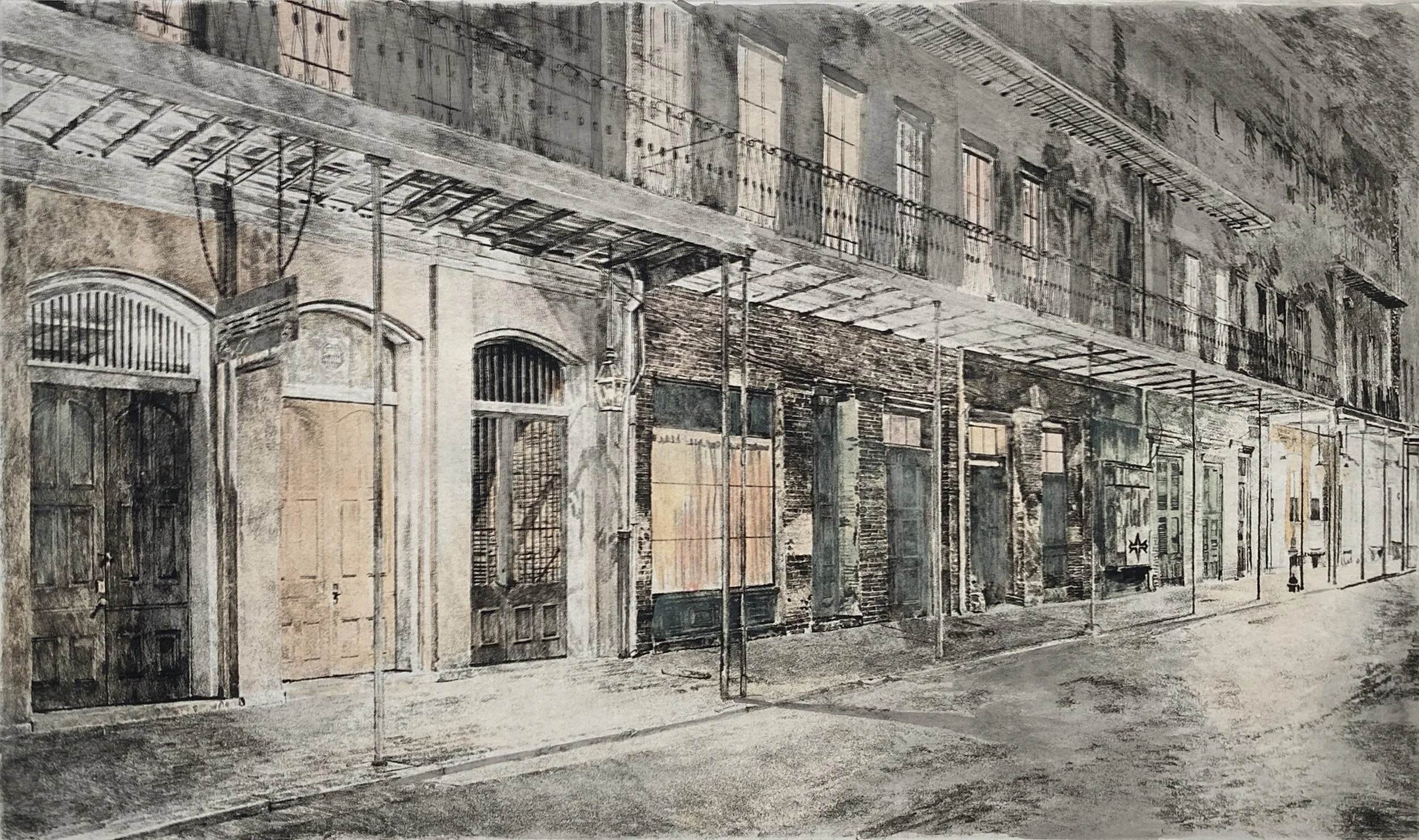
This is a hand colored proof of the soft ground proof.
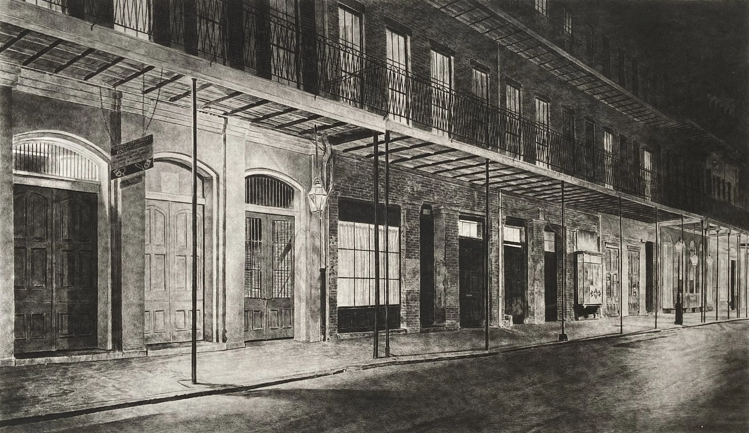
After abandoning the soft-ground version, I reworked the composition and started the image again using a different technique: direct gravure.
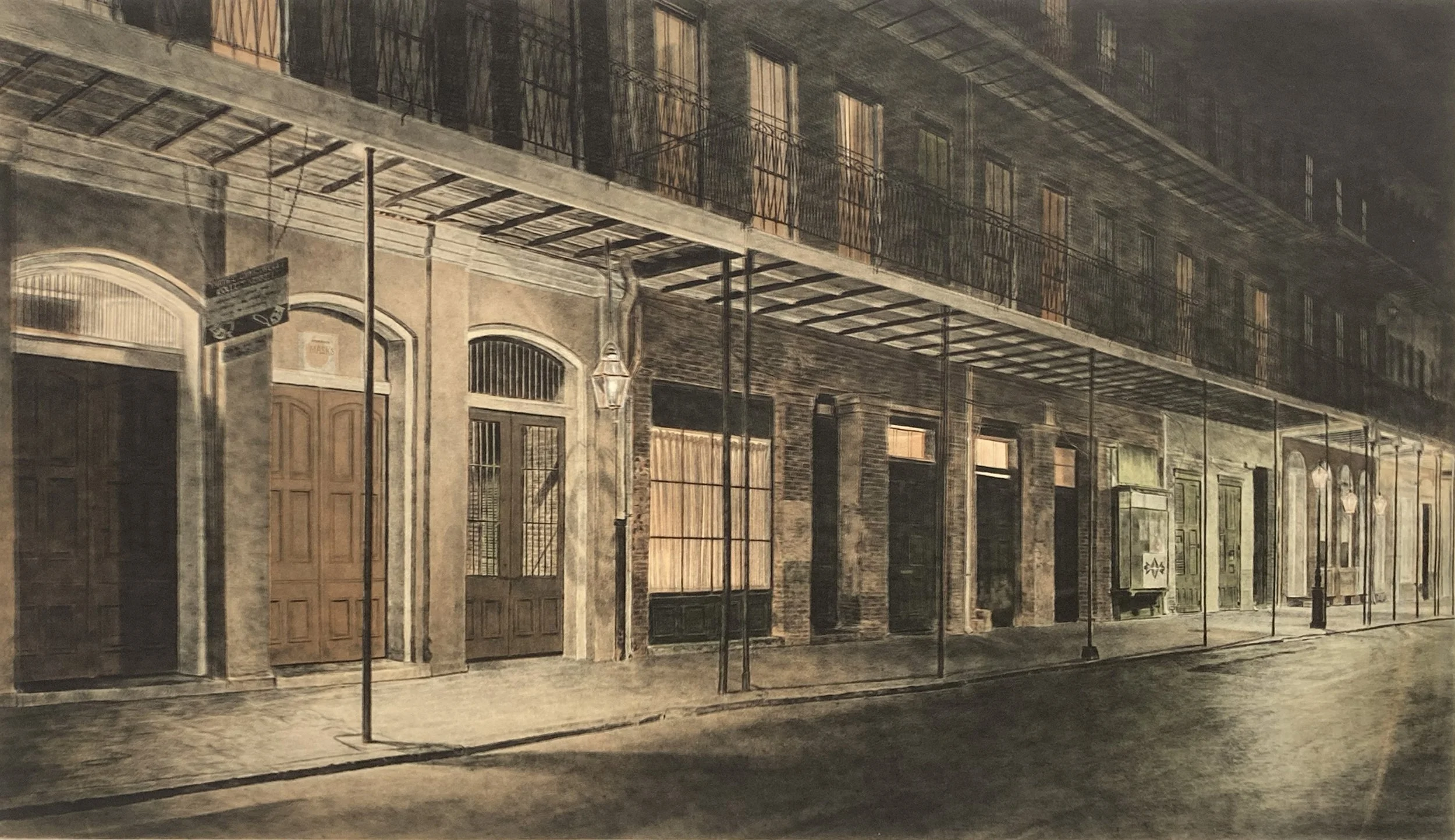
This proof was printed using two plates. The first is an aquatint plate, inked in multiple colors à la poupée and the second is the direct gravure plate, printed on top.
The proof uses a more cream-colored Chine collé than the one I ultimately chose for the final edition.
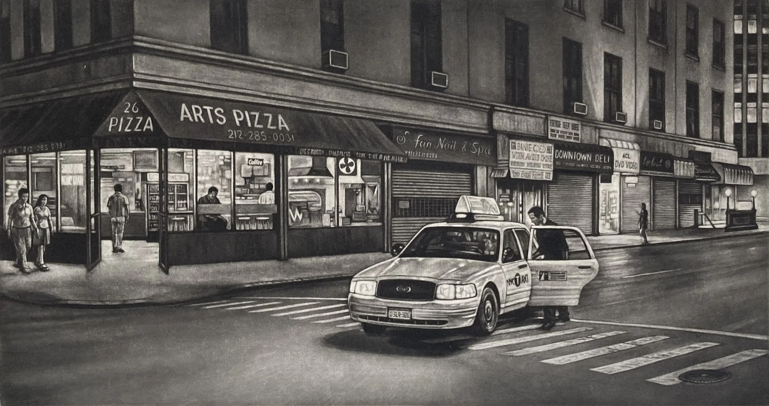
This mezzotint captures a slice of Manhattan nightlife, depicting a man getting into a cab in Tribeca.
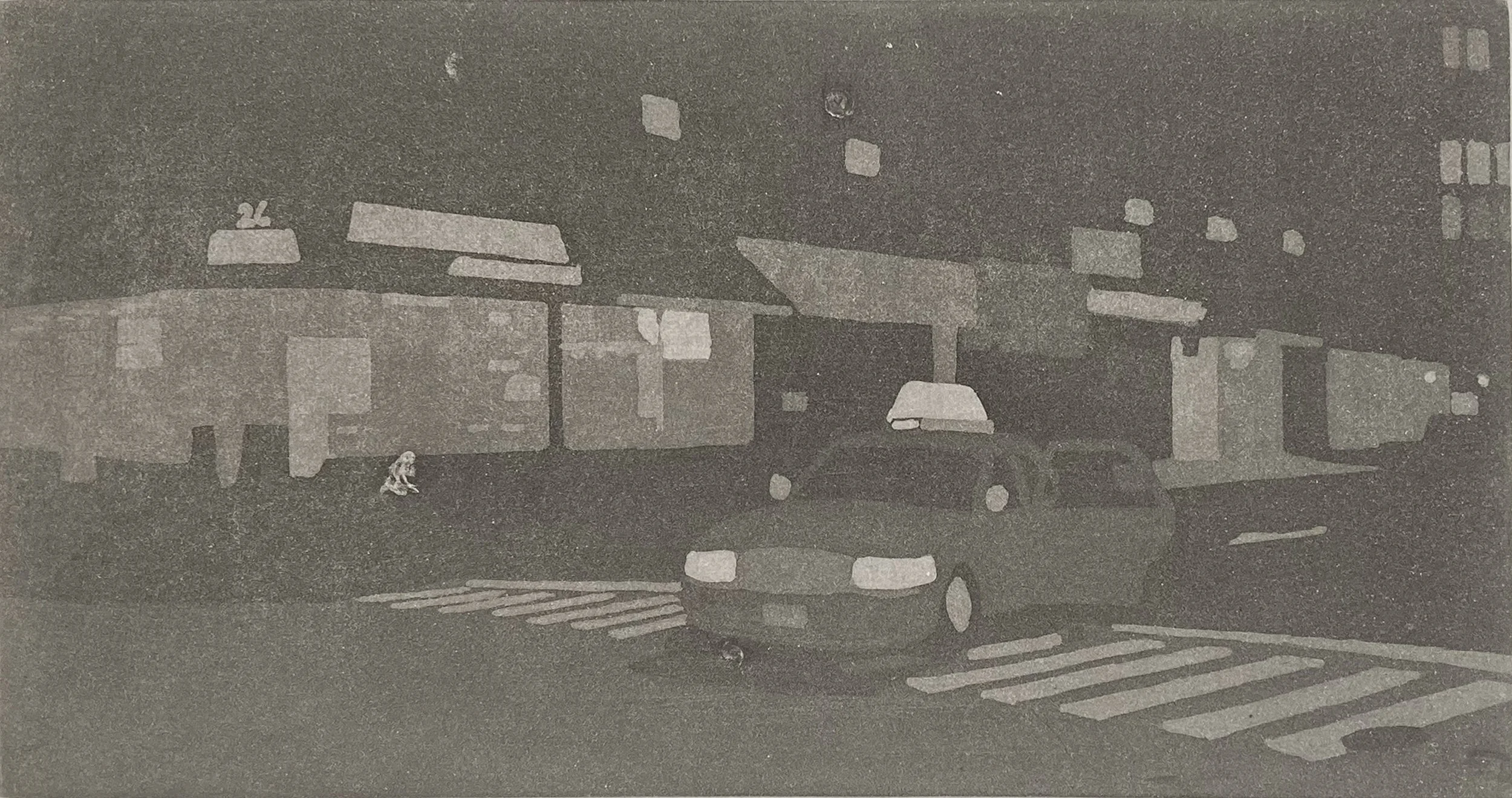
I designed this aquatint plate to print in light cream color ink to simulate the appearance of a chine collé. This avoids using thin chine collé papers, which lack the tooth needed to hold the heavy ink of a mezzotint.
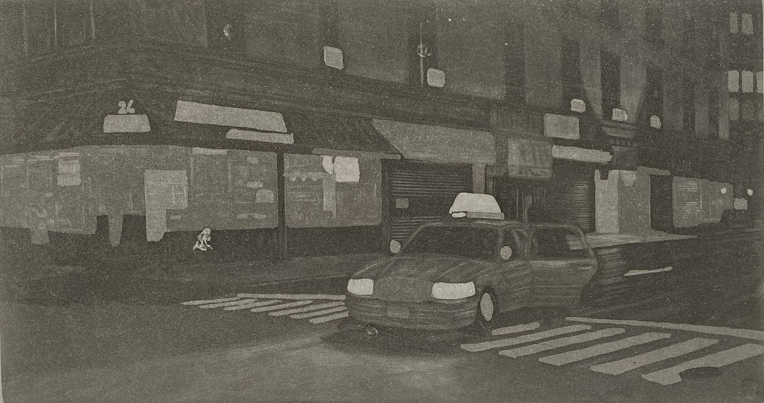
I burnished on the plate to pull out highlights out of the aquatint ground.
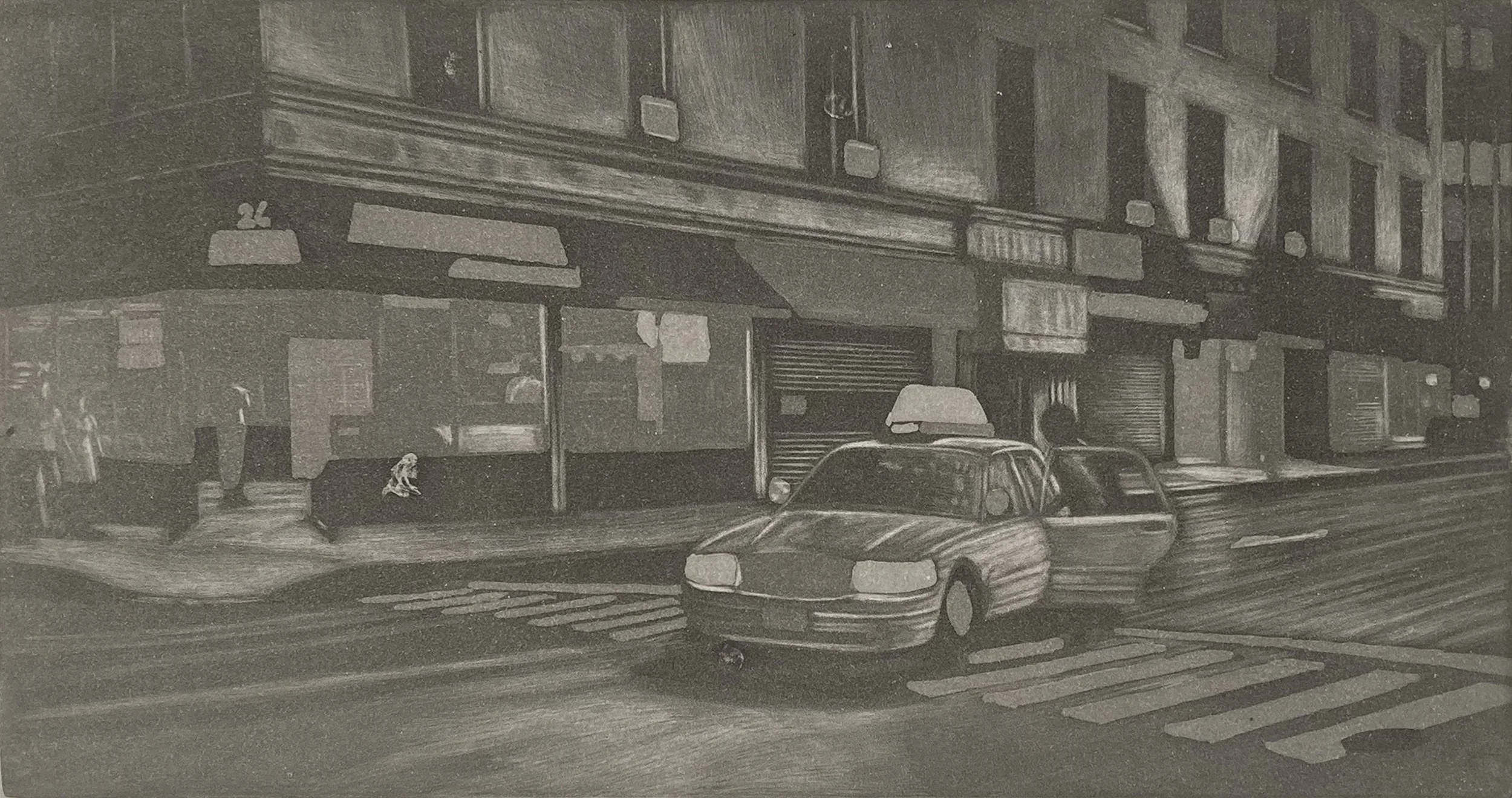
Further development of the highlights with my burnisher.
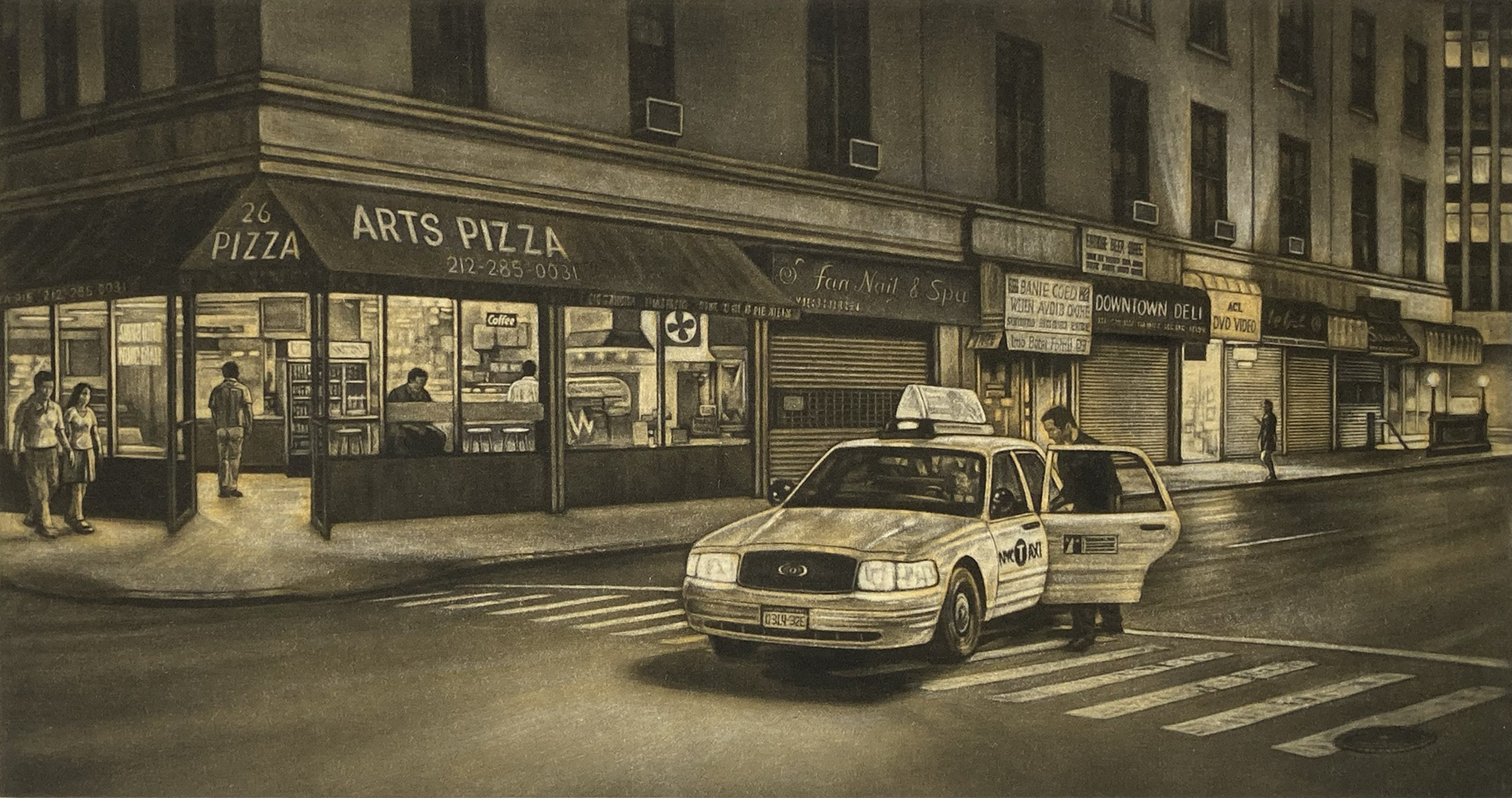
After Hours proof with the mezzotint and aquatint plates. After experimenting with different ink colors and transparencies, I decided to scrape the aquatint plate because it did not add to the film-noir quality established by the mezzotint alone. In the end, I used only the mezzotint plate for the final print.
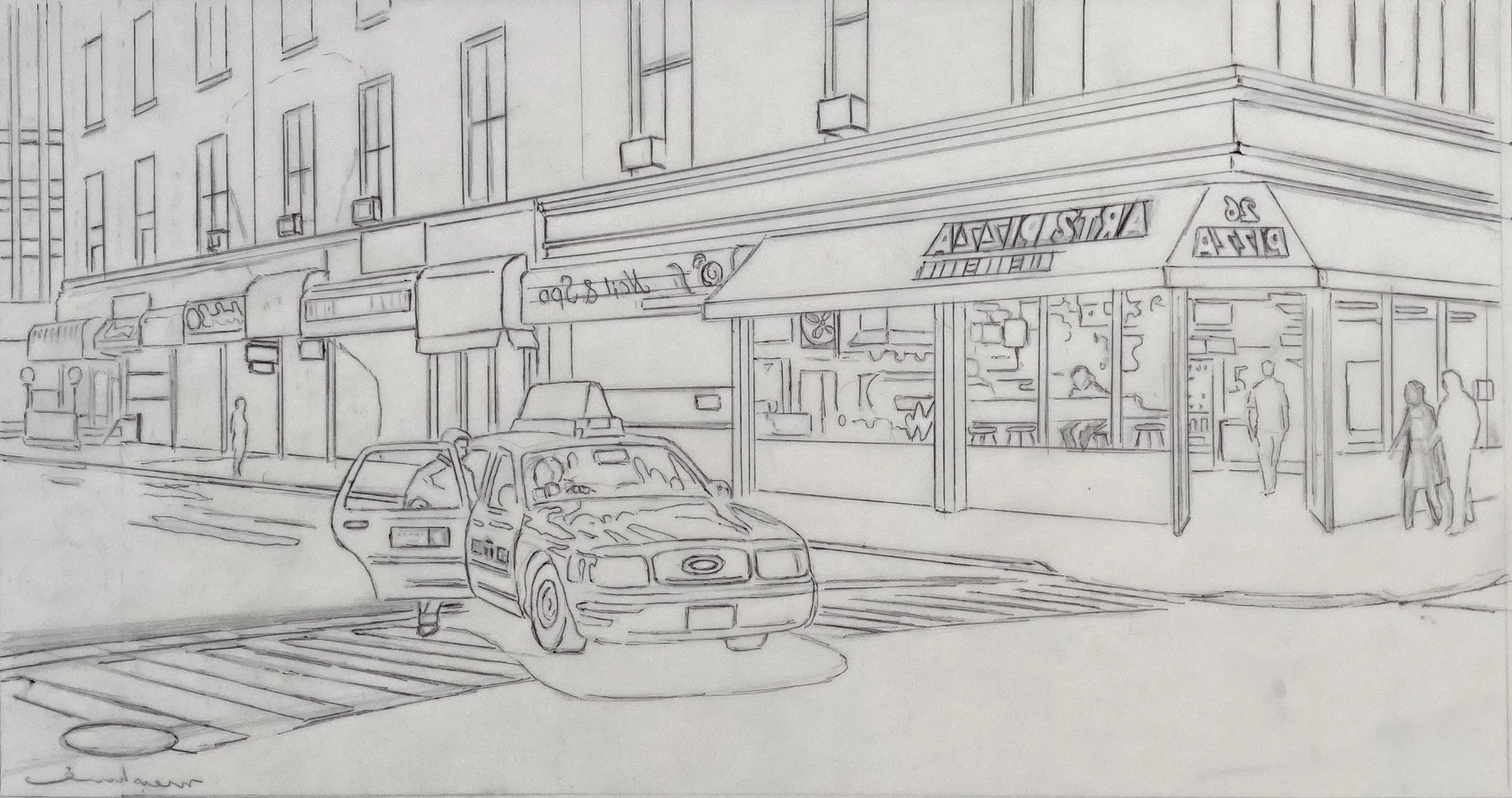
The tracing for After Hours is reversed because the finished print is a mirror image of what appears on the plate.
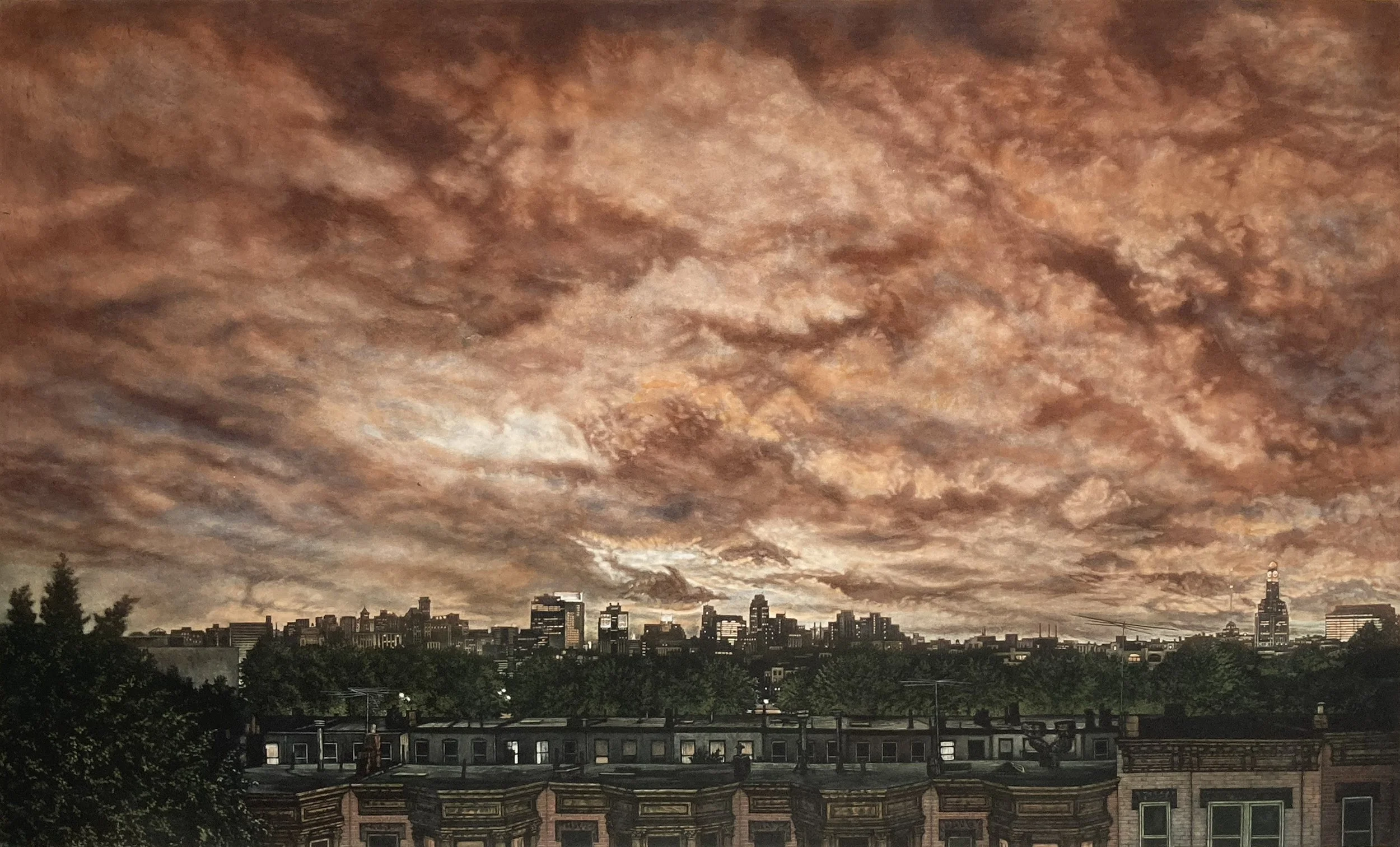
A scene of Hurricane Rita’s low cloud cover viewed from my Brooklyn rooftop. As the clouds rolled over the city, the skyscrapers of Manhattan pierced through the clouds, creating an amazing light show. There are three separate plates, each printed in two different colors.
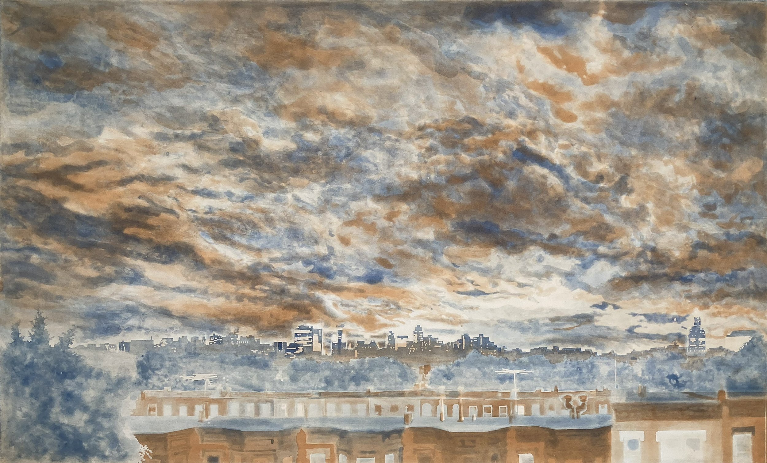
The first proofing of the first and second plate. Each plate is spite bite. aquatint.
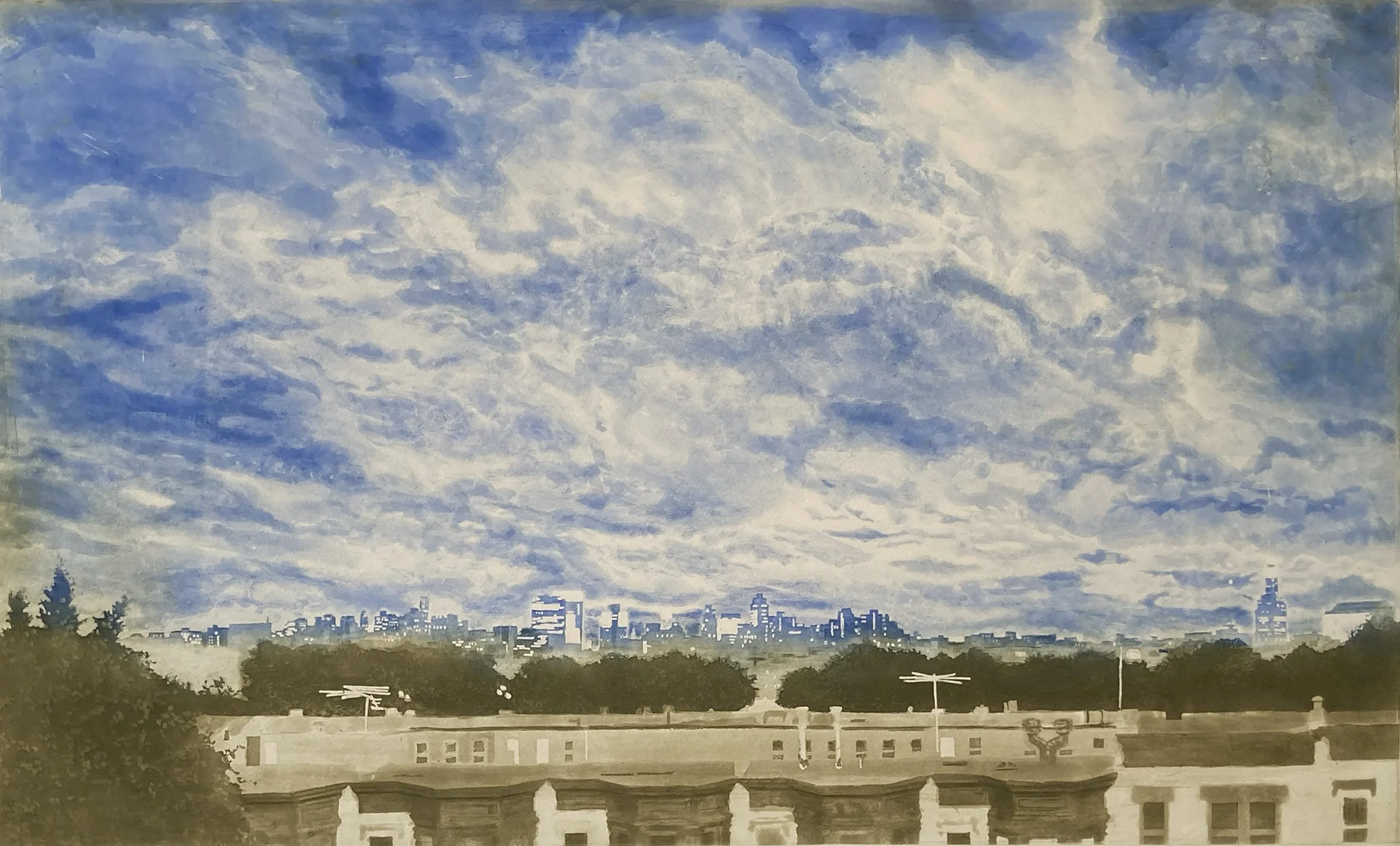
This is the second plate printed à la poupée using two colors: blue in the sky and olive green on the lower buildings.
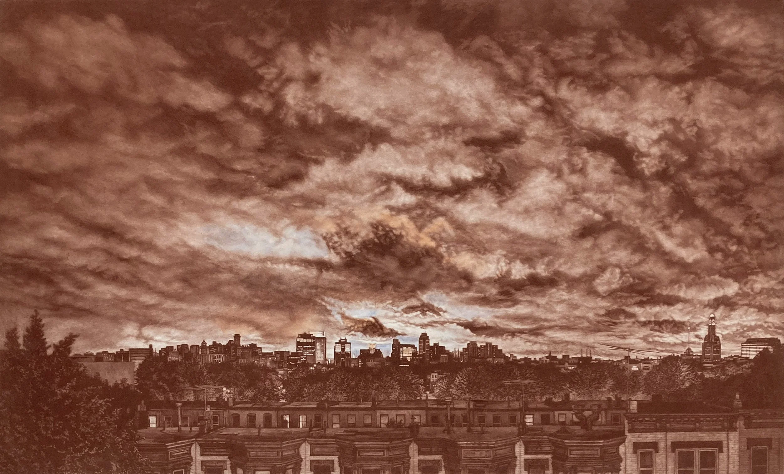
The first proofing of the mezzotint plate printed in just one color.

This print comes from the first proofing session and was printed with four different color mixtures inked in vertical bands. I rubbed a strip of blue ink across the sky with my finger to get a sense of how the mezzotint plate might print with the blue plate underneath.

In the second color proofing, I divided the plate in half and inked each half with different colors so I could more efficiently figure out the best path forward with the image.
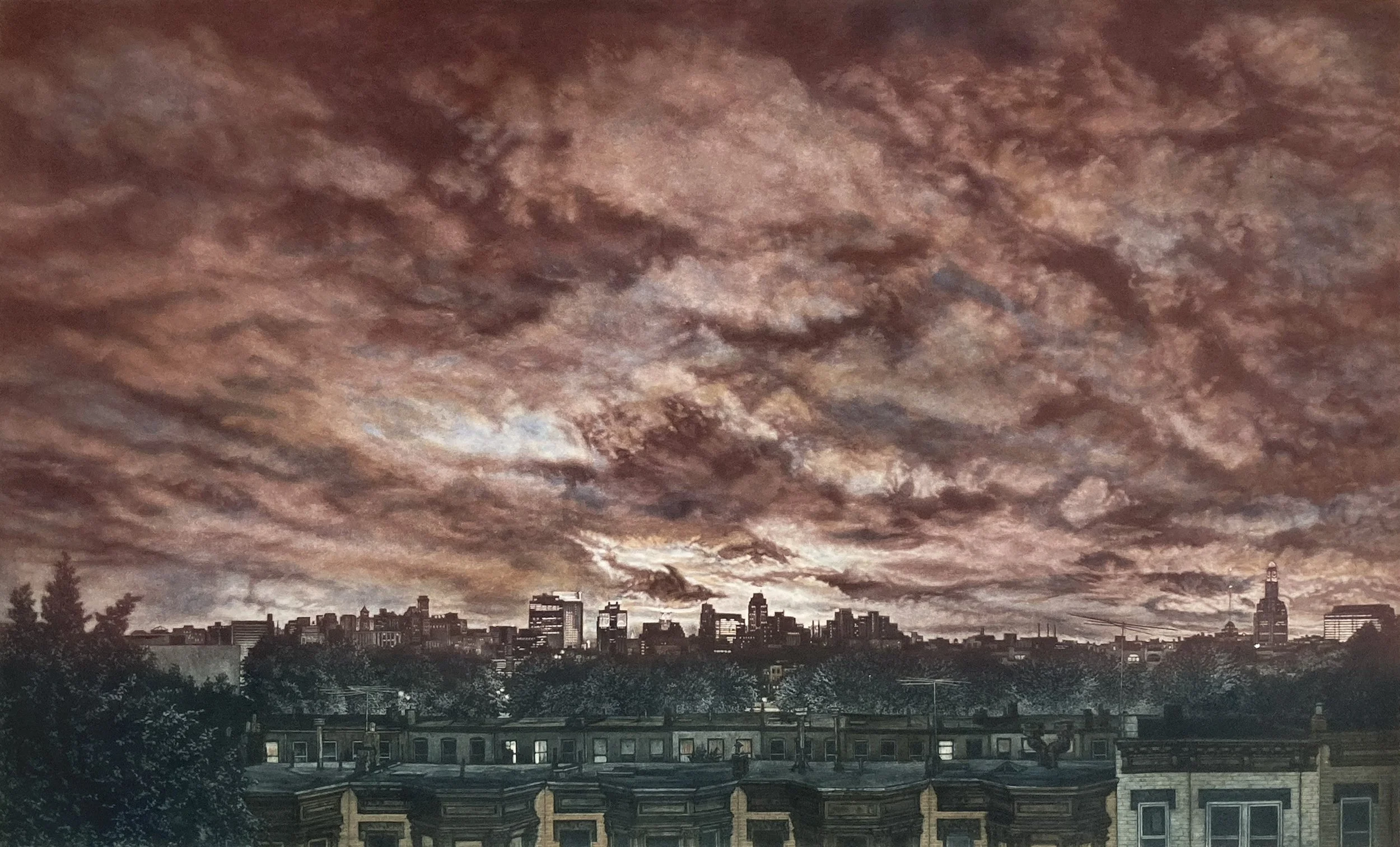
This is from the second proofing and the first attempt at à la poupée inking on the key plate.
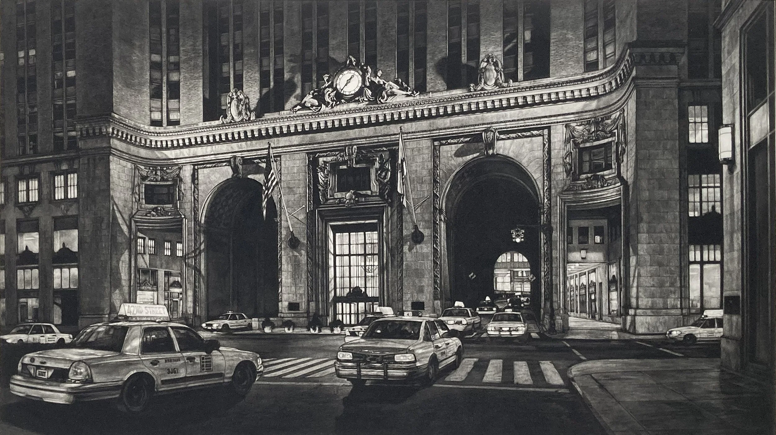
Mezzotint print of hurried cabs on Park Avenue heading into and out of the passageway beneath the Helmsley Building.
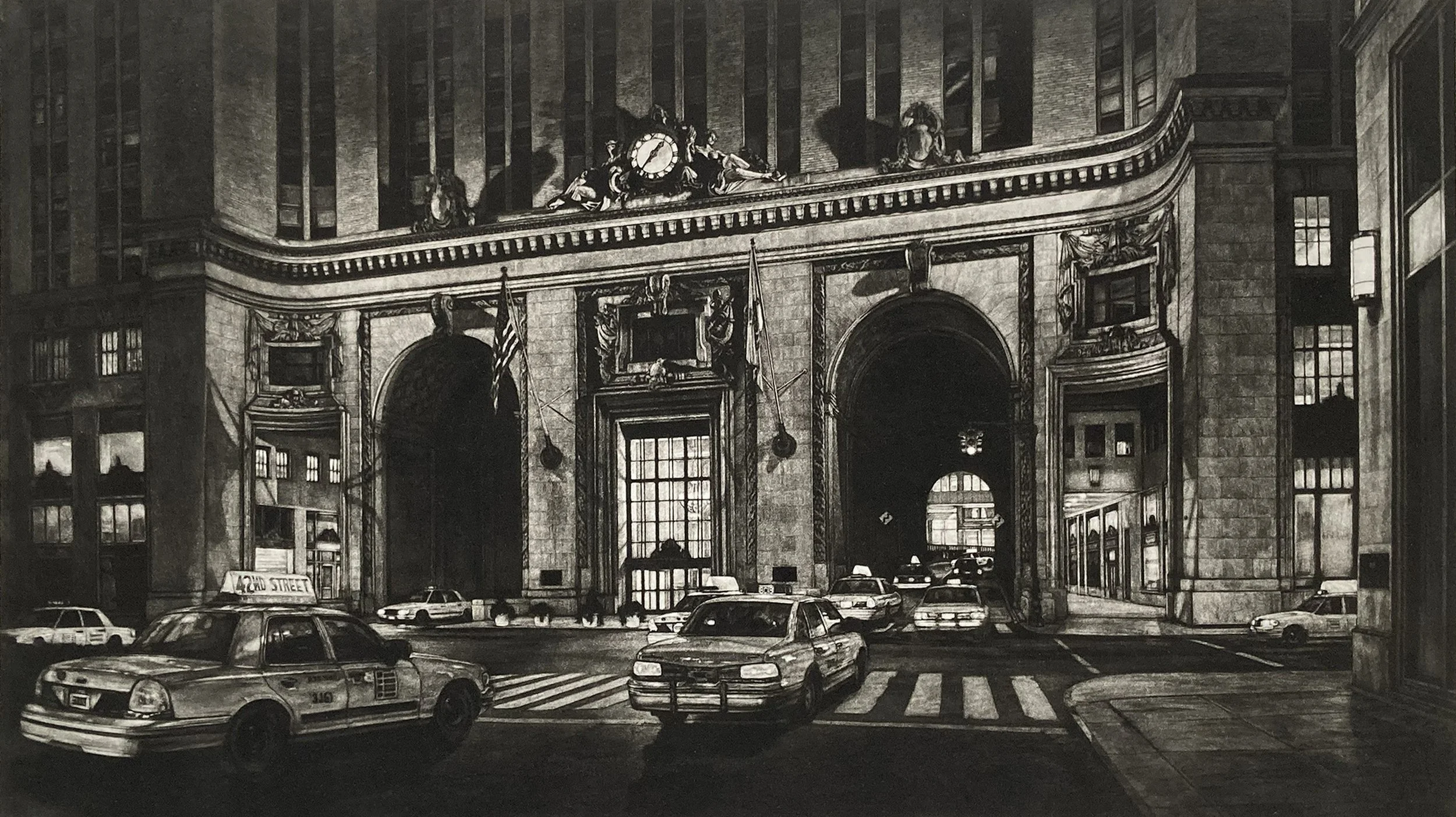
The first proof of Gateway is somewhat dark overall, with the far-left side of the building less fully developed.
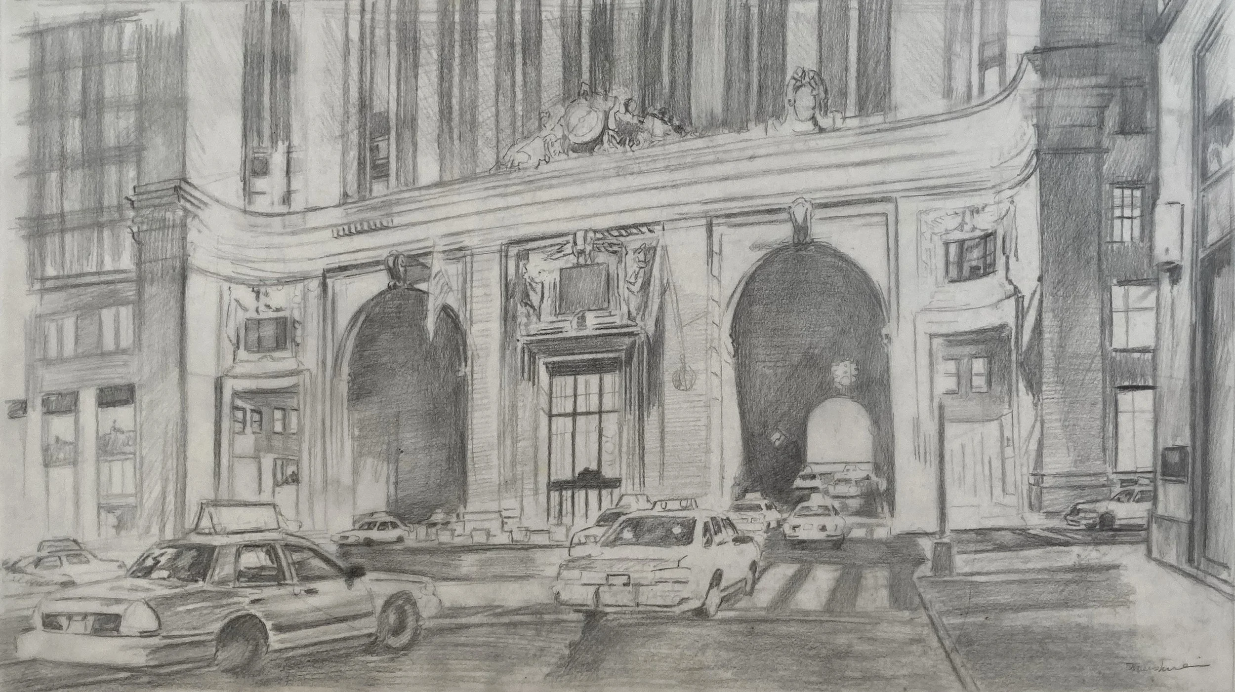
A sketch on tracing paper blocking out the image. I worked out ideas on tracing paper because I can flip it over and see the image in reverse, which is the orientation needed for the plate to print correctly.
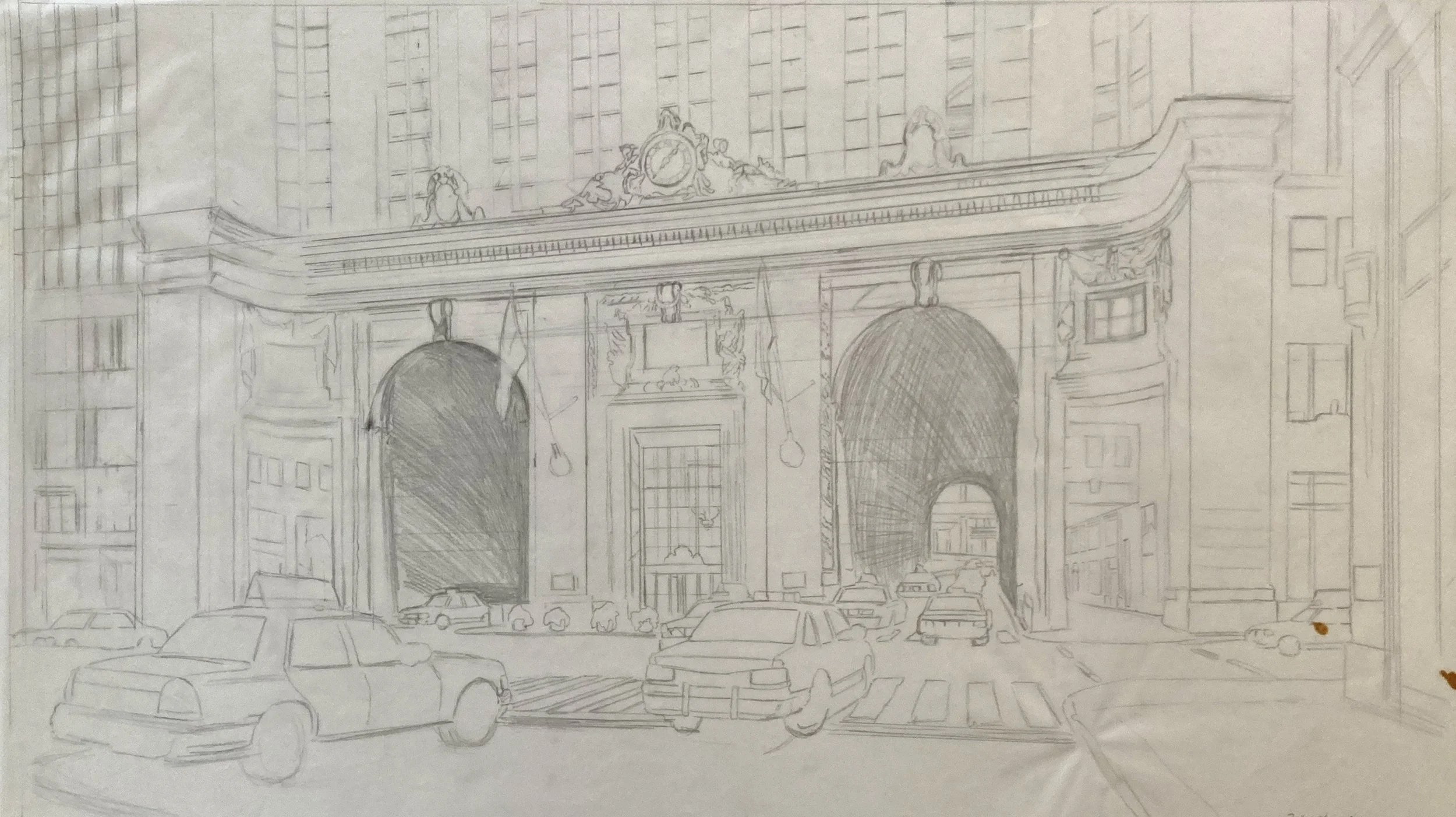
In this sketch, I further developed the composition and perspective, trying to capture the amusement park feeling I had when I first went through the tunnel in a cab.
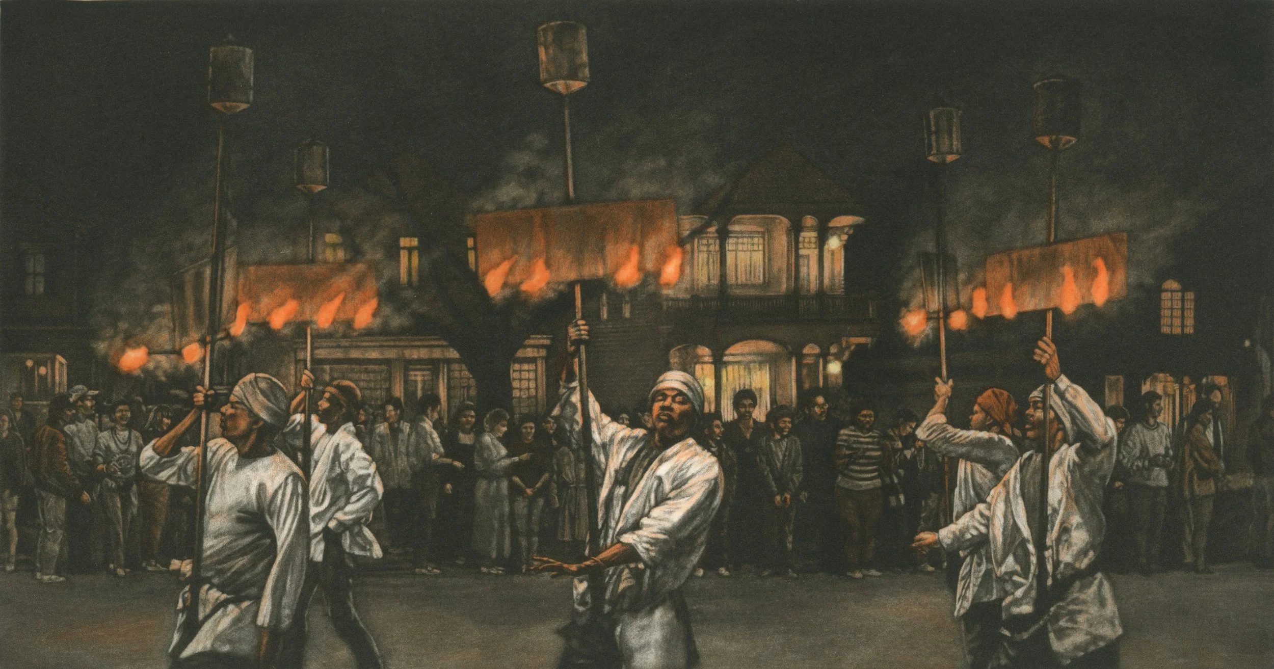
Mardi Gras prints featuring flambeaux illuminating the parade with open flames. These are old-fashioned flambeaux with cans of kerosene on top of the poles.
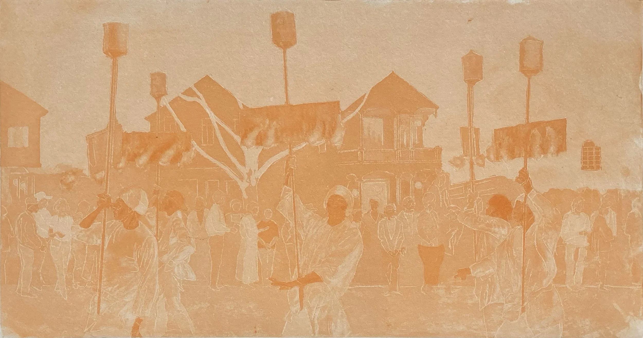
First proof of the Fire Dance orange plate. Transfer lines are visible in the proof of the men carrying flambeaux.
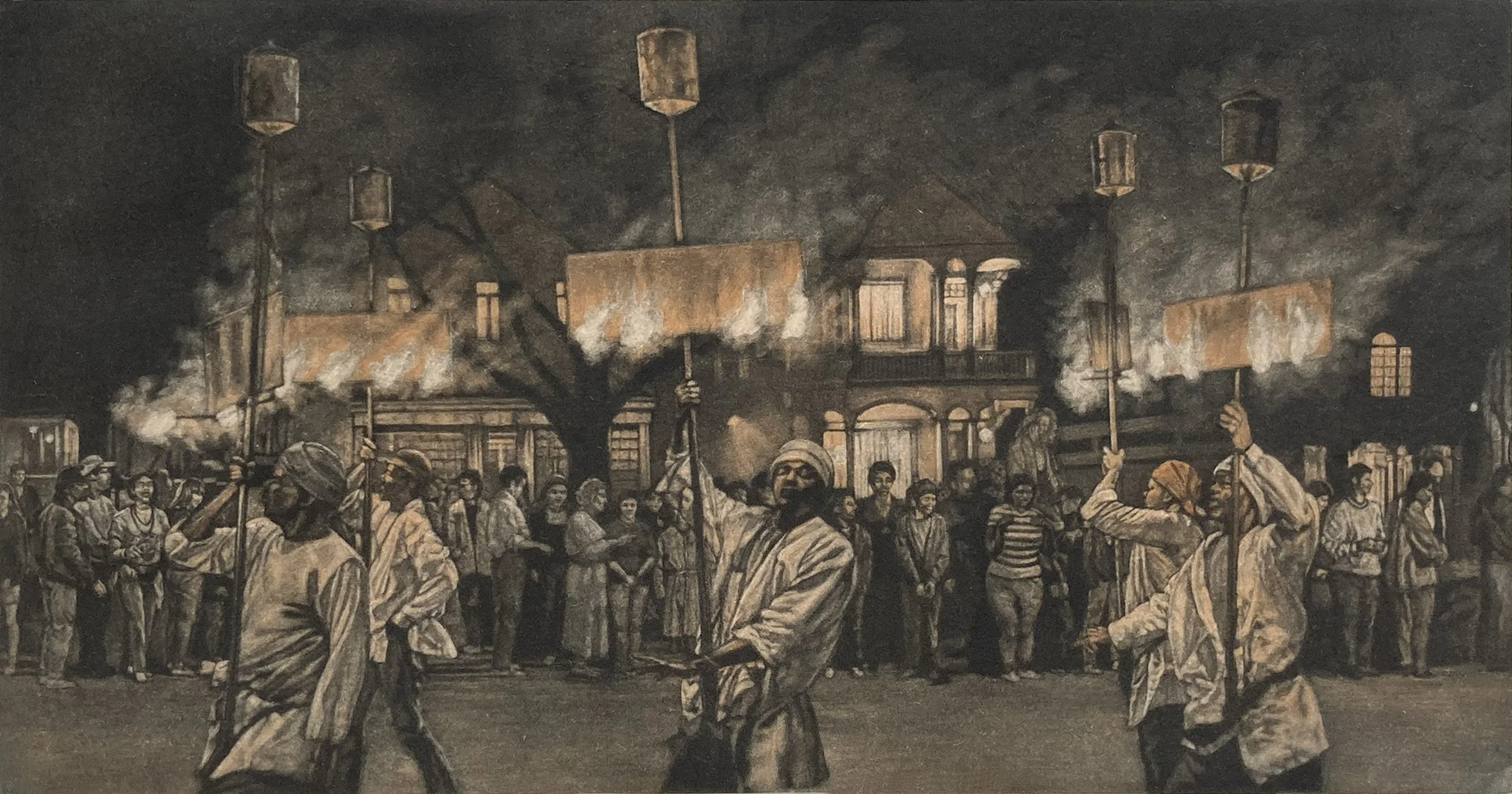
First proof of Fire Dance. The orange coloring is rather pale in this first proof and does not capture the feeling of the fire.
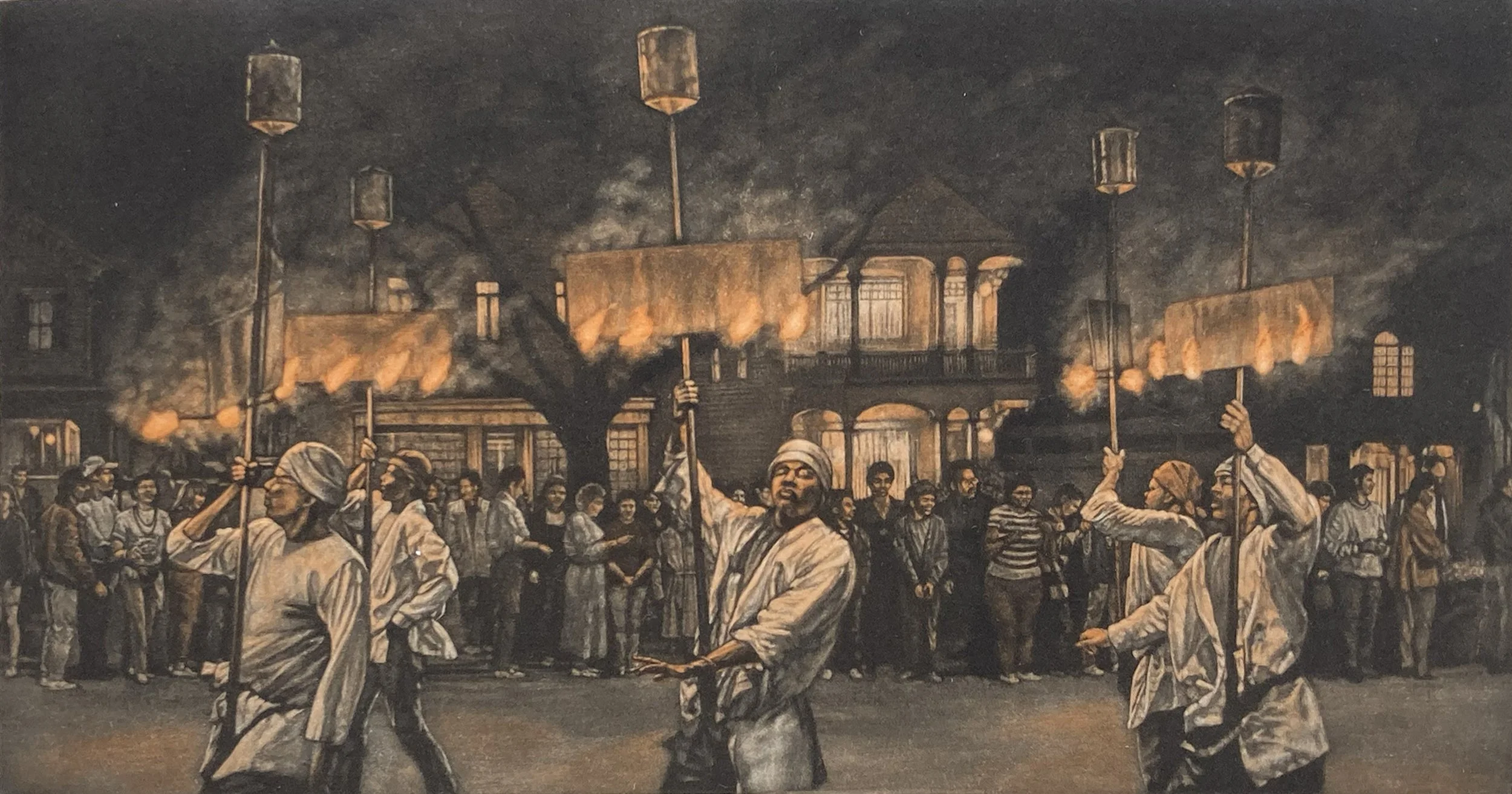
The orange coloring is stronger in this proof of Fire Dance.
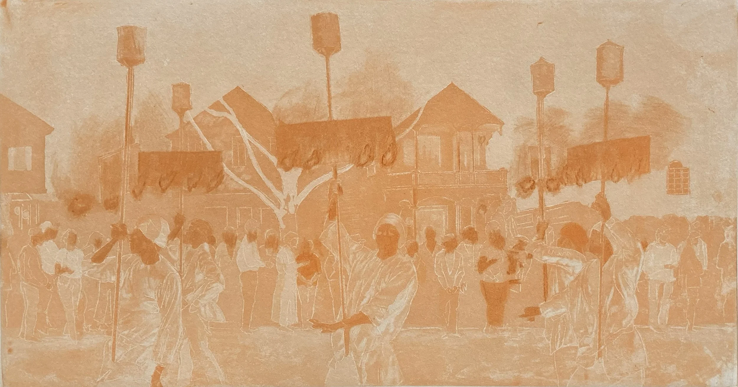
Third proof of the Fire Dance orange plate. Before this proof, I used a drypoint needle to pierce the plate and raise high burrs to better capture the feeling of flames.
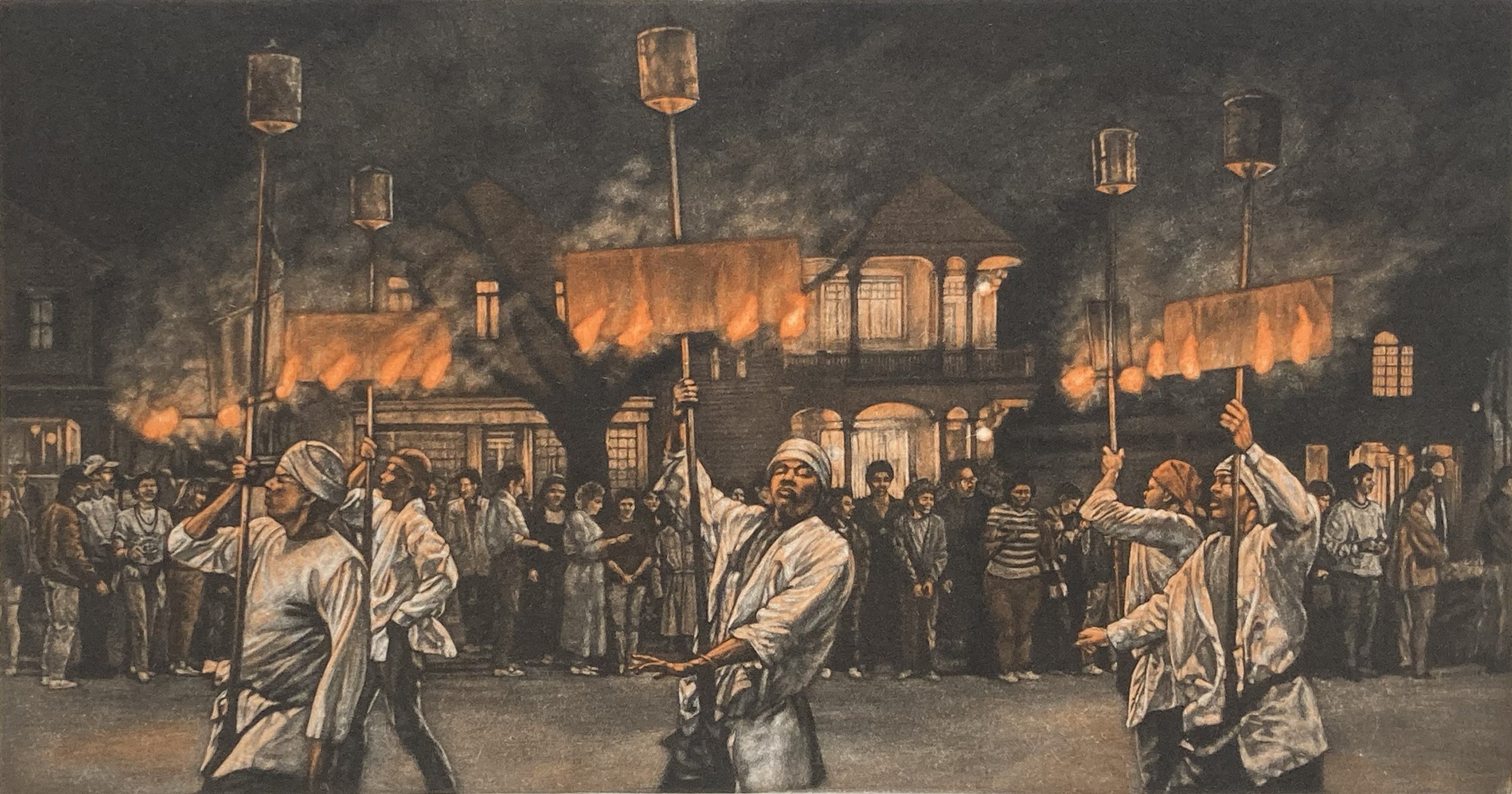
This proof was getting closer to catching the strength of the fire.
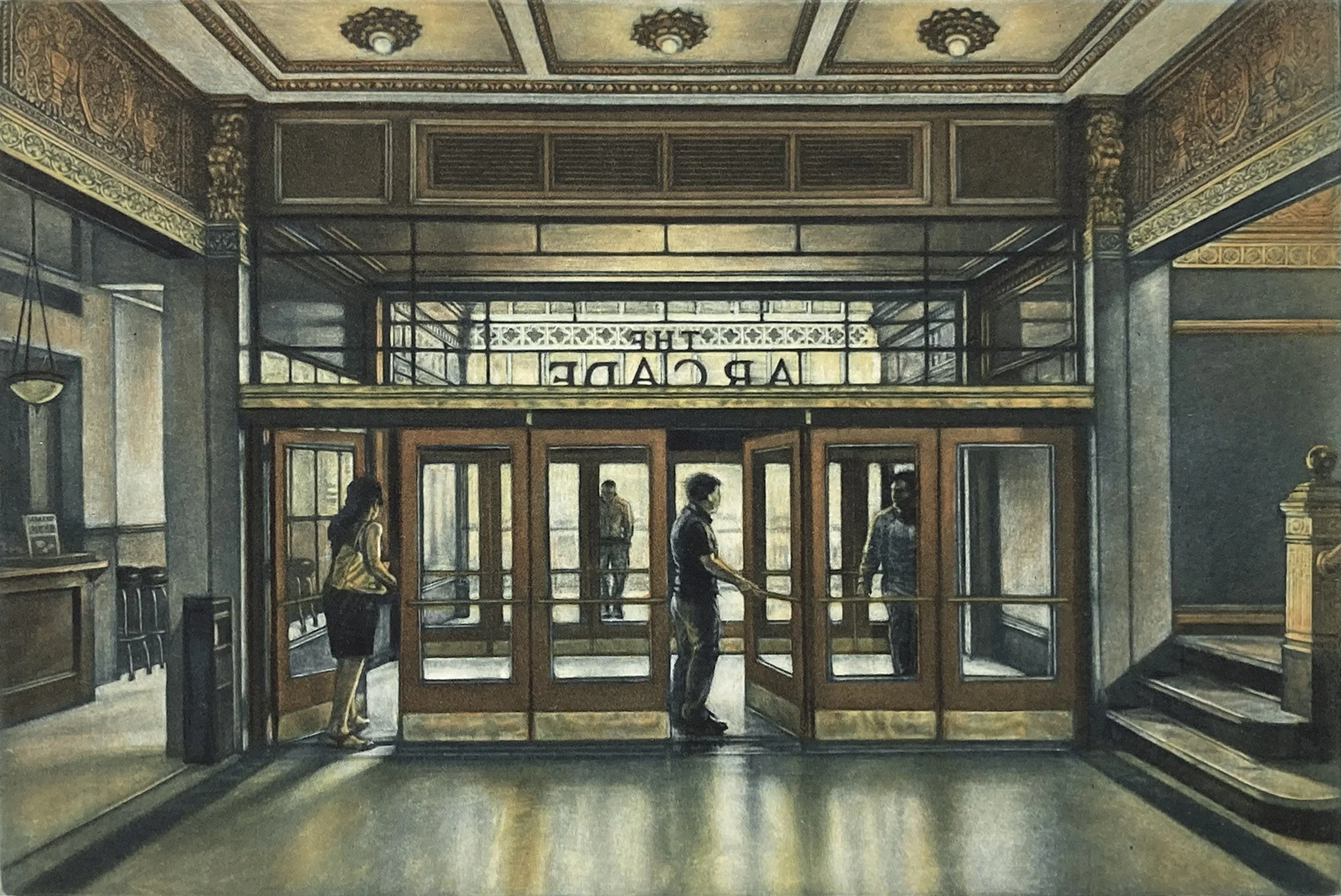
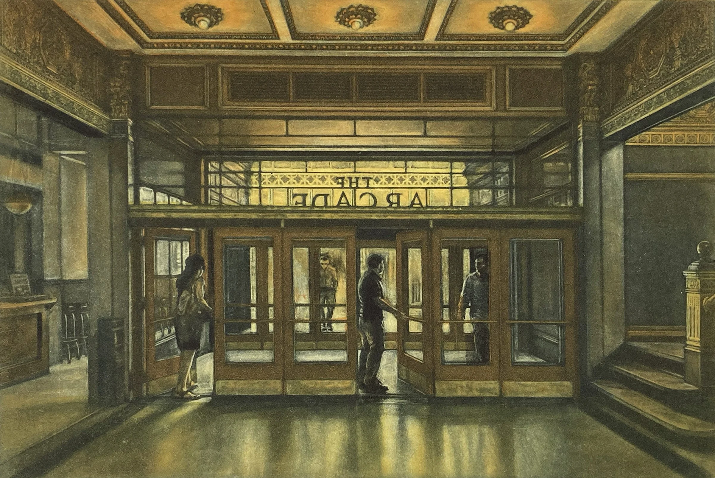
The interior view of the lobby of the Arcade Building in Cleveland. The building is known for its grand five-story arcade with a glass skylight, but I was captivated by the figures entering and leaving the entrance.
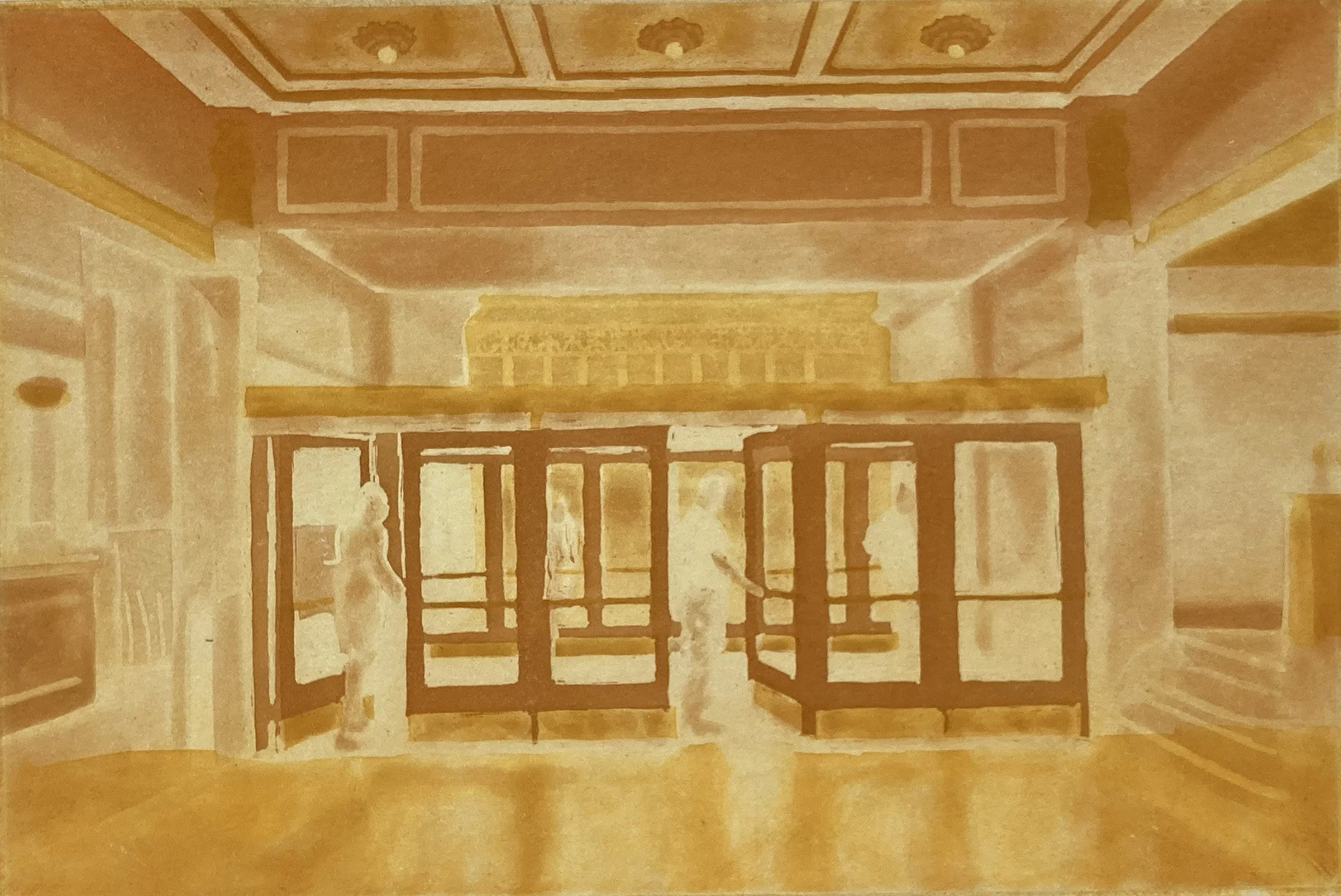
This is a proof of the first two color plates for Jewel Box. There is an apricot plate and a deep orange plate in this proof.
When making a color print, you make an estimate of how the plates will print together. I am usually not very happy with my first proofs, but once you make that first impression, you have information to make further adjustments to the plates.
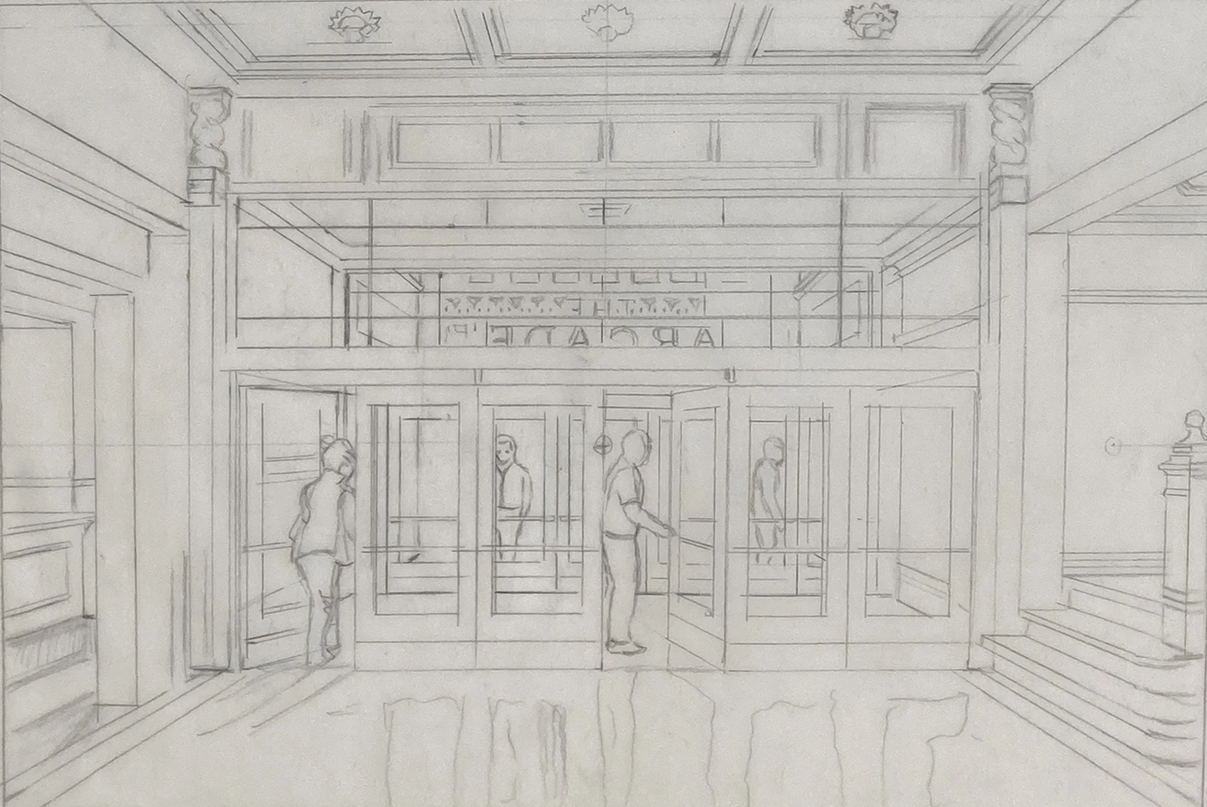
A drawing to work out the composition of the print, Jewel Box. Set among the square geometry of the architecture are four people.
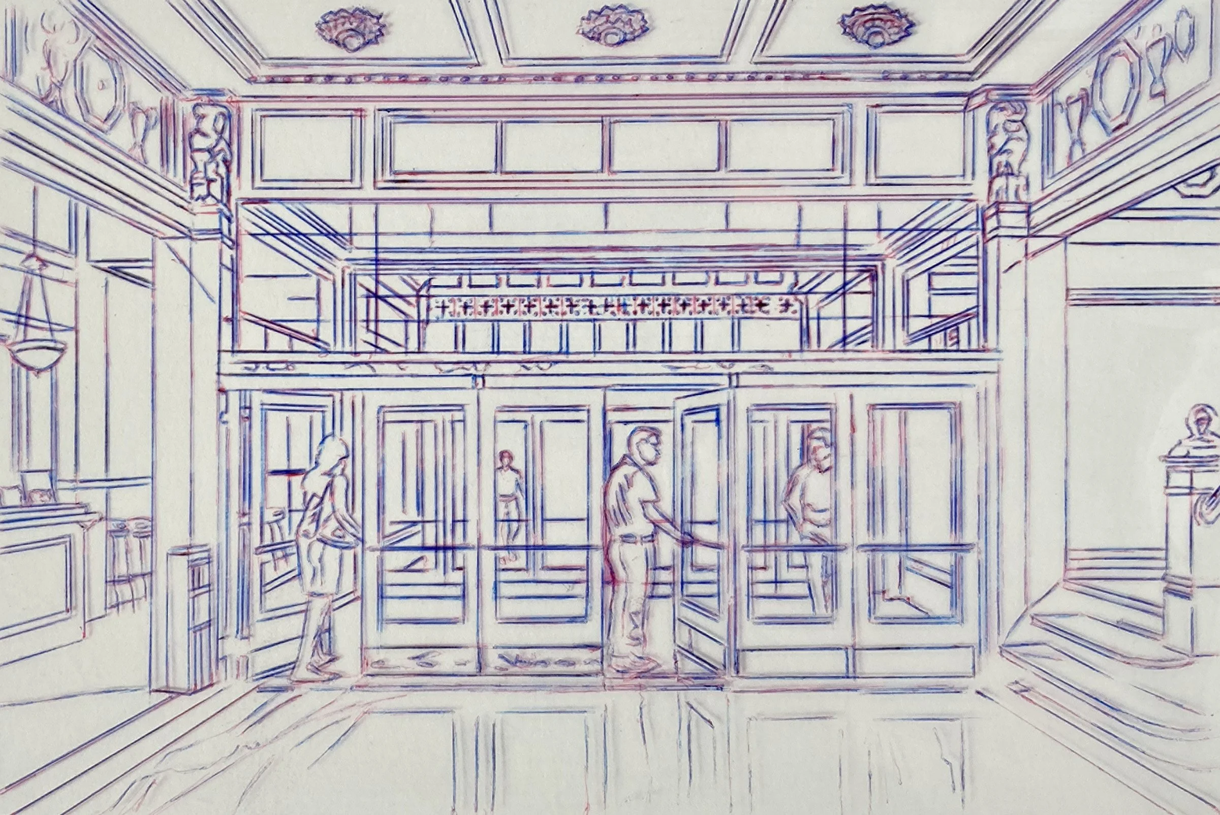
This is the Mylar transfer drawing showing the final placement of the four figures.
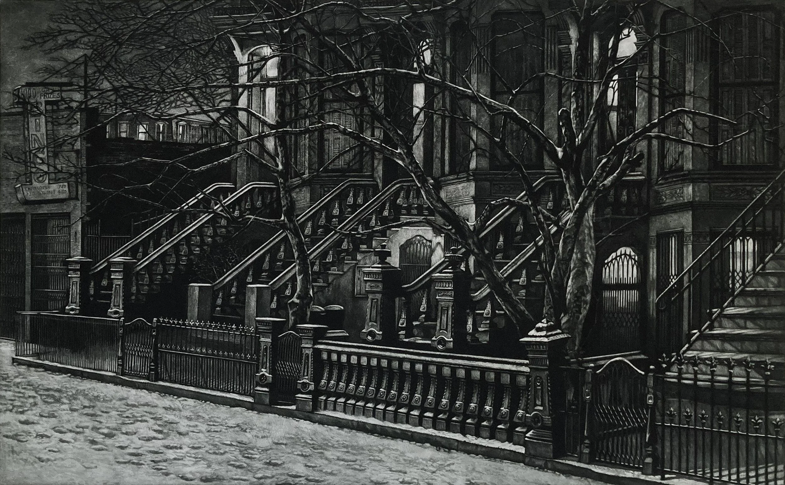
This is the dark-to-light viewing of this Brooklyn brownstone print. The spooky, gnarled tree branches set the mood for this dark winter night.
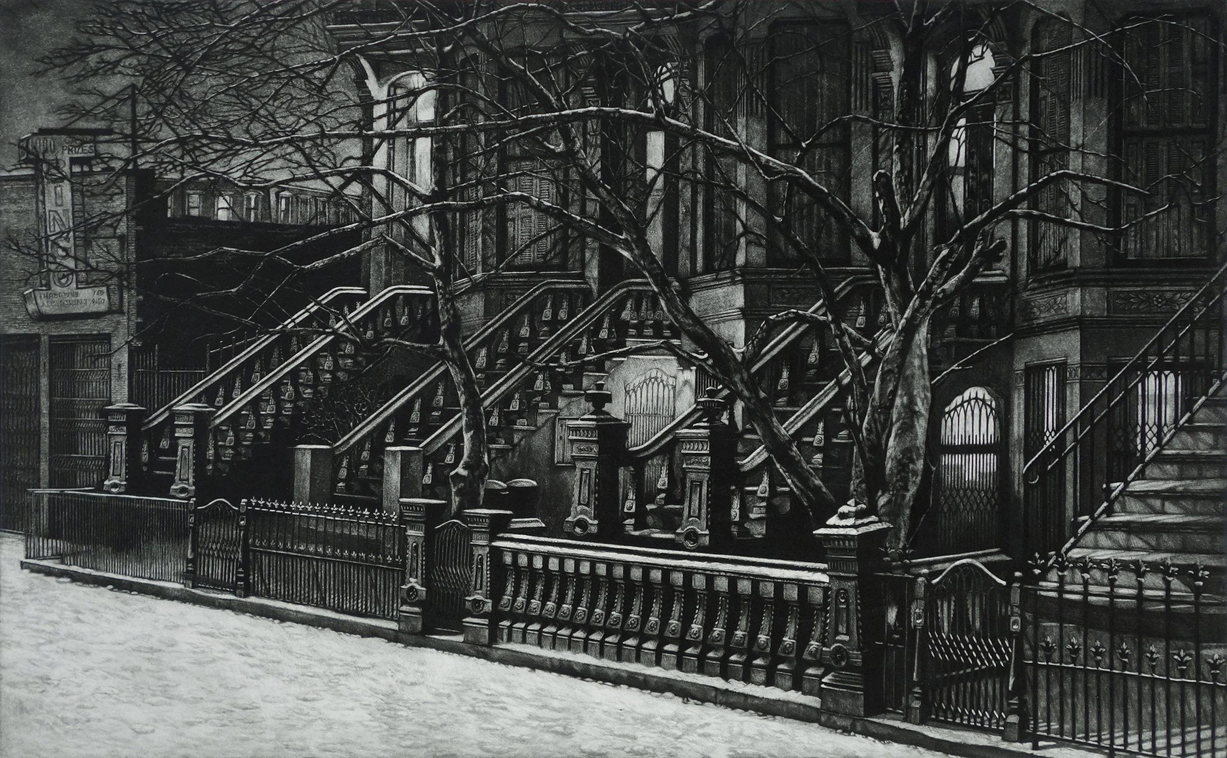
This is the second proof of Still Night. The snow in the foreground is much brighter, and the garden gate in the center now has the lights on.
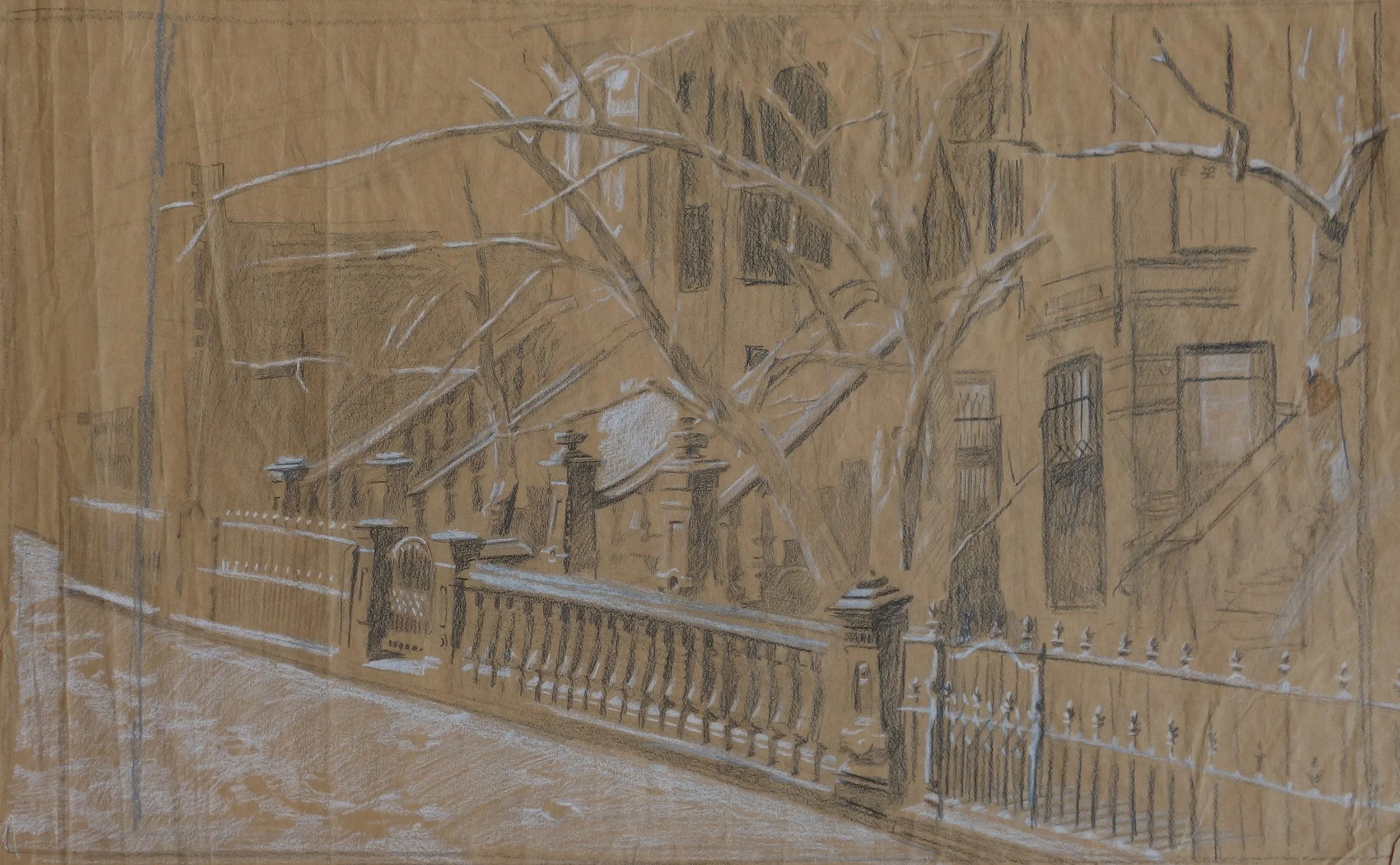
Color pencil on brown craft paper, a preliminary sketch to block out the scene. When I first start a piece, I just scribble out details and then refine the image in each drawing.
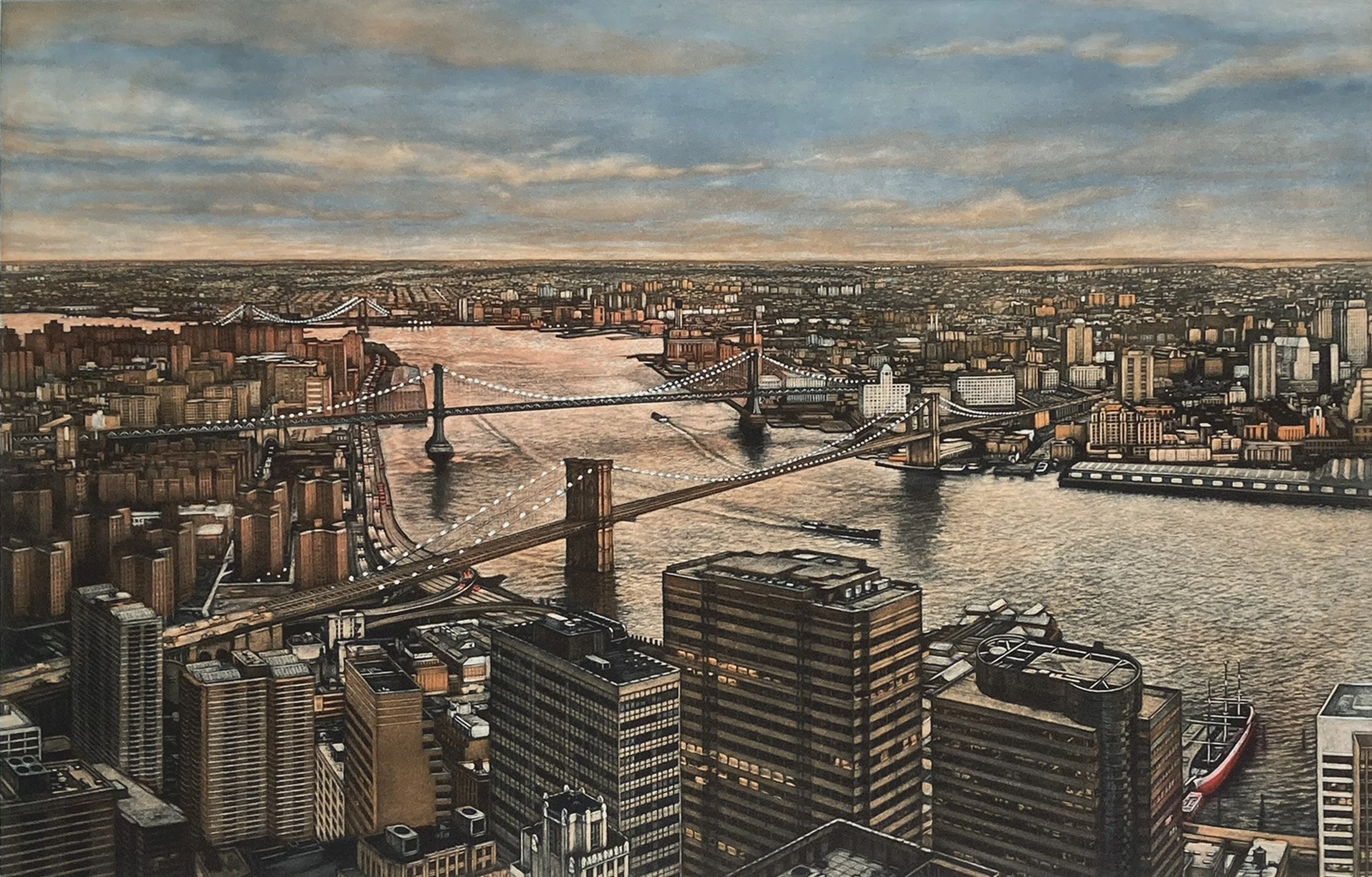
This view of the East River at twilight features its three famous bridges: the Brooklyn, Manhattan, and Williamsburg Bridges. This is a two-plate print.
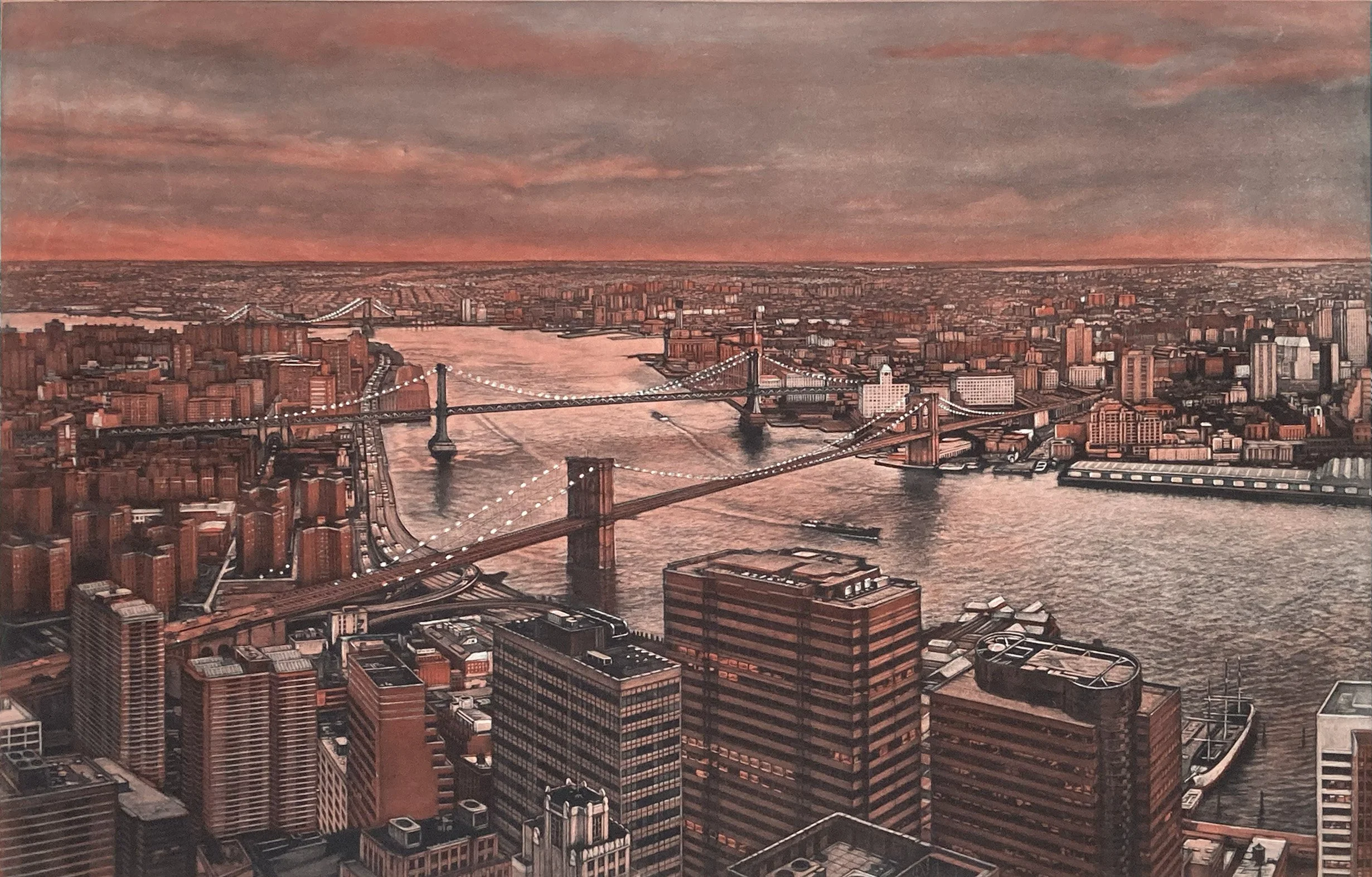
The first proof of both plates. This view was from the top floor of One Chase Manhattan Plaza.
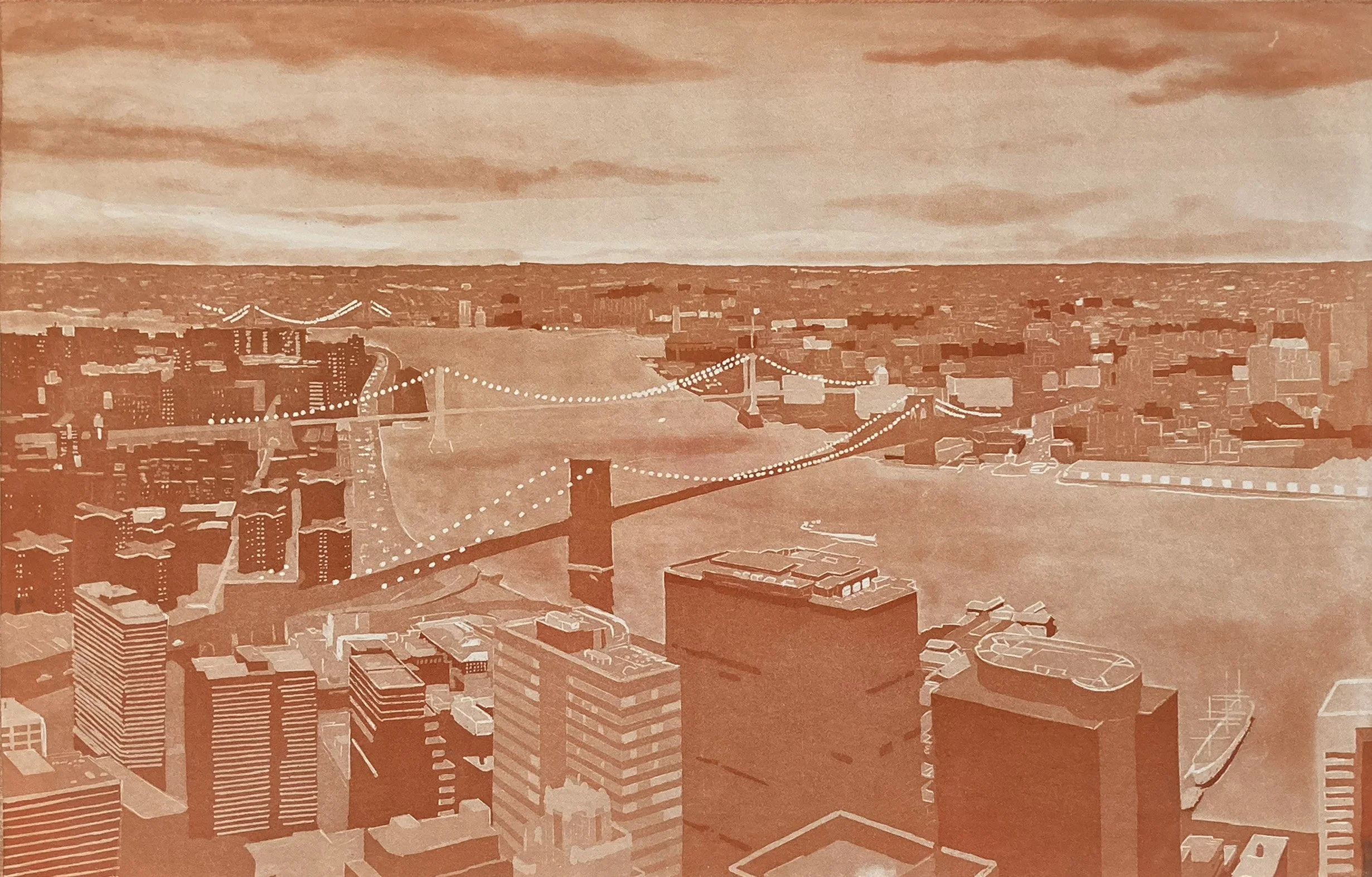
This is from the first proofing of the orange plate.
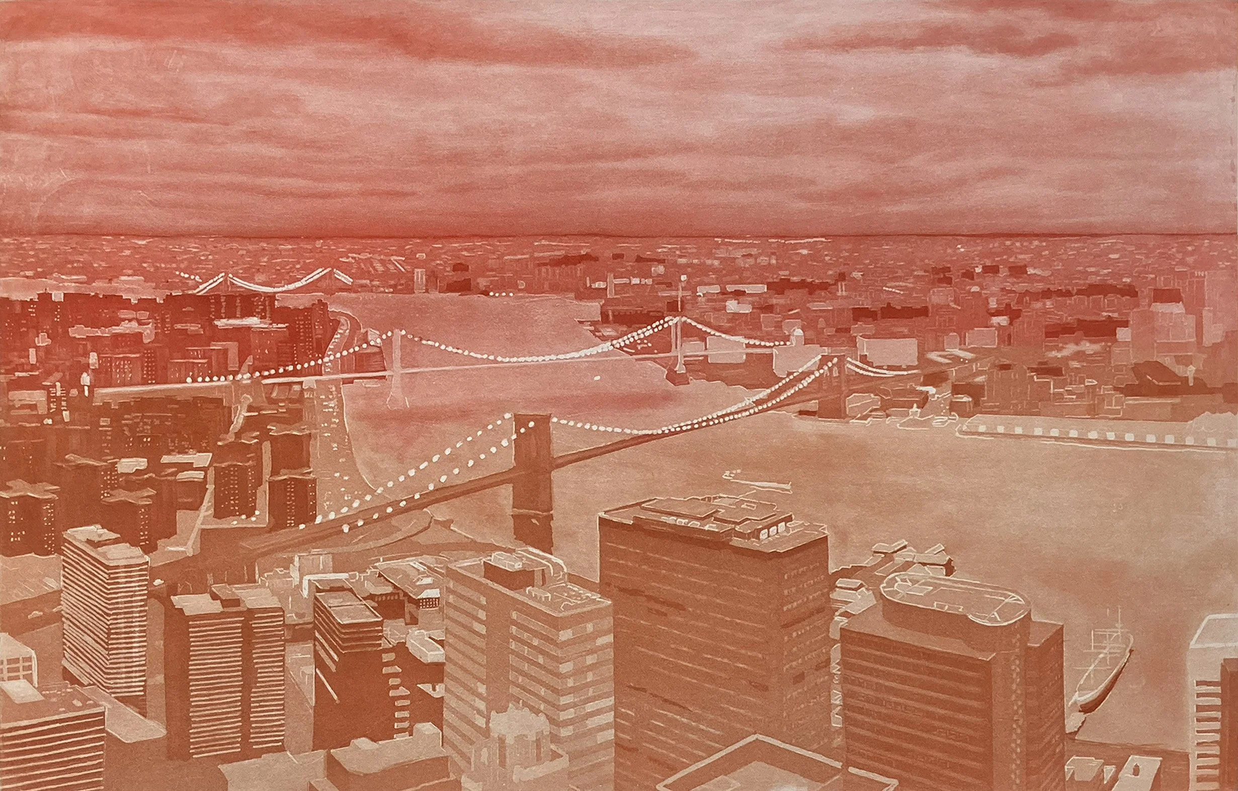
This second proof of the orange plate. Aquatint tone has been added to the sky and the river.
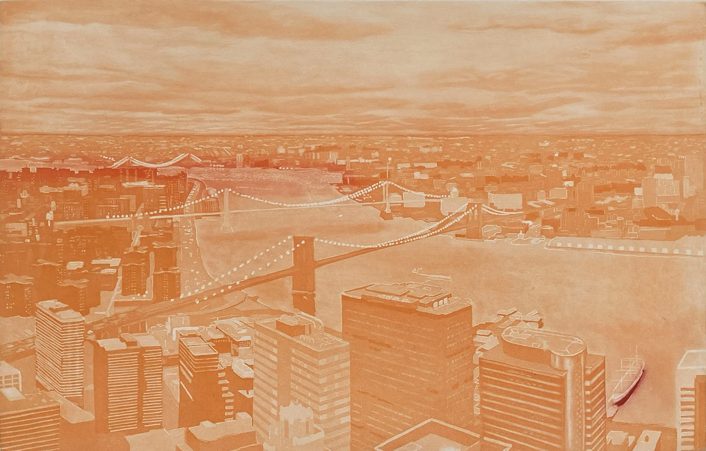
The third orange proof. I start working out an à la poupée. plan to get a better range of color,
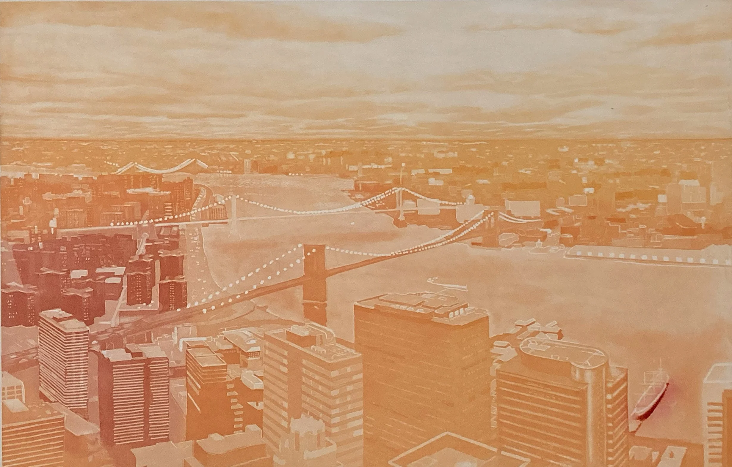
This is a proof of the final á la poupée inking for Three Bridges.
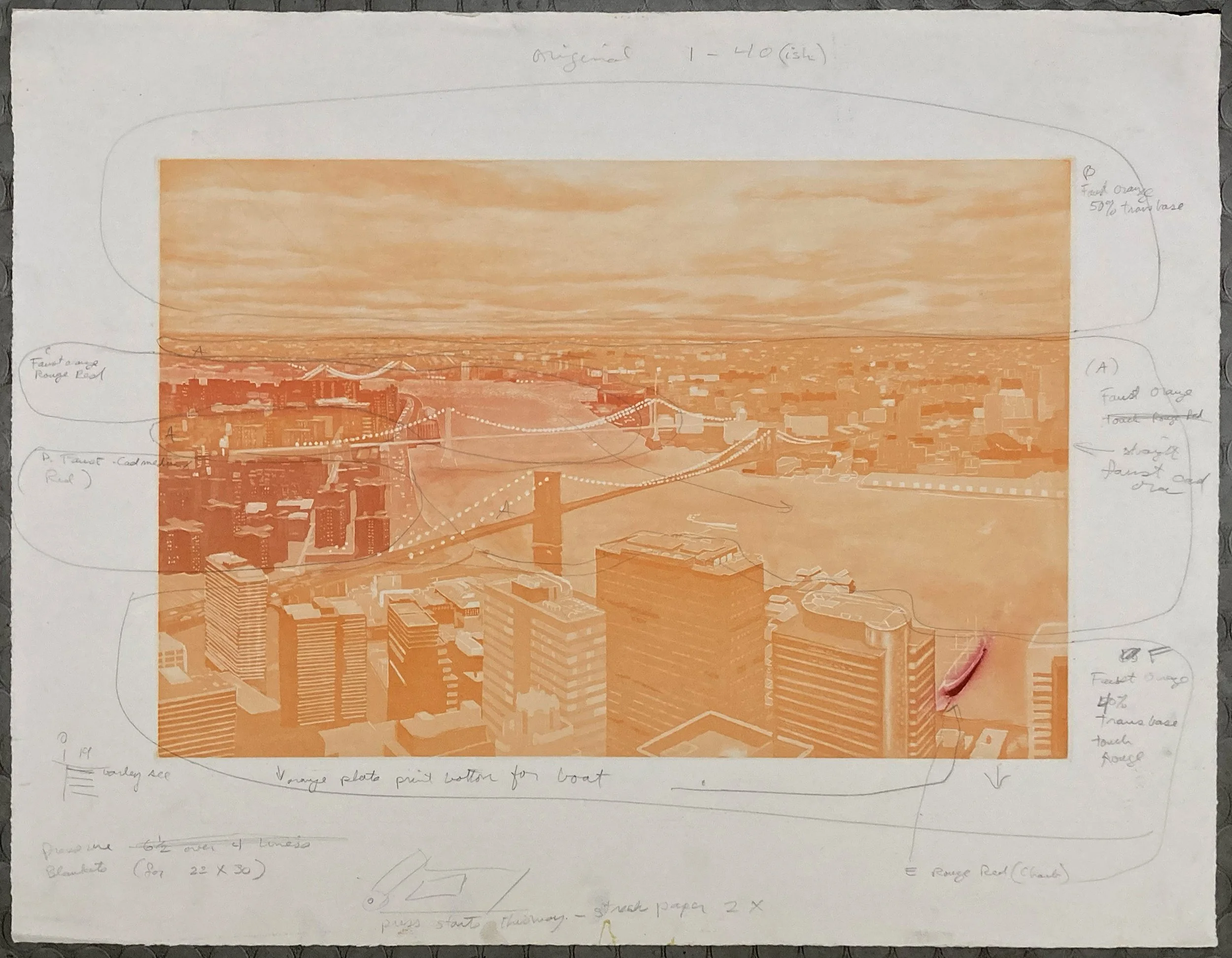
This proof includes detailed notes mapping the colors and their mixtures, along with instructions on press pressure, blankets, and even which side to begin rolling from to achieve the best plate registration.
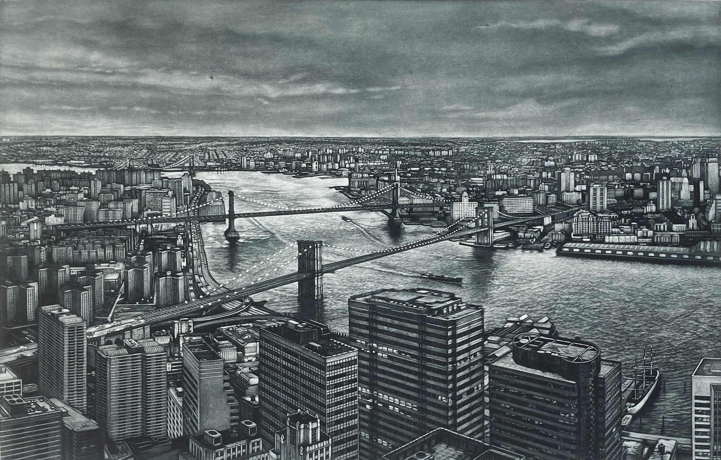
This is the mezzotint plate for the birds eye view of the East River scene.
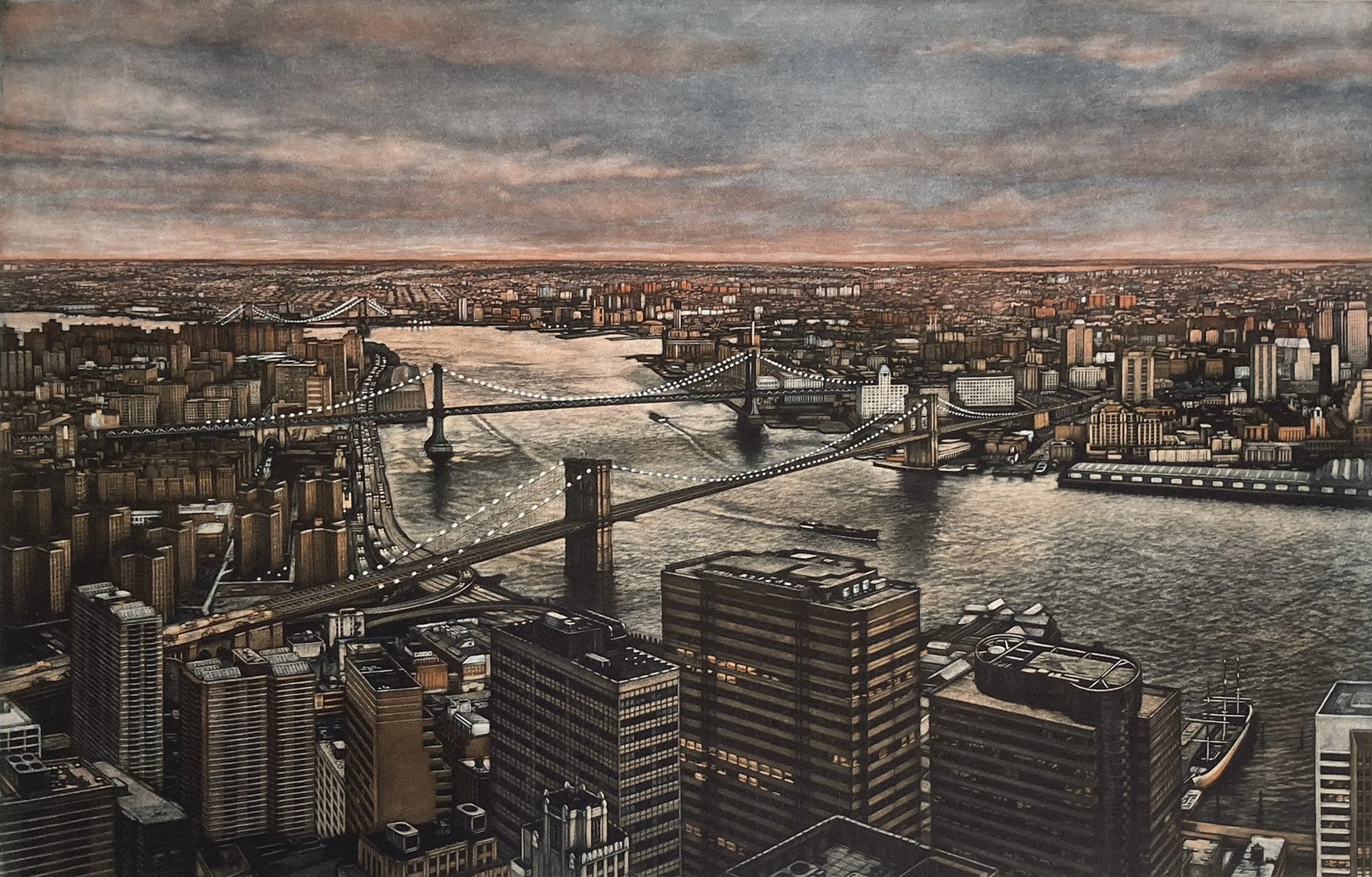
This is the second proof in the evolution of this print.

This my first attempt at this subject of the Grand Central sculptural group. I tried several intaglio techniques. Eventually this attempt would be abandoned and I would start again with a different composition and this time in mezzotint.

I am a tonal artist and did not like the line work I done so I scraped and burnished away much of the etched marks.

I started with a new plate, textured it with a roulette, and began pulling out the tones of the figures. In the sky, you can see the roulette marks left from texturing the plate. This proof uses two plates: the new mezzotint plate printed in sanguine and the remaining marks from the first plate.
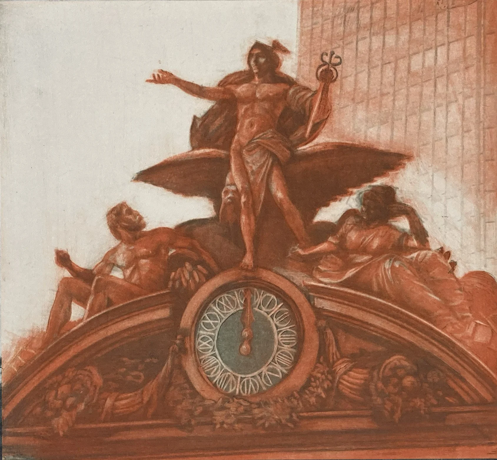
More details are brought out in the dark plate and printed with the reworked second plate.

This proof shows only the new mezzotint plate, printed in black. The tones have been further developed with the burnisher.
At this point, I had learned a lot about intaglio techniques, but I realized that mezzotint was my preferred method. I decided to stop working on this version, get a new plate, and start fresh.
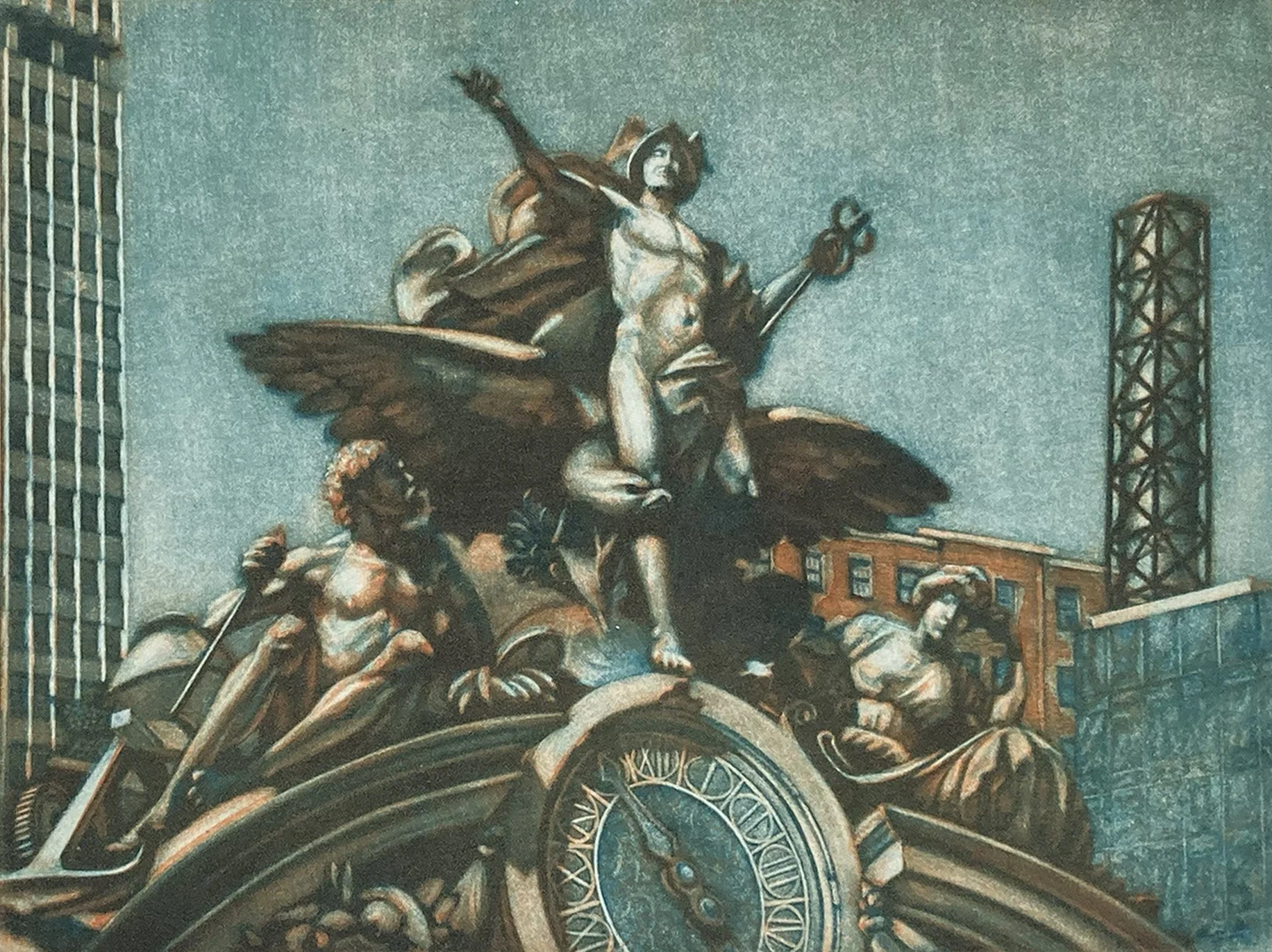
This is the revised version of the sculptural group of Hermes, flanked by Hercules and Minerva, above the main entrance to Grand Central Terminal.
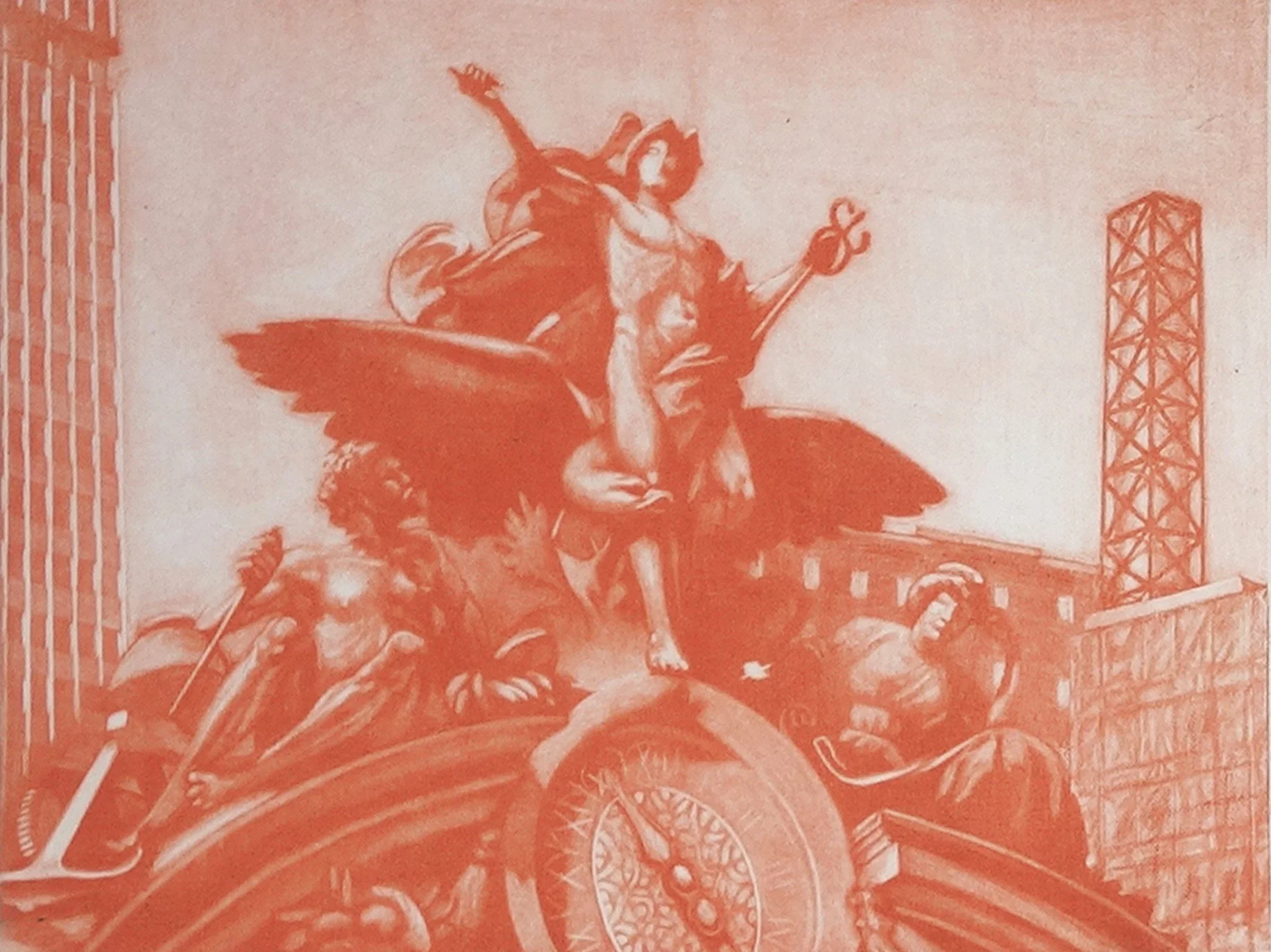
This is a two-plate print, with both plates made using mezzotint process. This plate is printed first in vermilion ink.
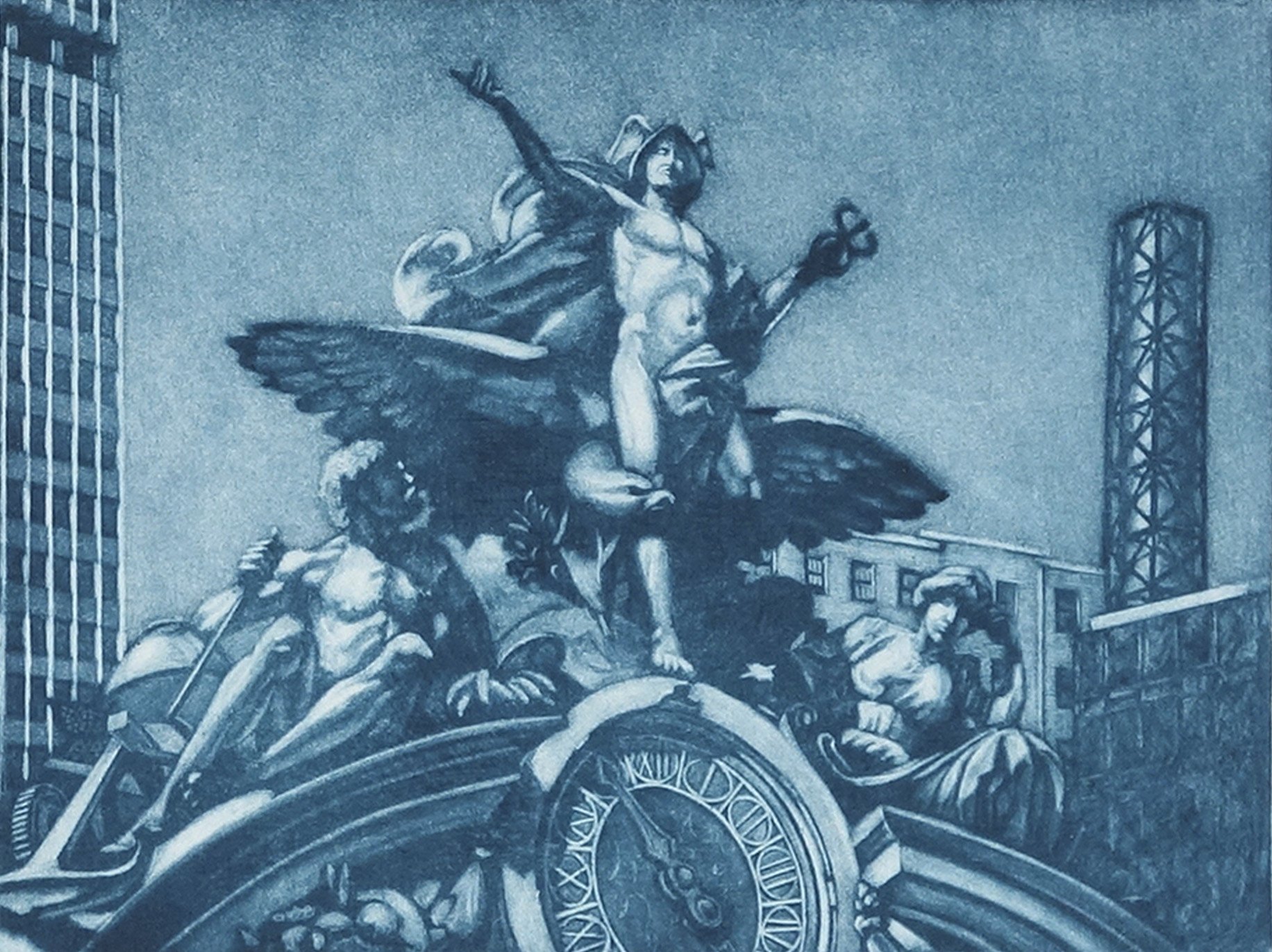
This is the key plate, printed last in blue ink.
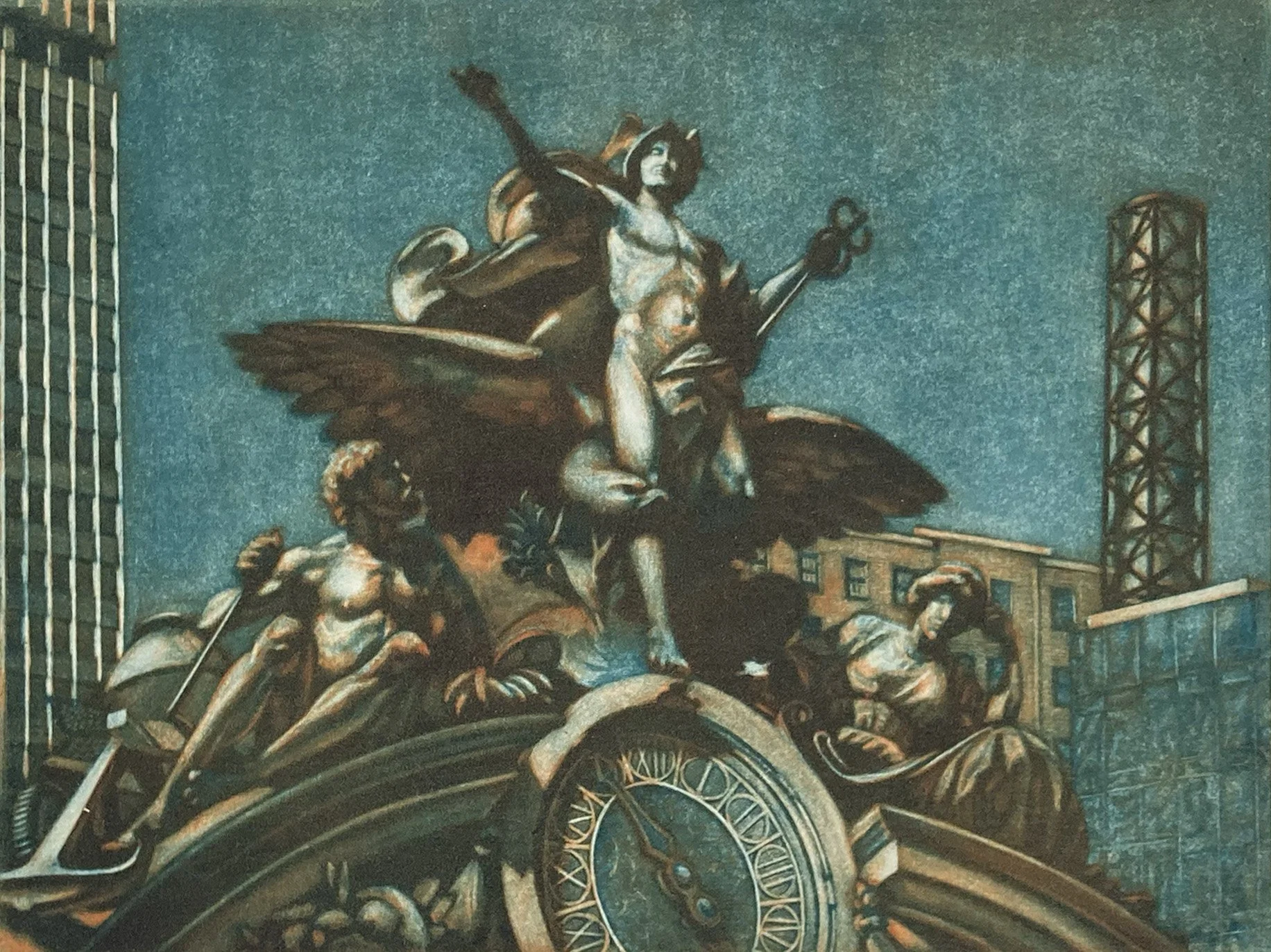
The Grand Central print was my eighth color print, and it taught me a lot about how colors interact when they are printed together. I spent a day experimenting with the two plates, trying as many color combinations as I could. Some worked while others clashed or became almost garish, but I learned something from every combination I tried.
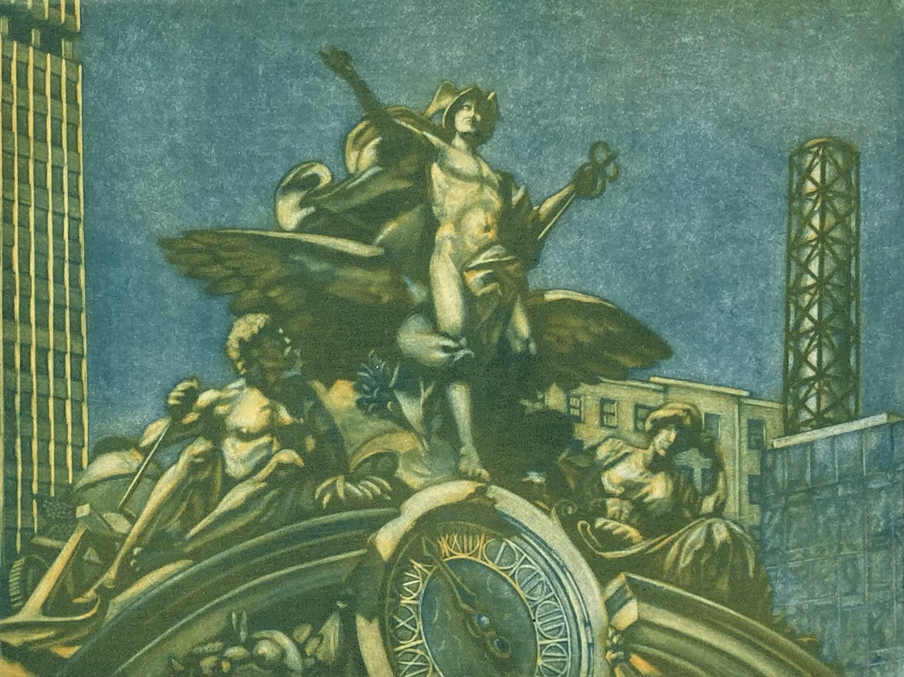
The colors are printed wet on wet so color blend on the press. The last color printed dominates the one below.
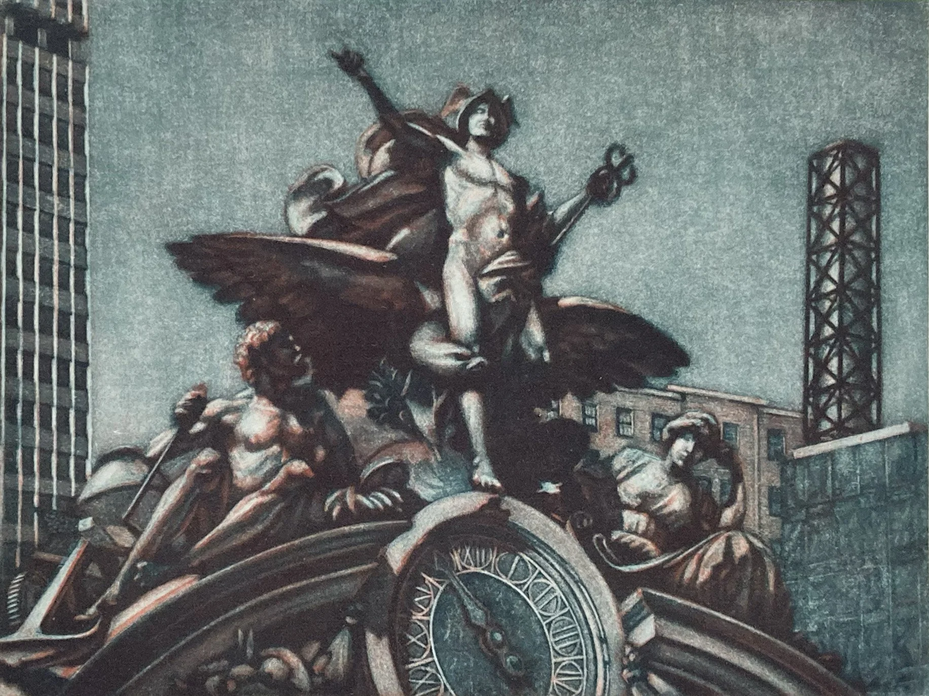
This proof of Grand Central is close to the finished variation.
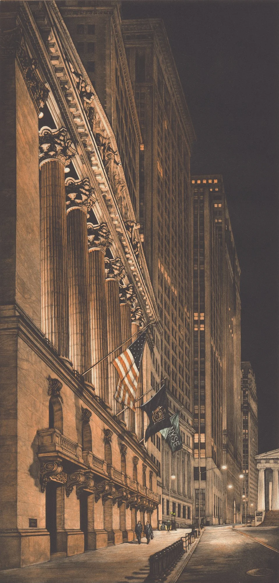
The New York Stock Exchange is the focus this two plate print. The final print has a small amount of green hand coloring on the subway station lights and the NYSE flag.
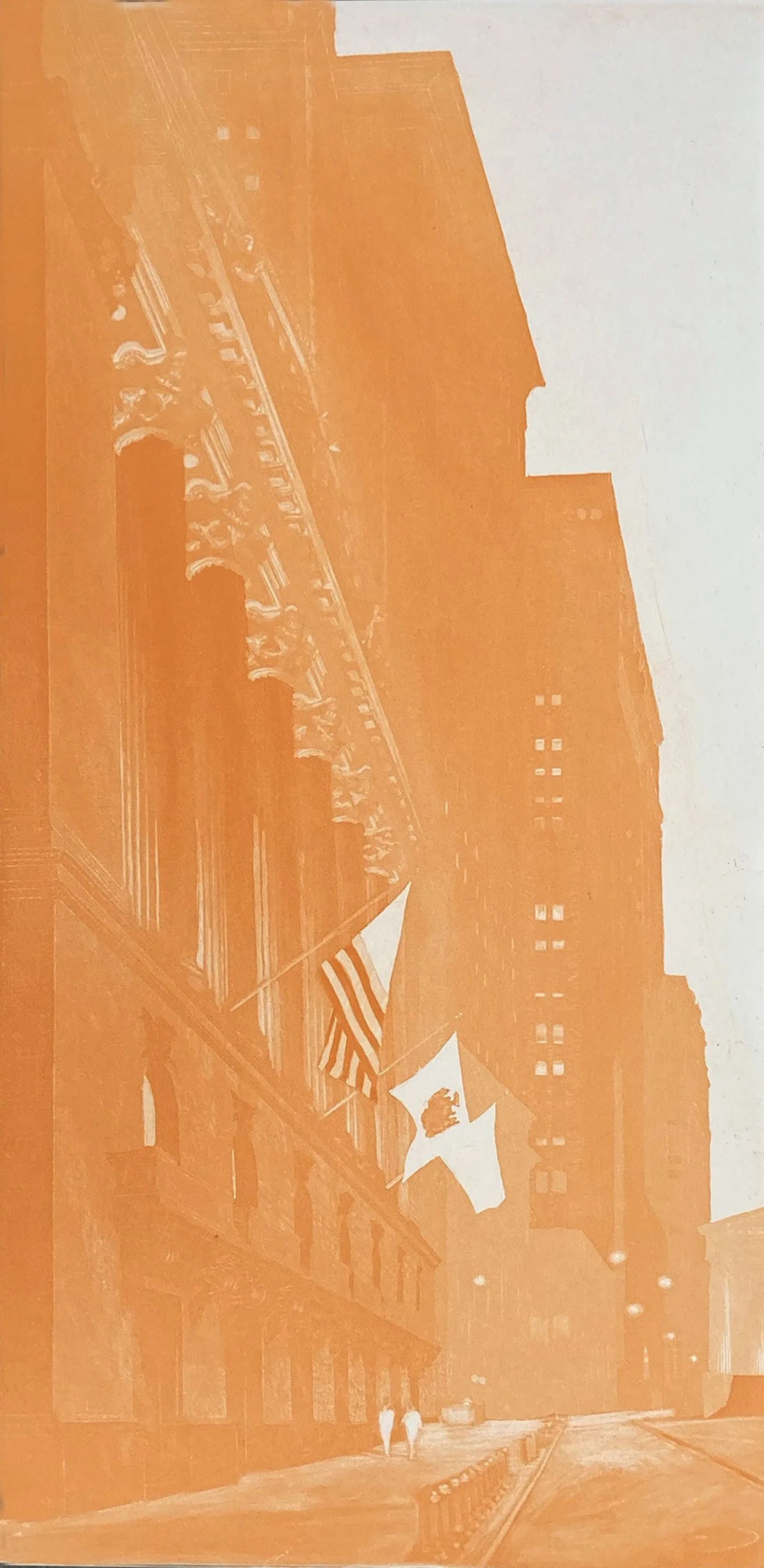
This is the orange plate for High Finance. Working subtractively, I burnished highlights into the fluted columns and their capitals. I also lightened the sidewalk and the base of the Exchange.
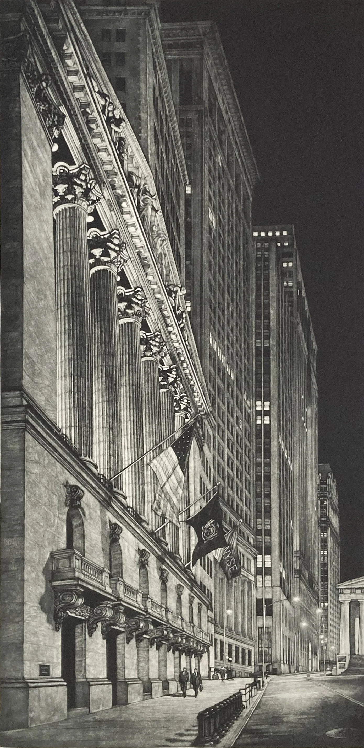
This is the mezzotint plate for High Finance. I was especially drawn to the sculptural group on top, particularly the figures leaning over the edge and looking down toward the street.
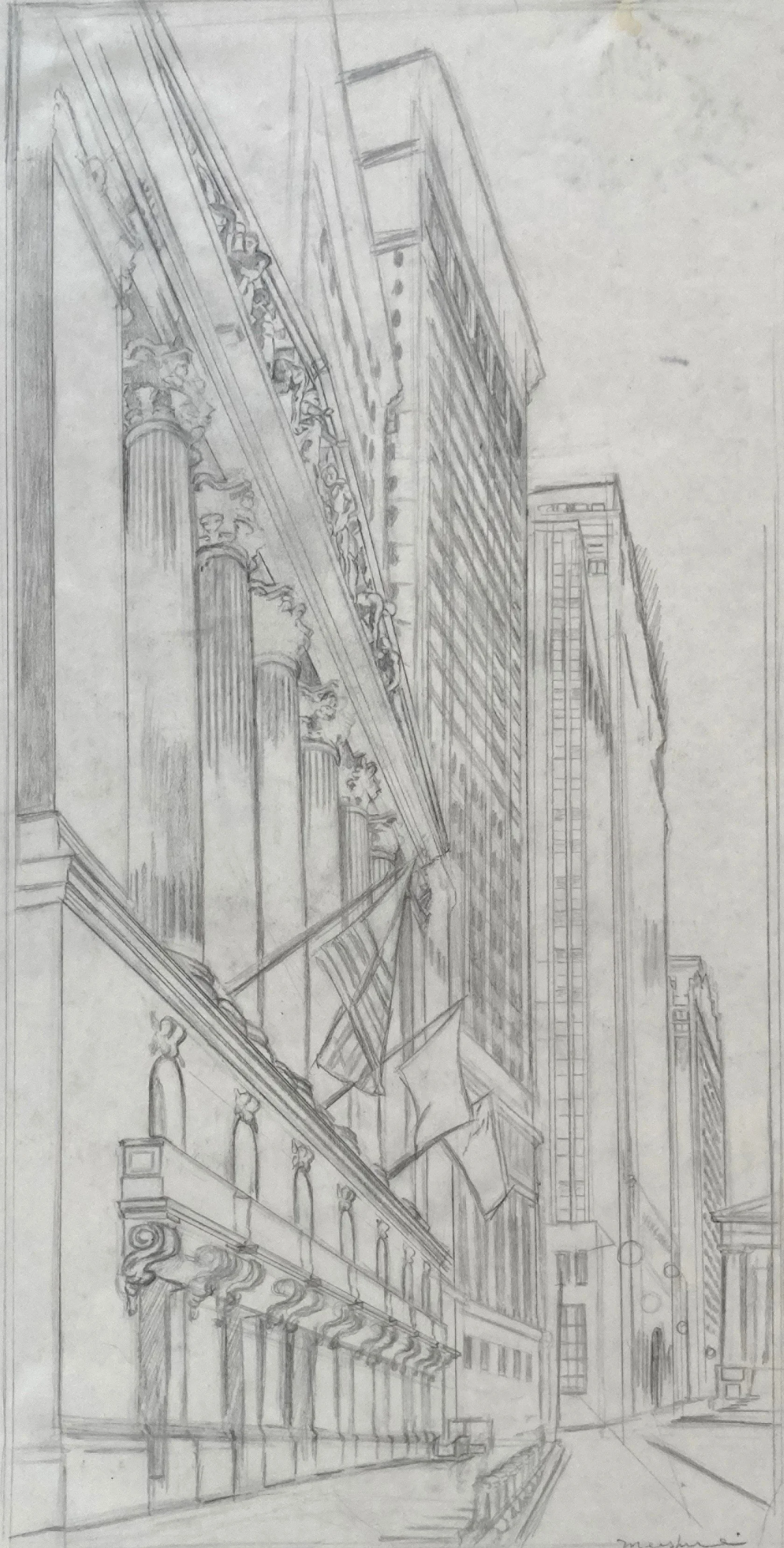
Pencil sketch for High Finance, focusing on the canyon-like quality of the Wall Street area.
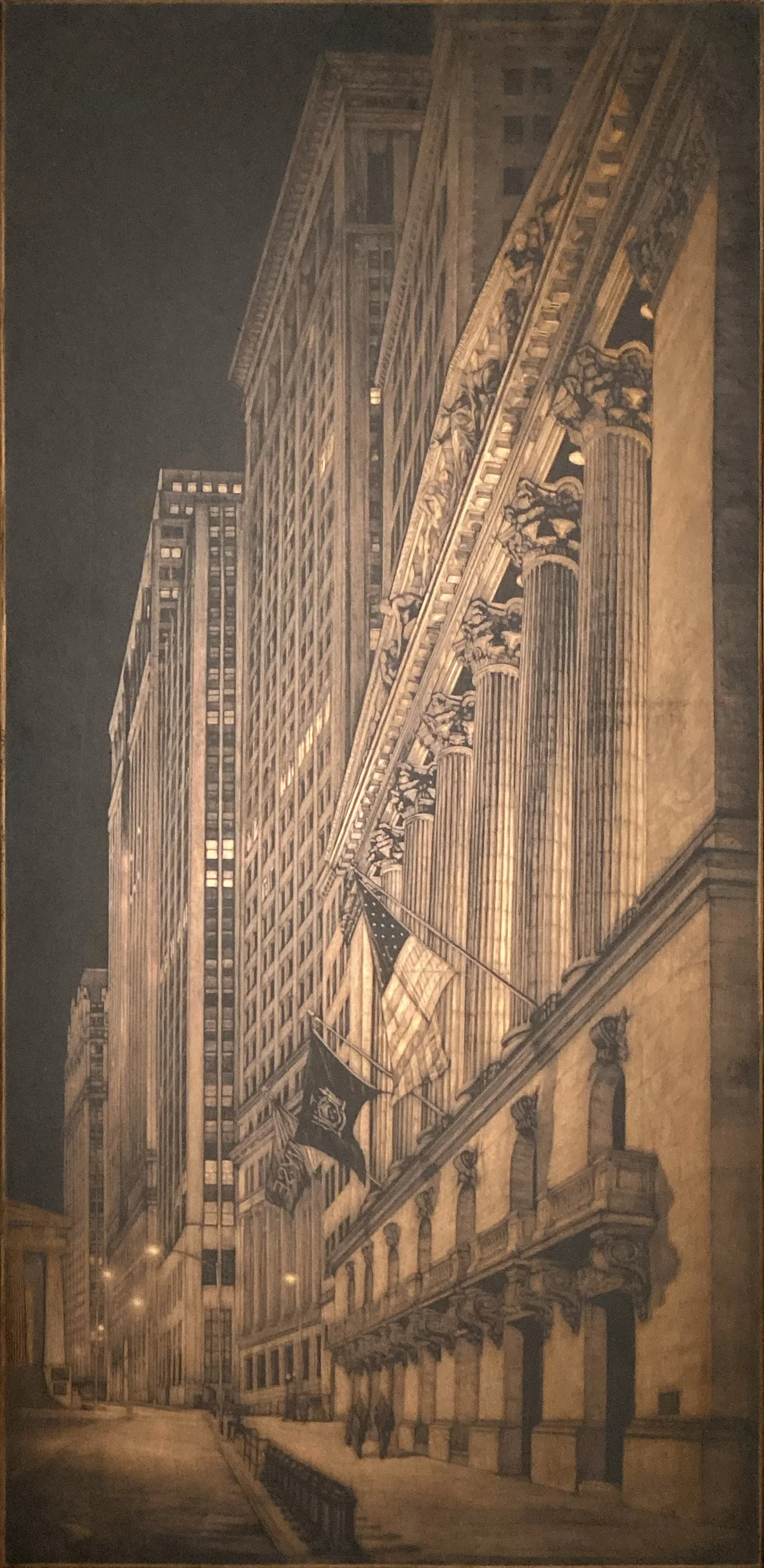
This is the copper mezzotint plate with black ink.
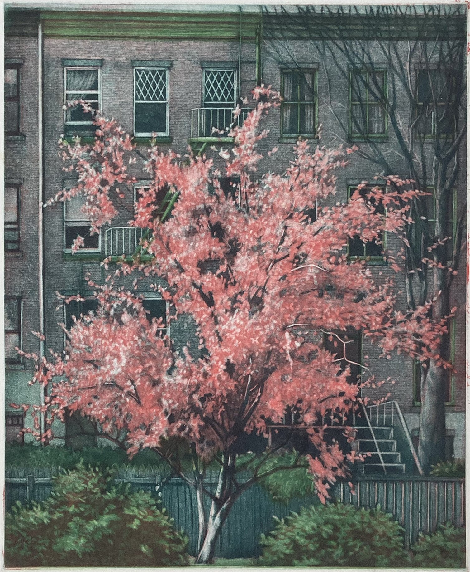
This three-color print of a flowering cherry tree was made during my second year as a printmaker, when I was beginning to explore color printmaking.
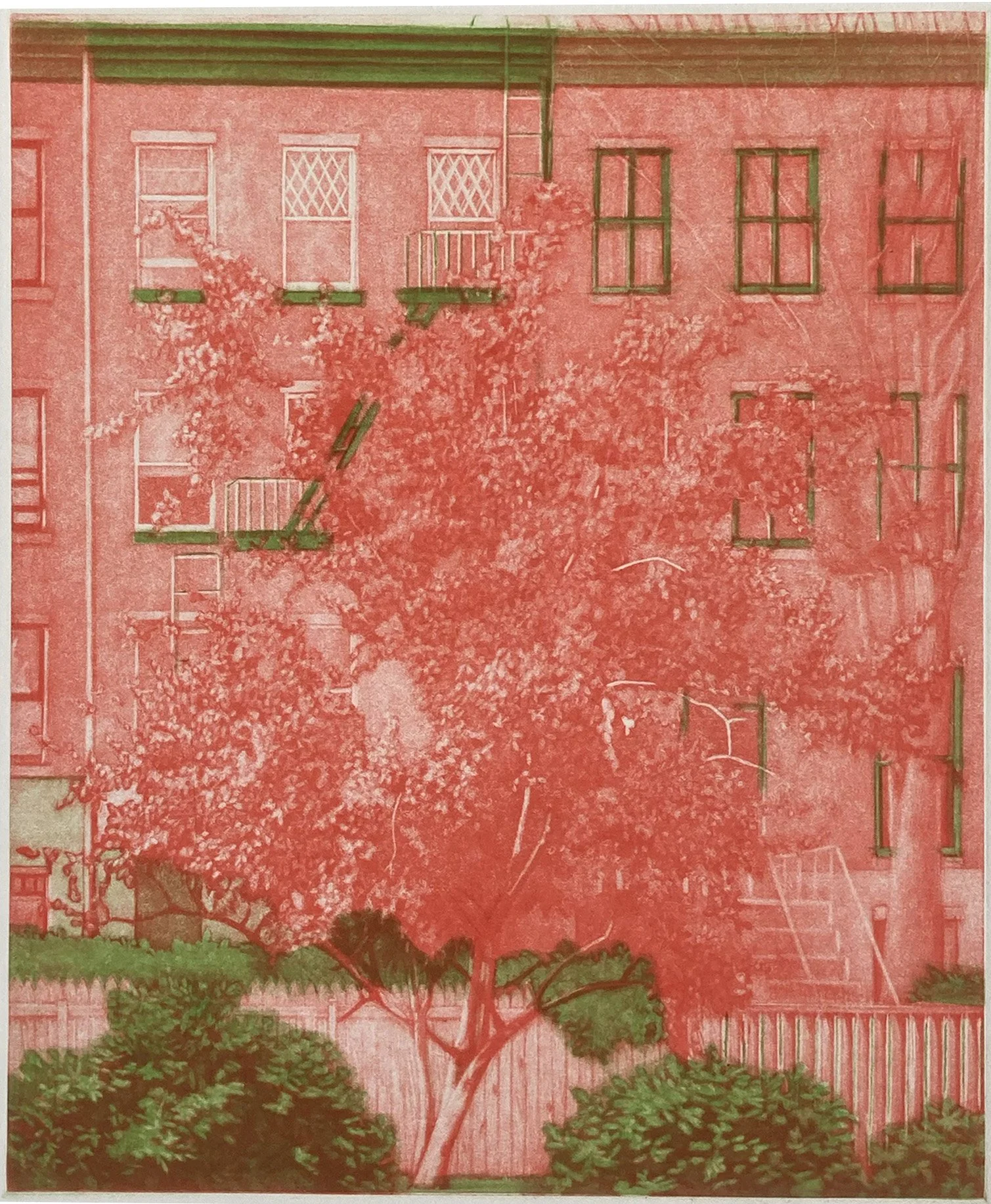
This proof shows the first two plates: the red plate is a rocked mezzotint, while the green plate is made with roulette.
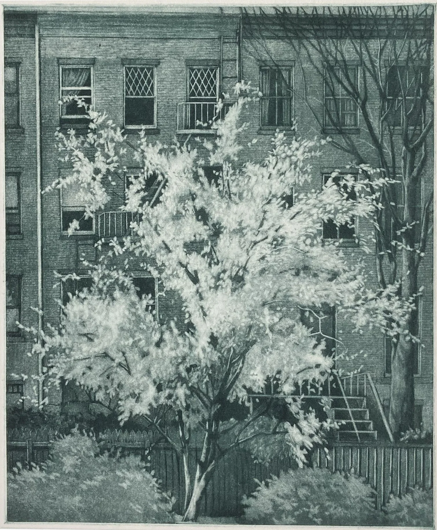
This key plate is made using the mezzotint technique and printed with a blue black ink. Much of the cherry tree will be defined by the previous red plate.

Watercolor and pencil sketch of the view from my first apartment in Brooklyn.
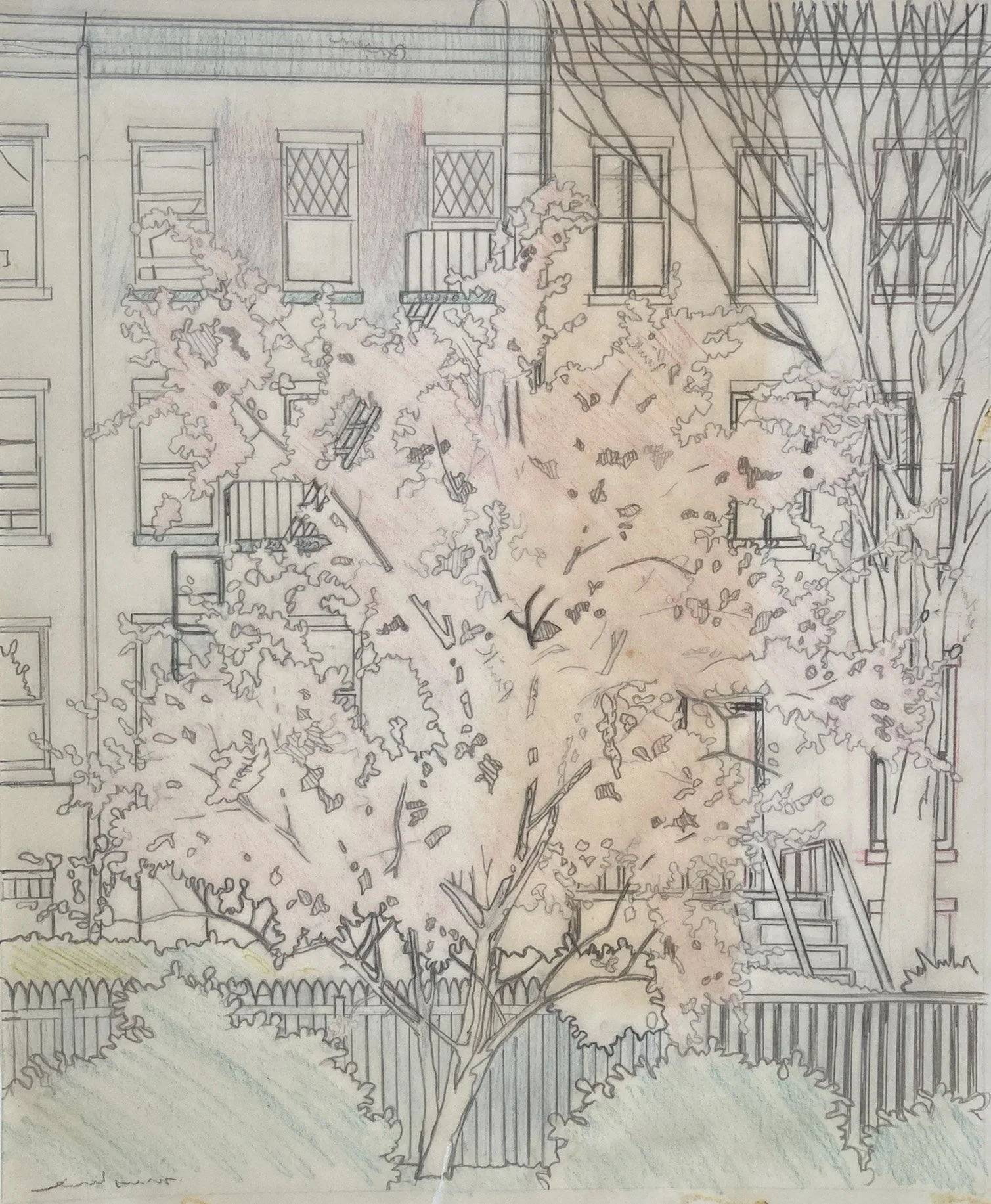
Registration transfer tracing used to align the three plates of View from My Window so each color prints in the correct position.
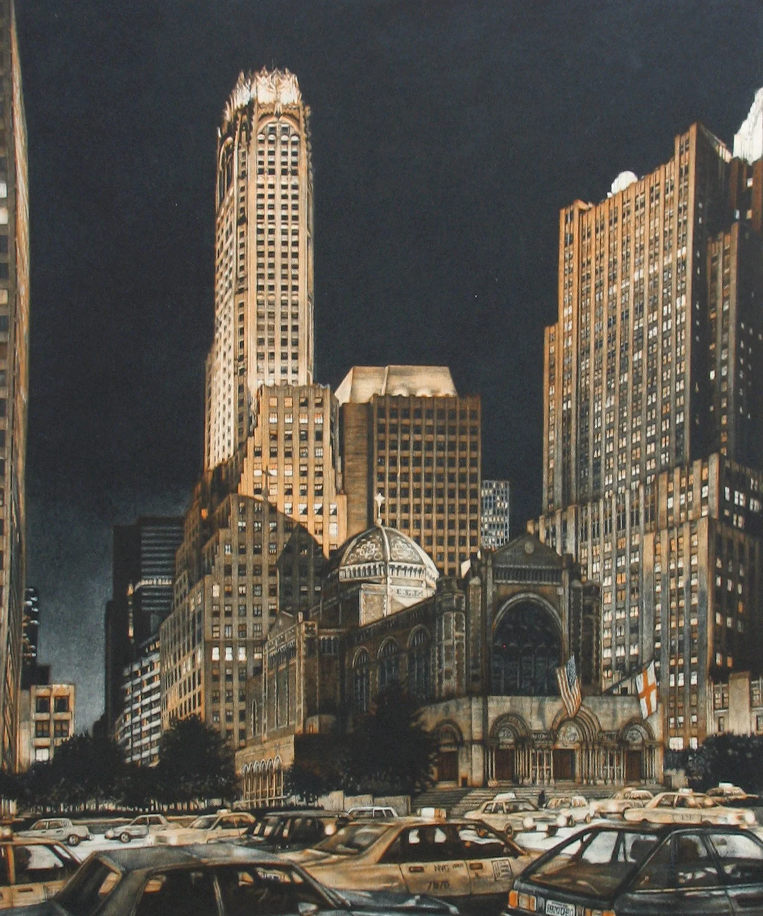
St. Bartholomew’s Episcopal Church is at the center of this two-plate print, with horizontal rows of cabs in the foreground contrasted against the vertical rise of skyscrapers behind it.
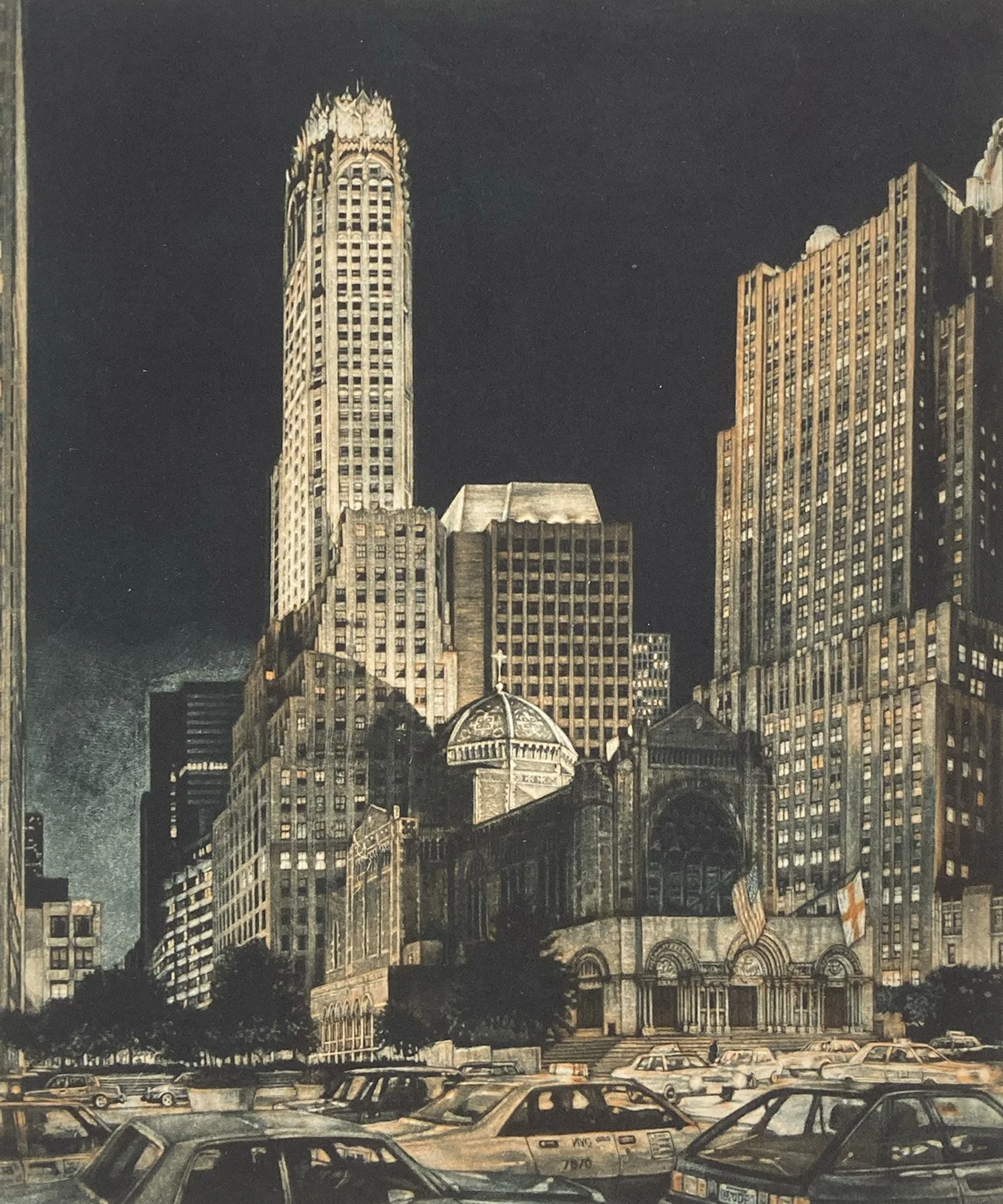
First proof of Ascension. The key plate is close to what I wanted, but the orange plate needs more strength.
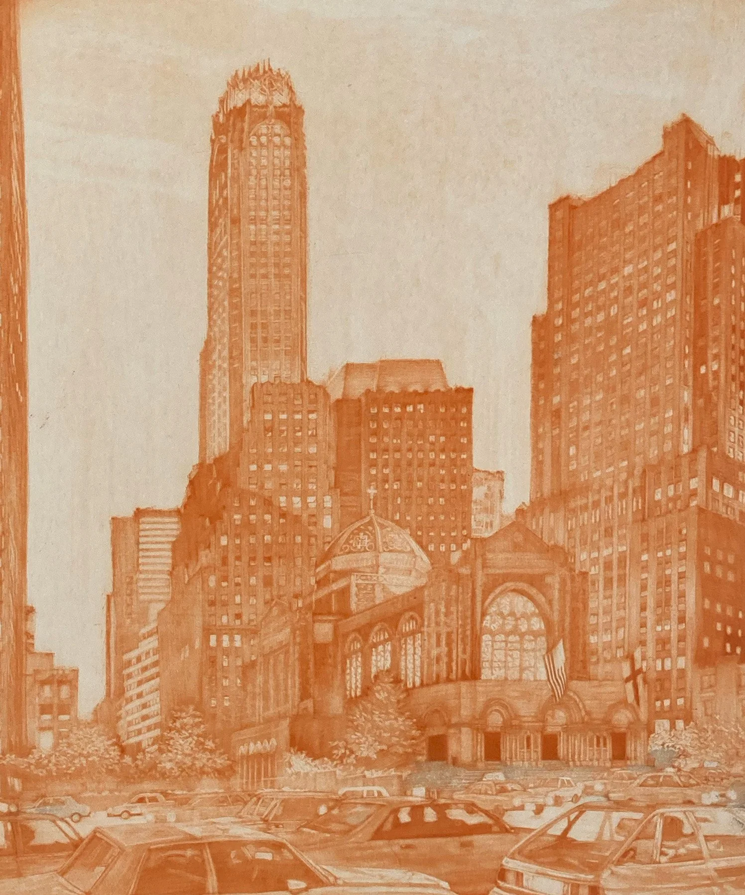
This first orange plate is worked in a subtractive mezzotint manner, the details of the two flag will be defining information for the final print.
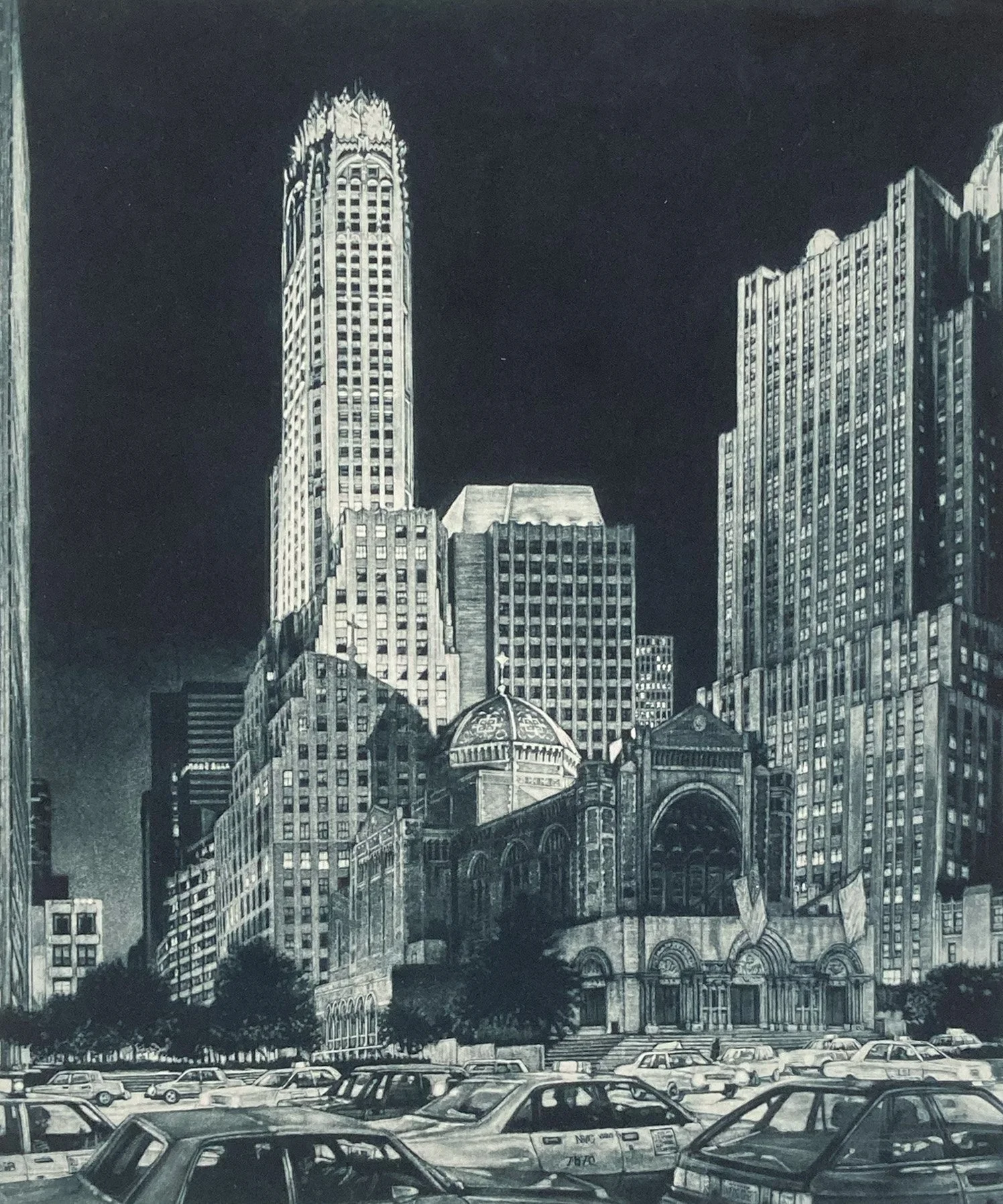
This mezzotint plate for Ascension holds most the details except for the two flags.
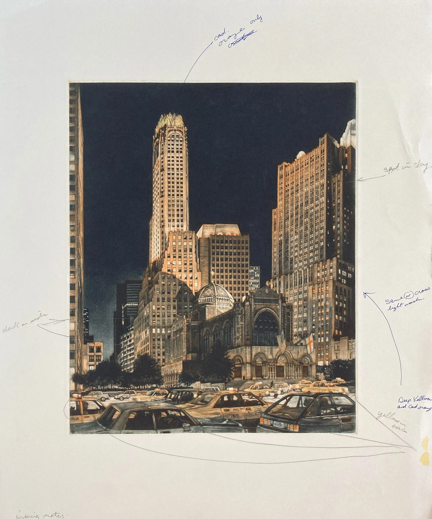
This proof of Ascension includes notes marking the areas that will be hand-colored after printing.
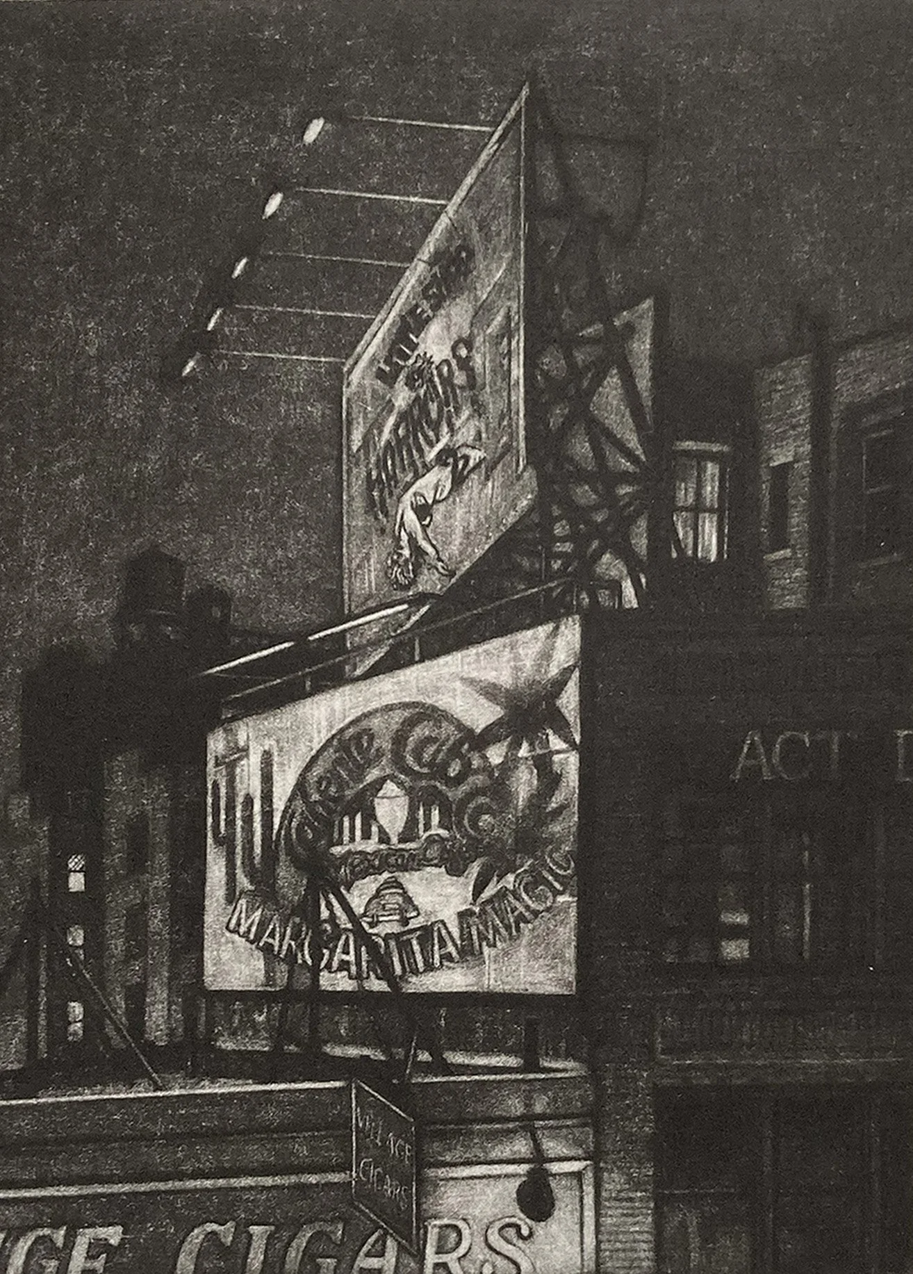
The next three proofs show the progression from dark to light. The subject is the two billboards above a cigar shop on this triangular property.
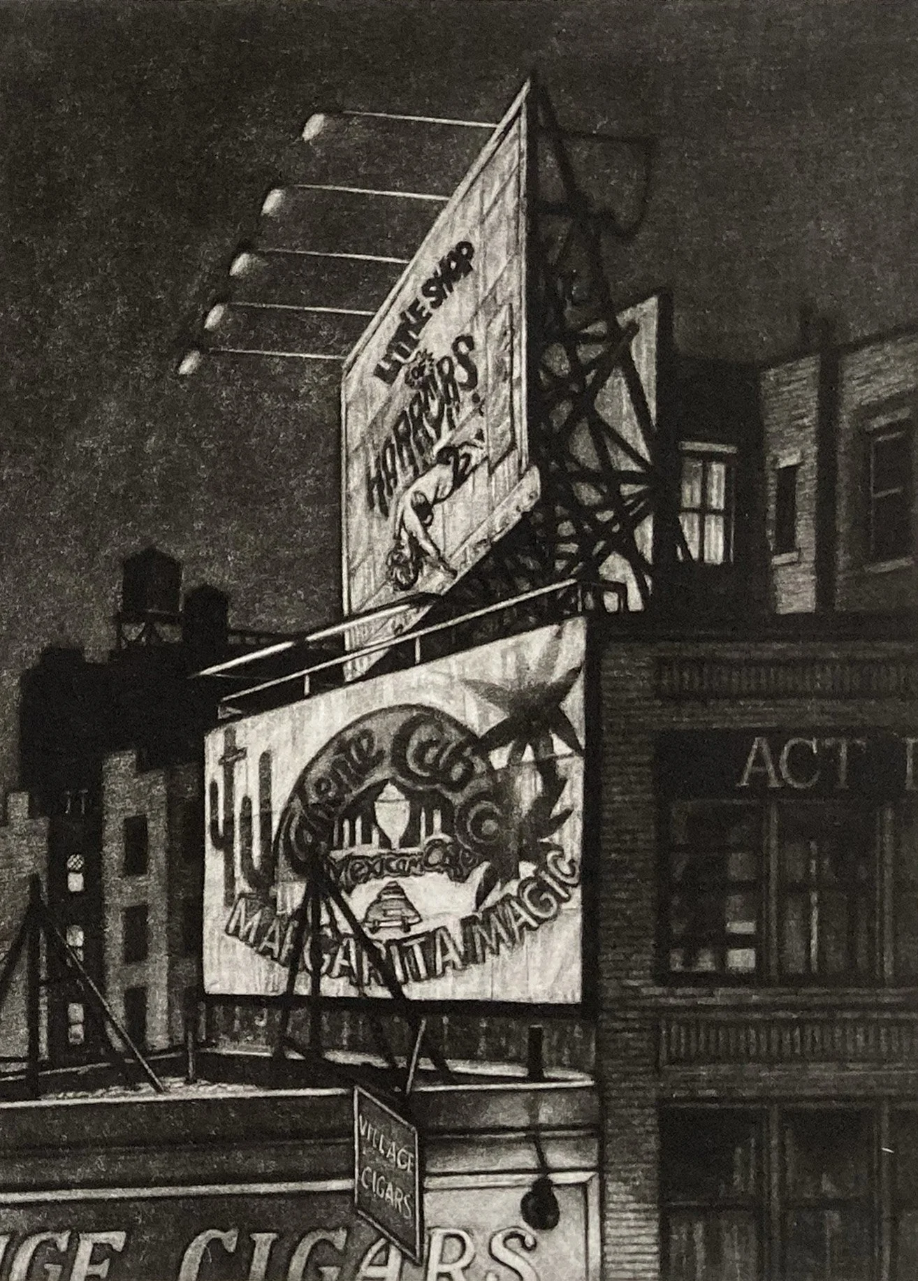
The Village Cigar was made during my first two years of working in mezzotint, when I was still developing my approach to the technique.
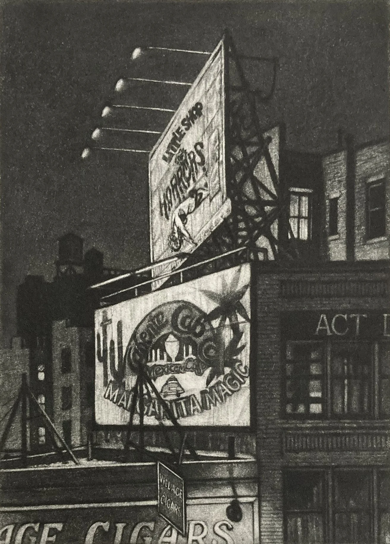
The top billboard advertises a long-running Off-Broadway show, while the lower one promotes a local restaurant.
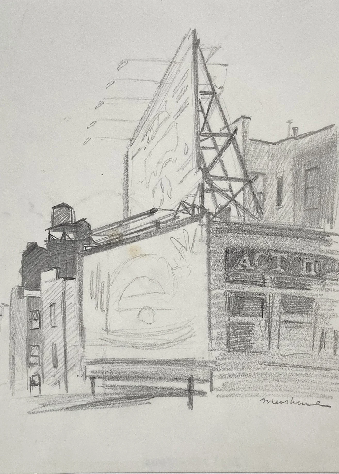
Sketch of the double billboard above the Village Cigars store, drawn from the window of my gym.
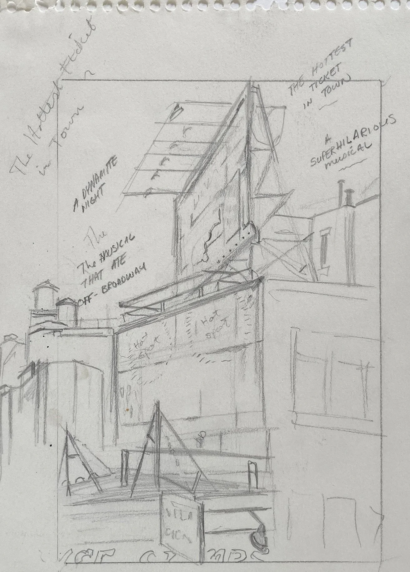
I noted the billboard text and lighting conditions on the sketch to help me capture the scene as I saw it.